Data Scientist @ ourworldindata.org
Interested in environmental change, biodiversity and health.
Reposted by Fiona Spooner


Several data sources show that theft in England and Wales has declined in recent decades.
One of those is police records — but they only capture reported crimes, and many people don’t report thefts.
Reposted by Fiona Spooner

Crime is clearly a concern for many people. Nearly 60% of Americans, for example, say that reducing crime should be a top priority for the US president and Congress.
Reposted by Dorothy Bishop, John Kennedy, James P. Collins , and 27 more Dorothy Bishop, John Kennedy, James P. Collins, Ken Caldeira, Euan G. Ritchie, Hugo Mercier, Johannes Haushofer, Philip N. Cohen, Martin Paul Eve, Pierre Bataille, Rebecca Sear, Paul E. Johnson, Ian Hussey, Karen Benjamin Guzzo, Climent Quintana‐Domeque, Aaron Sojourner, Andrew Livingstone, Paul Goldsmith-Pinkham, Dominik Vogel, Barrett, Bruce Bradbury, Zen Faulkes, Richard Pettigrew, Johannes Breuer, Marcus Credé, Richard M. Carpiano, Hisham Zerriffi, Juan Ramón, Michael Scharkow, Fiona Spooner


My guide to data visualization, which includes a very long table of contents, tons of charts, and more.
--> Why data visualization matters and how to make charts more effective, clear, transparent, and sometimes, beautiful.
www.scientificdiscovery.dev/p/salonis-gu...
Reposted by Fiona Spooner

Here are our top 5 most-viewed charts.
Each Friday over the next few weeks, we’ll share the top 5 for other categories (articles, etc.). Stay tuned!
1. CO2 emissions
Reposted by Fiona Spooner

What is the distribution of the global mammal kingdom today?
Reposted by Fiona Spooner

Reposted by Fiona Spooner


Amazing how much research and work goes into creating a chart like this. And it's such a good insight into society.
Reposted by Joanna Bryson, Fiona Spooner, Sandra Dullau

Of all vertebrates (animals with a backbone and skull), amphibians are most threatened with extinction.
Reposted by Aaron Sojourner, Sylvain Genevois, Fiona Spooner


We’ve just released @chartlecc.bsky.social - a daily chart game!
Your job is to guess which country is represented by the red line in today's chart. You get 5 tries, no other clues!
Play today, come back tomorrow for a different chart with new data and share with your chart friends 📈
Reposted by Fiona Spooner

Reposted by Fiona Spooner

Reposted by Fiona Spooner
Reposted by Greg Linden, Fiona Spooner

If you click 'Learn more about this data' on any of our interactive charts, a new window will open with more information about the indicator and data source used.
Reposted by Fiona Spooner

Reposted by Fiona Spooner
For example, on our page showing childhood vaccination coverage, you can easily switch between the share and number of children vaccinated (and unvaccinated), and compare across vaccines or focus on a particular one.
Reposted by Fiona Spooner

Reposted by Roger A. Pielke, Fiona Spooner
– Enhanced country/region selection with several sorting options and a bar chart preview
– Selecting a country highlights it and shows its value on the map
– Zooming to your selection brings up a 3D globe view 🌍
Reposted by Fiona Spooner
Reposted by Fiona Spooner

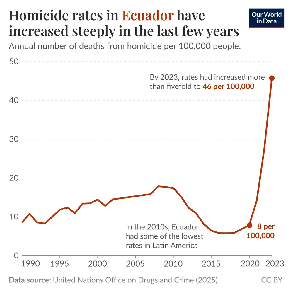
The data comes from the UN Office on Drugs and Crime 2025 release.
This update was led on our team by @spoonerf.bsky.social.
Reposted by Fiona Spooner

Reposted by Fiona Spooner
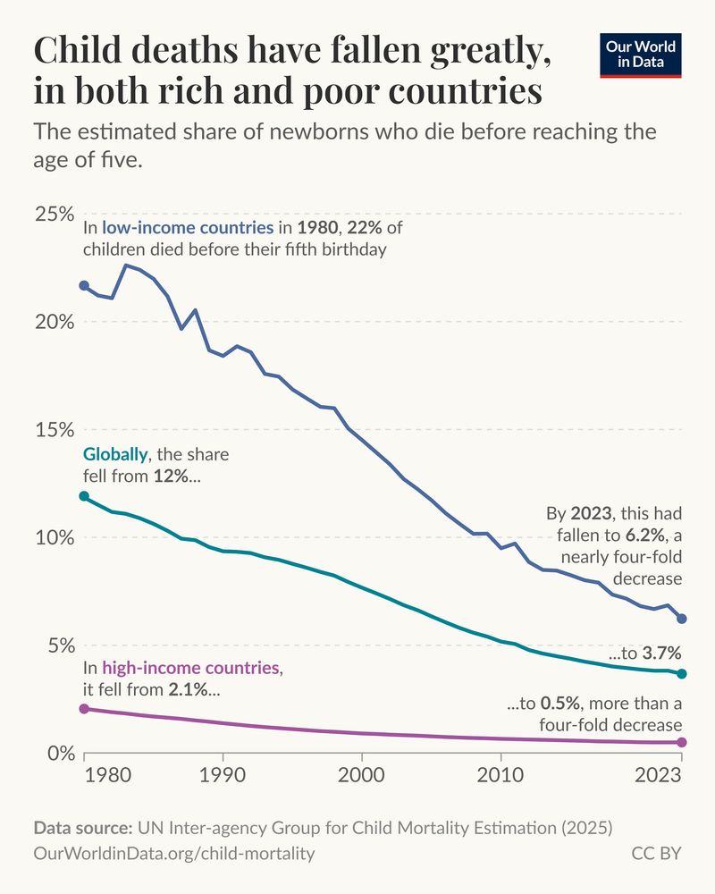
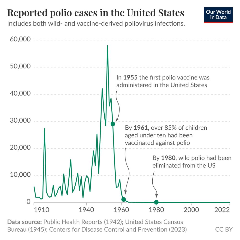
For most of humanity’s past, these tragedies occurred all too frequently — half of all children died. This was true no matter where in the world a child was born, even in the richest countries.

Reposted by Fiona Spooner

In a new article, @spoonerf.bsky.social and I describe how they were developed and scaled up worldwide, and the impact they've had:

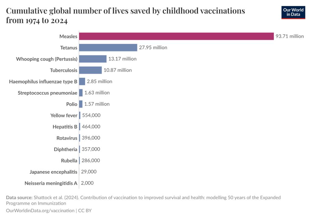
The measles vaccine is arguably the most life-saving vaccine in use.
Our latest article from @scientificdiscovery.dev and @spoonerf.bsky.social: ourworldindata.org/measles-vacc...
Reposted by Fiona Spooner

Timely review of the data on measles vaccines from @ourworldindata.org
ourworldindata.org/measles-vacc...

This long-run data is a proxy for how the climate has changed.
Since the early 20th century, the combined effects of urbanization and higher temperatures due to climate change have gradually moved the peak blossom earlier in the year.
Reposted by Fiona Spooner