


xyzettgraphix.
@xyzett.bsky.social
Fresh updates on graphic design, typography, lettering, screen printing, advertising, and all things creative!
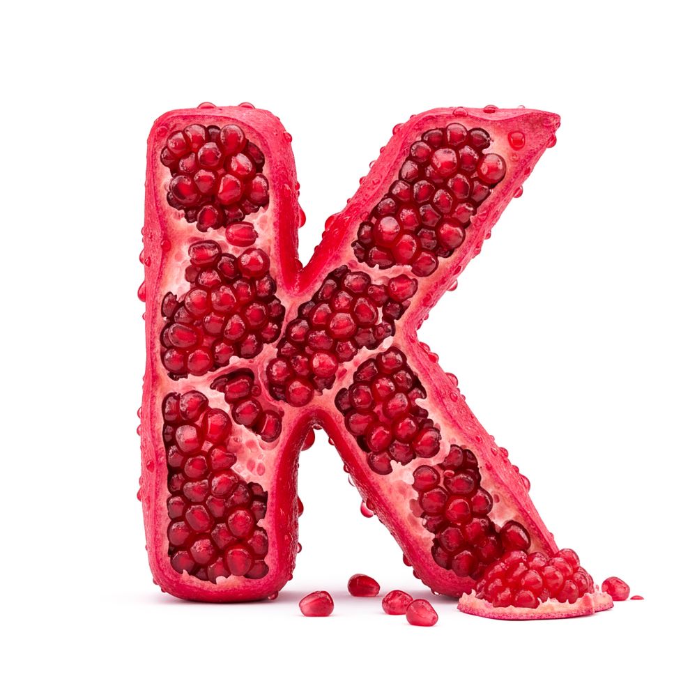
Juicy Pomegranate Letter K – 3D Typography.
A bold and juicy Letter K, sculpted entirely from pomegranate seeds.
Glossy texture, tiny droplets, natural irregularities — and a small pile of spilled seeds add a tactile, realistic finish.
typography, 3d art, pomegranate, food lettering, juicy type
A bold and juicy Letter K, sculpted entirely from pomegranate seeds.
Glossy texture, tiny droplets, natural irregularities — and a small pile of spilled seeds add a tactile, realistic finish.
typography, 3d art, pomegranate, food lettering, juicy type
November 28, 2025 at 12:25 PM
Juicy Pomegranate Letter K – 3D Typography.
A bold and juicy Letter K, sculpted entirely from pomegranate seeds.
Glossy texture, tiny droplets, natural irregularities — and a small pile of spilled seeds add a tactile, realistic finish.
typography, 3d art, pomegranate, food lettering, juicy type
A bold and juicy Letter K, sculpted entirely from pomegranate seeds.
Glossy texture, tiny droplets, natural irregularities — and a small pile of spilled seeds add a tactile, realistic finish.
typography, 3d art, pomegranate, food lettering, juicy type
Today’s letter is built, quite literally — brick by brick.
A clean white Lego “L” with a single bold blue piece as the visual twist. The scattered bricks around it make it feel like it was just finished… or about to be rebuilt. 🧱✨
#Typography #Lettering #DesignInspiration #TypeDesign #GraphicDesign
A clean white Lego “L” with a single bold blue piece as the visual twist. The scattered bricks around it make it feel like it was just finished… or about to be rebuilt. 🧱✨
#Typography #Lettering #DesignInspiration #TypeDesign #GraphicDesign

November 26, 2025 at 12:00 PM
Today’s letter is built, quite literally — brick by brick.
A clean white Lego “L” with a single bold blue piece as the visual twist. The scattered bricks around it make it feel like it was just finished… or about to be rebuilt. 🧱✨
#Typography #Lettering #DesignInspiration #TypeDesign #GraphicDesign
A clean white Lego “L” with a single bold blue piece as the visual twist. The scattered bricks around it make it feel like it was just finished… or about to be rebuilt. 🧱✨
#Typography #Lettering #DesignInspiration #TypeDesign #GraphicDesign
3D Bread Letter M – Food Typography
A creative 3D letter M made entirely from rustic bread, complete with a crispy crust and soft interior.
Fresh green lettuce adds a natural contrast.
Part of a unique alphabet series exploring food textures and material-based typography.
#Typography
A creative 3D letter M made entirely from rustic bread, complete with a crispy crust and soft interior.
Fresh green lettuce adds a natural contrast.
Part of a unique alphabet series exploring food textures and material-based typography.
#Typography

November 21, 2025 at 1:07 PM
3D Bread Letter M – Food Typography
A creative 3D letter M made entirely from rustic bread, complete with a crispy crust and soft interior.
Fresh green lettuce adds a natural contrast.
Part of a unique alphabet series exploring food textures and material-based typography.
#Typography
A creative 3D letter M made entirely from rustic bread, complete with a crispy crust and soft interior.
Fresh green lettuce adds a natural contrast.
Part of a unique alphabet series exploring food textures and material-based typography.
#Typography
3D Copper Letter N – Metallic Typography Inspiration
A polished copper 3D letter N with glossy reflections and diagonal grooves.
Part of a creative alphabet exploring materials, textures, and clean studio aesthetics.
#Typography #LetterDesign #CreativeTypography #TypeDesign #Font
A polished copper 3D letter N with glossy reflections and diagonal grooves.
Part of a creative alphabet exploring materials, textures, and clean studio aesthetics.
#Typography #LetterDesign #CreativeTypography #TypeDesign #Font

November 19, 2025 at 2:41 PM
3D Copper Letter N – Metallic Typography Inspiration
A polished copper 3D letter N with glossy reflections and diagonal grooves.
Part of a creative alphabet exploring materials, textures, and clean studio aesthetics.
#Typography #LetterDesign #CreativeTypography #TypeDesign #Font
A polished copper 3D letter N with glossy reflections and diagonal grooves.
Part of a creative alphabet exploring materials, textures, and clean studio aesthetics.
#Typography #LetterDesign #CreativeTypography #TypeDesign #Font
O stands for „On Court“ – and on point. 🎾
Today’s letter comes with a sporty twist: a neon-yellow furry “O”, textured like a real tennis ball.
The ball next to it? Just to check if the texture match is legit. Spoiler: it is.
#Typography #3DArt #LetterDesign #3DLettering #DesignInspiration
Today’s letter comes with a sporty twist: a neon-yellow furry “O”, textured like a real tennis ball.
The ball next to it? Just to check if the texture match is legit. Spoiler: it is.
#Typography #3DArt #LetterDesign #3DLettering #DesignInspiration

November 14, 2025 at 2:01 PM
O stands for „On Court“ – and on point. 🎾
Today’s letter comes with a sporty twist: a neon-yellow furry “O”, textured like a real tennis ball.
The ball next to it? Just to check if the texture match is legit. Spoiler: it is.
#Typography #3DArt #LetterDesign #3DLettering #DesignInspiration
Today’s letter comes with a sporty twist: a neon-yellow furry “O”, textured like a real tennis ball.
The ball next to it? Just to check if the texture match is legit. Spoiler: it is.
#Typography #3DArt #LetterDesign #3DLettering #DesignInspiration
P is for Plush Power. 💙
Soft, bold, and full of energy – this letter P radiates texture and presence.
Part of my ongoing experimental alphabet series, where typography meets materials.
Today’s vibe: royal blue fur with attitude.
#Typography #3DArt #DesignInspiration #LetterDesign #TypeDesign
Soft, bold, and full of energy – this letter P radiates texture and presence.
Part of my ongoing experimental alphabet series, where typography meets materials.
Today’s vibe: royal blue fur with attitude.
#Typography #3DArt #DesignInspiration #LetterDesign #TypeDesign

November 13, 2025 at 1:22 PM
P is for Plush Power. 💙
Soft, bold, and full of energy – this letter P radiates texture and presence.
Part of my ongoing experimental alphabet series, where typography meets materials.
Today’s vibe: royal blue fur with attitude.
#Typography #3DArt #DesignInspiration #LetterDesign #TypeDesign
Soft, bold, and full of energy – this letter P radiates texture and presence.
Part of my ongoing experimental alphabet series, where typography meets materials.
Today’s vibe: royal blue fur with attitude.
#Typography #3DArt #DesignInspiration #LetterDesign #TypeDesign
Q is for Quirky & Quick!
This letter just can’t sit still – fuzzy, bold, and full of kinetic energy.
Part of my ongoing alphabet series exploring materials, motion, and texture.
Because sometimes “less” just doesn’t cut it.
#Typography #3DArt #DesignInspiration #LetterDesign #TypeDesign #LetterArt
This letter just can’t sit still – fuzzy, bold, and full of kinetic energy.
Part of my ongoing alphabet series exploring materials, motion, and texture.
Because sometimes “less” just doesn’t cut it.
#Typography #3DArt #DesignInspiration #LetterDesign #TypeDesign #LetterArt

November 12, 2025 at 7:58 AM
Q is for Quirky & Quick!
This letter just can’t sit still – fuzzy, bold, and full of kinetic energy.
Part of my ongoing alphabet series exploring materials, motion, and texture.
Because sometimes “less” just doesn’t cut it.
#Typography #3DArt #DesignInspiration #LetterDesign #TypeDesign #LetterArt
This letter just can’t sit still – fuzzy, bold, and full of kinetic energy.
Part of my ongoing alphabet series exploring materials, motion, and texture.
Because sometimes “less” just doesn’t cut it.
#Typography #3DArt #DesignInspiration #LetterDesign #TypeDesign #LetterArt
R is for Ready to Pop! 🍿
Another letter from my ongoing alphabet design series — where typography meets texture and a playful twist.
#Typography #TypeDesign #LetterArt #3DLettering #PopcornArt #FoodTypography #Adobe #AIDesign #LetterR #TypographyLovers #DesignCommunity
Another letter from my ongoing alphabet design series — where typography meets texture and a playful twist.
#Typography #TypeDesign #LetterArt #3DLettering #PopcornArt #FoodTypography #Adobe #AIDesign #LetterR #TypographyLovers #DesignCommunity

November 10, 2025 at 4:39 PM
R is for Ready to Pop! 🍿
Another letter from my ongoing alphabet design series — where typography meets texture and a playful twist.
#Typography #TypeDesign #LetterArt #3DLettering #PopcornArt #FoodTypography #Adobe #AIDesign #LetterR #TypographyLovers #DesignCommunity
Another letter from my ongoing alphabet design series — where typography meets texture and a playful twist.
#Typography #TypeDesign #LetterArt #3DLettering #PopcornArt #FoodTypography #Adobe #AIDesign #LetterR #TypographyLovers #DesignCommunity
Porcelain meets typography.
The letter “S” features a blue-and-white Delft-inspired pattern — a blend of craftsmanship and AI creativity.
#AITypography #TypographyDesign #PorcelainArt #CeramicDesign #TypeDesign #3DTypography #HelloType #DesignCommunity #AIArt #NanoBanana #Adobe
The letter “S” features a blue-and-white Delft-inspired pattern — a blend of craftsmanship and AI creativity.
#AITypography #TypographyDesign #PorcelainArt #CeramicDesign #TypeDesign #3DTypography #HelloType #DesignCommunity #AIArt #NanoBanana #Adobe

November 7, 2025 at 11:40 AM
Porcelain meets typography.
The letter “S” features a blue-and-white Delft-inspired pattern — a blend of craftsmanship and AI creativity.
#AITypography #TypographyDesign #PorcelainArt #CeramicDesign #TypeDesign #3DTypography #HelloType #DesignCommunity #AIArt #NanoBanana #Adobe
The letter “S” features a blue-and-white Delft-inspired pattern — a blend of craftsmanship and AI creativity.
#AITypography #TypographyDesign #PorcelainArt #CeramicDesign #TypeDesign #3DTypography #HelloType #DesignCommunity #AIArt #NanoBanana #Adobe
Continuing my reverse alphabet series with T 💜🧡
This time, color takes the lead — a glossy, liquid blend of violet and orange, like melted energy in motion.
#AITypography #3DTypography #TypeDesign #3DDesign #GraphicDesign #DigitalArt #LiquidArt #ColorFlow
This time, color takes the lead — a glossy, liquid blend of violet and orange, like melted energy in motion.
#AITypography #3DTypography #TypeDesign #3DDesign #GraphicDesign #DigitalArt #LiquidArt #ColorFlow

November 6, 2025 at 10:22 AM
Continuing my reverse alphabet series with T 💜🧡
This time, color takes the lead — a glossy, liquid blend of violet and orange, like melted energy in motion.
#AITypography #3DTypography #TypeDesign #3DDesign #GraphicDesign #DigitalArt #LiquidArt #ColorFlow
This time, color takes the lead — a glossy, liquid blend of violet and orange, like melted energy in motion.
#AITypography #3DTypography #TypeDesign #3DDesign #GraphicDesign #DigitalArt #LiquidArt #ColorFlow
Keeping the flow going with the next letter in my reverse alphabet series — U 🔴
A vivid, bubbly 3D design made of sponge-like texture and floating soap bubbles.
#AITypography #3DTypography #AlphabetDesign #LetterArt #TypeDesign #3DDesign #GraphicDesign #DigitalArt #BubbleArt
A vivid, bubbly 3D design made of sponge-like texture and floating soap bubbles.
#AITypography #3DTypography #AlphabetDesign #LetterArt #TypeDesign #3DDesign #GraphicDesign #DigitalArt #BubbleArt

November 5, 2025 at 7:34 AM
Keeping the flow going with the next letter in my reverse alphabet series — U 🔴
A vivid, bubbly 3D design made of sponge-like texture and floating soap bubbles.
#AITypography #3DTypography #AlphabetDesign #LetterArt #TypeDesign #3DDesign #GraphicDesign #DigitalArt #BubbleArt
A vivid, bubbly 3D design made of sponge-like texture and floating soap bubbles.
#AITypography #3DTypography #AlphabetDesign #LetterArt #TypeDesign #3DDesign #GraphicDesign #DigitalArt #BubbleArt
Bin wieder da – die Erkältung hat mich übers Wochenende kurz aus dem Spiel genommen.
Dafür geht’s jetzt weiter mit dem nächsten Buchstaben aus meiner rückwärtslaufenden Alphabet-Serie: das V 💛
#AITypography #3DTypography #AlphabetDesign #LetterArt #TypeDesign #3DDesign #GraphicDesign
Dafür geht’s jetzt weiter mit dem nächsten Buchstaben aus meiner rückwärtslaufenden Alphabet-Serie: das V 💛
#AITypography #3DTypography #AlphabetDesign #LetterArt #TypeDesign #3DDesign #GraphicDesign

November 5, 2025 at 7:32 AM
Bin wieder da – die Erkältung hat mich übers Wochenende kurz aus dem Spiel genommen.
Dafür geht’s jetzt weiter mit dem nächsten Buchstaben aus meiner rückwärtslaufenden Alphabet-Serie: das V 💛
#AITypography #3DTypography #AlphabetDesign #LetterArt #TypeDesign #3DDesign #GraphicDesign
Dafür geht’s jetzt weiter mit dem nächsten Buchstaben aus meiner rückwärtslaufenden Alphabet-Serie: das V 💛
#AITypography #3DTypography #AlphabetDesign #LetterArt #TypeDesign #3DDesign #GraphicDesign
This “W” was created in Photoshop using Nano Banana. Another letter, another material. Continuing the idea that each character becomes its own visual world.
Have a great weekend — see you Monday.
#AITypography #Photoshop #NanoBanana #TypeDesign #LetterArt #CreativeAlphabet #DigitalArt
Have a great weekend — see you Monday.
#AITypography #Photoshop #NanoBanana #TypeDesign #LetterArt #CreativeAlphabet #DigitalArt

October 24, 2025 at 1:41 PM
This “W” was created in Photoshop using Nano Banana. Another letter, another material. Continuing the idea that each character becomes its own visual world.
Have a great weekend — see you Monday.
#AITypography #Photoshop #NanoBanana #TypeDesign #LetterArt #CreativeAlphabet #DigitalArt
Have a great weekend — see you Monday.
#AITypography #Photoshop #NanoBanana #TypeDesign #LetterArt #CreativeAlphabet #DigitalArt
Wenn Typografie glänzt.
Der nächste Buchstabe in meiner KI-Alphabet-Reihe, ein cremiges „X“ aus Kondensmilch, gerendert in Photoshop mit Nano Banana.
Ich liebe, wie unterschiedlich Typografie wirken kann, sobald das Material die Hauptrolle spielt.
#AITypography #NanoBanana #TypeDesign #LetterArt
Der nächste Buchstabe in meiner KI-Alphabet-Reihe, ein cremiges „X“ aus Kondensmilch, gerendert in Photoshop mit Nano Banana.
Ich liebe, wie unterschiedlich Typografie wirken kann, sobald das Material die Hauptrolle spielt.
#AITypography #NanoBanana #TypeDesign #LetterArt

October 23, 2025 at 5:26 PM
Wenn Typografie glänzt.
Der nächste Buchstabe in meiner KI-Alphabet-Reihe, ein cremiges „X“ aus Kondensmilch, gerendert in Photoshop mit Nano Banana.
Ich liebe, wie unterschiedlich Typografie wirken kann, sobald das Material die Hauptrolle spielt.
#AITypography #NanoBanana #TypeDesign #LetterArt
Der nächste Buchstabe in meiner KI-Alphabet-Reihe, ein cremiges „X“ aus Kondensmilch, gerendert in Photoshop mit Nano Banana.
Ich liebe, wie unterschiedlich Typografie wirken kann, sobald das Material die Hauptrolle spielt.
#AITypography #NanoBanana #TypeDesign #LetterArt
Yum… Wenn Typografie schmeckt. 🍓
Kapitel 2 meines KI-Alphabets.
Gestern flauschig – heute köstlich. Dieses „Y“ besteht aus Biscuit, Erdbeeren, Schokolade und Vanillesoße, komplett als Food-Typografie mit Adobe Firefly generiert.
#AITypography #TypographyLove #LetterArt #TypeDesign #TypoArt
Kapitel 2 meines KI-Alphabets.
Gestern flauschig – heute köstlich. Dieses „Y“ besteht aus Biscuit, Erdbeeren, Schokolade und Vanillesoße, komplett als Food-Typografie mit Adobe Firefly generiert.
#AITypography #TypographyLove #LetterArt #TypeDesign #TypoArt

October 22, 2025 at 3:01 PM
Yum… Wenn Typografie schmeckt. 🍓
Kapitel 2 meines KI-Alphabets.
Gestern flauschig – heute köstlich. Dieses „Y“ besteht aus Biscuit, Erdbeeren, Schokolade und Vanillesoße, komplett als Food-Typografie mit Adobe Firefly generiert.
#AITypography #TypographyLove #LetterArt #TypeDesign #TypoArt
Kapitel 2 meines KI-Alphabets.
Gestern flauschig – heute köstlich. Dieses „Y“ besteht aus Biscuit, Erdbeeren, Schokolade und Vanillesoße, komplett als Food-Typografie mit Adobe Firefly generiert.
#AITypography #TypographyLove #LetterArt #TypeDesign #TypoArt
Erste Runde meiner KI-Typografie-Experimente mit Adobe Firefly.
Faszinierend zu sehen, wie stark sich Material, Licht und Form über Prompts steuern lassen.
Dieses flauschige „Z“ ist der Anfang einer kleinen Alphabet-Serie. ✌️
#AITypography #TypographyLove #HelloType #HelloFont #LetterArt #AIDesign
Faszinierend zu sehen, wie stark sich Material, Licht und Form über Prompts steuern lassen.
Dieses flauschige „Z“ ist der Anfang einer kleinen Alphabet-Serie. ✌️
#AITypography #TypographyLove #HelloType #HelloFont #LetterArt #AIDesign

October 21, 2025 at 5:06 PM
Erste Runde meiner KI-Typografie-Experimente mit Adobe Firefly.
Faszinierend zu sehen, wie stark sich Material, Licht und Form über Prompts steuern lassen.
Dieses flauschige „Z“ ist der Anfang einer kleinen Alphabet-Serie. ✌️
#AITypography #TypographyLove #HelloType #HelloFont #LetterArt #AIDesign
Faszinierend zu sehen, wie stark sich Material, Licht und Form über Prompts steuern lassen.
Dieses flauschige „Z“ ist der Anfang einer kleinen Alphabet-Serie. ✌️
#AITypography #TypographyLove #HelloType #HelloFont #LetterArt #AIDesign
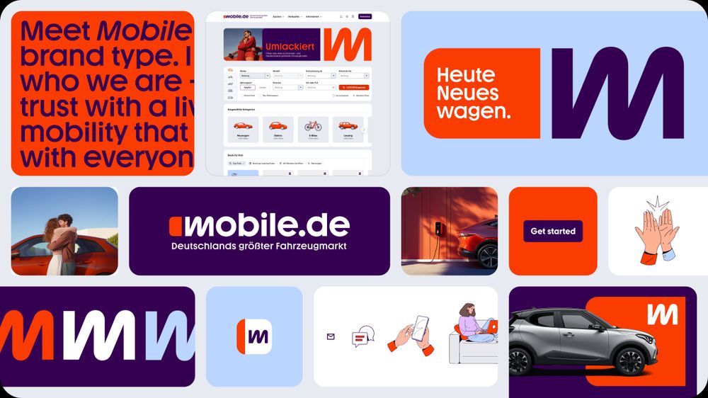
🚗 Neues Design für #mobilede – nach fast 30 Jahren!
Deutschlands größter Fahrzeugmarkt bekommt ein umfassendes Rebranding. #Mutabor entwickelt ein modernes, flexibles #Designsystem mit neuem #Logo, frischer Farbwelt und eigener #Typo.
#Rebranding #CorporateDesign
www.mutabor.de/de/highlight...
Deutschlands größter Fahrzeugmarkt bekommt ein umfassendes Rebranding. #Mutabor entwickelt ein modernes, flexibles #Designsystem mit neuem #Logo, frischer Farbwelt und eigener #Typo.
#Rebranding #CorporateDesign
www.mutabor.de/de/highlight...
April 18, 2025 at 10:43 AM
🚗 Neues Design für #mobilede – nach fast 30 Jahren!
Deutschlands größter Fahrzeugmarkt bekommt ein umfassendes Rebranding. #Mutabor entwickelt ein modernes, flexibles #Designsystem mit neuem #Logo, frischer Farbwelt und eigener #Typo.
#Rebranding #CorporateDesign
www.mutabor.de/de/highlight...
Deutschlands größter Fahrzeugmarkt bekommt ein umfassendes Rebranding. #Mutabor entwickelt ein modernes, flexibles #Designsystem mit neuem #Logo, frischer Farbwelt und eigener #Typo.
#Rebranding #CorporateDesign
www.mutabor.de/de/highlight...
Beton. Licht. Raum.
St. Gertrud in Köln – Brutalismus-Meisterwerk von Gottfried Böhm. Klare Linien, rohe Materialien, avantgardistische Baukunst. 1967 mit dem Kölner Architekturpreis ausgezeichnet.
#StGertrud #Brutalismus #GottfriedBöhm #Betonkunst #ArchitekturLiebe #Köln #Minimalismus
St. Gertrud in Köln – Brutalismus-Meisterwerk von Gottfried Böhm. Klare Linien, rohe Materialien, avantgardistische Baukunst. 1967 mit dem Kölner Architekturpreis ausgezeichnet.
#StGertrud #Brutalismus #GottfriedBöhm #Betonkunst #ArchitekturLiebe #Köln #Minimalismus


March 27, 2025 at 10:29 AM
Beton. Licht. Raum.
St. Gertrud in Köln – Brutalismus-Meisterwerk von Gottfried Böhm. Klare Linien, rohe Materialien, avantgardistische Baukunst. 1967 mit dem Kölner Architekturpreis ausgezeichnet.
#StGertrud #Brutalismus #GottfriedBöhm #Betonkunst #ArchitekturLiebe #Köln #Minimalismus
St. Gertrud in Köln – Brutalismus-Meisterwerk von Gottfried Böhm. Klare Linien, rohe Materialien, avantgardistische Baukunst. 1967 mit dem Kölner Architekturpreis ausgezeichnet.
#StGertrud #Brutalismus #GottfriedBöhm #Betonkunst #ArchitekturLiebe #Köln #Minimalismus
→ Habe ab Mittwoch, dem 24.04.2024, wieder "freie" Kapazitäten. → Freue mich über Nachfragen. → hallo@xyzettgraphix.com → Bis bald, Zeljko

April 22, 2024 at 8:20 AM
→ Habe ab Mittwoch, dem 24.04.2024, wieder "freie" Kapazitäten. → Freue mich über Nachfragen. → hallo@xyzettgraphix.com → Bis bald, Zeljko
Decathlon, der Sportartikelhersteller und -händler, hat sich einem visuellen Neuanstrich unterzogen und ein Rebranding durchgeführt.
#Decathlon
#Rebranding
#Corporate
#Branding
#Identity
#Logo
www.designtagebuch.de/decathlon-sc...
#Decathlon
#Rebranding
#Corporate
#Branding
#Identity
#Logo
www.designtagebuch.de/decathlon-sc...

March 18, 2024 at 9:22 AM
Decathlon, der Sportartikelhersteller und -händler, hat sich einem visuellen Neuanstrich unterzogen und ein Rebranding durchgeführt.
#Decathlon
#Rebranding
#Corporate
#Branding
#Identity
#Logo
www.designtagebuch.de/decathlon-sc...
#Decathlon
#Rebranding
#Corporate
#Branding
#Identity
#Logo
www.designtagebuch.de/decathlon-sc...
Pepsi präsentiert sein neues Logo! Nach einem Jahr globaler Markenvorbereitung wird das erste Redesign seit 14 Jahren weltweit in über 120 Märkten eingeführt. 🌎✨
#Corporate
#Design
#Branding
#Logo
#Pepsi
#PepsiRedesign
#GlobalRollout
www.horizont.net/marketing/na...
#Corporate
#Design
#Branding
#Logo
#Pepsi
#PepsiRedesign
#GlobalRollout
www.horizont.net/marketing/na...

March 4, 2024 at 8:53 AM
Pepsi präsentiert sein neues Logo! Nach einem Jahr globaler Markenvorbereitung wird das erste Redesign seit 14 Jahren weltweit in über 120 Märkten eingeführt. 🌎✨
#Corporate
#Design
#Branding
#Logo
#Pepsi
#PepsiRedesign
#GlobalRollout
www.horizont.net/marketing/na...
#Corporate
#Design
#Branding
#Logo
#Pepsi
#PepsiRedesign
#GlobalRollout
www.horizont.net/marketing/na...
Am 1. April erstrahlt @fritzkola im frischen Glanz. Ist es zu perfekt, um rebellisch zu sein?
#Redesign
#Corporate
#Branding
#Design
#Logo
#Cola
#FritzKola
www.horizont.net/marketing/na...
#Redesign
#Corporate
#Branding
#Design
#Logo
#Cola
#FritzKola
www.horizont.net/marketing/na...

February 29, 2024 at 8:03 AM
Am 1. April erstrahlt @fritzkola im frischen Glanz. Ist es zu perfekt, um rebellisch zu sein?
#Redesign
#Corporate
#Branding
#Design
#Logo
#Cola
#FritzKola
www.horizont.net/marketing/na...
#Redesign
#Corporate
#Branding
#Design
#Logo
#Cola
#FritzKola
www.horizont.net/marketing/na...
Das Nordisk Büro Hamburg hat mit dem radikalen Redesign der BKK VBU bewiesen, dass Kommunikationsdesign eine Frage des Mutes ist. 🚀
#Corporate
#Design
#Branding
#Redesign
#Logo
page-online.de/kreation/wie...
#Corporate
#Design
#Branding
#Redesign
#Logo
page-online.de/kreation/wie...

February 26, 2024 at 10:27 AM
Das Nordisk Büro Hamburg hat mit dem radikalen Redesign der BKK VBU bewiesen, dass Kommunikationsdesign eine Frage des Mutes ist. 🚀
#Corporate
#Design
#Branding
#Redesign
#Logo
page-online.de/kreation/wie...
#Corporate
#Design
#Branding
#Redesign
#Logo
page-online.de/kreation/wie...
Das Clubkombinat Hamburg setzt sich seit 20 Jahren für die Subkultur ein und präsentiert nun stolz ein frisches, neues Erscheinungsbild!
#Corporate
#Design
#Branding
#Kreation
page-online.de/kreation/meh...
#Corporate
#Design
#Branding
#Kreation
page-online.de/kreation/meh...

February 14, 2024 at 1:58 PM
Das Clubkombinat Hamburg setzt sich seit 20 Jahren für die Subkultur ein und präsentiert nun stolz ein frisches, neues Erscheinungsbild!
#Corporate
#Design
#Branding
#Kreation
page-online.de/kreation/meh...
#Corporate
#Design
#Branding
#Kreation
page-online.de/kreation/meh...
🚀 Brand-Refresh für Pluto TV! 🌌 Das zum Paramount Global Medienunternehmen gehörende Streamingportal hat ein aufregendes Facelift durchgeführt. 📺✨
#Branding
#Corporate
#Design
#Logo
#PlutoTV
#BrandRefresh
www.designtagebuch.de/brand-refres...
#Branding
#Corporate
#Design
#Logo
#PlutoTV
#BrandRefresh
www.designtagebuch.de/brand-refres...

February 13, 2024 at 9:35 AM
🚀 Brand-Refresh für Pluto TV! 🌌 Das zum Paramount Global Medienunternehmen gehörende Streamingportal hat ein aufregendes Facelift durchgeführt. 📺✨
#Branding
#Corporate
#Design
#Logo
#PlutoTV
#BrandRefresh
www.designtagebuch.de/brand-refres...
#Branding
#Corporate
#Design
#Logo
#PlutoTV
#BrandRefresh
www.designtagebuch.de/brand-refres...