


Xan Gregg
@xangregg.bsky.social
Engineering Fellow at JMP, focused on #DataViz, preferring smoothers over fitted lines. Creator of JMP #GraphBuilder and #PackedBars chart type for high-cardinality Pareto data. #TieDye #LessIsMore
I'm not sure there is a good use of this beeswarm clamping treatment, but it's surely overdone here. Looking deeper, there are a large number of zeros which stress any distribution view. I tried a few in a #dataviz blog post. rawdatastudies.com/2025/11/22/b...


November 23, 2025 at 3:09 PM
I'm not sure there is a good use of this beeswarm clamping treatment, but it's surely overdone here. Looking deeper, there are a large number of zeros which stress any distribution view. I tried a few in a #dataviz blog post. rawdatastudies.com/2025/11/22/b...
Trying the same thing with JMP 19's constrained p-splines. Nicely similar to the R GAMs, but JMP's CIs are bootstrapped instead of analytical, which is why they're not symmetric. #dataviz

November 13, 2025 at 1:30 PM
Trying the same thing with JMP 19's constrained p-splines. Nicely similar to the R GAMs, but JMP's CIs are bootstrapped instead of analytical, which is why they're not symmetric. #dataviz
My "discovery" was discussed 30 years earlier in a research note by Martin Mächler (see lowess.ps in his unpublished manuscripts folder) people.math.ethz.ch/~maechler/

November 6, 2025 at 5:57 PM
My "discovery" was discussed 30 years earlier in a research note by Martin Mächler (see lowess.ps in his unpublished manuscripts folder) people.math.ethz.ch/~maechler/
Did you know (robust) loess fitting can fail if the data is already smooth? I made a notebook that shows the flawed fit (red) along with a possible improvement (blue), using Cleveland's original demonstration curve. #stats
observablehq.com/@xangregg/lo...
observablehq.com/@xangregg/lo...

November 6, 2025 at 5:50 PM
Did you know (robust) loess fitting can fail if the data is already smooth? I made a notebook that shows the flawed fit (red) along with a possible improvement (blue), using Cleveland's original demonstration curve. #stats
observablehq.com/@xangregg/lo...
observablehq.com/@xangregg/lo...
New blog post looking at some recently-shared NCAA football player data. The scatterplot is percent drafted to NFL against average player high school rating by college. Also trying out inward-jittered, smoothed dot plots.
rawdatastudies.com/2025/10/26/n...
rawdatastudies.com/2025/10/26/n...


October 27, 2025 at 2:14 PM
New blog post looking at some recently-shared NCAA football player data. The scatterplot is percent drafted to NFL against average player high school rating by college. Also trying out inward-jittered, smoothed dot plots.
rawdatastudies.com/2025/10/26/n...
rawdatastudies.com/2025/10/26/n...
Dot plot #dataviz comparison: ratings of FIDE chess Grand Masters via Tidy Tuesday.
1 Nearest stacks (Wilkinson)
2 Smoothed stacks
3 Smoothed hexagonal grid
4 Exact position (beeswarm)
Smoothing trades delta-x for spikiness (deviation from kernel density estimate).
1 Nearest stacks (Wilkinson)
2 Smoothed stacks
3 Smoothed hexagonal grid
4 Exact position (beeswarm)
Smoothing trades delta-x for spikiness (deviation from kernel density estimate).


September 27, 2025 at 12:17 PM
Dot plot #dataviz comparison: ratings of FIDE chess Grand Masters via Tidy Tuesday.
1 Nearest stacks (Wilkinson)
2 Smoothed stacks
3 Smoothed hexagonal grid
4 Exact position (beeswarm)
Smoothing trades delta-x for spikiness (deviation from kernel density estimate).
1 Nearest stacks (Wilkinson)
2 Smoothed stacks
3 Smoothed hexagonal grid
4 Exact position (beeswarm)
Smoothing trades delta-x for spikiness (deviation from kernel density estimate).
JMP 19 is out (free trial available), and I wrote a blog post about the main things I worked on. Constrained smoothers, jitter options, easier arrows, parallel y axes, ... #dataviz
community.jmp.com/t5/JMPer-Cab...
community.jmp.com/t5/JMPer-Cab...

September 19, 2025 at 12:53 PM
JMP 19 is out (free trial available), and I wrote a blog post about the main things I worked on. Constrained smoothers, jitter options, easier arrows, parallel y axes, ... #dataviz
community.jmp.com/t5/JMPer-Cab...
community.jmp.com/t5/JMPer-Cab...
Yay, I was able to reproduce the lines in this chart precisely from the raw data. The original shows summary dots where mine shows raw data dots, and at a couple zoom levels. The power of statistics; signal and noise. www.nature.com/articles/s41...


August 22, 2025 at 7:26 PM
Yay, I was able to reproduce the lines in this chart precisely from the raw data. The original shows summary dots where mine shows raw data dots, and at a couple zoom levels. The power of statistics; signal and noise. www.nature.com/articles/s41...
What to make of a paper that shares a ton of well-organized data and code for its charts, but not enough detail for analysis? PII concerns, maybe.
Curiously, these line charts are random data, suggesting steadier step counts. www.nature.com/articles/s41...
Curiously, these line charts are random data, suggesting steadier step counts. www.nature.com/articles/s41...

![Screenshot from a Python notebook shared with the paper. Code part reads:
with plt.rc_context({'figure.autolayout': True}):
fig, ax = plt.subplots(figsize=(4, 2));
pre_x = range(-35, -5);
y = np.random.normal(loc=from_df.loc[from_df['from_loc'] == 'Seattle, WA', 'pre_avg'], scale=50., size=(len(pre_x), ));
plt.plot(pre_x, y, lw=5., c='#aa3939');
plt.ylim(5800, 7000);
ax.grid(False);
for item in ([ax.xaxis.label, ax.yaxis.label] + ax.get_xticklabels() + ax.get_yticklabels()):
item.set_fontsize(axis_fontsize);
ax.set(xlabel=r'Days from Move $\left(t - t_{move}\right)$', ylabel='Daily Steps', xticks=range(-35, -4, 10));
fig.tight_layout()
plt.savefig('../output/fig1b_subplots/seattle_from.png',
dpi=600);](https://cdn.bsky.app/img/feed_thumbnail/plain/did:plc:vum7yuqczgryxehx6ozitxjg/bafkreifl6rfkiphf3g3ryzskgo4vg6vj2pw7wcwhh4e3jr6rxf52434bqy@jpeg)
August 20, 2025 at 12:48 AM
What to make of a paper that shares a ton of well-organized data and code for its charts, but not enough detail for analysis? PII concerns, maybe.
Curiously, these line charts are random data, suggesting steadier step counts. www.nature.com/articles/s41...
Curiously, these line charts are random data, suggesting steadier step counts. www.nature.com/articles/s41...
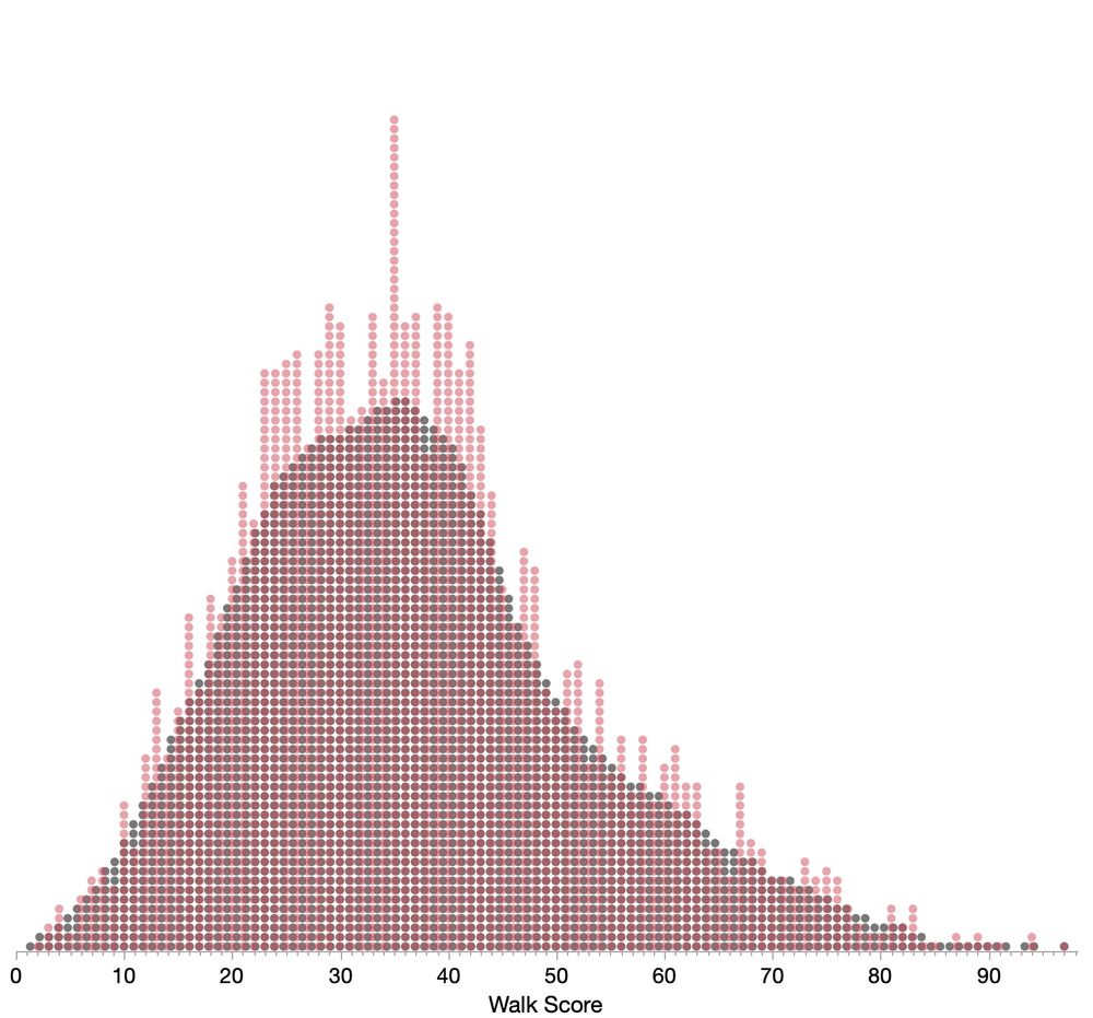
Here's the smoothed grid with dots colored by their values's ones digit (walkScore % 10), and a superposition attempt, with smoothed in gray. (I didn't quite get the walk score per dot width to be an exact number of pixels.) Hope these capture the diagnostic you're looking for.
August 17, 2025 at 8:59 PM
Here's the smoothed grid with dots colored by their values's ones digit (walkScore % 10), and a superposition attempt, with smoothed in gray. (I didn't quite get the walk score per dot width to be an exact number of pixels.) Hope these capture the diagnostic you're looking for.
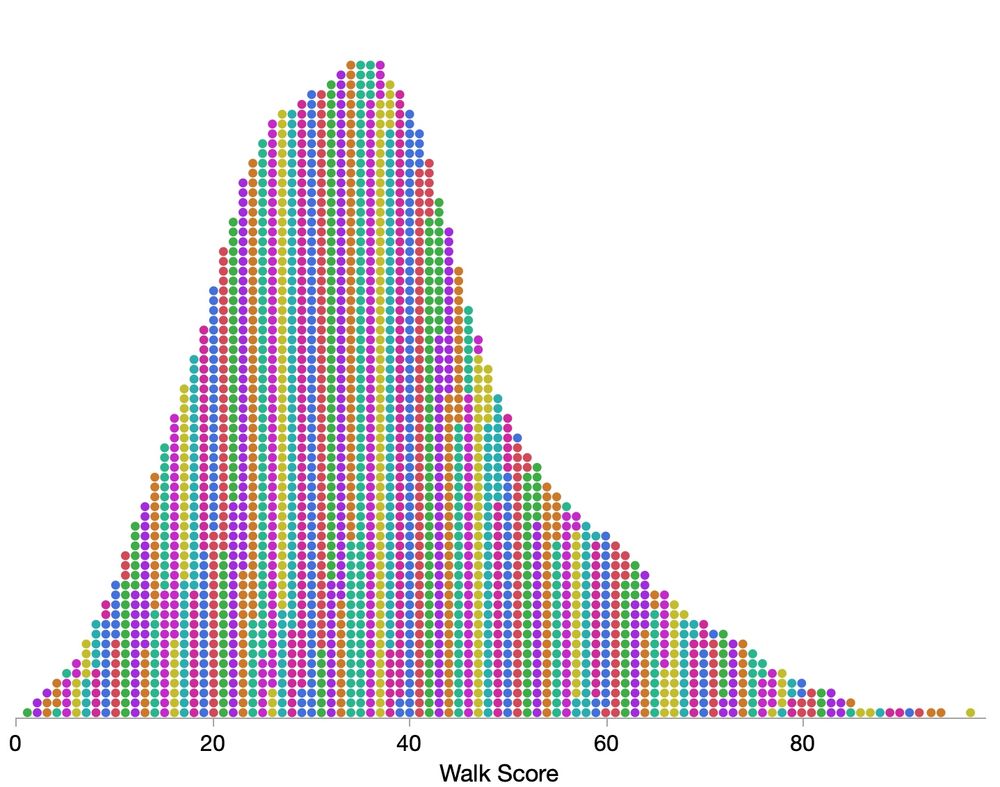
Quick dot plot #dataviz study with 2500 US city Walk Scores. Plain dot plot (exact because scores are integers), with smoothing (±1), and with hexagonal placement (±0.75). Data from www.walkscore.com


August 17, 2025 at 4:57 PM
Quick dot plot #dataviz study with 2500 US city Walk Scores. Plain dot plot (exact because scores are integers), with smoothing (±1), and with hexagonal placement (±0.75). Data from www.walkscore.com
It can't be a ratio of the changes since the denominator could be very small, even 0. However, using (total + first)/(total+latest) is no good since base is so much bigger. It seems like some smoothing/annualizing is happening. Closest I could get was a 12-month cumulative error versus the total.

August 13, 2025 at 2:32 PM
It can't be a ratio of the changes since the denominator could be very small, even 0. However, using (total + first)/(total+latest) is no good since base is so much bigger. It seems like some smoothing/annualizing is happening. Closest I could get was a 12-month cumulative error versus the total.
Rare sighting of letter-values plots in the wild. Nicely described in the caption as "plots which first identify the median, then extend boxes outward, each covering half of the remaining data." n=2.9M, so regular box plots would be swamped with outliers. #dataviz
arxiv.org/pdf/2402.14583
arxiv.org/pdf/2402.14583

August 1, 2025 at 12:13 PM
Rare sighting of letter-values plots in the wild. Nicely described in the caption as "plots which first identify the median, then extend boxes outward, each covering half of the remaining data." n=2.9M, so regular box plots would be swamped with outliers. #dataviz
arxiv.org/pdf/2402.14583
arxiv.org/pdf/2402.14583
The originals could serve as fodder for some #dataviz guides. When the zero-origin rule breaks down or when to use dots/lines instead of bars.

July 23, 2025 at 12:25 PM
The originals could serve as fodder for some #dataviz guides. When the zero-origin rule breaks down or when to use dots/lines instead of bars.
Great improvement sequence, but for me, it's harder to verify which categories are changing after putting their bars in separate groups. I see it's a trade-off with simplifying the coloring. Here's a try at sticking with the original ordering, at the cost of an imperfect time legend.

July 16, 2025 at 12:11 PM
Great improvement sequence, but for me, it's harder to verify which categories are changing after putting their bars in separate groups. I see it's a trade-off with simplifying the coloring. Here's a try at sticking with the original ordering, at the cost of an imperfect time legend.
This article by Don Wheeler has a good discussion of Grubbs' test and others. www.qualitydigest.com/inside/stati... [free reg reqd]
He's a control charts expert, which explains the sequence-based context and small data sizes.
He's a control charts expert, which explains the sequence-based context and small data sizes.

June 30, 2025 at 7:22 PM
This article by Don Wheeler has a good discussion of Grubbs' test and others. www.qualitydigest.com/inside/stati... [free reg reqd]
He's a control charts expert, which explains the sequence-based context and small data sizes.
He's a control charts expert, which explains the sequence-based context and small data sizes.
I need to do a full write-up. The green ones are my experimental inventions. One idea was that "shortest half" and related intervals would make good data-driven density intervals. They seem better for very skewed distributions like exponential, but maybe not so great in general.

June 30, 2025 at 7:11 PM
I need to do a full write-up. The green ones are my experimental inventions. One idea was that "shortest half" and related intervals would make good data-driven density intervals. They seem better for very skewed distributions like exponential, but maybe not so great in general.
Round 2 of my 1D #dataviz experiment at xangregg.github.io/data-strips/.
I realized my adaptive outlier idea was already done as Grubbs' test, which I've adapted for non-gaussian moments.
Added a couple thirds-based views. Here's 5000 random normal samples plus 2 outliers. The green ones use Grubbs.
I realized my adaptive outlier idea was already done as Grubbs' test, which I've adapted for non-gaussian moments.
Added a couple thirds-based views. Here's 5000 random normal samples plus 2 outliers. The green ones use Grubbs.

June 30, 2025 at 6:55 PM
Round 2 of my 1D #dataviz experiment at xangregg.github.io/data-strips/.
I realized my adaptive outlier idea was already done as Grubbs' test, which I've adapted for non-gaussian moments.
Added a couple thirds-based views. Here's 5000 random normal samples plus 2 outliers. The green ones use Grubbs.
I realized my adaptive outlier idea was already done as Grubbs' test, which I've adapted for non-gaussian moments.
Added a couple thirds-based views. Here's 5000 random normal samples plus 2 outliers. The green ones use Grubbs.
Thanks! Overcoming HDR drawbacks was an initial motivation.
1) many false outliers for big data
2) no outliers for small data
3) regions can extend beyond the data
Still tuning, but the code is in JavaScript at github.com/xangregg/dat....
1) many false outliers for big data
2) no outliers for small data
3) regions can extend beyond the data
Still tuning, but the code is in JavaScript at github.com/xangregg/dat....

June 24, 2025 at 7:44 PM
Thanks! Overcoming HDR drawbacks was an initial motivation.
1) many false outliers for big data
2) no outliers for small data
3) regions can extend beyond the data
Still tuning, but the code is in JavaScript at github.com/xangregg/dat....
1) many false outliers for big data
2) no outliers for small data
3) regions can extend beyond the data
Still tuning, but the code is in JavaScript at github.com/xangregg/dat....
Different data sets:
Old Faithful eruption intervals bimodal data,
Random bimodal
Random exponential
Random lognormal
Old Faithful eruption intervals bimodal data,
Random bimodal
Random exponential
Random lognormal


June 23, 2025 at 5:09 PM
Different data sets:
Old Faithful eruption intervals bimodal data,
Random bimodal
Random exponential
Random lognormal
Old Faithful eruption intervals bimodal data,
Random bimodal
Random exponential
Random lognormal
6 old and 7 new 1D #dataviz. Trying Shortest Half with a twist: one break is allowed. Also half-sample mode & count-adaptive outlier thresholds. Here's 1000 random normal points plus two outliers. The green ones are new. Try it at xangregg.github.io/data-strips/

June 23, 2025 at 5:02 PM
6 old and 7 new 1D #dataviz. Trying Shortest Half with a twist: one break is allowed. Also half-sample mode & count-adaptive outlier thresholds. Here's 1000 random normal points plus two outliers. The green ones are new. Try it at xangregg.github.io/data-strips/
This bilinear fit prompted me to try out a p-spline idea. P-splines are additive models that minimize adjacent slope differences. What if we relax the weight on the difference at the knot with highest curvature and re-optimize? ... Not bad.

June 11, 2025 at 6:59 PM
This bilinear fit prompted me to try out a p-spline idea. P-splines are additive models that minimize adjacent slope differences. What if we relax the weight on the difference at the knot with highest curvature and re-optimize? ... Not bad.
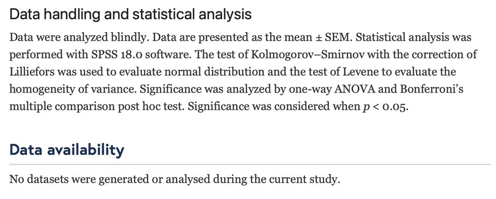
Adding to my collection of bold Data Availability statements. Malicious compliance, or am I missing something? alzres.biomedcentral.com/articles/10....
June 9, 2025 at 3:30 PM
Adding to my collection of bold Data Availability statements. Malicious compliance, or am I missing something? alzres.biomedcentral.com/articles/10....
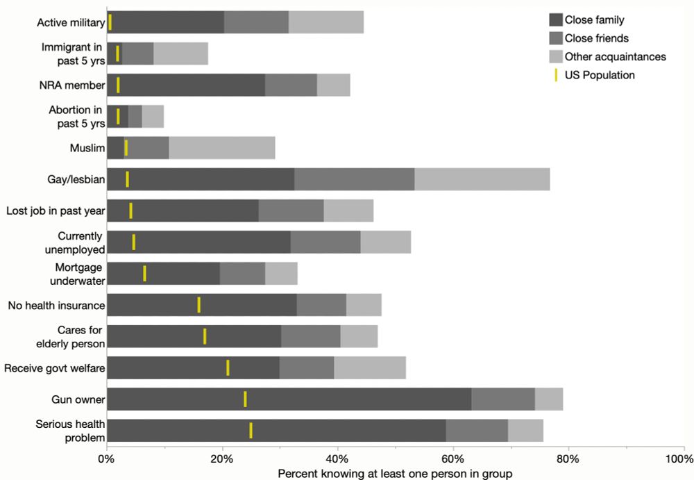
Thinking a little more, using bars allows coloring each response instead of using lines in the penumbra region. And since the yellow values were not part of the survey (they're just US demographics), they should have a different encoding, esp. to not obscure the survey response values.
May 31, 2025 at 4:35 PM
Thinking a little more, using bars allows coloring each response instead of using lines in the penumbra region. And since the yellow values were not part of the survey (they're just US demographics), they should have a different encoding, esp. to not obscure the survey response values.
That chart is mostly just from the survey responses, not the model, so their provided data works pretty well. Here's a quick stacked bar version, not trying to mimic their weighting and imputation. My data in ALT text if you want to experiment.

May 31, 2025 at 2:58 PM
That chart is mostly just from the survey responses, not the model, so their provided data works pretty well. Here's a quick stacked bar version, not trying to mimic their weighting and imputation. My data in ALT text if you want to experiment.