


@welcome3245.bsky.social
Reposted

Yes, sadly the pandemic is ongoing for one class of people -- those aged 5-17
It's stopped for us older adults
But for children it keeps on going, relentlessly
When are we going to talk about this?
I'm guessing it's an Inconvenient Truth
So, never?
It's stopped for us older adults
But for children it keeps on going, relentlessly
When are we going to talk about this?
I'm guessing it's an Inconvenient Truth
So, never?
May 26, 2025 at 1:24 PM
Yes, sadly the pandemic is ongoing for one class of people -- those aged 5-17
It's stopped for us older adults
But for children it keeps on going, relentlessly
When are we going to talk about this?
I'm guessing it's an Inconvenient Truth
So, never?
It's stopped for us older adults
But for children it keeps on going, relentlessly
When are we going to talk about this?
I'm guessing it's an Inconvenient Truth
So, never?
Reposted
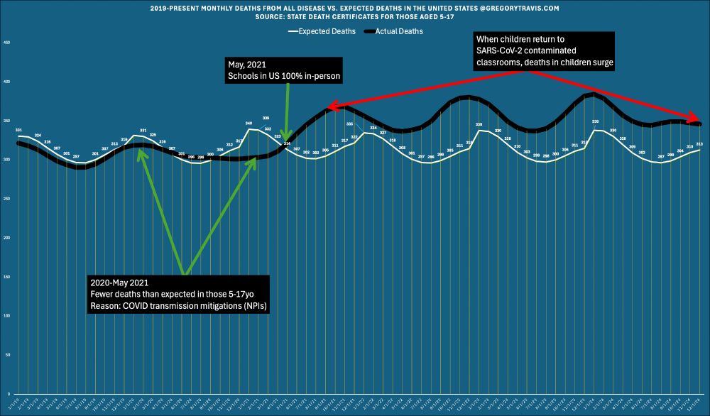
That's the same chart as I did for all ages except it's now restricted to the 5-17yo age group
Why does that chart look so different than the all-ages one?
More important, why does it look like the pandemic did not end in February 2024 for children?
Here's why
Why does that chart look so different than the all-ages one?
More important, why does it look like the pandemic did not end in February 2024 for children?
Here's why
May 26, 2025 at 1:24 PM
That's the same chart as I did for all ages except it's now restricted to the 5-17yo age group
Why does that chart look so different than the all-ages one?
More important, why does it look like the pandemic did not end in February 2024 for children?
Here's why
Why does that chart look so different than the all-ages one?
More important, why does it look like the pandemic did not end in February 2024 for children?
Here's why
Reposted
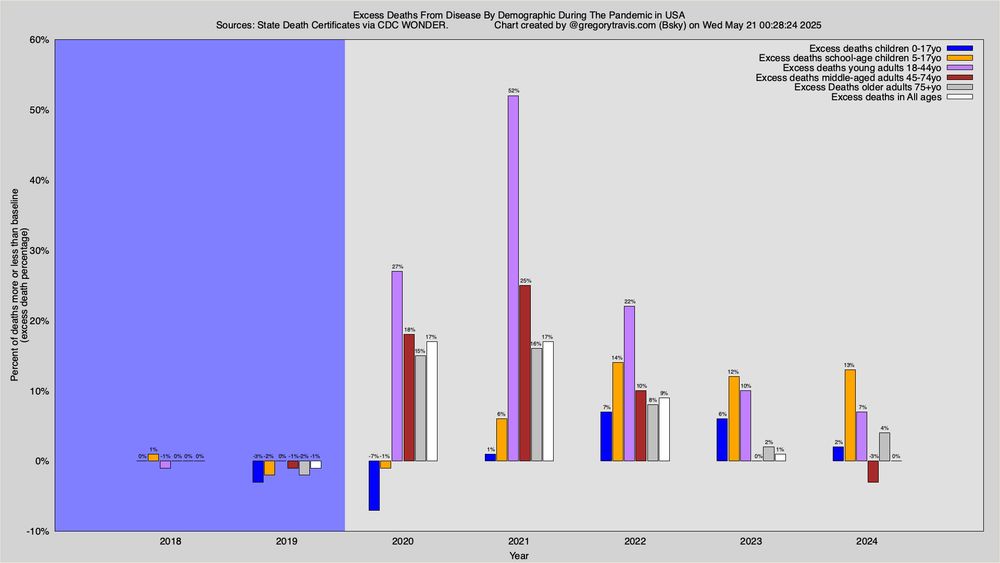
Those charts were for deaths in ALL ages
Since most people wait until they are old to die, the statistics in that chart are flooded by the ordinary, expected, deaths of old people and old people die, as I said, all the time
So take a look at this chart
Since most people wait until they are old to die, the statistics in that chart are flooded by the ordinary, expected, deaths of old people and old people die, as I said, all the time
So take a look at this chart

May 26, 2025 at 1:24 PM
Those charts were for deaths in ALL ages
Since most people wait until they are old to die, the statistics in that chart are flooded by the ordinary, expected, deaths of old people and old people die, as I said, all the time
So take a look at this chart
Since most people wait until they are old to die, the statistics in that chart are flooded by the ordinary, expected, deaths of old people and old people die, as I said, all the time
So take a look at this chart
Reposted
Note that the black and white lines converge again in February of 2024
Does that mean the SARS-CoV-2 ("COVID") pandemic only lasted from 2020-2024?
No. And I am going to tell you why...
Does that mean the SARS-CoV-2 ("COVID") pandemic only lasted from 2020-2024?
No. And I am going to tell you why...

May 26, 2025 at 1:24 PM
Note that the black and white lines converge again in February of 2024
Does that mean the SARS-CoV-2 ("COVID") pandemic only lasted from 2020-2024?
No. And I am going to tell you why...
Does that mean the SARS-CoV-2 ("COVID") pandemic only lasted from 2020-2024?
No. And I am going to tell you why...
Reposted
Until January 2020, actual deaths were identical to what we expected
But then the lines began to diverge
The gap between the lines is "excess" death if the black line is above the white line
It's NEGATIVE excess deaths if the black line is below the white line
So simple even I understand it
But then the lines began to diverge
The gap between the lines is "excess" death if the black line is above the white line
It's NEGATIVE excess deaths if the black line is below the white line
So simple even I understand it

May 26, 2025 at 1:24 PM
Until January 2020, actual deaths were identical to what we expected
But then the lines began to diverge
The gap between the lines is "excess" death if the black line is above the white line
It's NEGATIVE excess deaths if the black line is below the white line
So simple even I understand it
But then the lines began to diverge
The gap between the lines is "excess" death if the black line is above the white line
It's NEGATIVE excess deaths if the black line is below the white line
So simple even I understand it
Reposted
Here's an example of excess death analysis
The white line represents the number of deaths per month that we EXPECT, given history
The black line represents the ACTUAL number of deaths each month
Expected vs. Actual
Yes, it's as simple as that
The white line represents the number of deaths per month that we EXPECT, given history
The black line represents the ACTUAL number of deaths each month
Expected vs. Actual
Yes, it's as simple as that
May 26, 2025 at 1:24 PM
Here's an example of excess death analysis
The white line represents the number of deaths per month that we EXPECT, given history
The black line represents the ACTUAL number of deaths each month
Expected vs. Actual
Yes, it's as simple as that
The white line represents the number of deaths per month that we EXPECT, given history
The black line represents the ACTUAL number of deaths each month
Expected vs. Actual
Yes, it's as simple as that
Reposted
How do we better measure the impact of a disease when it is widely acknowledged that traditional methods of measuring disease mortality are inaccurate?
One tool is "excess death" analysis
This is simply a comparison of current mortality to a historic baseline
One tool is "excess death" analysis
This is simply a comparison of current mortality to a historic baseline
May 26, 2025 at 1:24 PM
How do we better measure the impact of a disease when it is widely acknowledged that traditional methods of measuring disease mortality are inaccurate?
One tool is "excess death" analysis
This is simply a comparison of current mortality to a historic baseline
One tool is "excess death" analysis
This is simply a comparison of current mortality to a historic baseline
And we will have to call on the world to come up with Long COVID 19 risks and how it affects people
December 5, 2024 at 7:04 PM
And we will have to call on the world to come up with Long COVID 19 risks and how it affects people
I know the abuse among masked individuals have grown when world tries to move on, we need new approach, mask, HEPA, far uvc 222 lights and proof that Far UVC 222 lights have worked. Thats the best way to reduce covid 19 spread
December 5, 2024 at 7:03 PM
I know the abuse among masked individuals have grown when world tries to move on, we need new approach, mask, HEPA, far uvc 222 lights and proof that Far UVC 222 lights have worked. Thats the best way to reduce covid 19 spread
That will involve going up to the news and getting evidence proven about long covid 19 risks to medical health professionals and releasing data on how many people have been disabled by long covid.
December 5, 2024 at 7:02 PM
That will involve going up to the news and getting evidence proven about long covid 19 risks to medical health professionals and releasing data on how many people have been disabled by long covid.