


Adrian
@uiadrian.bsky.social
I hope this was helpful!
Thanks for reading and have a good day :)
--
Need a website or an app?
Let's chat → designme.agency/intro
Thanks for reading and have a good day :)
--
Need a website or an app?
Let's chat → designme.agency/intro

November 17, 2025 at 12:00 PM
I hope this was helpful!
Thanks for reading and have a good day :)
--
Need a website or an app?
Let's chat → designme.agency/intro
Thanks for reading and have a good day :)
--
Need a website or an app?
Let's chat → designme.agency/intro
7/ Modal overlays
Full-screen modals feel overwhelming on mobile.
Bottom sheets slide up from the bottom while keeping the main screen visible behind them.
Airbnb uses sheets for service details - users stay grounded in context all the time.
Full-screen modals feel overwhelming on mobile.
Bottom sheets slide up from the bottom while keeping the main screen visible behind them.
Airbnb uses sheets for service details - users stay grounded in context all the time.
November 17, 2025 at 12:00 PM
7/ Modal overlays
Full-screen modals feel overwhelming on mobile.
Bottom sheets slide up from the bottom while keeping the main screen visible behind them.
Airbnb uses sheets for service details - users stay grounded in context all the time.
Full-screen modals feel overwhelming on mobile.
Bottom sheets slide up from the bottom while keeping the main screen visible behind them.
Airbnb uses sheets for service details - users stay grounded in context all the time.
6/ Gesture-based shortcuts
For this dating app we used swipe gestures instead of buttons:
- Swipe left = reject
- Swipe right = like
- Tap X/heart for quick actions
Saves space by hiding navigation in natural gestures. The interface stays clean while still remaining intuitive.
For this dating app we used swipe gestures instead of buttons:
- Swipe left = reject
- Swipe right = like
- Tap X/heart for quick actions
Saves space by hiding navigation in natural gestures. The interface stays clean while still remaining intuitive.
November 17, 2025 at 12:00 PM
6/ Gesture-based shortcuts
For this dating app we used swipe gestures instead of buttons:
- Swipe left = reject
- Swipe right = like
- Tap X/heart for quick actions
Saves space by hiding navigation in natural gestures. The interface stays clean while still remaining intuitive.
For this dating app we used swipe gestures instead of buttons:
- Swipe left = reject
- Swipe right = like
- Tap X/heart for quick actions
Saves space by hiding navigation in natural gestures. The interface stays clean while still remaining intuitive.
5/ Collapsing headers
Use headers that collapse as you scroll:
- Top of page: Large title takes ~100px
- Scroll down: Title moves to compact nav bar
- Scroll to top: Large title returns
Saves 60-70px of space, shows data visible without losing navigation.
Use headers that collapse as you scroll:
- Top of page: Large title takes ~100px
- Scroll down: Title moves to compact nav bar
- Scroll to top: Large title returns
Saves 60-70px of space, shows data visible without losing navigation.

November 17, 2025 at 12:00 PM
5/ Collapsing headers
Use headers that collapse as you scroll:
- Top of page: Large title takes ~100px
- Scroll down: Title moves to compact nav bar
- Scroll to top: Large title returns
Saves 60-70px of space, shows data visible without losing navigation.
Use headers that collapse as you scroll:
- Top of page: Large title takes ~100px
- Scroll down: Title moves to compact nav bar
- Scroll to top: Large title returns
Saves 60-70px of space, shows data visible without losing navigation.
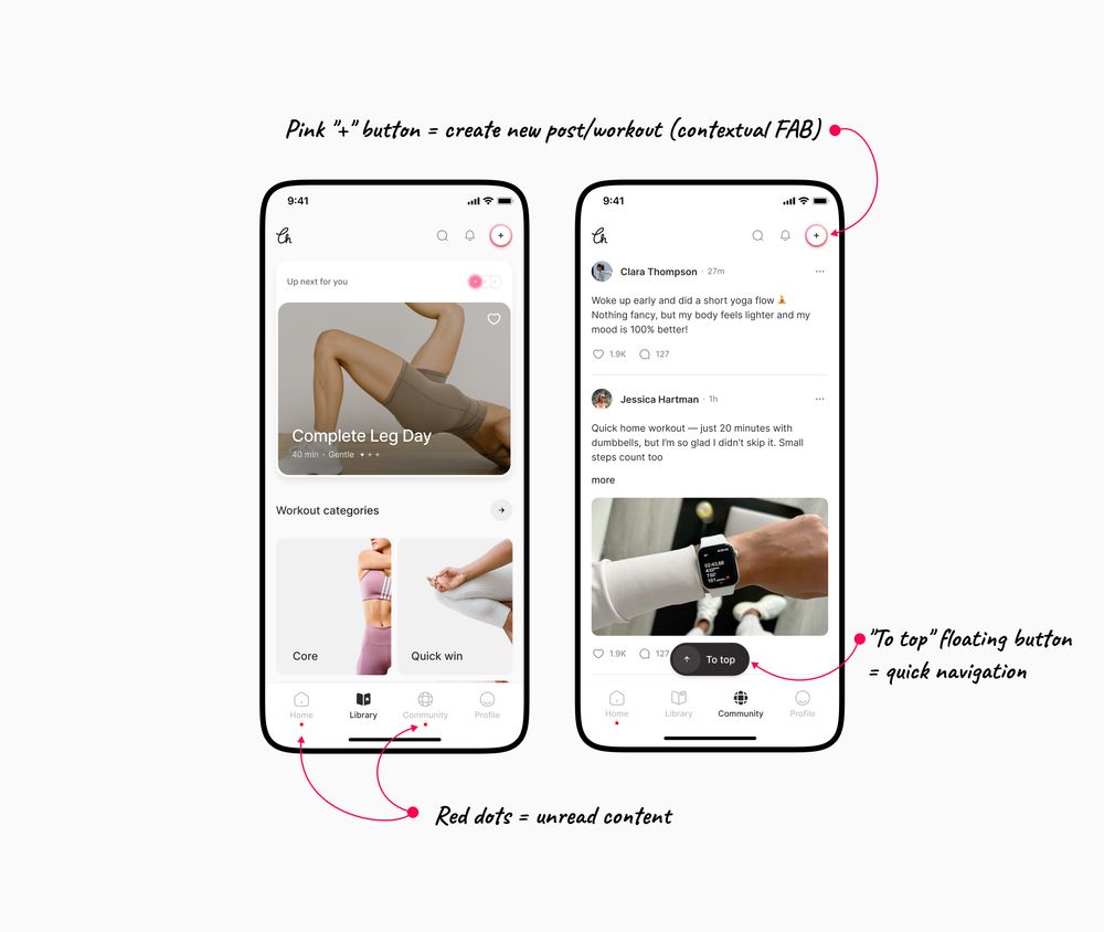
4/ Tab bar icon states
Your navigation can display data, not just provide access. In this app we designed, we used red dots under tabs to show:
- New posts in feed
- Community activity
- Updates in other sections
Your tab bar tells you where attention is needed.
Your navigation can display data, not just provide access. In this app we designed, we used red dots under tabs to show:
- New posts in feed
- Community activity
- Updates in other sections
Your tab bar tells you where attention is needed.
November 17, 2025 at 12:00 PM
4/ Tab bar icon states
Your navigation can display data, not just provide access. In this app we designed, we used red dots under tabs to show:
- New posts in feed
- Community activity
- Updates in other sections
Your tab bar tells you where attention is needed.
Your navigation can display data, not just provide access. In this app we designed, we used red dots under tabs to show:
- New posts in feed
- Community activity
- Updates in other sections
Your tab bar tells you where attention is needed.
3/ Contextual FABs
Don't waste space on buttons users rarely need. Show action buttons only when relevant:
- "Add to cart" when viewing products
- "Send message" when typing
- "Save" when editing
Context-aware UI feels smarter and saves precious screen real estate.
Don't waste space on buttons users rarely need. Show action buttons only when relevant:
- "Add to cart" when viewing products
- "Send message" when typing
- "Save" when editing
Context-aware UI feels smarter and saves precious screen real estate.

November 17, 2025 at 12:00 PM
3/ Contextual FABs
Don't waste space on buttons users rarely need. Show action buttons only when relevant:
- "Add to cart" when viewing products
- "Send message" when typing
- "Save" when editing
Context-aware UI feels smarter and saves precious screen real estate.
Don't waste space on buttons users rarely need. Show action buttons only when relevant:
- "Add to cart" when viewing products
- "Send message" when typing
- "Save" when editing
Context-aware UI feels smarter and saves precious screen real estate.
2/ Sheet overlays
Use bottom sheets for quick actions:
- Attachment options
- Share menus
- Filters and settings
Slack uses this for file uploads - the conversation stays visible behind the sheet.
You're not taken to a new screen, just accessing quick actions.
Use bottom sheets for quick actions:
- Attachment options
- Share menus
- Filters and settings
Slack uses this for file uploads - the conversation stays visible behind the sheet.
You're not taken to a new screen, just accessing quick actions.

November 17, 2025 at 12:00 PM
2/ Sheet overlays
Use bottom sheets for quick actions:
- Attachment options
- Share menus
- Filters and settings
Slack uses this for file uploads - the conversation stays visible behind the sheet.
You're not taken to a new screen, just accessing quick actions.
Use bottom sheets for quick actions:
- Attachment options
- Share menus
- Filters and settings
Slack uses this for file uploads - the conversation stays visible behind the sheet.
You're not taken to a new screen, just accessing quick actions.
1/ Smart defaults
Don't show everything at once - reveal information as users need it.
Start with most-used options visible. Use expandable sections for secondary features.
Smart defaults reduce cognitive load while keeping power features accessible.
Don't show everything at once - reveal information as users need it.
Start with most-used options visible. Use expandable sections for secondary features.
Smart defaults reduce cognitive load while keeping power features accessible.

November 17, 2025 at 12:00 PM
1/ Smart defaults
Don't show everything at once - reveal information as users need it.
Start with most-used options visible. Use expandable sections for secondary features.
Smart defaults reduce cognitive load while keeping power features accessible.
Don't show everything at once - reveal information as users need it.
Start with most-used options visible. Use expandable sections for secondary features.
Smart defaults reduce cognitive load while keeping power features accessible.