


TypeErrorDev
@typeerrordev.bsky.social
www.TaskDay.org || Come join the waitlist
Looking kind of like a dashboard 💪🏽

December 8, 2024 at 6:52 AM
Looking kind of like a dashboard 💪🏽
Create Custom Styles with plt.style.use() for Consistency
Matplotlib offers built-in styles like seaborn and ggplot, but creating your own style means consistent branding across projects. Use custom styles for cohesive, professional presentations, adjusting colors, fonts, and grids.
Matplotlib offers built-in styles like seaborn and ggplot, but creating your own style means consistent branding across projects. Use custom styles for cohesive, professional presentations, adjusting colors, fonts, and grids.

November 2, 2024 at 4:36 PM
Create Custom Styles with plt.style.use() for Consistency
Matplotlib offers built-in styles like seaborn and ggplot, but creating your own style means consistent branding across projects. Use custom styles for cohesive, professional presentations, adjusting colors, fonts, and grids.
Matplotlib offers built-in styles like seaborn and ggplot, but creating your own style means consistent branding across projects. Use custom styles for cohesive, professional presentations, adjusting colors, fonts, and grids.
Dual-Axis Plots with twinx()
When you need to show data with different units or scales on one plot, use twinx(). This adds a secondary y-axis, allowing you to compare relationships between data types that wouldn’t typically share an axis.
When you need to show data with different units or scales on one plot, use twinx(). This adds a secondary y-axis, allowing you to compare relationships between data types that wouldn’t typically share an axis.

November 2, 2024 at 4:36 PM
Dual-Axis Plots with twinx()
When you need to show data with different units or scales on one plot, use twinx(). This adds a secondary y-axis, allowing you to compare relationships between data types that wouldn’t typically share an axis.
When you need to show data with different units or scales on one plot, use twinx(). This adds a secondary y-axis, allowing you to compare relationships between data types that wouldn’t typically share an axis.
Direct Labels with plt.text() for Added Clarity
Sometimes text labels within the plot area can provide better context than legends, especially in crowded plots. Use plt.text() to add specific values or labels directly on the bars, lines, or points of interest.
Sometimes text labels within the plot area can provide better context than legends, especially in crowded plots. Use plt.text() to add specific values or labels directly on the bars, lines, or points of interest.

November 2, 2024 at 4:36 PM
Direct Labels with plt.text() for Added Clarity
Sometimes text labels within the plot area can provide better context than legends, especially in crowded plots. Use plt.text() to add specific values or labels directly on the bars, lines, or points of interest.
Sometimes text labels within the plot area can provide better context than legends, especially in crowded plots. Use plt.text() to add specific values or labels directly on the bars, lines, or points of interest.
Composite Legends with HandlerTuple
Sometimes, you’ll want a single legend entry for a combination of lines or markers. With HandlerTuple, you can group elements for one legend item, giving viewers an intuitive and organized way to understand the plot.
Sometimes, you’ll want a single legend entry for a combination of lines or markers. With HandlerTuple, you can group elements for one legend item, giving viewers an intuitive and organized way to understand the plot.

November 2, 2024 at 4:36 PM
Composite Legends with HandlerTuple
Sometimes, you’ll want a single legend entry for a combination of lines or markers. With HandlerTuple, you can group elements for one legend item, giving viewers an intuitive and organized way to understand the plot.
Sometimes, you’ll want a single legend entry for a combination of lines or markers. With HandlerTuple, you can group elements for one legend item, giving viewers an intuitive and organized way to understand the plot.
Highlighting Regions with axvspan and axhspan
Highlight specific regions in your plot with axvspan (vertical shading) and axhspan (horizontal shading). These methods are helpful for showing events, periods, or thresholds in your data to draw the viewer’s attention to significant regions.
Highlight specific regions in your plot with axvspan (vertical shading) and axhspan (horizontal shading). These methods are helpful for showing events, periods, or thresholds in your data to draw the viewer’s attention to significant regions.

November 2, 2024 at 4:35 PM
Highlighting Regions with axvspan and axhspan
Highlight specific regions in your plot with axvspan (vertical shading) and axhspan (horizontal shading). These methods are helpful for showing events, periods, or thresholds in your data to draw the viewer’s attention to significant regions.
Highlight specific regions in your plot with axvspan (vertical shading) and axhspan (horizontal shading). These methods are helpful for showing events, periods, or thresholds in your data to draw the viewer’s attention to significant regions.
Using Different Scales for Better Analysis
Large data ranges can be difficult to view on a linear scale. Use ax.set_yscale() or ax.set_xscale() to change your scale to log or symlog. This is especially useful for financial or scientific data with wide-ranging values.
Large data ranges can be difficult to view on a linear scale. Use ax.set_yscale() or ax.set_xscale() to change your scale to log or symlog. This is especially useful for financial or scientific data with wide-ranging values.

November 2, 2024 at 4:35 PM
Using Different Scales for Better Analysis
Large data ranges can be difficult to view on a linear scale. Use ax.set_yscale() or ax.set_xscale() to change your scale to log or symlog. This is especially useful for financial or scientific data with wide-ranging values.
Large data ranges can be difficult to view on a linear scale. Use ax.set_yscale() or ax.set_xscale() to change your scale to log or symlog. This is especially useful for financial or scientific data with wide-ranging values.
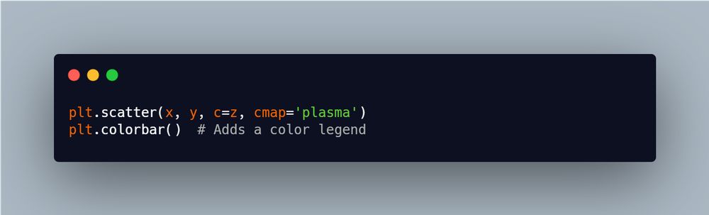
Advanced Color Mapping with plt.cm for Depth
Applying color maps to scatter plots or heatmaps can add clarity and visual appeal, especially when you plotting dense data. Use plt.cm to apply gradual colors that reflect value intensity helping patterns stand out
Applying color maps to scatter plots or heatmaps can add clarity and visual appeal, especially when you plotting dense data. Use plt.cm to apply gradual colors that reflect value intensity helping patterns stand out
November 2, 2024 at 4:32 PM
Advanced Color Mapping with plt.cm for Depth
Applying color maps to scatter plots or heatmaps can add clarity and visual appeal, especially when you plotting dense data. Use plt.cm to apply gradual colors that reflect value intensity helping patterns stand out
Applying color maps to scatter plots or heatmaps can add clarity and visual appeal, especially when you plotting dense data. Use plt.cm to apply gradual colors that reflect value intensity helping patterns stand out
Highlighting with plt.annotate()
Use plt.annotate() to emphasize specific points or trends in your data. Arrows and labels direct attention and add context, making it easier for viewers to grasp key insights immediately.
Perfect for emphasizing anomalies or key events in time series data!
Use plt.annotate() to emphasize specific points or trends in your data. Arrows and labels direct attention and add context, making it easier for viewers to grasp key insights immediately.
Perfect for emphasizing anomalies or key events in time series data!

November 2, 2024 at 4:32 PM
Highlighting with plt.annotate()
Use plt.annotate() to emphasize specific points or trends in your data. Arrows and labels direct attention and add context, making it easier for viewers to grasp key insights immediately.
Perfect for emphasizing anomalies or key events in time series data!
Use plt.annotate() to emphasize specific points or trends in your data. Arrows and labels direct attention and add context, making it easier for viewers to grasp key insights immediately.
Perfect for emphasizing anomalies or key events in time series data!
Customized Plot Layouts with GridSpec
Complex layouts are easier with GridSpec, which lets you arrange subplots with precise control. Each subplot can have unique sizing and positioning, so you can tell richer stories within one figure.
Complex layouts are easier with GridSpec, which lets you arrange subplots with precise control. Each subplot can have unique sizing and positioning, so you can tell richer stories within one figure.

November 2, 2024 at 4:32 PM
Customized Plot Layouts with GridSpec
Complex layouts are easier with GridSpec, which lets you arrange subplots with precise control. Each subplot can have unique sizing and positioning, so you can tell richer stories within one figure.
Complex layouts are easier with GridSpec, which lets you arrange subplots with precise control. Each subplot can have unique sizing and positioning, so you can tell richer stories within one figure.
Saving Your Plot
With plt.savefig(), you can export your visuals directly to image files (PNG, JPG, PDF, etc.). Perfect for adding visuals to reports or presentations! Just specify a filename and file format.
With plt.savefig(), you can export your visuals directly to image files (PNG, JPG, PDF, etc.). Perfect for adding visuals to reports or presentations! Just specify a filename and file format.

November 1, 2024 at 7:29 PM
Saving Your Plot
With plt.savefig(), you can export your visuals directly to image files (PNG, JPG, PDF, etc.). Perfect for adding visuals to reports or presentations! Just specify a filename and file format.
With plt.savefig(), you can export your visuals directly to image files (PNG, JPG, PDF, etc.). Perfect for adding visuals to reports or presentations! Just specify a filename and file format.
Subplots with plt.subplot()
Want multiple plots in one figure? Use plt.subplot(). This is great for comparing different datasets or views within the same figure. Control layout with nrows and ncols.
Want multiple plots in one figure? Use plt.subplot(). This is great for comparing different datasets or views within the same figure. Control layout with nrows and ncols.

November 1, 2024 at 7:29 PM
Subplots with plt.subplot()
Want multiple plots in one figure? Use plt.subplot(). This is great for comparing different datasets or views within the same figure. Control layout with nrows and ncols.
Want multiple plots in one figure? Use plt.subplot(). This is great for comparing different datasets or views within the same figure. Control layout with nrows and ncols.
Adding Legends
For multi-line plots, plt.legend() is a must. It clarifies which line is which, especially when plotting multiple datasets. Set label in plt.plot() to use it.
For multi-line plots, plt.legend() is a must. It clarifies which line is which, especially when plotting multiple datasets. Set label in plt.plot() to use it.

November 1, 2024 at 7:29 PM
Adding Legends
For multi-line plots, plt.legend() is a must. It clarifies which line is which, especially when plotting multiple datasets. Set label in plt.plot() to use it.
For multi-line plots, plt.legend() is a must. It clarifies which line is which, especially when plotting multiple datasets. Set label in plt.plot() to use it.
Labels and Titles
Don’t forget to label your axes and add a title! Using plt.xlabel(), plt.ylabel(), and plt.title() will make sure your audience knows what they’re looking at. Clear labels make a big difference! #DataVisualization
Don’t forget to label your axes and add a title! Using plt.xlabel(), plt.ylabel(), and plt.title() will make sure your audience knows what they’re looking at. Clear labels make a big difference! #DataVisualization

November 1, 2024 at 7:29 PM
Labels and Titles
Don’t forget to label your axes and add a title! Using plt.xlabel(), plt.ylabel(), and plt.title() will make sure your audience knows what they’re looking at. Clear labels make a big difference! #DataVisualization
Don’t forget to label your axes and add a title! Using plt.xlabel(), plt.ylabel(), and plt.title() will make sure your audience knows what they’re looking at. Clear labels make a big difference! #DataVisualization
Customization Options
Matplotlib allows you to style your plots easily. You can change colors, line styles, labels, and more. Experimenting with options like color, linestyle, and marker can add clarity and appeal to your visuals! #DataViz
Matplotlib allows you to style your plots easily. You can change colors, line styles, labels, and more. Experimenting with options like color, linestyle, and marker can add clarity and appeal to your visuals! #DataViz

November 1, 2024 at 7:29 PM
Customization Options
Matplotlib allows you to style your plots easily. You can change colors, line styles, labels, and more. Experimenting with options like color, linestyle, and marker can add clarity and appeal to your visuals! #DataViz
Matplotlib allows you to style your plots easily. You can change colors, line styles, labels, and more. Experimenting with options like color, linestyle, and marker can add clarity and appeal to your visuals! #DataViz
Basic Plotting with plt.plot()
The plt.plot() function is your gateway to line plots in Matplotlib. With just a line or two, you can create quick visualizations to explore trends. Simple yet powerful!
The plt.plot() function is your gateway to line plots in Matplotlib. With just a line or two, you can create quick visualizations to explore trends. Simple yet powerful!

November 1, 2024 at 7:29 PM
Basic Plotting with plt.plot()
The plt.plot() function is your gateway to line plots in Matplotlib. With just a line or two, you can create quick visualizations to explore trends. Simple yet powerful!
The plt.plot() function is your gateway to line plots in Matplotlib. With just a line or two, you can create quick visualizations to explore trends. Simple yet powerful!
visualization: Visualizing your data makes insights clear! Use the Matplotlib or Seaborn to create impactful visuals
Visuals will help tell the story of your data! #DataViz
6/7
Visuals will help tell the story of your data! #DataViz
6/7

October 21, 2024 at 8:29 PM
visualization: Visualizing your data makes insights clear! Use the Matplotlib or Seaborn to create impactful visuals
Visuals will help tell the story of your data! #DataViz
6/7
Visuals will help tell the story of your data! #DataViz
6/7
Data Analysis: Time for insights! Use groupby and aggregation to summarize your data. Here’s an example to calculate the sum of a specific column grouped by another
Discover patterns and trends! #DataAnalysis
5/7
Discover patterns and trends! #DataAnalysis
5/7

October 21, 2024 at 8:29 PM
Data Analysis: Time for insights! Use groupby and aggregation to summarize your data. Here’s an example to calculate the sum of a specific column grouped by another
Discover patterns and trends! #DataAnalysis
5/7
Discover patterns and trends! #DataAnalysis
5/7
Data Cleaning: Clean data leads to better insights! Handle missing values and duplicates effectively
A clean dataset is the foundation of great analysis! #DataCleaning
4/7
A clean dataset is the foundation of great analysis! #DataCleaning
4/7

October 21, 2024 at 8:29 PM
Data Cleaning: Clean data leads to better insights! Handle missing values and duplicates effectively
A clean dataset is the foundation of great analysis! #DataCleaning
4/7
A clean dataset is the foundation of great analysis! #DataCleaning
4/7
Exploring Data: Understanding your dataset is crucial! Use head(), info(), and describe() to get a feel for the data structure and summary statistics
Get familiar with your data! #Pandas
3/7
Get familiar with your data! #Pandas
3/7

October 21, 2024 at 8:29 PM
Exploring Data: Understanding your dataset is crucial! Use head(), info(), and describe() to get a feel for the data structure and summary statistics
Get familiar with your data! #Pandas
3/7
Get familiar with your data! #Pandas
3/7
Importing Data: The first step in any analysis is getting your data into Python. With Pandas, reading CSV files is a breeze. Use this code snippet to load your dataset
Now you're ready to analyze! #DataScience
2/7
Now you're ready to analyze! #DataScience
2/7

October 21, 2024 at 8:29 PM
Importing Data: The first step in any analysis is getting your data into Python. With Pandas, reading CSV files is a breeze. Use this code snippet to load your dataset
Now you're ready to analyze! #DataScience
2/7
Now you're ready to analyze! #DataScience
2/7