


JAllen
@tjamesallen.bsky.social
Pro-science liberal, not religious.
I support a free multicultural multigender society.
I studied philosophy of language. I built parts of the www. I collect vintage and antique technology.
I support a free multicultural multigender society.
I studied philosophy of language. I built parts of the www. I collect vintage and antique technology.
Bus spotting on the Virginia 511 website, Richmond, Broad St and 8th, November 2025, bus seen several times, sometimes crossing Broad, sometimes turning west. What is this thin, white bus? Not the usual GRTC or Pulse colors. #bus #busspotting

November 14, 2025 at 11:32 PM
Bus spotting on the Virginia 511 website, Richmond, Broad St and 8th, November 2025, bus seen several times, sometimes crossing Broad, sometimes turning west. What is this thin, white bus? Not the usual GRTC or Pulse colors. #bus #busspotting
Here I go again. By move 17, I am up +4.61 against the Francis BOT, yet I will lose all that advantage over the next 15 moves. How do I convert my advantage in development into a win? Later, discouraged, I mistakenly resign in a near-equal position.

November 3, 2025 at 7:38 PM
Here I go again. By move 17, I am up +4.61 against the Francis BOT, yet I will lose all that advantage over the next 15 moves. How do I convert my advantage in development into a win? Later, discouraged, I mistakenly resign in a near-equal position.
Addendum: This is the chess book that saved me.
Irving Chernev, Logical Chess, Move by Move.
There is an explanation of every single move! This was the first chess book where I played through every game and every variation. My chess improved! And I realized how much time I had wasted.
Irving Chernev, Logical Chess, Move by Move.
There is an explanation of every single move! This was the first chess book where I played through every game and every variation. My chess improved! And I realized how much time I had wasted.

November 2, 2025 at 1:47 PM
Addendum: This is the chess book that saved me.
Irving Chernev, Logical Chess, Move by Move.
There is an explanation of every single move! This was the first chess book where I played through every game and every variation. My chess improved! And I realized how much time I had wasted.
Irving Chernev, Logical Chess, Move by Move.
There is an explanation of every single move! This was the first chess book where I played through every game and every variation. My chess improved! And I realized how much time I had wasted.


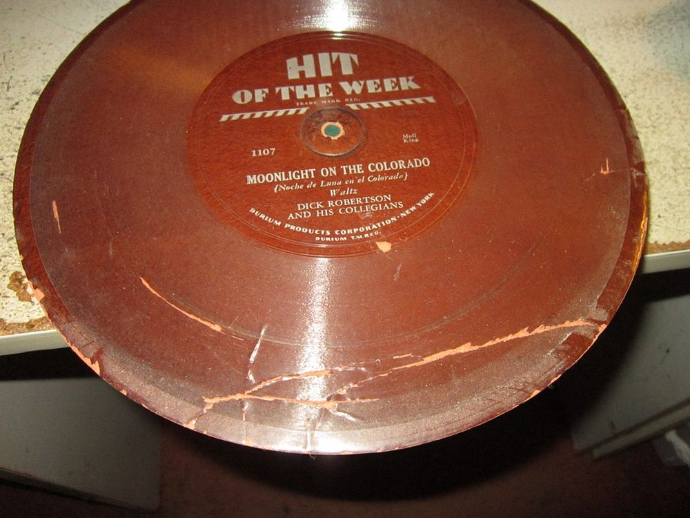
Here's what happens to them - bent, chipped, some warp like the crown of a road, some grow bubbles where the acetate (?) separates from the cardboard. I have three and they all look like this.
August 30, 2025 at 6:23 PM
Here's what happens to them - bent, chipped, some warp like the crown of a road, some grow bubbles where the acetate (?) separates from the cardboard. I have three and they all look like this.
Children's book - I Wish That I Had Duck Feet.

August 27, 2025 at 9:35 AM
Children's book - I Wish That I Had Duck Feet.
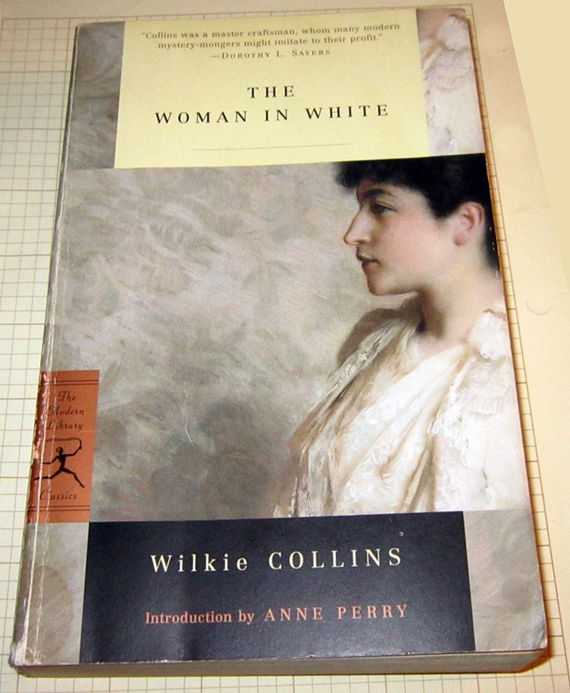
Wilkie Collins' novel, The Woman in White, published in 1860, kidnapped me immediately and carried me away for 650+ pages in Victorian style. Considered one of the first "sensational novels," literature intended to thrill the emotions rather than instruct the intellect,
1/2
1/2
August 26, 2025 at 1:53 PM
Wilkie Collins' novel, The Woman in White, published in 1860, kidnapped me immediately and carried me away for 650+ pages in Victorian style. Considered one of the first "sensational novels," literature intended to thrill the emotions rather than instruct the intellect,
1/2
1/2
The historical mystery "Sovereign" by C.J. Sansom (2006) is so good I could hardly put it down. Set in Tudor England in 1541, lawyer Matthew Shardlake investigates a murder amidst the political intrigue surrounding Henry VIII and his fifth wife Catherine Howard. Excellent and recommended! 1/2

August 10, 2025 at 9:30 PM
The historical mystery "Sovereign" by C.J. Sansom (2006) is so good I could hardly put it down. Set in Tudor England in 1541, lawyer Matthew Shardlake investigates a murder amidst the political intrigue surrounding Henry VIII and his fifth wife Catherine Howard. Excellent and recommended! 1/2

Desperate to escape from climate change? Google says I can drive to Fairbanks, Alaska in only 69 hours. Chilly Alaska and the beckoning wilds of Northern Canada are only 4,200 miles away. Let me check the change jar for some gas money.

July 18, 2025 at 8:37 PM
Desperate to escape from climate change? Google says I can drive to Fairbanks, Alaska in only 69 hours. Chilly Alaska and the beckoning wilds of Northern Canada are only 4,200 miles away. Let me check the change jar for some gas money.
Context: Trump's controversial pardons.

May 28, 2025 at 7:10 PM
Context: Trump's controversial pardons.
Some info from google, with links.
May 14, 2025 at 2:22 PM
Some info from google, with links.
I found this Art Deco Crosley 56TP-L radio-record player from 1946. The radio is AM and shortwave. The record player is one speed (78 RPM) and monophonic. Stereo records, the 33 RPM LP, and 45 RPM singles had not yet been introduced.

May 2, 2025 at 1:38 PM
I found this Art Deco Crosley 56TP-L radio-record player from 1946. The radio is AM and shortwave. The record player is one speed (78 RPM) and monophonic. Stereo records, the 33 RPM LP, and 45 RPM singles had not yet been introduced.
Our first turtle of the year is this big one, about 11 inches long, crawling up from the swamp to lay eggs in the yard.
(Hanover County, Virginia, April 27, 2025)
(Hanover County, Virginia, April 27, 2025)


April 27, 2025 at 3:47 PM
Our first turtle of the year is this big one, about 11 inches long, crawling up from the swamp to lay eggs in the yard.
(Hanover County, Virginia, April 27, 2025)
(Hanover County, Virginia, April 27, 2025)

Here is another box of my web dev books from the 1997-2007 era. The Cascading Style Sheets book (bottom of the pile) was important to me, despite a few misprints and the recalcitrant browsers.

March 8, 2025 at 7:03 PM
Here is another box of my web dev books from the 1997-2007 era. The Cascading Style Sheets book (bottom of the pile) was important to me, despite a few misprints and the recalcitrant browsers.
My Dad worked for IBM, so I occasionally got to play with a keypunch, probably one Saturday when he got called in to work and I tagged along.
Later at UVA, I learned FORTRAN and COBOL using punch cards.
Later at UVA, I learned FORTRAN and COBOL using punch cards.

March 4, 2025 at 3:05 AM
My Dad worked for IBM, so I occasionally got to play with a keypunch, probably one Saturday when he got called in to work and I tagged along.
Later at UVA, I learned FORTRAN and COBOL using punch cards.
Later at UVA, I learned FORTRAN and COBOL using punch cards.
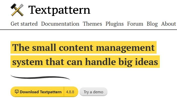
Web Dev History:
By 2008, many web devs were developing websites in Content Management Systems. I got onboard early with Textpattern, about 2007, and developed 25 websites in that CMS. Unfortunately, many more web devs chose Wordpress, Typescript, drupal, and other CMSs.
1/2
By 2008, many web devs were developing websites in Content Management Systems. I got onboard early with Textpattern, about 2007, and developed 25 websites in that CMS. Unfortunately, many more web devs chose Wordpress, Typescript, drupal, and other CMSs.
1/2
March 2, 2025 at 3:56 PM
Web Dev History:
By 2008, many web devs were developing websites in Content Management Systems. I got onboard early with Textpattern, about 2007, and developed 25 websites in that CMS. Unfortunately, many more web devs chose Wordpress, Typescript, drupal, and other CMSs.
1/2
By 2008, many web devs were developing websites in Content Management Systems. I got onboard early with Textpattern, about 2007, and developed 25 websites in that CMS. Unfortunately, many more web devs chose Wordpress, Typescript, drupal, and other CMSs.
1/2
Web Dev History:
The year 2010 caught many companies with websites that could not be viewed on the smartphone. I was contracted to build several fully functional smartphone-only websites. When you arrived at the URL, we measured your screen size and sent you to the main site or the smartphone site.
The year 2010 caught many companies with websites that could not be viewed on the smartphone. I was contracted to build several fully functional smartphone-only websites. When you arrived at the URL, we measured your screen size and sent you to the main site or the smartphone site.

March 2, 2025 at 1:04 PM
Web Dev History:
The year 2010 caught many companies with websites that could not be viewed on the smartphone. I was contracted to build several fully functional smartphone-only websites. When you arrived at the URL, we measured your screen size and sent you to the main site or the smartphone site.
The year 2010 caught many companies with websites that could not be viewed on the smartphone. I was contracted to build several fully functional smartphone-only websites. When you arrived at the URL, we measured your screen size and sent you to the main site or the smartphone site.
Web Dev History: 2008-2010
With the sudden ubiquity of smartphones, full-screen websites became dinosaurs. Websites I had designed for a 1024x768 pixel, 17-inch flat screen monitor did not fail gracefully on the tiny 320 pixel smartphone screen. I and other web devs moved to Responsive Web Design.
With the sudden ubiquity of smartphones, full-screen websites became dinosaurs. Websites I had designed for a 1024x768 pixel, 17-inch flat screen monitor did not fail gracefully on the tiny 320 pixel smartphone screen. I and other web devs moved to Responsive Web Design.


March 2, 2025 at 11:59 AM
Web Dev History: 2008-2010
With the sudden ubiquity of smartphones, full-screen websites became dinosaurs. Websites I had designed for a 1024x768 pixel, 17-inch flat screen monitor did not fail gracefully on the tiny 320 pixel smartphone screen. I and other web devs moved to Responsive Web Design.
With the sudden ubiquity of smartphones, full-screen websites became dinosaurs. Websites I had designed for a 1024x768 pixel, 17-inch flat screen monitor did not fail gracefully on the tiny 320 pixel smartphone screen. I and other web devs moved to Responsive Web Design.
User Interface,
not a metaphor.
not a metaphor.

March 1, 2025 at 3:23 PM
User Interface,
not a metaphor.
not a metaphor.
Look closely at the stack of books, the JavaScript book has xeroxed articles stuffed inside. This is how I stayed ahead of my competition: articles like these 3 from @scottandrew.com (2000-01) My original notes are over the top, but I had needed these, anticipated these, and here they were. Thanks!

February 24, 2025 at 8:43 PM
Look closely at the stack of books, the JavaScript book has xeroxed articles stuffed inside. This is how I stayed ahead of my competition: articles like these 3 from @scottandrew.com (2000-01) My original notes are over the top, but I had needed these, anticipated these, and here they were. Thanks!