


Sean Wilson
@seanw.org
I post about web/UI design and dev :)
💻 Design engineer seanw.org
🤖 SEO checker extension checkbot.io
🧠 Word game seanwilson.itch.io/wordoid
🎨 Accessible palette creator inclusivecolors.com
🏴 Edinburgh, Scotland
💻 Design engineer seanw.org
🤖 SEO checker extension checkbot.io
🧠 Word game seanwilson.itch.io/wordoid
🎨 Accessible palette creator inclusivecolors.com
🏴 Edinburgh, Scotland
Reposted by Sean Wilson
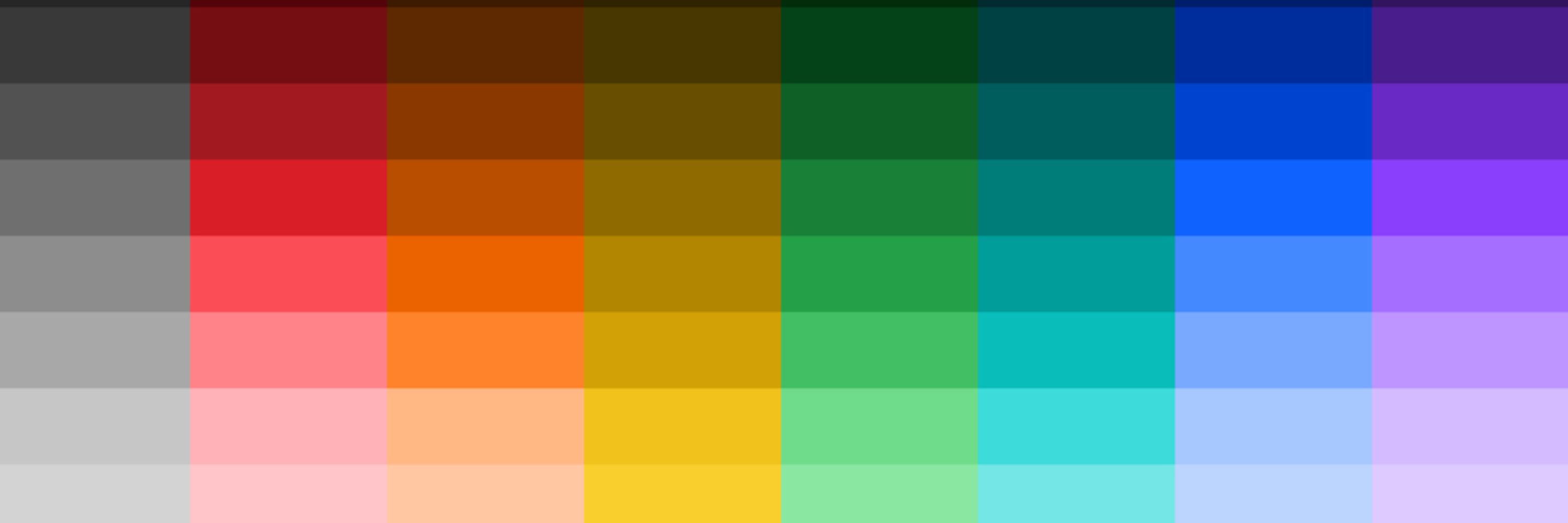
Thanks! You mean plot the editable HSL curves going left-to-right across the palette/swatches rather than plots going top-to-bottom across a single swatch? If it helps, you can make whatever kinds of gradients you want within a swatch right now. Quick example www.inclusivecolors.com?style_dictio...

December 10, 2024 at 12:10 AM
Thanks! You mean plot the editable HSL curves going left-to-right across the palette/swatches rather than plots going top-to-bottom across a single swatch? If it helps, you can make whatever kinds of gradients you want within a swatch right now. Quick example www.inclusivecolors.com?style_dictio...
Here's an accessible palette creator I made recently if you're looking for more like this. :) You get complete control over every shade, a UI mockup preview, and can check the contrast between any color pair, which I find it really useful for creating branded palettes.
www.inclusivecolors.com
www.inclusivecolors.com

InclusiveColors - Accessible color palette creator
Try it now to create your own color palettes!
www.inclusivecolors.com
February 26, 2025 at 4:29 PM
Here's an accessible palette creator I made recently if you're looking for more like this. :) You get complete control over every shade, a UI mockup preview, and can check the contrast between any color pair, which I find it really useful for creating branded palettes.
www.inclusivecolors.com
www.inclusivecolors.com
I'm curious if there's better ways to build auto contrast checking into browsers, so problems get flagged the moment they appear during dev. 🤔
Frontend devs have to keep on top of security, speed, SEO, UX, mobile etc. and also accessibility. It can feel endless, so things get missed. #a11y
Frontend devs have to keep on top of security, speed, SEO, UX, mobile etc. and also accessibility. It can feel endless, so things get missed. #a11y
January 14, 2025 at 8:02 AM
I'm curious if there's better ways to build auto contrast checking into browsers, so problems get flagged the moment they appear during dev. 🤔
Frontend devs have to keep on top of security, speed, SEO, UX, mobile etc. and also accessibility. It can feel endless, so things get missed. #a11y
Frontend devs have to keep on top of security, speed, SEO, UX, mobile etc. and also accessibility. It can feel endless, so things get missed. #a11y
Thanks for the feedback! Yeah, it's tricky, there's 11 colors with 3 sliders each so there's not much room. The mobile UI is mostly there to get people to try the desktop one. Guessing most aren't designing on their phones? A thin contrast level bar or metric would probably fit though.
January 13, 2025 at 7:03 AM
Thanks for the feedback! Yeah, it's tricky, there's 11 colors with 3 sliders each so there's not much room. The mobile UI is mostly there to get people to try the desktop one. Guessing most aren't designing on their phones? A thin contrast level bar or metric would probably fit though.
Reposted by Sean Wilson
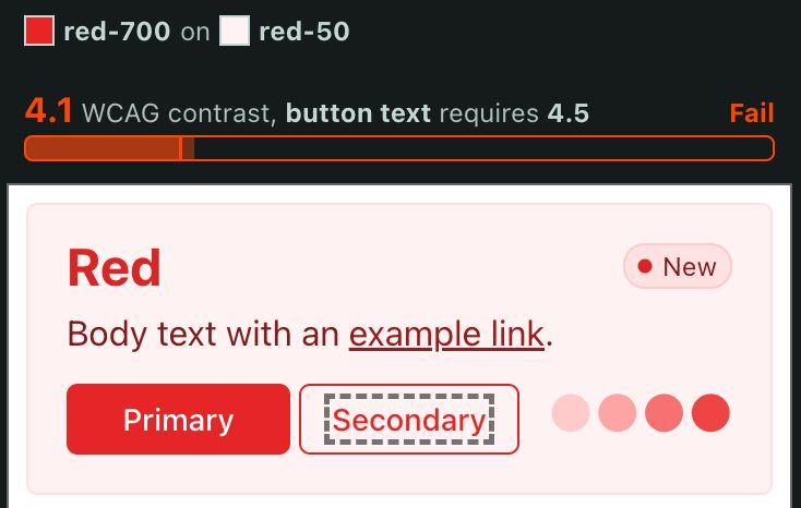
Did you try on desktop? Click an element on the mockup to show the current contrast ratio, the target ratio (e.g. 4.5:1 for body text, 3:1 for border), and if it passes. :) The contrast menu at the top lets you compare any color pair. Mobile has limited space but outlines mockup failures.
#a11y
#a11y

January 13, 2025 at 2:38 AM
Did you try on desktop? Click an element on the mockup to show the current contrast ratio, the target ratio (e.g. 4.5:1 for body text, 3:1 for border), and if it passes. :) The contrast menu at the top lets you compare any color pair. Mobile has limited space but outlines mockup failures.
#a11y
#a11y
January 13, 2025 at 2:38 AM
Did you try on desktop? Click an element on the mockup to show the current contrast ratio, the target ratio (e.g. 4.5:1 for body text, 3:1 for border), and if it passes. :) The contrast menu at the top lets you compare any color pair. Mobile has limited space but outlines mockup failures.
#a11y
#a11y
You might be interested in this color palette editor I've been working on then that lets you use ACPA or WCAG2. You can explore if they agree on which colors contrast e.g. APCA is much stricter about which pairs contrasts in dark mode themes.
www.inclusivecolors.com #a11y #accessibility
www.inclusivecolors.com #a11y #accessibility
InclusiveColors - Accessible color palette creator
Try it now to create your own color palettes!
www.inclusivecolors.com
January 11, 2025 at 2:15 PM
You might be interested in this color palette editor I've been working on then that lets you use ACPA or WCAG2. You can explore if they agree on which colors contrast e.g. APCA is much stricter about which pairs contrasts in dark mode themes.
www.inclusivecolors.com #a11y #accessibility
www.inclusivecolors.com #a11y #accessibility
But if we know WCAG2 is inaccurate because we can see it with our own eyes, and digital accessibility practitioners care about actual accessibility and not box ticking, it makes a lot of sense to use/promote at least BridgePCA if ACPA solves known false positives/negatives from WCAG2.
January 11, 2025 at 2:07 PM
But if we know WCAG2 is inaccurate because we can see it with our own eyes, and digital accessibility practitioners care about actual accessibility and not box ticking, it makes a lot of sense to use/promote at least BridgePCA if ACPA solves known false positives/negatives from WCAG2.
Yep, I find designers + devs already give up because they find following WCAG2 contrast hard. If APCA's contrast calculation is more accurate, it's a no-brainer to use it, but its extra rules for different types of text, silver/gold level etc. is going to overwhelm people IMO.
January 11, 2025 at 1:58 PM
Yep, I find designers + devs already give up because they find following WCAG2 contrast hard. If APCA's contrast calculation is more accurate, it's a no-brainer to use it, but its extra rules for different types of text, silver/gold level etc. is going to overwhelm people IMO.
I'm not sure what you mean by it not making sense when there's obvious examples of WCAG2 having false positives and false negatives? I'm not so bothered about APCA allowing e.g. some use of orange on white, but for dark themes, WCAG2 is very lax (as in, inaccurate/unhelpful) about what contrasts.
January 11, 2025 at 1:47 PM
I'm not sure what you mean by it not making sense when there's obvious examples of WCAG2 having false positives and false negatives? I'm not so bothered about APCA allowing e.g. some use of orange on white, but for dark themes, WCAG2 is very lax (as in, inaccurate/unhelpful) about what contrasts.
It makes sense APCA is promoted when we know WCAG2 is inaccurate and there isn't another replacement in discussion, unless you know of one? BridgePCA seems a reasonable stopgap.
Is there a way to keep track of how/when WCAG2 contrast will be improved? The GitHub discussions I found look inactive. 🤔
Is there a way to keep track of how/when WCAG2 contrast will be improved? The GitHub discussions I found look inactive. 🤔
January 11, 2025 at 1:06 PM
It makes sense APCA is promoted when we know WCAG2 is inaccurate and there isn't another replacement in discussion, unless you know of one? BridgePCA seems a reasonable stopgap.
Is there a way to keep track of how/when WCAG2 contrast will be improved? The GitHub discussions I found look inactive. 🤔
Is there a way to keep track of how/when WCAG2 contrast will be improved? The GitHub discussions I found look inactive. 🤔
All designers should make a small effort to learn a few weeks worth of CSS, and devs should learn some design too e.g. helps designers avoid hard to code designs, helps devs fill in the gaps in responsive design mockups. I can't understand the reasons why anyone would avoid this low hanging fruit? 🤷
January 11, 2025 at 7:52 AM
All designers should make a small effort to learn a few weeks worth of CSS, and devs should learn some design too e.g. helps designers avoid hard to code designs, helps devs fill in the gaps in responsive design mockups. I can't understand the reasons why anyone would avoid this low hanging fruit? 🤷
When you say "APCA is no longer part of WCAG3" you're just referencing it got removed in Jan 2023 because "Exploratory content that does not gain WG support to proceed to the next stage within 6 months is automatically removed" so this isn't new? It's still in discussion for WCAG3?
January 11, 2025 at 7:41 AM
When you say "APCA is no longer part of WCAG3" you're just referencing it got removed in Jan 2023 because "Exploratory content that does not gain WG support to proceed to the next stage within 6 months is automatically removed" so this isn't new? It's still in discussion for WCAG3?
"Use long versions of command-line flags": Ha, I wish devs did this always, like in obscure build/CI script steps where you always forget what flags do.
For 7, 8, 9, feels like there's a balance not to automate too much because the snippets start to get scary/complex and hard to debug? 🤔
For 7, 8, 9, feels like there's a balance not to automate too much because the snippets start to get scary/complex and hard to debug? 🤔
January 2, 2025 at 7:38 PM
"Use long versions of command-line flags": Ha, I wish devs did this always, like in obscure build/CI script steps where you always forget what flags do.
For 7, 8, 9, feels like there's a balance not to automate too much because the snippets start to get scary/complex and hard to debug? 🤔
For 7, 8, 9, feels like there's a balance not to automate too much because the snippets start to get scary/complex and hard to debug? 🤔
For comments about orange not contrasting well on brown, try the APCA contrast checker (WCAG is inaccurate for dark mode colors): www.myndex.com/BPCA/?BG=2a2... To get the 4.5 WCAG compatible contrast you need for small text, you can shift the orange hue right a little towards yellow?

APCA Contrast Calculator
The APCA Accessible Perceptual Contrast Algorithim BASIC VERSION.
www.myndex.com
December 22, 2024 at 2:53 PM
For comments about orange not contrasting well on brown, try the APCA contrast checker (WCAG is inaccurate for dark mode colors): www.myndex.com/BPCA/?BG=2a2... To get the 4.5 WCAG compatible contrast you need for small text, you can shift the orange hue right a little towards yellow?
Ah, yes, I meant include a label for screen readers but have it visually hidden. I don't think there's any exceptions for when a field can go without a label. :)
December 21, 2024 at 12:46 PM
Ah, yes, I meant include a label for screen readers but have it visually hidden. I don't think there's any exceptions for when a field can go without a label. :)
It's fine for forms with a single simple field though? I see this advice often without any exceptions, but almost every website with search uses an input field with no label. I don't see it being a problem in that case myself. It's also so common there, designs that go against this look strange.
December 21, 2024 at 12:00 PM
It's fine for forms with a single simple field though? I see this advice often without any exceptions, but almost every website with search uses an input field with no label. I don't see it being a problem in that case myself. It's also so common there, designs that go against this look strange.
@frontendfocus.bsky.social Guessing you know this, but when I see shared links to your homepage and newsletter pages there's no summary image shown, probably because you're missing something like a tag. It would make shares stand out more. 😄
December 18, 2024 at 7:02 PM
@frontendfocus.bsky.social Guessing you know this, but when I see shared links to your homepage and newsletter pages there's no summary image shown, probably because you're missing something like a tag. It would make shares stand out more. 😄
Welcome to Bluesky Adham! I use this approach too of only scaling down e.g. the h1/h2/h3 sizes on mobile widths, and the rest stay the same. Compared to gradually scaling all headings by screen width (like in Bootstrap), this way is predictable, with simpler code, and is easier to mockup in Figma. 😄
December 18, 2024 at 12:31 AM
Welcome to Bluesky Adham! I use this approach too of only scaling down e.g. the h1/h2/h3 sizes on mobile widths, and the rest stay the same. Compared to gradually scaling all headings by screen width (like in Bootstrap), this way is predictable, with simpler code, and is easier to mockup in Figma. 😄
The problem HSL has is the "lightness" slider is unintuitive: the "hue" and "saturation" sliders change the real lightness too. This makes picking contrasting color pairs difficult because contrast depends on the lightness ratio. I'm using hsluv.org in my inclusivecolors.com tool because of this.
InclusiveColors - Accessible color palette creator
Try it now to create your own color palettes!
inclusivecolors.com
December 12, 2024 at 8:10 PM
The problem HSL has is the "lightness" slider is unintuitive: the "hue" and "saturation" sliders change the real lightness too. This makes picking contrasting color pairs difficult because contrast depends on the lightness ratio. I'm using hsluv.org in my inclusivecolors.com tool because of this.