


Alice Walsh
@scoutrager.bsky.social
✨ Melbourne Based
🎨 2D/3D Artist + Art Director for Animation + Games
🐳 Art Director @ Hipster Whale
🐶 prev. Art Director @ Bluey
https://scoutrager.carrd.co/
🎨 2D/3D Artist + Art Director for Animation + Games
🐳 Art Director @ Hipster Whale
🐶 prev. Art Director @ Bluey
https://scoutrager.carrd.co/
I was there for a week, back in melbourne now though :,)
February 18, 2025 at 5:23 AM
I was there for a week, back in melbourne now though :,)
Not really that I know of, I learned on the job. Study Bluey backgrounds I guess hahah.
February 17, 2025 at 5:40 AM
Not really that I know of, I learned on the job. Study Bluey backgrounds I guess hahah.
Just personal taste 🫣
January 16, 2025 at 8:35 PM
Just personal taste 🫣
Repetition is inherent. You need it to create contrast.
January 6, 2025 at 8:20 PM
Repetition is inherent. You need it to create contrast.
Noise is basically detail or density of information
But I avoided using the word ‘detail’ because detail has connotations of effort, value and intentionality.
Noise can be the texture created by brushstrokes, or the visual noise of a dense paragraph, or a crowd in a photograph.
But I avoided using the word ‘detail’ because detail has connotations of effort, value and intentionality.
Noise can be the texture created by brushstrokes, or the visual noise of a dense paragraph, or a crowd in a photograph.
January 6, 2025 at 12:25 AM
Noise is basically detail or density of information
But I avoided using the word ‘detail’ because detail has connotations of effort, value and intentionality.
Noise can be the texture created by brushstrokes, or the visual noise of a dense paragraph, or a crowd in a photograph.
But I avoided using the word ‘detail’ because detail has connotations of effort, value and intentionality.
Noise can be the texture created by brushstrokes, or the visual noise of a dense paragraph, or a crowd in a photograph.
I agree!!! Contrast =/= just value
Though tbf, the audience generally won’t have the same limbic/emotional response to each of these gestalt elements.
Some of them - like value - are punchier and more attention grabbing than others - edges are pretty subtle and lower impact for instance
Though tbf, the audience generally won’t have the same limbic/emotional response to each of these gestalt elements.
Some of them - like value - are punchier and more attention grabbing than others - edges are pretty subtle and lower impact for instance
January 6, 2025 at 12:17 AM
I agree!!! Contrast =/= just value
Though tbf, the audience generally won’t have the same limbic/emotional response to each of these gestalt elements.
Some of them - like value - are punchier and more attention grabbing than others - edges are pretty subtle and lower impact for instance
Though tbf, the audience generally won’t have the same limbic/emotional response to each of these gestalt elements.
Some of them - like value - are punchier and more attention grabbing than others - edges are pretty subtle and lower impact for instance
Noise is basically detail or density of information..
But I avoided using the word ‘detail’ because detail has connotations of effort, value and intentionality.
Noise can be the texture created by brushstrokes, or the visual noise of a dense paragraph, or a crowd in a photograph.
But I avoided using the word ‘detail’ because detail has connotations of effort, value and intentionality.
Noise can be the texture created by brushstrokes, or the visual noise of a dense paragraph, or a crowd in a photograph.
January 6, 2025 at 12:09 AM
Noise is basically detail or density of information..
But I avoided using the word ‘detail’ because detail has connotations of effort, value and intentionality.
Noise can be the texture created by brushstrokes, or the visual noise of a dense paragraph, or a crowd in a photograph.
But I avoided using the word ‘detail’ because detail has connotations of effort, value and intentionality.
Noise can be the texture created by brushstrokes, or the visual noise of a dense paragraph, or a crowd in a photograph.
It’s all about establishing a norm/pattern with these elements throughout your image, and then breaking them on purpose to draw attention!
January 4, 2025 at 12:07 PM
It’s all about establishing a norm/pattern with these elements throughout your image, and then breaking them on purpose to draw attention!
another from the spiderverse colourscript (artstation.com/artwork/rRJYOL)
fantastic contrasts of:
- value
- shape
- noise
- hue
- saturation
fantastic contrasts of:
- value
- shape
- noise
- hue
- saturation
January 4, 2025 at 12:07 PM
another from the spiderverse colourscript (artstation.com/artwork/rRJYOL)
fantastic contrasts of:
- value
- shape
- noise
- hue
- saturation
fantastic contrasts of:
- value
- shape
- noise
- hue
- saturation
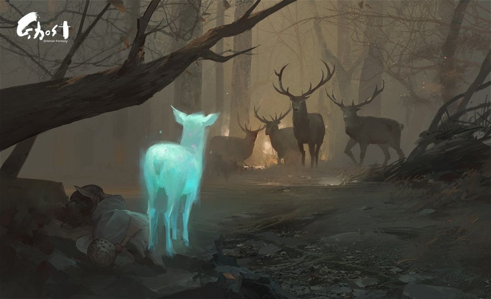
Back to controlling the eye with contrast,
An example (artstation.com/artwork/vxvxO)
What makes you look at the focal points(s)?
For this, the big ones are:
- hue
- value
- grouping
- saturation
- scale
- edges
An example (artstation.com/artwork/vxvxO)
What makes you look at the focal points(s)?
For this, the big ones are:
- hue
- value
- grouping
- saturation
- scale
- edges
January 4, 2025 at 12:07 PM
Back to controlling the eye with contrast,
An example (artstation.com/artwork/vxvxO)
What makes you look at the focal points(s)?
For this, the big ones are:
- hue
- value
- grouping
- saturation
- scale
- edges
An example (artstation.com/artwork/vxvxO)
What makes you look at the focal points(s)?
For this, the big ones are:
- hue
- value
- grouping
- saturation
- scale
- edges
Using multiple of these aspects at once is impactful, but can create stylistic dissonance.
It's worth considering what you want your overall impact to be, and locking a few aspects in. Bluey for instance locks in rounded square-ification as a shape language to keep a friendly vibe.
It's worth considering what you want your overall impact to be, and locking a few aspects in. Bluey for instance locks in rounded square-ification as a shape language to keep a friendly vibe.

January 4, 2025 at 12:07 PM
Using multiple of these aspects at once is impactful, but can create stylistic dissonance.
It's worth considering what you want your overall impact to be, and locking a few aspects in. Bluey for instance locks in rounded square-ification as a shape language to keep a friendly vibe.
It's worth considering what you want your overall impact to be, and locking a few aspects in. Bluey for instance locks in rounded square-ification as a shape language to keep a friendly vibe.
NOTE this guide neglects to mention bit-less bridles/mechanical hackamores. These look similar to an English bridle, but cross under the jaw, or have a mechanical way of applying pressure.
These specific ones are a relatively recent phenomenon at <100yo,
These specific ones are a relatively recent phenomenon at <100yo,


January 4, 2025 at 11:49 AM
NOTE this guide neglects to mention bit-less bridles/mechanical hackamores. These look similar to an English bridle, but cross under the jaw, or have a mechanical way of applying pressure.
These specific ones are a relatively recent phenomenon at <100yo,
These specific ones are a relatively recent phenomenon at <100yo,
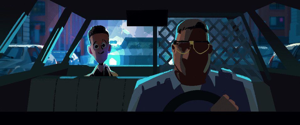
reupload from that other hellsite so it doesn't get lost.
January 4, 2025 at 11:47 AM
reupload from that other hellsite so it doesn't get lost.
It has made me super grateful for the lovely friends in my life who took me home from hospital (and supervised me) and got me groceries. (And all the more aware of how I need to make sure I’m checking in to take care of them too.)
But man, what a lonely experience it has been :(
But man, what a lonely experience it has been :(
December 8, 2024 at 6:00 AM
It has made me super grateful for the lovely friends in my life who took me home from hospital (and supervised me) and got me groceries. (And all the more aware of how I need to make sure I’m checking in to take care of them too.)
But man, what a lonely experience it has been :(
But man, what a lonely experience it has been :(
I’ve had a triple whammy of leg injury, bacterial infection that took me to the ED, and now septum surgery. I just want to be babied and not have to get my own water.
December 8, 2024 at 5:56 AM
I’ve had a triple whammy of leg injury, bacterial infection that took me to the ED, and now septum surgery. I just want to be babied and not have to get my own water.