


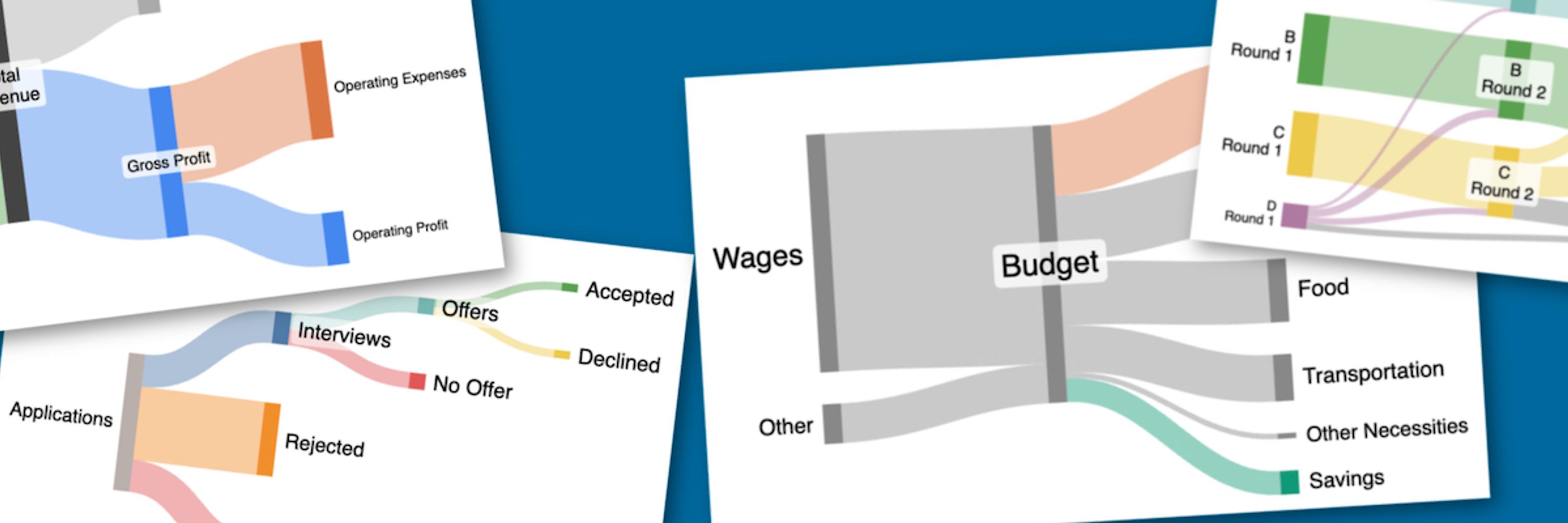

SankeyMATIC
@sankeymatic.bsky.social
Make Beautiful Flow Diagrams: https://sankeymatic.com/build/
Patreon: https://www.patreon.com/sankeymatic
Code: https://github.com/nowthis/sankeymatic
Author: @nowthis-sb.bsky.social
Mastodon: https://vis.social/@SankeyMATIC
Patreon: https://www.patreon.com/sankeymatic
Code: https://github.com/nowthis/sankeymatic
Author: @nowthis-sb.bsky.social
Mastodon: https://vis.social/@SankeyMATIC
This version of the Apple diagram shows how the discussion of the company's margin for different revenue streams can be lined up with the visible proportions for each product line.
Visit sankeymatic.com/data/apple/ to see a more interactive version & make your own variation.
Visit sankeymatic.com/data/apple/ to see a more interactive version & make your own variation.

August 3, 2025 at 1:11 AM
This version of the Apple diagram shows how the discussion of the company's margin for different revenue streams can be lined up with the visible proportions for each product line.
Visit sankeymatic.com/data/apple/ to see a more interactive version & make your own variation.
Visit sankeymatic.com/data/apple/ to see a more interactive version & make your own variation.
There's a lot going on in a diagram like this, and it may not be obvious at first glance.
That's why I'm also attaching two annotated versions.
This one specifically highlights & labels the differently-shaded Cost vs Margin sections of the Apple diagram.
That's why I'm also attaching two annotated versions.
This one specifically highlights & labels the differently-shaded Cost vs Margin sections of the Apple diagram.

August 3, 2025 at 1:06 AM
There's a lot going on in a diagram like this, and it may not be obvious at first glance.
That's why I'm also attaching two annotated versions.
This one specifically highlights & labels the differently-shaded Cost vs Margin sections of the Apple diagram.
That's why I'm also attaching two annotated versions.
This one specifically highlights & labels the differently-shaded Cost vs Margin sections of the Apple diagram.
New Apple diagram showing their latest quarterly results.
Their CFO noted costs increased $800 million because of tariffs. That's highlighted in red.
Visit sankeymatic.com/data/apple/ to see a more interactive version & to make your own variation.
#dataviz #SankeyDiagram #Apple #AAPL #earnings
Their CFO noted costs increased $800 million because of tariffs. That's highlighted in red.
Visit sankeymatic.com/data/apple/ to see a more interactive version & to make your own variation.
#dataviz #SankeyDiagram #Apple #AAPL #earnings

August 3, 2025 at 1:04 AM
New Apple diagram showing their latest quarterly results.
Their CFO noted costs increased $800 million because of tariffs. That's highlighted in red.
Visit sankeymatic.com/data/apple/ to see a more interactive version & to make your own variation.
#dataviz #SankeyDiagram #Apple #AAPL #earnings
Their CFO noted costs increased $800 million because of tariffs. That's highlighted in red.
Visit sankeymatic.com/data/apple/ to see a more interactive version & to make your own variation.
#dataviz #SankeyDiagram #Apple #AAPL #earnings
The ranked-choice results are in for the 2025 NYC Mayoral Democratic Primary.
Here's a diagram detailing how the 3 rounds went.
See an interactive version (& make your own custom variation) at sankeymatic.com/data/newyork...
#NYCMayor
#NYCMayor2025
#dataViz
#RCV
#SankeyDiagram
Here's a diagram detailing how the 3 rounds went.
See an interactive version (& make your own custom variation) at sankeymatic.com/data/newyork...
#NYCMayor
#NYCMayor2025
#dataViz
#RCV
#SankeyDiagram

July 5, 2025 at 6:37 PM
The ranked-choice results are in for the 2025 NYC Mayoral Democratic Primary.
Here's a diagram detailing how the 3 rounds went.
See an interactive version (& make your own custom variation) at sankeymatic.com/data/newyork...
#NYCMayor
#NYCMayor2025
#dataViz
#RCV
#SankeyDiagram
Here's a diagram detailing how the 3 rounds went.
See an interactive version (& make your own custom variation) at sankeymatic.com/data/newyork...
#NYCMayor
#NYCMayor2025
#dataViz
#RCV
#SankeyDiagram
In anticipation of this year’s NYC Mayoral primaries (happening now), I've put together a diagram of the *previous* Democratic primary, from 2021.
See the big version at sankeymatic.com/data/newyork...
When the 2025 results are finalized, I'll add a new diagram.
#nycmayor #nycmayor2021 #dataviz
See the big version at sankeymatic.com/data/newyork...
When the 2025 results are finalized, I'll add a new diagram.
#nycmayor #nycmayor2021 #dataviz

June 25, 2025 at 1:52 AM
In anticipation of this year’s NYC Mayoral primaries (happening now), I've put together a diagram of the *previous* Democratic primary, from 2021.
See the big version at sankeymatic.com/data/newyork...
When the 2025 results are finalized, I'll add a new diagram.
#nycmayor #nycmayor2021 #dataviz
See the big version at sankeymatic.com/data/newyork...
When the 2025 results are finalized, I'll add a new diagram.
#nycmayor #nycmayor2021 #dataviz
New on the site: Quarterly graphs for Microsoft (MSFT).
Here is Microsoft's most recent quarter vs. the same quarter a year before. Besides the $10M increase in Service revenue, the pictures are quite consistent.
See more quarters at sankeymatic.com/data/microso... #dataviz #MSFT
Here is Microsoft's most recent quarter vs. the same quarter a year before. Besides the $10M increase in Service revenue, the pictures are quite consistent.
See more quarters at sankeymatic.com/data/microso... #dataviz #MSFT


November 17, 2024 at 2:04 PM
New on the site: Quarterly graphs for Microsoft (MSFT).
Here is Microsoft's most recent quarter vs. the same quarter a year before. Besides the $10M increase in Service revenue, the pictures are quite consistent.
See more quarters at sankeymatic.com/data/microso... #dataviz #MSFT
Here is Microsoft's most recent quarter vs. the same quarter a year before. Besides the $10M increase in Service revenue, the pictures are quite consistent.
See more quarters at sankeymatic.com/data/microso... #dataviz #MSFT