


Brad T
@sammich-blt.bsky.social
Creator of @naturalstattrick.com, editor at
@silversevensens.com - Mostly hockey, mostly Ottawa.
@blt@mstdn.ca on Mastodon @sammich_blt on Twitter
@silversevensens.com - Mostly hockey, mostly Ottawa.
@blt@mstdn.ca on Mastodon @sammich_blt on Twitter
Is this a silly little "feature"?
Yep.
But it brings me HAPPINESS.
Yep.
But it brings me HAPPINESS.

November 27, 2025 at 9:29 PM
Is this a silly little "feature"?
Yep.
But it brings me HAPPINESS.
Yep.
But it brings me HAPPINESS.
Okay, yeah, pretty happy with these at this point.


November 26, 2025 at 3:06 AM
Okay, yeah, pretty happy with these at this point.
Think I'm almost there. Still need to add date labels along the x axis, deal with the "crossover" lines going from the wc window to the Metro/Pacific, and maybe tweak the colours a bit.
Then it's on to the delivery infrastructure
Then it's on to the delivery infrastructure


November 25, 2025 at 5:58 PM
Think I'm almost there. Still need to add date labels along the x axis, deal with the "crossover" lines going from the wc window to the Metro/Pacific, and maybe tweak the colours a bit.
Then it's on to the delivery infrastructure
Then it's on to the delivery infrastructure
That is last season, so you would already be dead. Here is this season, which YOU'RE FINE. Unless this is also your xray, in which case don't make plans past April.


November 18, 2025 at 10:07 PM
That is last season, so you would already be dead. Here is this season, which YOU'RE FINE. Unless this is also your xray, in which case don't make plans past April.
On to the next big question... Horizontal vs vertical, and which I can make work better in a layout.
I don't see any way around some kind of scrolling though.
I don't see any way around some kind of scrolling though.


November 18, 2025 at 9:52 PM
On to the next big question... Horizontal vs vertical, and which I can make work better in a layout.
I don't see any way around some kind of scrolling though.
I don't see any way around some kind of scrolling though.
Okay, pretty happy with the wild card version... Except a full season one is REALLY TALL.
It also takes a few minutes to generate, which is way too long
It also takes a few minutes to generate, which is way too long


November 17, 2025 at 8:20 PM
Okay, pretty happy with the wild card version... Except a full season one is REALLY TALL.
It also takes a few minutes to generate, which is way too long
It also takes a few minutes to generate, which is way too long
Wild card version almost working, just having trouble with line widths (which I thought would be the easy part).
Metro on the left, then Atlantic, then the wild card.
The one thing missing I haven't figured out how to do yet is indicate when a divisional top 3 is behind wc1/2 overall...
Metro on the left, then Atlantic, then the wild card.
The one thing missing I haven't figured out how to do yet is indicate when a divisional top 3 is behind wc1/2 overall...

November 17, 2025 at 3:27 PM
Wild card version almost working, just having trouble with line widths (which I thought would be the easy part).
Metro on the left, then Atlantic, then the wild card.
The one thing missing I haven't figured out how to do yet is indicate when a divisional top 3 is behind wc1/2 overall...
Metro on the left, then Atlantic, then the wild card.
The one thing missing I haven't figured out how to do yet is indicate when a divisional top 3 is behind wc1/2 overall...
The second worst person you know is picking a fight with the worst person you know

November 16, 2025 at 4:19 PM
The second worst person you know is picking a fight with the worst person you know
I think I prefer the feel of vertical, but horizontal might be more intuitive?

November 15, 2025 at 2:23 AM
I think I prefer the feel of vertical, but horizontal might be more intuitive?
(combined) line width and line spacing now always equals one point, which will work much better later in the season when the gap between first and Buff... last place gets wider.
Also got rid of all the jaggies that you probably didn't notice but I couldn't un-see.
Also got rid of all the jaggies that you probably didn't notice but I couldn't un-see.

November 15, 2025 at 2:05 AM
(combined) line width and line spacing now always equals one point, which will work much better later in the season when the gap between first and Buff... last place gets wider.
Also got rid of all the jaggies that you probably didn't notice but I couldn't un-see.
Also got rid of all the jaggies that you probably didn't notice but I couldn't un-see.
Kinda hope they leaned into it and played "I want to drive the zamboni" over the PA while the plows were clearing the porch for extra time

November 10, 2025 at 9:26 PM
Kinda hope they leaned into it and played "I want to drive the zamboni" over the PA while the plows were clearing the porch for extra time
Maybe when you isolate one team... You kinda lose the ability to easily tell where they rank though

November 10, 2025 at 2:55 PM
Maybe when you isolate one team... You kinda lose the ability to easily tell where they rank though
This is why you don't use team colours for these things. So much red, so much blue.

November 10, 2025 at 2:53 PM
This is why you don't use team colours for these things. So much red, so much blue.
Still some work to do to make sure everything lines up well, but it's coming together nicely.

November 8, 2025 at 12:00 AM
Still some work to do to make sure everything lines up well, but it's coming together nicely.
Blending the tied lines ended up being way easier than I was expecting.
Next up, the 14-15 Sabres problem. Where they were so bad they'll skew the scale and start pushing together lines of teams that weren't tied
Next up, the 14-15 Sabres problem. Where they were so bad they'll skew the scale and start pushing together lines of teams that weren't tied


November 7, 2025 at 5:02 PM
Blending the tied lines ended up being way easier than I was expecting.
Next up, the 14-15 Sabres problem. Where they were so bad they'll skew the scale and start pushing together lines of teams that weren't tied
Next up, the 14-15 Sabres problem. Where they were so bad they'll skew the scale and start pushing together lines of teams that weren't tied
As a rough draft, I'm happy wth the technical side of this. But ooooh boy does it need a whole lot of polish
(eastern conference standings, vertically by day with the oldest at the top, horizontally by point gap & tiebreakers)
(eastern conference standings, vertically by day with the oldest at the top, horizontally by point gap & tiebreakers)

November 7, 2025 at 2:58 PM
As a rough draft, I'm happy wth the technical side of this. But ooooh boy does it need a whole lot of polish
(eastern conference standings, vertically by day with the oldest at the top, horizontally by point gap & tiebreakers)
(eastern conference standings, vertically by day with the oldest at the top, horizontally by point gap & tiebreakers)
The one singular piece of baseball memorabilia I have

November 2, 2025 at 3:23 AM
The one singular piece of baseball memorabilia I have
There's also something going on where xGA/60 and CA/60 are largely in sync to start, but then xGA/60 spikes way more as the play drags on (regardless of which zone the faceoff was in)


October 23, 2025 at 3:33 PM
There's also something going on where xGA/60 and CA/60 are largely in sync to start, but then xGA/60 spikes way more as the play drags on (regardless of which zone the faceoff was in)
The gap in "quantity" vs "quality" for the Sens production when Jensen is on the ice for an OZ faceoff so far this season is astoundingly bad
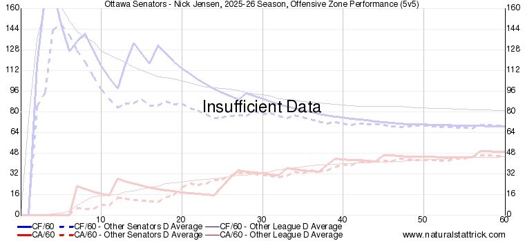

October 23, 2025 at 3:20 PM
The gap in "quantity" vs "quality" for the Sens production when Jensen is on the ice for an OZ faceoff so far this season is astoundingly bad
Na-na na-na na-na na-na
Na-na na-na na-na na-na
Na-na na-na na-na na-na

October 15, 2025 at 3:08 PM
Na-na na-na na-na na-na
Na-na na-na na-na na-na
Na-na na-na na-na na-na
They're eaaaarlyyyy

September 11, 2025 at 11:14 PM
They're eaaaarlyyyy
The eagle eyed among you may have noticed the slightly different font and... NO OF COURSE THAT'S NOT THE MAIN DIFFERENCE.
The old one is a generated image, the new one is pure HTML and css. Throw in a bit of JavaScript and you can do some fun stuff with it.
The old one is a generated image, the new one is pure HTML and css. Throw in a bit of JavaScript and you can do some fun stuff with it.

August 26, 2025 at 5:31 PM
The eagle eyed among you may have noticed the slightly different font and... NO OF COURSE THAT'S NOT THE MAIN DIFFERENCE.
The old one is a generated image, the new one is pure HTML and css. Throw in a bit of JavaScript and you can do some fun stuff with it.
The old one is a generated image, the new one is pure HTML and css. Throw in a bit of JavaScript and you can do some fun stuff with it.
Hahaha, yes! The joy of getting something working just right.
Existing shift charts vs new shift charts
Existing shift charts vs new shift charts


August 26, 2025 at 5:26 PM
Hahaha, yes! The joy of getting something working just right.
Existing shift charts vs new shift charts
Existing shift charts vs new shift charts

Uh, I think this means all of the bad guys have respawned?

July 13, 2025 at 3:02 AM
Uh, I think this means all of the bad guys have respawned?