


Sabri Hakuli
@sabrihakuli.bsky.social
Founding Designer & Strategic Product Consultant. 🇽🇰🇦🇱 - UI/UX Designer @Publer.io
Pinned
Sabri Hakuli
@sabrihakuli.bsky.social
· Nov 12

Sabri Hakuli - Your Design Partner
Dedicated to delivering personalized UI/UX and web design solutions, prioritizing each project to ensure your success. Unlike large companies, offer focused attention and commitment.
sabrihakuli.com
My new portfolio is out now!
It reflects my journey, experience, and what I bring to the table as a designer. Take a look and let me know your thoughts.
sabrihakuli.com/
It reflects my journey, experience, and what I bring to the table as a designer. Take a look and let me know your thoughts.
sabrihakuli.com/
Recently, I’ve been switching back to light mode.
In the pic: Designinf Publer Threads
In the pic: Designinf Publer Threads

December 19, 2025 at 12:01 PM
Recently, I’ve been switching back to light mode.
In the pic: Designinf Publer Threads
In the pic: Designinf Publer Threads
This is because products should look alike.
Familiar patterns reduce thinking.
If users do not recognize how your product works, they won’t learn it, they will quit!
Familiar patterns reduce thinking.
If users do not recognize how your product works, they won’t learn it, they will quit!

December 16, 2025 at 1:01 PM
This is because products should look alike.
Familiar patterns reduce thinking.
If users do not recognize how your product works, they won’t learn it, they will quit!
Familiar patterns reduce thinking.
If users do not recognize how your product works, they won’t learn it, they will quit!
If you’re still on WordPress, you should be planning your migration ASAP.
Most “cheap” WordPress websites end up being the most expensive ones.
Plugins everywhere.
Updates that break everything.
Small changes that suddenly need a developer.
We’ve built the entire Publer website in Framer.
Most “cheap” WordPress websites end up being the most expensive ones.
Plugins everywhere.
Updates that break everything.
Small changes that suddenly need a developer.
We’ve built the entire Publer website in Framer.

December 15, 2025 at 12:30 PM
If you’re still on WordPress, you should be planning your migration ASAP.
Most “cheap” WordPress websites end up being the most expensive ones.
Plugins everywhere.
Updates that break everything.
Small changes that suddenly need a developer.
We’ve built the entire Publer website in Framer.
Most “cheap” WordPress websites end up being the most expensive ones.
Plugins everywhere.
Updates that break everything.
Small changes that suddenly need a developer.
We’ve built the entire Publer website in Framer.
I don’t work with “revision limits.”
Work isn’t done when the revision counter hits zero
𝗠𝘆 𝗽𝗿𝗼𝗰𝗲𝘀𝘀 𝗶𝘀 𝘀𝗶𝗺𝗽𝗹𝗲:
👉 I design until I believe the design is good
👉 The client gives feedback until they have nothing left to add
👉We stop only when the design deserves to be shipped
𝘯𝘰𝘵 𝘸𝘩𝘦𝘯 𝘵𝘩𝘦 𝘤𝘰𝘯𝘵𝘳𝘢𝘤𝘵
Work isn’t done when the revision counter hits zero
𝗠𝘆 𝗽𝗿𝗼𝗰𝗲𝘀𝘀 𝗶𝘀 𝘀𝗶𝗺𝗽𝗹𝗲:
👉 I design until I believe the design is good
👉 The client gives feedback until they have nothing left to add
👉We stop only when the design deserves to be shipped
𝘯𝘰𝘵 𝘸𝘩𝘦𝘯 𝘵𝘩𝘦 𝘤𝘰𝘯𝘵𝘳𝘢𝘤𝘵
December 11, 2025 at 11:14 AM
I don’t work with “revision limits.”
Work isn’t done when the revision counter hits zero
𝗠𝘆 𝗽𝗿𝗼𝗰𝗲𝘀𝘀 𝗶𝘀 𝘀𝗶𝗺𝗽𝗹𝗲:
👉 I design until I believe the design is good
👉 The client gives feedback until they have nothing left to add
👉We stop only when the design deserves to be shipped
𝘯𝘰𝘵 𝘸𝘩𝘦𝘯 𝘵𝘩𝘦 𝘤𝘰𝘯𝘵𝘳𝘢𝘤𝘵
Work isn’t done when the revision counter hits zero
𝗠𝘆 𝗽𝗿𝗼𝗰𝗲𝘀𝘀 𝗶𝘀 𝘀𝗶𝗺𝗽𝗹𝗲:
👉 I design until I believe the design is good
👉 The client gives feedback until they have nothing left to add
👉We stop only when the design deserves to be shipped
𝘯𝘰𝘵 𝘸𝘩𝘦𝘯 𝘵𝘩𝘦 𝘤𝘰𝘯𝘵𝘳𝘢𝘤𝘵
I recorded a quick clip editing the new Multi Linkie section on the Linkie landing page.
This is why we switched everything to Framer:
the marketing team can jump in, update text, swap images, tweak layout, all without waiting for developers.
Faster updates. Less back-and-forth. Days saved.
This is why we switched everything to Framer:
the marketing team can jump in, update text, swap images, tweak layout, all without waiting for developers.
Faster updates. Less back-and-forth. Days saved.
December 10, 2025 at 12:00 PM
I recorded a quick clip editing the new Multi Linkie section on the Linkie landing page.
This is why we switched everything to Framer:
the marketing team can jump in, update text, swap images, tweak layout, all without waiting for developers.
Faster updates. Less back-and-forth. Days saved.
This is why we switched everything to Framer:
the marketing team can jump in, update text, swap images, tweak layout, all without waiting for developers.
Faster updates. Less back-and-forth. Days saved.
Small update in my portfolio today.
I removed the email
Why?
Everybody contacted me either thru Social Media or somehow found my Whatsapp Number
They want 30 minutes face-to-face to see if we click.
sabrihakuli.com
Faster for them, faster for me, fewer back-and-forths.
One click → we talk
I removed the email
Why?
Everybody contacted me either thru Social Media or somehow found my Whatsapp Number
They want 30 minutes face-to-face to see if we click.
sabrihakuli.com
Faster for them, faster for me, fewer back-and-forths.
One click → we talk

December 5, 2025 at 12:01 PM
Small update in my portfolio today.
I removed the email
Why?
Everybody contacted me either thru Social Media or somehow found my Whatsapp Number
They want 30 minutes face-to-face to see if we click.
sabrihakuli.com
Faster for them, faster for me, fewer back-and-forths.
One click → we talk
I removed the email
Why?
Everybody contacted me either thru Social Media or somehow found my Whatsapp Number
They want 30 minutes face-to-face to see if we click.
sabrihakuli.com
Faster for them, faster for me, fewer back-and-forths.
One click → we talk
Most teams focus on two roles: the one who sells and the one who builds.
In 2025, that’s not enough.
AI leveled the field.
What sets products apart now is design — the person who shapes how it feels and how people use it.
Same tools. Same models.
Taste is the real edge.
In 2025, that’s not enough.
AI leveled the field.
What sets products apart now is design — the person who shapes how it feels and how people use it.
Same tools. Same models.
Taste is the real edge.

December 3, 2025 at 12:01 PM
Most teams focus on two roles: the one who sells and the one who builds.
In 2025, that’s not enough.
AI leveled the field.
What sets products apart now is design — the person who shapes how it feels and how people use it.
Same tools. Same models.
Taste is the real edge.
In 2025, that’s not enough.
AI leveled the field.
What sets products apart now is design — the person who shapes how it feels and how people use it.
Same tools. Same models.
Taste is the real edge.
Clean, predictable, and boring — exactly how it should be.


November 17, 2025 at 4:01 PM
Clean, predictable, and boring — exactly how it should be.
You can’t hire a graphic designer and expect a full website.
You can’t hire a UI/UX designer and expect motion videos.
Design isn’t one big soup of “creativity.” It’s made of specialties, each with their own skills, mindset, and tools.
You can’t hire a UI/UX designer and expect motion videos.
Design isn’t one big soup of “creativity.” It’s made of specialties, each with their own skills, mindset, and tools.
November 14, 2025 at 10:17 PM
You can’t hire a graphic designer and expect a full website.
You can’t hire a UI/UX designer and expect motion videos.
Design isn’t one big soup of “creativity.” It’s made of specialties, each with their own skills, mindset, and tools.
You can’t hire a UI/UX designer and expect motion videos.
Design isn’t one big soup of “creativity.” It’s made of specialties, each with their own skills, mindset, and tools.
A link cant be styled like a button and expect users to magically understand what it does.
Buttons do something.
Links go somewhere.
Different roles, different expectations, different behaviors.
Breaking this rule users will get confused, miss clicks, or get lost in the interface.
If a screen rea
Buttons do something.
Links go somewhere.
Different roles, different expectations, different behaviors.
Breaking this rule users will get confused, miss clicks, or get lost in the interface.
If a screen rea

November 14, 2025 at 9:30 AM
A link cant be styled like a button and expect users to magically understand what it does.
Buttons do something.
Links go somewhere.
Different roles, different expectations, different behaviors.
Breaking this rule users will get confused, miss clicks, or get lost in the interface.
If a screen rea
Buttons do something.
Links go somewhere.
Different roles, different expectations, different behaviors.
Breaking this rule users will get confused, miss clicks, or get lost in the interface.
If a screen rea
Why Red Buttons Convert Better And Sometimes Destroy UX
1. 🔵 Blue buttons
Blue buttons tend to outperform every other color in conversion tests. They whisper trust me.
That’s why they dominate in finance, tech, and healthcare.
It’s not urgency that drives clicks here, it’s confidence.
People click
1. 🔵 Blue buttons
Blue buttons tend to outperform every other color in conversion tests. They whisper trust me.
That’s why they dominate in finance, tech, and healthcare.
It’s not urgency that drives clicks here, it’s confidence.
People click

November 11, 2025 at 12:01 PM
Why Red Buttons Convert Better And Sometimes Destroy UX
1. 🔵 Blue buttons
Blue buttons tend to outperform every other color in conversion tests. They whisper trust me.
That’s why they dominate in finance, tech, and healthcare.
It’s not urgency that drives clicks here, it’s confidence.
People click
1. 🔵 Blue buttons
Blue buttons tend to outperform every other color in conversion tests. They whisper trust me.
That’s why they dominate in finance, tech, and healthcare.
It’s not urgency that drives clicks here, it’s confidence.
People click
Design is in details 🧩

November 5, 2025 at 12:01 PM
Design is in details 🧩
When a drawer holds a lot of information, readability drops fast.
After testing, I grouped related items under clear sections.
Now (right), users can scan faster, understand context instantly, and spend less cognitive effort parsing data.
Small structure change -> big usability win. 🧠✨
After testing, I grouped related items under clear sections.
Now (right), users can scan faster, understand context instantly, and spend less cognitive effort parsing data.
Small structure change -> big usability win. 🧠✨

November 4, 2025 at 12:01 PM
When a drawer holds a lot of information, readability drops fast.
After testing, I grouped related items under clear sections.
Now (right), users can scan faster, understand context instantly, and spend less cognitive effort parsing data.
Small structure change -> big usability win. 🧠✨
After testing, I grouped related items under clear sections.
Now (right), users can scan faster, understand context instantly, and spend less cognitive effort parsing data.
Small structure change -> big usability win. 🧠✨
Gave Publer an iOS-style icon refresh - soft glass, smooth gradients, dock-ready. 😎


October 31, 2025 at 10:20 AM
Gave Publer an iOS-style icon refresh - soft glass, smooth gradients, dock-ready. 😎
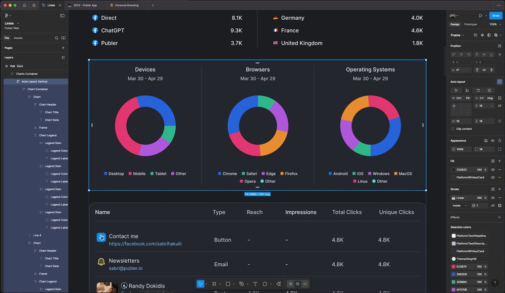
Complex stacked bar chart

October 22, 2025 at 11:40 AM
Complex stacked bar chart
🔐 Account Management UI


September 6, 2025 at 2:00 PM
🔐 Account Management UI
When the options can only be true or false, enabled or disabled, 1 or 2. Which toggle selector is the right one?
The wrong choice can confuse users the right one feels effortless.
The wrong choice can confuse users the right one feels effortless.

September 5, 2025 at 11:00 AM
When the options can only be true or false, enabled or disabled, 1 or 2. Which toggle selector is the right one?
The wrong choice can confuse users the right one feels effortless.
The wrong choice can confuse users the right one feels effortless.
Solve this UX Challange

September 4, 2025 at 11:01 AM
Solve this UX Challange
Adding a search bar inside the dropdown makes it effortless to jump straight to the right option. It saves time and creates a smoother experience for everyone.
It’s a small UX detail, but it makes a huge difference when scale meets usability.
It’s a small UX detail, but it makes a huge difference when scale meets usability.

September 3, 2025 at 11:01 AM
Adding a search bar inside the dropdown makes it effortless to jump straight to the right option. It saves time and creates a smoother experience for everyone.
It’s a small UX detail, but it makes a huge difference when scale meets usability.
It’s a small UX detail, but it makes a huge difference when scale meets usability.
Design is in the details.
This dropdown isn’t just "black with a shadow." It’s carefully crafted to feel like a floating, focused component and not a flat box.
And yes, all of this for a component that disappears when you click outside of it.
This is where UX hides
This dropdown isn’t just "black with a shadow." It’s carefully crafted to feel like a floating, focused component and not a flat box.
And yes, all of this for a component that disappears when you click outside of it.
This is where UX hides

August 18, 2025 at 11:01 AM
Design is in the details.
This dropdown isn’t just "black with a shadow." It’s carefully crafted to feel like a floating, focused component and not a flat box.
And yes, all of this for a component that disappears when you click outside of it.
This is where UX hides
This dropdown isn’t just "black with a shadow." It’s carefully crafted to feel like a floating, focused component and not a flat box.
And yes, all of this for a component that disappears when you click outside of it.
This is where UX hides
While working on a recent project, I started using "dark" dropdowns/popups.
Here’s why:
✅ It follows the “popover” visual language.
Floating layers should feel separate from the main UI.
A darker tone makes it clear: this is a temporary action, not permanent content.
✅ It increases focus.
The dro
Here’s why:
✅ It follows the “popover” visual language.
Floating layers should feel separate from the main UI.
A darker tone makes it clear: this is a temporary action, not permanent content.
✅ It increases focus.
The dro

August 15, 2025 at 11:00 AM
While working on a recent project, I started using "dark" dropdowns/popups.
Here’s why:
✅ It follows the “popover” visual language.
Floating layers should feel separate from the main UI.
A darker tone makes it clear: this is a temporary action, not permanent content.
✅ It increases focus.
The dro
Here’s why:
✅ It follows the “popover” visual language.
Floating layers should feel separate from the main UI.
A darker tone makes it clear: this is a temporary action, not permanent content.
✅ It increases focus.
The dro
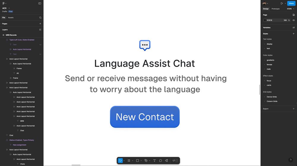
🤌 Took the @theiconicapp icon and shaped it into a tiny logo for the Language Assist Chat feature.
August 6, 2025 at 10:01 AM
🤌 Took the @theiconicapp icon and shaped it into a tiny logo for the Language Assist Chat feature.
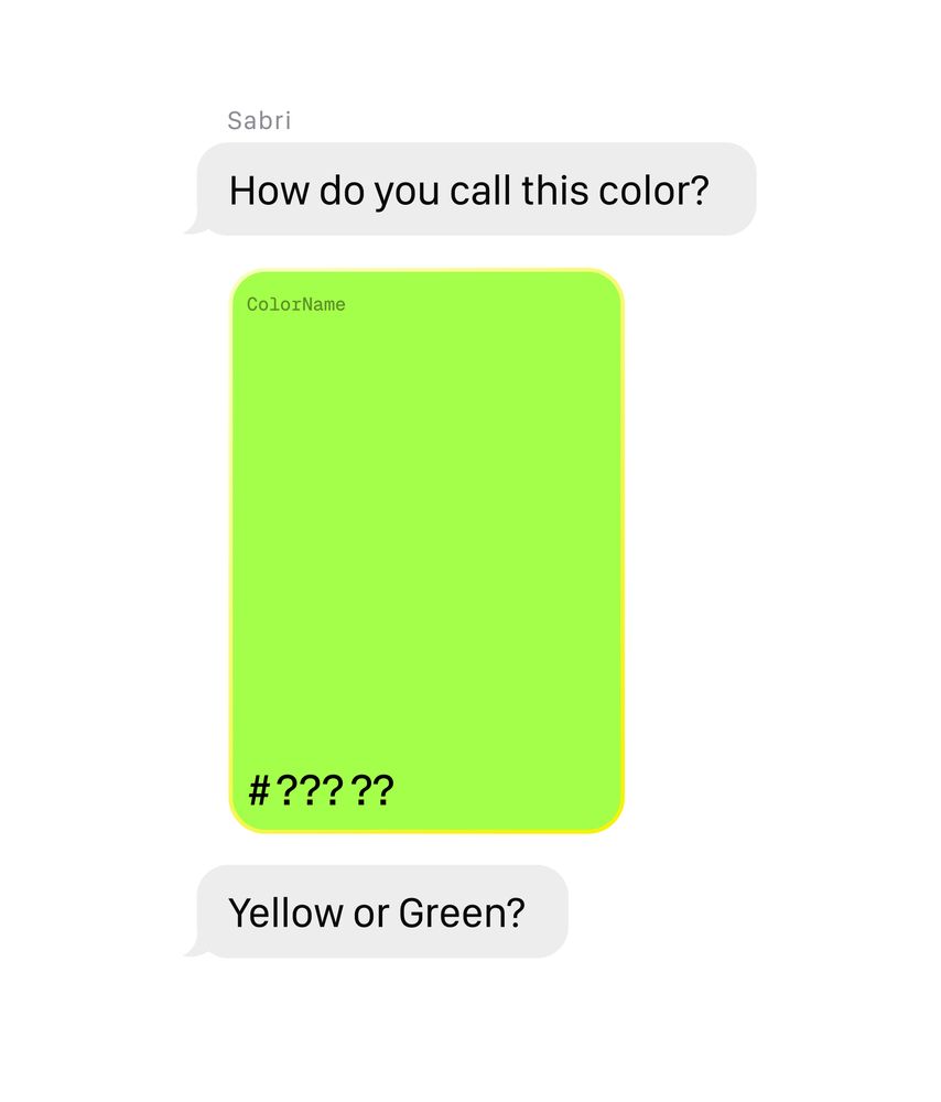
What color is this?
August 1, 2025 at 11:00 AM
What color is this?