


Riley Cran
@rileycran.bsky.social
Designer / Developer | I make fonts at Lettermatic | 🔠 He/Him 🔤
Lettermatic.com
Lettermatic.com
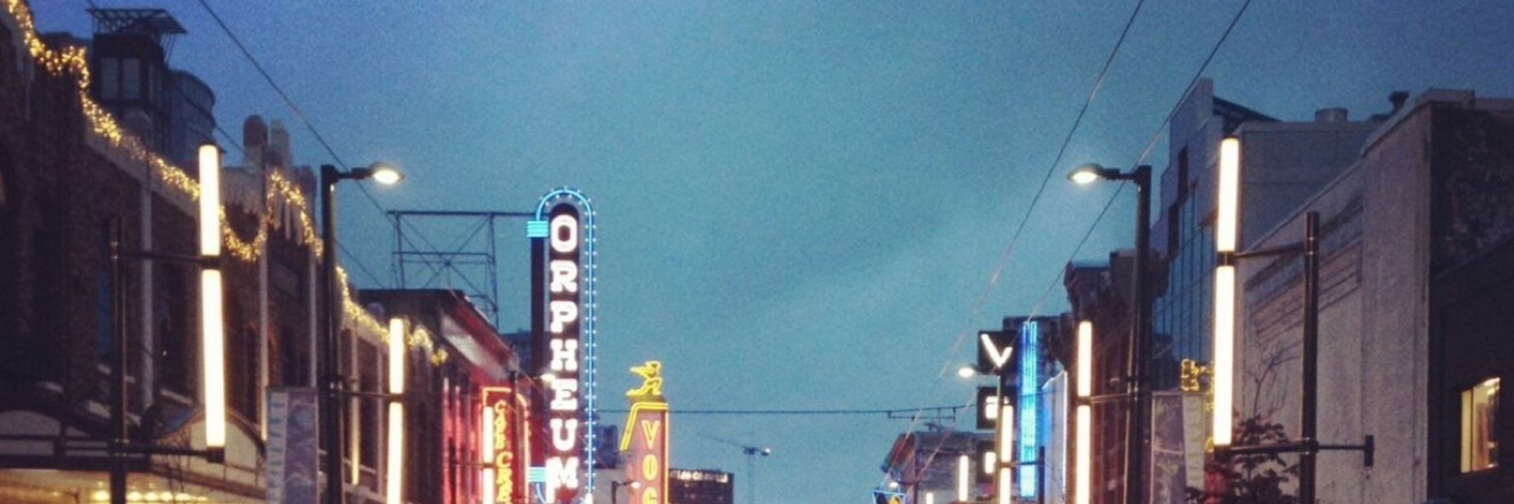
Alex Toth was so good at drawing spaceships. From the book ‘Genius Animated’. Cc @thespaceshipper.com


September 6, 2025 at 2:23 AM
Alex Toth was so good at drawing spaceships. From the book ‘Genius Animated’. Cc @thespaceshipper.com
Please enjoy this charming story of Bill being convinced to add rounded rectangles to the Macintosh graphics libraries.
Also please note that his process was documented with a Polaroid camera because the ‘screenshot’ had not yet been invented.
www.folklore.org/Round_Rects_...
Also please note that his process was documented with a Polaroid camera because the ‘screenshot’ had not yet been invented.
www.folklore.org/Round_Rects_...

June 8, 2025 at 3:29 PM
Please enjoy this charming story of Bill being convinced to add rounded rectangles to the Macintosh graphics libraries.
Also please note that his process was documented with a Polaroid camera because the ‘screenshot’ had not yet been invented.
www.folklore.org/Round_Rects_...
Also please note that his process was documented with a Polaroid camera because the ‘screenshot’ had not yet been invented.
www.folklore.org/Round_Rects_...
This typographic vibe really had the 1990s in a stranglehold (two of these being Bodega Sans).


May 26, 2025 at 9:29 PM
This typographic vibe really had the 1990s in a stranglehold (two of these being Bodega Sans).
Explore the design process behind two new type families, WeGo Serif and WeGo Sans for Fetch:
lettermatic.com/custom/fetch...
🔤🔠
lettermatic.com/custom/fetch...
🔤🔠

March 10, 2025 at 3:23 PM
Explore the design process behind two new type families, WeGo Serif and WeGo Sans for Fetch:
lettermatic.com/custom/fetch...
🔤🔠
lettermatic.com/custom/fetch...
🔤🔠
The swashes in WeGo Serif also have smart OpenType settings which auto-magically choose the best swash combinations on the fly.
Read more about the design process here:
lettermatic.com/custom/fetch...
Read more about the design process here:
lettermatic.com/custom/fetch...
March 7, 2025 at 3:26 PM
The swashes in WeGo Serif also have smart OpenType settings which auto-magically choose the best swash combinations on the fly.
Read more about the design process here:
lettermatic.com/custom/fetch...
Read more about the design process here:
lettermatic.com/custom/fetch...
The team at Lettermatic designed two custom families of type (a serif and a sans) for Fetch. 🔤
lettermatic.com/custom/fetch...
lettermatic.com/custom/fetch...

March 6, 2025 at 5:48 PM
The team at Lettermatic designed two custom families of type (a serif and a sans) for Fetch. 🔤
lettermatic.com/custom/fetch...
lettermatic.com/custom/fetch...
New Work: Fonts for Fetch. 🔡 🐕 🔠
We made a custom type system comprised of a workhorse sans and friendly serif for one of the most popular shopping apps in the USA. Read the full case study here:
lettermatic.com/custom/fetch...
We made a custom type system comprised of a workhorse sans and friendly serif for one of the most popular shopping apps in the USA. Read the full case study here:
lettermatic.com/custom/fetch...
March 6, 2025 at 3:58 PM
New Work: Fonts for Fetch. 🔡 🐕 🔠
We made a custom type system comprised of a workhorse sans and friendly serif for one of the most popular shopping apps in the USA. Read the full case study here:
lettermatic.com/custom/fetch...
We made a custom type system comprised of a workhorse sans and friendly serif for one of the most popular shopping apps in the USA. Read the full case study here:
lettermatic.com/custom/fetch...
Music theory, in comparison, is a sprawling complicated system that seems to strive to document what we perceive to be beautiful, pleasant music.

February 25, 2025 at 12:35 AM
Music theory, in comparison, is a sprawling complicated system that seems to strive to document what we perceive to be beautiful, pleasant music.
For instance, chess has relatively few rules (most of which are often explained in a single sitting), but chess players are still playing never-before-seen games 1500 years later.

February 25, 2025 at 12:35 AM
For instance, chess has relatively few rules (most of which are often explained in a single sitting), but chess players are still playing never-before-seen games 1500 years later.
Typeface design strikes me as working this same way. We have an instinct to make the letters rationally similar, and develop a ‘simple system’ for how they are assembled. But we’ve learned over time that it takes a more complicated system to make a typeface feel ‘simple’ to read.

February 25, 2025 at 12:35 AM
Typeface design strikes me as working this same way. We have an instinct to make the letters rationally similar, and develop a ‘simple system’ for how they are assembled. But we’ve learned over time that it takes a more complicated system to make a typeface feel ‘simple’ to read.
I think there is something to be said about the word ‘simple.’ I sense that many designers share this ambition to make their work ‘simple to perceive.’ Easy to understand.
February 25, 2025 at 12:35 AM
I think there is something to be said about the word ‘simple.’ I sense that many designers share this ambition to make their work ‘simple to perceive.’ Easy to understand.
One way to visualize the importance of counterforms is a 'blur test.' Adrian Frutiger did tests like this in the 1970s when designing his eponymous typeface (originally for a French airport). See how one set of drawings is easier to distinguish, in these harsh conditions of blur?
February 25, 2025 at 12:35 AM
One way to visualize the importance of counterforms is a 'blur test.' Adrian Frutiger did tests like this in the 1970s when designing his eponymous typeface (originally for a French airport). See how one set of drawings is easier to distinguish, in these harsh conditions of blur?
If so, perhaps the reason was the disambiguation of counterforms. The less similar the 'c' counterform is to an 'o' counterform, the faster it may be discovered in context. Here's how that detail is handled in Really Sans.
February 25, 2025 at 12:27 AM
If so, perhaps the reason was the disambiguation of counterforms. The less similar the 'c' counterform is to an 'o' counterform, the faster it may be discovered in context. Here's how that detail is handled in Really Sans.
For comparison — where are the ‘c’s in this image? Were they easier to find?

February 25, 2025 at 12:27 AM
For comparison — where are the ‘c’s in this image? Were they easier to find?
We call this 'disambiguation.’ As an example — try finding the 'c's amongst the 'o's in this image.

February 25, 2025 at 12:27 AM
We call this 'disambiguation.’ As an example — try finding the 'c's amongst the 'o's in this image.
Many typefaces have a rational construction that tries to make the counterforms as similar (in their shape) to each other as possible. This makes rational sense, but it turns out that it doesn’t produce the most pleasant result for reading.
February 25, 2025 at 12:26 AM
Many typefaces have a rational construction that tries to make the counterforms as similar (in their shape) to each other as possible. This makes rational sense, but it turns out that it doesn’t produce the most pleasant result for reading.
Another simple exercise: pixel fonts. When you have such little material to work with, how do you draw an irrefutable ‘s’ or ‘e’? If the letters shown here are successful, perhaps it is because of their ‘counter pixels’, and the balance in their positive and negative space.

February 25, 2025 at 12:26 AM
Another simple exercise: pixel fonts. When you have such little material to work with, how do you draw an irrefutable ‘s’ or ‘e’? If the letters shown here are successful, perhaps it is because of their ‘counter pixels’, and the balance in their positive and negative space.
A balanced word will typically be made of letters where the counterforms are approximately equal in their overall mass or volume. I've sometimes pictured it as candle wax; if I melted these counters down, would they each be about the same amount of wax?
February 25, 2025 at 12:26 AM
A balanced word will typically be made of letters where the counterforms are approximately equal in their overall mass or volume. I've sometimes pictured it as candle wax; if I melted these counters down, would they each be about the same amount of wax?
By drawing different counter shapes, I can make many letters appear without changing the positive shape at all. This is shown here to illustrate the importance of the counterforms, and how they impact our perception of letter shapes.
February 25, 2025 at 12:24 AM
By drawing different counter shapes, I can make many letters appear without changing the positive shape at all. This is shown here to illustrate the importance of the counterforms, and how they impact our perception of letter shapes.
For this reason, lowercase letters tend to get taller as they get bolder, so the counterforms can combat that 'wrong height' illusion. Here's that effect at work in Really Sans.

February 25, 2025 at 12:24 AM
For this reason, lowercase letters tend to get taller as they get bolder, so the counterforms can combat that 'wrong height' illusion. Here's that effect at work in Really Sans.
Then some illusions come into play. You would swear the lighter letter was larger, right? Even though they use the exact same positive shape?

February 25, 2025 at 12:24 AM
Then some illusions come into play. You would swear the lighter letter was larger, right? Even though they use the exact same positive shape?
I can make a very light-weight letter by allowing the negative shapes to be as large as possible.

February 25, 2025 at 12:24 AM
I can make a very light-weight letter by allowing the negative shapes to be as large as possible.
What does it mean to make a 'bold' letter? Perhaps I can make this letter bolder without changing the positive shape at all — I can just reduce the size of the negative shapes.

February 25, 2025 at 12:22 AM
What does it mean to make a 'bold' letter? Perhaps I can make this letter bolder without changing the positive shape at all — I can just reduce the size of the negative shapes.
Using the same positive shape, I can subtract some counterforms and turn it into a lowercase 'a.'
February 25, 2025 at 12:22 AM
Using the same positive shape, I can subtract some counterforms and turn it into a lowercase 'a.'
It turns out subtraction is the quickest way. It's relatively simple; subtracting these two negative 'counterforms' or 'counters' from our positive shape has made this an 's.' Our brain wants to see the 's' here, based on the previous reading we've done in our lives.
February 25, 2025 at 12:22 AM
It turns out subtraction is the quickest way. It's relatively simple; subtracting these two negative 'counterforms' or 'counters' from our positive shape has made this an 's.' Our brain wants to see the 's' here, based on the previous reading we've done in our lives.