


@past-and-future.bsky.social
"You don't have to count them, just enjoy them one by one."
I like to do both! (I share #PhishPlots ⭕️ 📊)
Remember: Analyzing Phish stats does not change anyone's enjoyment of the art, don't take it too seriously (I don't, and I spend the time to do it!)
I like to do both! (I share #PhishPlots ⭕️ 📊)
Remember: Analyzing Phish stats does not change anyone's enjoyment of the art, don't take it too seriously (I don't, and I spend the time to do it!)
I've been playing around with a new Phish plot, one that shows gap (# shows since last time played) info ... this has show on x-axis (this is first part of Fall '95 tour) with median (⚫), mean (🟥), and max gap (number) ... it's a lot of info, but it's not intuitive to glance at and learn something

October 1, 2025 at 9:45 PM
I've been playing around with a new Phish plot, one that shows gap (# shows since last time played) info ... this has show on x-axis (this is first part of Fall '95 tour) with median (⚫), mean (🟥), and max gap (number) ... it's a lot of info, but it's not intuitive to glance at and learn something
and visualized as 'box and whisker' plots ... bold horizontal line in middle of colored boxes is the median value, box extents are the interquartile range, and outliers shown as dots

September 2, 2025 at 8:27 PM
and visualized as 'box and whisker' plots ... bold horizontal line in middle of colored boxes is the median value, box extents are the interquartile range, and outliers shown as dots
here ya go ... I did this very quickly

September 2, 2025 at 8:22 PM
here ya go ... I did this very quickly
plot of duration/length (in minutes, vertical axis) over time (horizontal axis) with the HF Pod Mt. Rushmore candidate performances in orange
just for fun ... maybe it provides some context for the discussion 📈🤓
just for fun ... maybe it provides some context for the discussion 📈🤓

September 2, 2025 at 2:59 PM
plot of duration/length (in minutes, vertical axis) over time (horizontal axis) with the HF Pod Mt. Rushmore candidate performances in orange
just for fun ... maybe it provides some context for the discussion 📈🤓
just for fun ... maybe it provides some context for the discussion 📈🤓
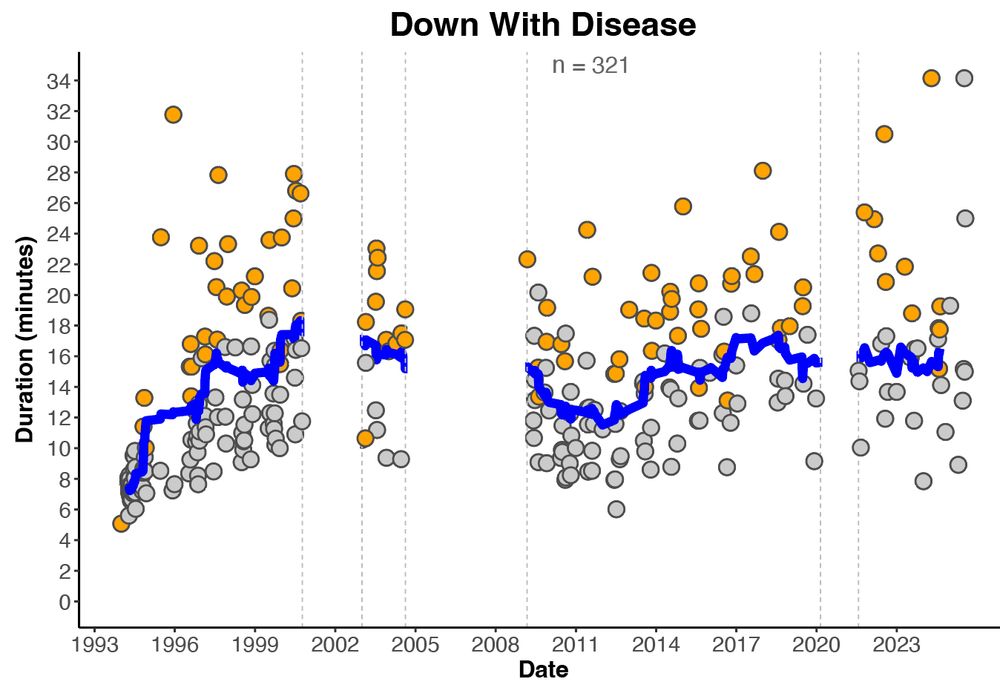
playing around w/ the look of my song-duration plots on this Friday afternoon ... this iteration (using Disease as an example) has 'jamchart' versions in orange ... potentially useful (?)
perhaps unsurprisingly, almost all jamchart versions are longer than the moving average (blue line) #PhishPlots
perhaps unsurprisingly, almost all jamchart versions are longer than the moving average (blue line) #PhishPlots
August 15, 2025 at 8:09 PM
playing around w/ the look of my song-duration plots on this Friday afternoon ... this iteration (using Disease as an example) has 'jamchart' versions in orange ... potentially useful (?)
perhaps unsurprisingly, almost all jamchart versions are longer than the moving average (blue line) #PhishPlots
perhaps unsurprisingly, almost all jamchart versions are longer than the moving average (blue line) #PhishPlots
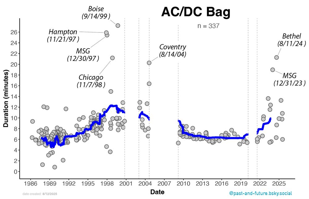
to go with @hfpod.bsky.social's discussion of AC/DC Bag today, here's a plot of the duration of AC/DC Bags through time w/ some of the longer ones annotated (blue line is a 20-point moving average, just to help see any trends) #PhishPlots
check out the uptick in length in 4.0 (compared to 3.0)
check out the uptick in length in 4.0 (compared to 3.0)
August 12, 2025 at 7:01 PM
to go with @hfpod.bsky.social's discussion of AC/DC Bag today, here's a plot of the duration of AC/DC Bags through time w/ some of the longer ones annotated (blue line is a 20-point moving average, just to help see any trends) #PhishPlots
check out the uptick in length in 4.0 (compared to 3.0)
check out the uptick in length in 4.0 (compared to 3.0)
me when I ask myself "Should I stop listening to the SPAC shows?"
August 11, 2025 at 8:04 PM
me when I ask myself "Should I stop listening to the SPAC shows?"
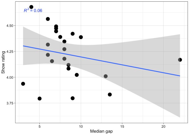
and, finally ... I computed the median gap after removing outliers (defined as values outside of 2 standard deviations, a common approach) ... just a smidge better than above
none of this really matters, it's just nerdy fun ... if you all keep proposing these ideas on the pod I'll do more of this
none of this really matters, it's just nerdy fun ... if you all keep proposing these ideas on the pod I'll do more of this
August 8, 2025 at 6:58 PM
and, finally ... I computed the median gap after removing outliers (defined as values outside of 2 standard deviations, a common approach) ... just a smidge better than above
none of this really matters, it's just nerdy fun ... if you all keep proposing these ideas on the pod I'll do more of this
none of this really matters, it's just nerdy fun ... if you all keep proposing these ideas on the pod I'll do more of this
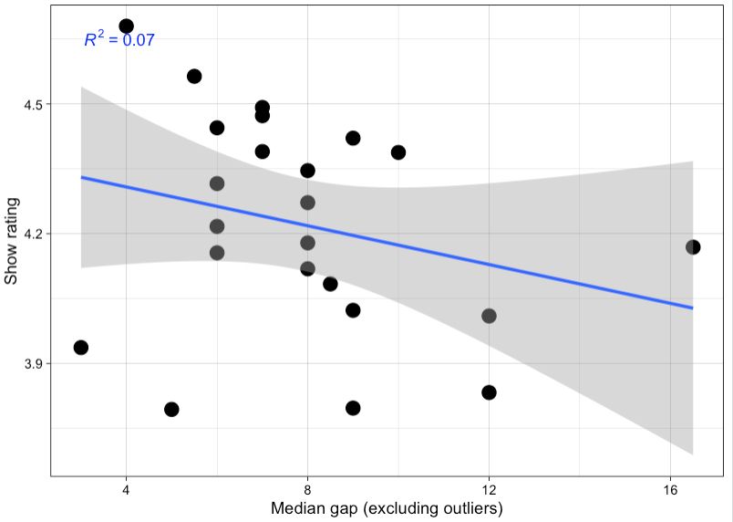
I couldn't resist doing some more on this ... here is the median gap (middle value of distribution) instead of the average gap ... still a poor correlation but a little better; at least the blue trend line in the direction that supports the hypothesis
August 8, 2025 at 6:56 PM
I couldn't resist doing some more on this ... here is the median gap (middle value of distribution) instead of the average gap ... still a poor correlation but a little better; at least the blue trend line in the direction that supports the hypothesis
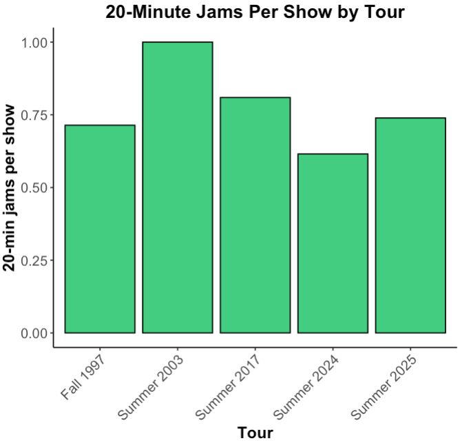
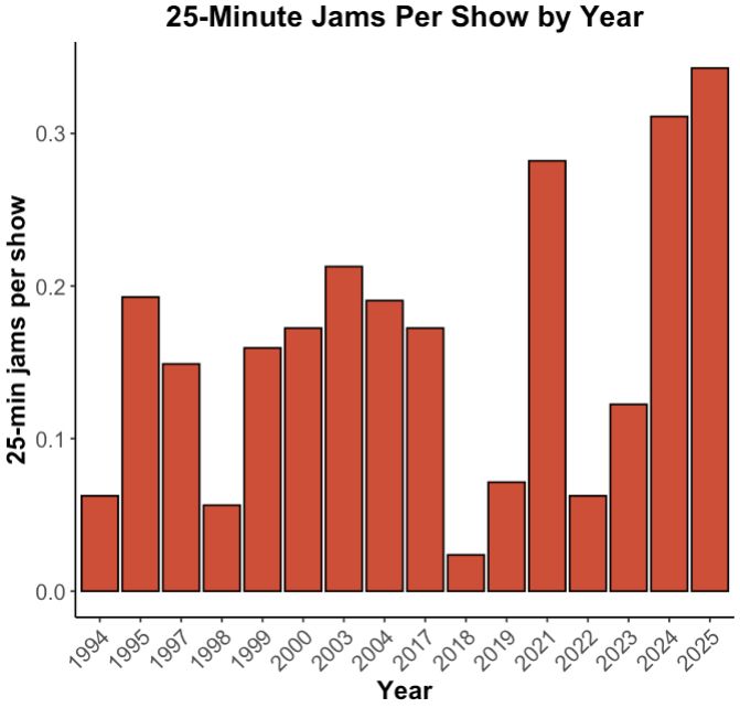
nice! ... I took your computed '# of 20/25 minute jams per show' stat and put into these simple bar plots ... just to help visualize
my gosh ... 2021, 2024, and 2025
my gosh ... 2021, 2024, and 2025
August 8, 2025 at 6:19 PM
nice! ... I took your computed '# of 20/25 minute jams per show' stat and put into these simple bar plots ... just to help visualize
my gosh ... 2021, 2024, and 2025
my gosh ... 2021, 2024, and 2025
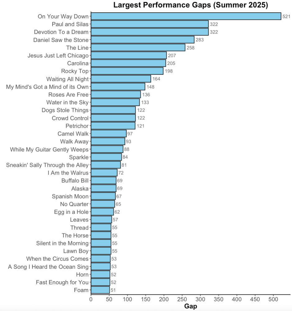
Second, here's a similar bar chart but showing the largest performance gaps (for those with ≥50-show gap).
A bunch of bluegrass-y tunes up there near the top.
A bunch of bluegrass-y tunes up there near the top.
August 8, 2025 at 4:12 PM
Second, here's a similar bar chart but showing the largest performance gaps (for those with ≥50-show gap).
A bunch of bluegrass-y tunes up there near the top.
A bunch of bluegrass-y tunes up there near the top.
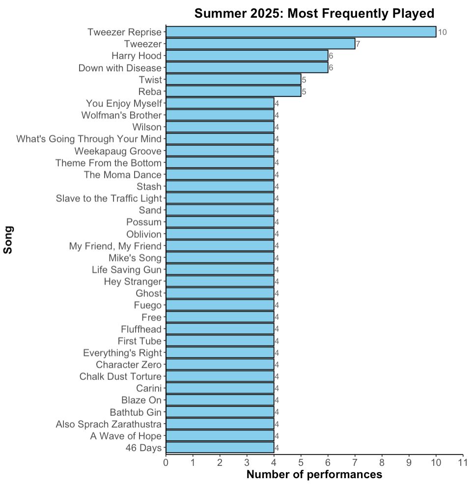
Alright, a couple of Summer 2025 tour data visualizations for those of you who are into that sort of thing. #PhishPlots
First, here's a chart of the most frequently played songs (with at least four performances). We all know why Tweezer Reprise is at the top 🤩
First, here's a chart of the most frequently played songs (with at least four performances). We all know why Tweezer Reprise is at the top 🤩
August 8, 2025 at 4:09 PM
Alright, a couple of Summer 2025 tour data visualizations for those of you who are into that sort of thing. #PhishPlots
First, here's a chart of the most frequently played songs (with at least four performances). We all know why Tweezer Reprise is at the top 🤩
First, here's a chart of the most frequently played songs (with at least four performances). We all know why Tweezer Reprise is at the top 🤩
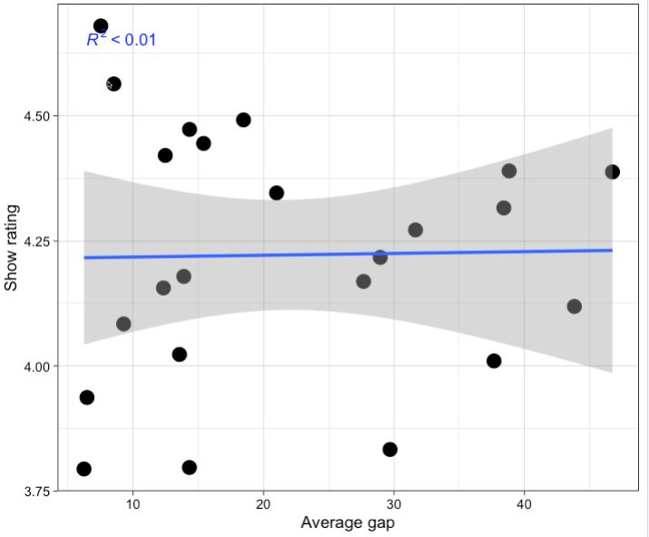
I was also intrigued by this hypothesis, so I did a quick regression (vertical axis = rating, horiz axis = average gap), definitely no correlation.
However, I agree that the average is a misleading stat (for reasons you discussed). The median would be more appropriate, but need to do add'l work.
However, I agree that the average is a misleading stat (for reasons you discussed). The median would be more appropriate, but need to do add'l work.
August 8, 2025 at 1:39 PM
I was also intrigued by this hypothesis, so I did a quick regression (vertical axis = rating, horiz axis = average gap), definitely no correlation.
However, I agree that the average is a misleading stat (for reasons you discussed). The median would be more appropriate, but need to do add'l work.
However, I agree that the average is a misleading stat (for reasons you discussed). The median would be more appropriate, but need to do add'l work.
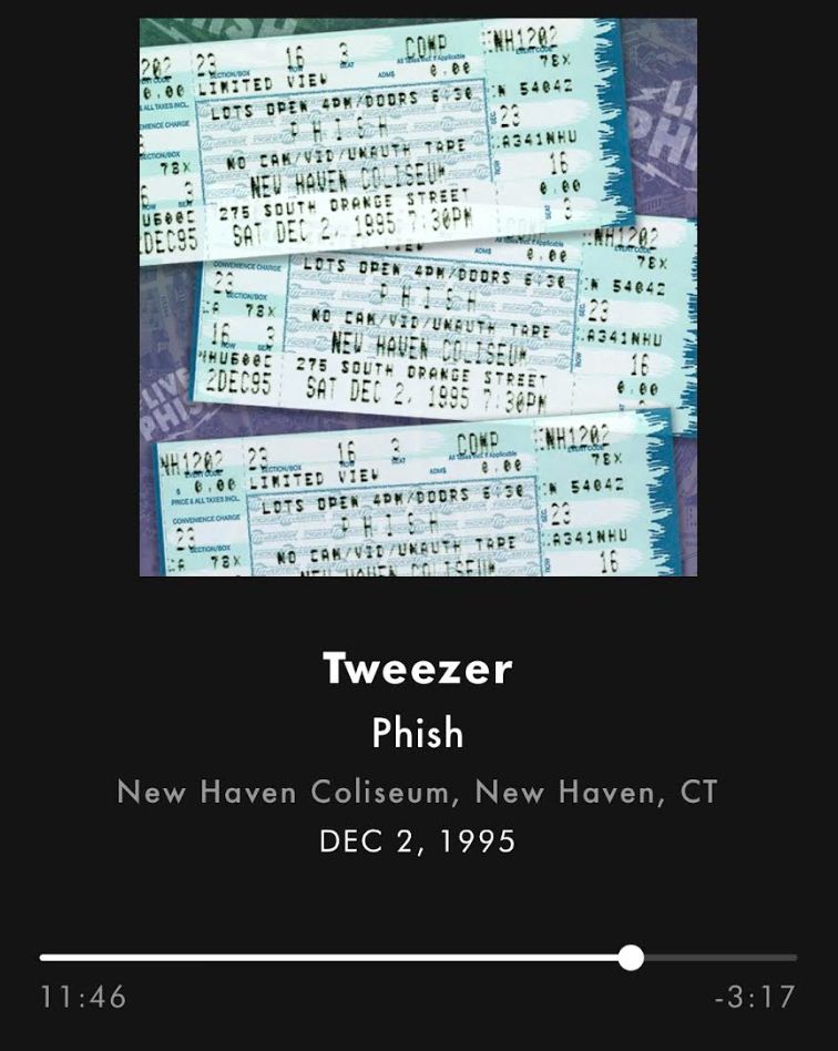
I was listening to this Tweezer this morning (it's in my 'workout' list, a rager that wakes me up when riding the stationary bike early) ... and at this point it *almost* sounds like a SPAC 2025-style segue into Tweezer Reprise could've happened ... a fleeting moment almost 30 yrs ago, check it out
August 6, 2025 at 2:22 PM
I was listening to this Tweezer this morning (it's in my 'workout' list, a rager that wakes me up when riding the stationary bike early) ... and at this point it *almost* sounds like a SPAC 2025-style segue into Tweezer Reprise could've happened ... a fleeting moment almost 30 yrs ago, check it out
what an amazing run and weekend –– in addition to the fantastic music, I reconnected with some old friends
July 28, 2025 at 6:55 PM
what an amazing run and weekend –– in addition to the fantastic music, I reconnected with some old friends
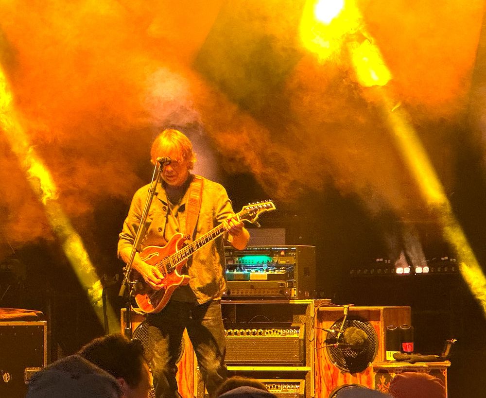
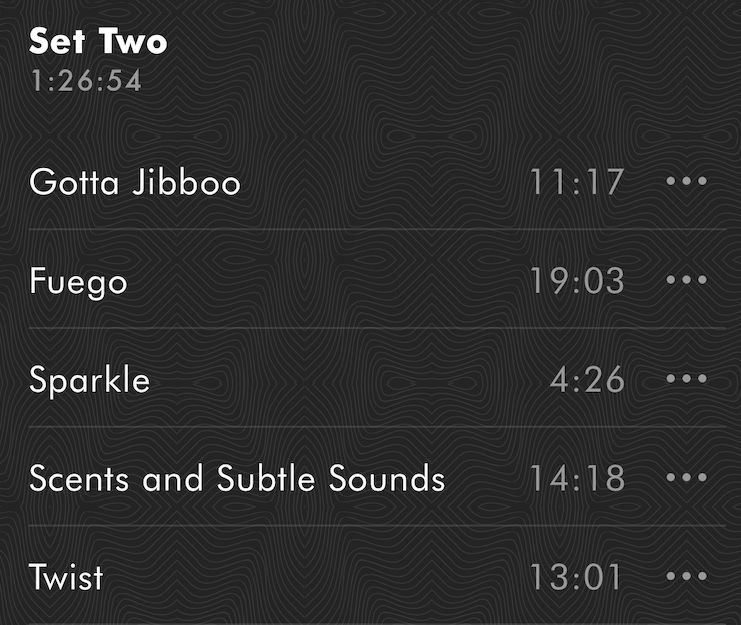
had I not webcasted last night's show and only saw the list of songs in the first part of the second set I would've scoffed at Sparkle's placement –– but it strangely worked, it seemed to get them all pumped up (especially Trey)!
I'll likely skip it on a relisten, but it was fun in the moment
I'll likely skip it on a relisten, but it was fun in the moment
July 21, 2025 at 4:10 PM
had I not webcasted last night's show and only saw the list of songs in the first part of the second set I would've scoffed at Sparkle's placement –– but it strangely worked, it seemed to get them all pumped up (especially Trey)!
I'll likely skip it on a relisten, but it was fun in the moment
I'll likely skip it on a relisten, but it was fun in the moment
okay, I made a few more of these 'song gap timeline' plots ... when I should've been doing real work 🤫 ... here's YEM and Bowie
the higher the number (and bold line, which is a moving average) the longer the gap between performances ... the lower it is, the more frequently it's played #PhishPlots
the higher the number (and bold line, which is a moving average) the longer the gap between performances ... the lower it is, the more frequently it's played #PhishPlots
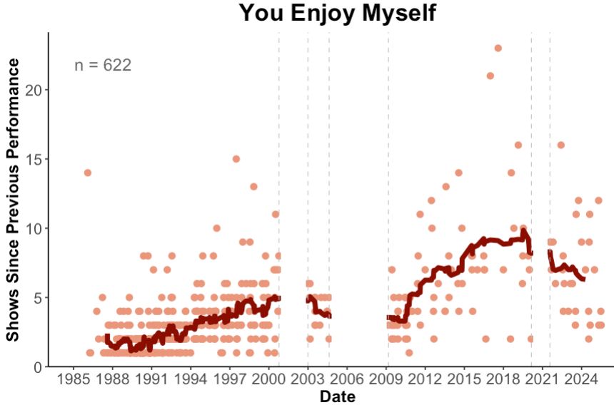
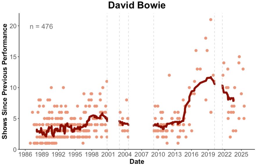
July 16, 2025 at 7:25 PM
okay, I made a few more of these 'song gap timeline' plots ... when I should've been doing real work 🤫 ... here's YEM and Bowie
the higher the number (and bold line, which is a moving average) the longer the gap between performances ... the lower it is, the more frequently it's played #PhishPlots
the higher the number (and bold line, which is a moving average) the longer the gap between performances ... the lower it is, the more frequently it's played #PhishPlots
however, this doesn't work very well for tunes that have long stretches of time between performances
for example, here's Camel Walk that wasn't played from 1989 to 1995, resulting in this one large number and making it difficult to see the rest of the data –– need to think about this more
3/3
for example, here's Camel Walk that wasn't played from 1989 to 1995, resulting in this one large number and making it difficult to see the rest of the data –– need to think about this more
3/3

July 16, 2025 at 1:04 PM
however, this doesn't work very well for tunes that have long stretches of time between performances
for example, here's Camel Walk that wasn't played from 1989 to 1995, resulting in this one large number and making it difficult to see the rest of the data –– need to think about this more
3/3
for example, here's Camel Walk that wasn't played from 1989 to 1995, resulting in this one large number and making it difficult to see the rest of the data –– need to think about this more
3/3
I started playing around w/ a visualization to see the gap info for a specific song through time –– here's Chalk Dust Torture
the vertical axis is the number of shows since previous performance (the number in the 'Gap Chart') and date on the horizontal axis –– the bold line is a moving average
2/3
the vertical axis is the number of shows since previous performance (the number in the 'Gap Chart') and date on the horizontal axis –– the bold line is a moving average
2/3

July 16, 2025 at 1:00 PM
I started playing around w/ a visualization to see the gap info for a specific song through time –– here's Chalk Dust Torture
the vertical axis is the number of shows since previous performance (the number in the 'Gap Chart') and date on the horizontal axis –– the bold line is a moving average
2/3
the vertical axis is the number of shows since previous performance (the number in the 'Gap Chart') and date on the horizontal axis –– the bold line is a moving average
2/3
as you all know, when you go to phish.net for a show you can view the 'Gap Chart', which shows you how many shows between performances of a song –– here's an example from set 1 of last night's show
this is useful to see what songs are in regular rotation (small gap) versus rare (large gap)
1/3
this is useful to see what songs are in regular rotation (small gap) versus rare (large gap)
1/3


July 16, 2025 at 12:59 PM
as you all know, when you go to phish.net for a show you can view the 'Gap Chart', which shows you how many shows between performances of a song –– here's an example from set 1 of last night's show
this is useful to see what songs are in regular rotation (small gap) versus rare (large gap)
1/3
this is useful to see what songs are in regular rotation (small gap) versus rare (large gap)
1/3
fun fact: the Stash in the encore slot on night 1 of Folsom was only the third time it's been in the encore –– the other two were 11-1-1991 and 11-14-1996


July 8, 2025 at 12:56 PM
fun fact: the Stash in the encore slot on night 1 of Folsom was only the third time it's been in the encore –– the other two were 11-1-1991 and 11-14-1996
here's the visualization to go with your observation about Bowie's not going long since back in the day ... blue line is a 20-point moving average (to help see trends) ... it's been flatlined at ~11 minutes for well over a decade 😭

July 7, 2025 at 9:08 PM
here's the visualization to go with your observation about Bowie's not going long since back in the day ... blue line is a 20-point moving average (to help see trends) ... it's been flatlined at ~11 minutes for well over a decade 😭
I've had very little time/capacity to make new #PhishPlots these past months, but summertime should be better –– for now, here's a heatmap of number of shows played by month over the years (through spring '25 tour)

June 5, 2025 at 3:07 AM
I've had very little time/capacity to make new #PhishPlots these past months, but summertime should be better –– for now, here's a heatmap of number of shows played by month over the years (through spring '25 tour)
as of 15-20 minutes ago ... we totally got this 💪⭕

February 13, 2025 at 6:08 PM
as of 15-20 minutes ago ... we totally got this 💪⭕
so, this is odd ... the Chalk Dusts from both this year's Mexico run (1/31/2025) and last year's (2/23/2024) are not showing up when I tabulate by date played (most recent at top) ... and seems to be for every song

February 13, 2025 at 5:43 PM
so, this is odd ... the Chalk Dusts from both this year's Mexico run (1/31/2025) and last year's (2/23/2024) are not showing up when I tabulate by date played (most recent at top) ... and seems to be for every song