


JKK
@oneateseven.studio
UI Developer and Designer
25 years of messing with The Big Trio: HTML, CSS and Javascript
Accessibility and good UX enthusiast
Less is always more
25 years of messing with The Big Trio: HTML, CSS and Javascript
Accessibility and good UX enthusiast
Less is always more

Because I’ve heard things that surprised me
July 9, 2025 at 8:56 AM
Because I’ve heard things that surprised me
I like them.
They can distract me or not. My own choice :) I can keep reading the main stuff uninterrupted, or just go on a little journey
(Not really though with my ADHD)
They can distract me or not. My own choice :) I can keep reading the main stuff uninterrupted, or just go on a little journey
(Not really though with my ADHD)

a man running in a field with the words " i 'm going on an adventure "
ALT: a man running in a field with the words " i 'm going on an adventure "
media.tenor.com
July 2, 2025 at 12:44 PM
I like them.
They can distract me or not. My own choice :) I can keep reading the main stuff uninterrupted, or just go on a little journey
(Not really though with my ADHD)
They can distract me or not. My own choice :) I can keep reading the main stuff uninterrupted, or just go on a little journey
(Not really though with my ADHD)
Cool, but that horizontal scroll on mobile is so damn annoying :)
Constructive advice. What if that “horizontalness” would show up only when footnote in viewport? Huh? :)
Constructive advice. What if that “horizontalness” would show up only when footnote in viewport? Huh? :)
July 2, 2025 at 12:41 PM
Cool, but that horizontal scroll on mobile is so damn annoying :)
Constructive advice. What if that “horizontalness” would show up only when footnote in viewport? Huh? :)
Constructive advice. What if that “horizontalness” would show up only when footnote in viewport? Huh? :)
Shareholders’ profit over team’s profit in most cases.
Decisions about the shape of the product often become driven by just immediate profit instead of long term product quality etc
Not always the case, but almost.
Sigh
Decisions about the shape of the product often become driven by just immediate profit instead of long term product quality etc
Not always the case, but almost.
Sigh
July 2, 2025 at 12:34 PM
Shareholders’ profit over team’s profit in most cases.
Decisions about the shape of the product often become driven by just immediate profit instead of long term product quality etc
Not always the case, but almost.
Sigh
Decisions about the shape of the product often become driven by just immediate profit instead of long term product quality etc
Not always the case, but almost.
Sigh
Oh! Is it still actively developed?
Completely forgot it existed
Completely forgot it existed
July 2, 2025 at 12:32 PM
Oh! Is it still actively developed?
Completely forgot it existed
Completely forgot it existed
Also to expose it so a brand (theme) can be fully configurable from one theme file with just variables.
In case brand requires for example danger buttons in some specific context (let’s say notification to be dofferent because of some colour clashes etc
In case brand requires for example danger buttons in some specific context (let’s say notification to be dofferent because of some colour clashes etc
June 28, 2025 at 5:46 PM
Also to expose it so a brand (theme) can be fully configurable from one theme file with just variables.
In case brand requires for example danger buttons in some specific context (let’s say notification to be dofferent because of some colour clashes etc
In case brand requires for example danger buttons in some specific context (let’s say notification to be dofferent because of some colour clashes etc
Yeah. I get you.
I just used this technique on two levels when I wanted to granularly control and style differently the same component in different context (parent component).
I just used this technique on two levels when I wanted to granularly control and style differently the same component in different context (parent component).
June 28, 2025 at 5:45 PM
Yeah. I get you.
I just used this technique on two levels when I wanted to granularly control and style differently the same component in different context (parent component).
I just used this technique on two levels when I wanted to granularly control and style differently the same component in different context (parent component).
What if you exposed some hooks in each component to allow precise control of allowed properties from one place (:root) or some user’s parent component?
Like: codepen.io/kali187/pen/...
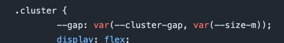
Like this for example:
Like: codepen.io/kali187/pen/...
Like this for example:
June 28, 2025 at 4:17 PM
What if you exposed some hooks in each component to allow precise control of allowed properties from one place (:root) or some user’s parent component?
Like: codepen.io/kali187/pen/...
Like this for example:
Like: codepen.io/kali187/pen/...
Like this for example:
Really like how you define layers and just use base colours to define functional colours (danger etc)
For shades, why not use use actual css colour functions to regenerate them from overridden main colours?
For shades, why not use use actual css colour functions to regenerate them from overridden main colours?
June 28, 2025 at 4:03 PM
Really like how you define layers and just use base colours to define functional colours (danger etc)
For shades, why not use use actual css colour functions to regenerate them from overridden main colours?
For shades, why not use use actual css colour functions to regenerate them from overridden main colours?