


Joey Cherdarchuk - Obumbratta
@obumbratta.com
I sure hope I haven’t complicated things. Though I understand with a personality like mine it can happen.
October 23, 2025 at 3:56 AM
I sure hope I haven’t complicated things. Though I understand with a personality like mine it can happen.
This morning I remembered an excellent and classic use of the quantile plot by the NYT
You Draw It: How Family Income
Predicts Children’s College Chances
www.nytimes.com/interactive/...
You Draw It: How Family Income
Predicts Children’s College Chances
www.nytimes.com/interactive/...

You Draw It: How Family Income Predicts Children’s College Chances (Published 2015)
Draw your guess for every income level, then compare it with the actual data on college enrollment and the drawings of other readers.
www.nytimes.com
July 17, 2025 at 5:27 PM
This morning I remembered an excellent and classic use of the quantile plot by the NYT
You Draw It: How Family Income
Predicts Children’s College Chances
www.nytimes.com/interactive/...
You Draw It: How Family Income
Predicts Children’s College Chances
www.nytimes.com/interactive/...
This is basically the content of a blog post I wrote 9yrs ago while at Darkhorse Analytics. But no one reads blogs anymore and many of those links are now dead so it was time for an update
Read that post here
www.darkhorseanalytics.com/blog/visuali...
And see my work/hire me here
www.obumbratta.com
Read that post here
www.darkhorseanalytics.com/blog/visuali...
And see my work/hire me here
www.obumbratta.com
July 16, 2025 at 1:20 PM
This is basically the content of a blog post I wrote 9yrs ago while at Darkhorse Analytics. But no one reads blogs anymore and many of those links are now dead so it was time for an update
Read that post here
www.darkhorseanalytics.com/blog/visuali...
And see my work/hire me here
www.obumbratta.com
Read that post here
www.darkhorseanalytics.com/blog/visuali...
And see my work/hire me here
www.obumbratta.com
The list is by no means exhaustive, HOPs, horizon charts and I'm sure other charts can be and have been used to show distributions. But attached is a handy one pager to summarize all the methods discussed here

July 16, 2025 at 1:20 PM
The list is by no means exhaustive, HOPs, horizon charts and I'm sure other charts can be and have been used to show distributions. But attached is a handy one pager to summarize all the methods discussed here
Honestly, I've seen examples in books by Cleveland or Few, and researchers use them a lot, but I don't have any good real world examples to share with you of Quantile plots
July 16, 2025 at 1:20 PM
Honestly, I've seen examples in books by Cleveland or Few, and researchers use them a lot, but I don't have any good real world examples to share with you of Quantile plots
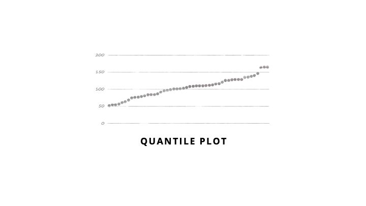
Quantile Plot
These can feel less cluttered than ranked bars, but can be harder to highlight a single data point. You usually plot each of the 100 percentiles rather than plotting every point in your data. Great for answering "what percent of my values are below/above a certain threshold?"
These can feel less cluttered than ranked bars, but can be harder to highlight a single data point. You usually plot each of the 100 percentiles rather than plotting every point in your data. Great for answering "what percent of my values are below/above a certain threshold?"
July 16, 2025 at 1:20 PM
Quantile Plot
These can feel less cluttered than ranked bars, but can be harder to highlight a single data point. You usually plot each of the 100 percentiles rather than plotting every point in your data. Great for answering "what percent of my values are below/above a certain threshold?"
These can feel less cluttered than ranked bars, but can be harder to highlight a single data point. You usually plot each of the 100 percentiles rather than plotting every point in your data. Great for answering "what percent of my values are below/above a certain threshold?"
OECD Better Life Index by @moritzstefaner.bsky.social, @do.minik.us & Raureif (current tool not working so here is Moritz's post)
truth-and-beauty.net/projects/oec...
Darkhorse Analytics on Alberta school grades
grades.dha.io
Density Design ranks cesarean sections
www.flickr.com/photos/densi...
truth-and-beauty.net/projects/oec...
Darkhorse Analytics on Alberta school grades
grades.dha.io
Density Design ranks cesarean sections
www.flickr.com/photos/densi...


July 16, 2025 at 1:20 PM
OECD Better Life Index by @moritzstefaner.bsky.social, @do.minik.us & Raureif (current tool not working so here is Moritz's post)
truth-and-beauty.net/projects/oec...
Darkhorse Analytics on Alberta school grades
grades.dha.io
Density Design ranks cesarean sections
www.flickr.com/photos/densi...
truth-and-beauty.net/projects/oec...
Darkhorse Analytics on Alberta school grades
grades.dha.io
Density Design ranks cesarean sections
www.flickr.com/photos/densi...
Ranked Bars
Great to communicate a single distribution while highlighting a particular data point. People love to rank things so it’s easy to interpret. It behaves in almost the opposite manner to a histogram in that flat areas represent clusters of data whereas with a histogram it is the peaks.
Great to communicate a single distribution while highlighting a particular data point. People love to rank things so it’s easy to interpret. It behaves in almost the opposite manner to a histogram in that flat areas represent clusters of data whereas with a histogram it is the peaks.

July 16, 2025 at 1:20 PM
Ranked Bars
Great to communicate a single distribution while highlighting a particular data point. People love to rank things so it’s easy to interpret. It behaves in almost the opposite manner to a histogram in that flat areas represent clusters of data whereas with a histogram it is the peaks.
Great to communicate a single distribution while highlighting a particular data point. People love to rank things so it’s easy to interpret. It behaves in almost the opposite manner to a histogram in that flat areas represent clusters of data whereas with a histogram it is the peaks.
We are back to plotting all the data, but this time we use one axis to plot the values and another to plot the ranking. This gives a different perspective on the shape of the data. These are excellent at providing context for where one data point fits in among many. Not great for comparing >1 dist.

July 16, 2025 at 1:20 PM
We are back to plotting all the data, but this time we use one axis to plot the values and another to plot the ranking. This gives a different perspective on the shape of the data. These are excellent at providing context for where one data point fits in among many. Not great for comparing >1 dist.
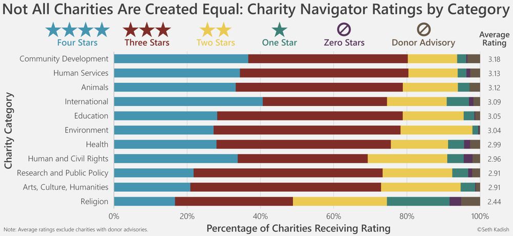
Seth Kadish visualizes charity ratings
vizual-statistix.tumblr.com/post/1207793...
I rework social media demographics
www.darkhorseanalytics.com/blog/divergi...
(I've since learned to have better contrast)
vizual-statistix.tumblr.com/post/1207793...
I rework social media demographics
www.darkhorseanalytics.com/blog/divergi...
(I've since learned to have better contrast)

July 16, 2025 at 1:20 PM
Seth Kadish visualizes charity ratings
vizual-statistix.tumblr.com/post/1207793...
I rework social media demographics
www.darkhorseanalytics.com/blog/divergi...
(I've since learned to have better contrast)
vizual-statistix.tumblr.com/post/1207793...
I rework social media demographics
www.darkhorseanalytics.com/blog/divergi...
(I've since learned to have better contrast)
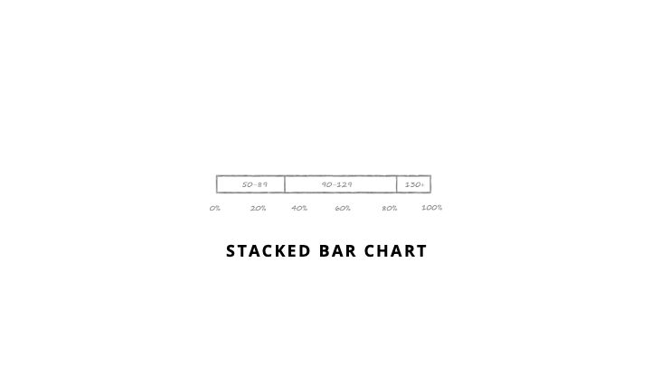
Stacked Bar
This plot involves a change in perspective. It has a much smaller number of bins and shows the proportion of the data that fits in each. It will provide a very coarse look at the shape of the data but is quite easy to interpret. It is most effective with a small number of categories.
This plot involves a change in perspective. It has a much smaller number of bins and shows the proportion of the data that fits in each. It will provide a very coarse look at the shape of the data but is quite easy to interpret. It is most effective with a small number of categories.
July 16, 2025 at 1:20 PM
Stacked Bar
This plot involves a change in perspective. It has a much smaller number of bins and shows the proportion of the data that fits in each. It will provide a very coarse look at the shape of the data but is quite easy to interpret. It is most effective with a small number of categories.
This plot involves a change in perspective. It has a much smaller number of bins and shows the proportion of the data that fits in each. It will provide a very coarse look at the shape of the data but is quite easy to interpret. It is most effective with a small number of categories.
FiveThirtyEight with a story on name based age estimates
fivethirtyeight.com/features/how...
@flowingdata.com plots 10th, Median, & 90th percentiles of salaries across industries
projects.flowingdata.com/2014/industry/
Flourish looks at the ages of olympians
flourish.studio/blog/visuali...
fivethirtyeight.com/features/how...
@flowingdata.com plots 10th, Median, & 90th percentiles of salaries across industries
projects.flowingdata.com/2014/industry/
Flourish looks at the ages of olympians
flourish.studio/blog/visuali...


July 16, 2025 at 1:20 PM
FiveThirtyEight with a story on name based age estimates
fivethirtyeight.com/features/how...
@flowingdata.com plots 10th, Median, & 90th percentiles of salaries across industries
projects.flowingdata.com/2014/industry/
Flourish looks at the ages of olympians
flourish.studio/blog/visuali...
fivethirtyeight.com/features/how...
@flowingdata.com plots 10th, Median, & 90th percentiles of salaries across industries
projects.flowingdata.com/2014/industry/
Flourish looks at the ages of olympians
flourish.studio/blog/visuali...
Range Plot
The ends of the line (usually) show the min and max of your data and the dot shows the average, or really any three metrics you find most useful. If the range of the data is the most important thing or your audience my struggle to interpret the other plots, this is nice and simple.
The ends of the line (usually) show the min and max of your data and the dot shows the average, or really any three metrics you find most useful. If the range of the data is the most important thing or your audience my struggle to interpret the other plots, this is nice and simple.

July 16, 2025 at 1:20 PM
Range Plot
The ends of the line (usually) show the min and max of your data and the dot shows the average, or really any three metrics you find most useful. If the range of the data is the most important thing or your audience my struggle to interpret the other plots, this is nice and simple.
The ends of the line (usually) show the min and max of your data and the dot shows the average, or really any three metrics you find most useful. If the range of the data is the most important thing or your audience my struggle to interpret the other plots, this is nice and simple.
FiveThirtyEight looks at the Red Sox roller coaster
fivethirtyeight.com/features/the...
Washington Post - Ivy League Grad Income
www.washingtonpost.com/news/wonk/wp...
Marcus Beck analyzes dissertation & thesis lengths
beckmw.wordpress.com/2014/07/15/a...
fivethirtyeight.com/features/the...
Washington Post - Ivy League Grad Income
www.washingtonpost.com/news/wonk/wp...
Marcus Beck analyzes dissertation & thesis lengths
beckmw.wordpress.com/2014/07/15/a...


July 16, 2025 at 1:20 PM
FiveThirtyEight looks at the Red Sox roller coaster
fivethirtyeight.com/features/the...
Washington Post - Ivy League Grad Income
www.washingtonpost.com/news/wonk/wp...
Marcus Beck analyzes dissertation & thesis lengths
beckmw.wordpress.com/2014/07/15/a...
fivethirtyeight.com/features/the...
Washington Post - Ivy League Grad Income
www.washingtonpost.com/news/wonk/wp...
Marcus Beck analyzes dissertation & thesis lengths
beckmw.wordpress.com/2014/07/15/a...
Box Plot
Box Plots focus on the min, 25th percentile, median, 75th percentile and max. Many will explicitly plot outliers and exclude them from the min-max
Box Plots focus on the min, 25th percentile, median, 75th percentile and max. Many will explicitly plot outliers and exclude them from the min-max

July 16, 2025 at 1:20 PM
Box Plot
Box Plots focus on the min, 25th percentile, median, 75th percentile and max. Many will explicitly plot outliers and exclude them from the min-max
Box Plots focus on the min, 25th percentile, median, 75th percentile and max. Many will explicitly plot outliers and exclude them from the min-max
You can also simplify the distribution by focusing on a few key aspects of the data, usually some measure of central tendency plus some measure of range. The following visuals give less detail but may make comparisons simpler.

July 16, 2025 at 1:20 PM
You can also simplify the distribution by focusing on a few key aspects of the data, usually some measure of central tendency plus some measure of range. The following visuals give less detail but may make comparisons simpler.
Nick Berry analyzes 4-digit PINs
www.datagenetics.com/blog/septemb...
Seth Kadish shows chess board utilization
vizual-statistix.tumblr.com/post/7882178...
Matt Styles looks at the distribution of birthdays
www.themarginalian.org/2013/10/08/b...
www.datagenetics.com/blog/septemb...
Seth Kadish shows chess board utilization
vizual-statistix.tumblr.com/post/7882178...
Matt Styles looks at the distribution of birthdays
www.themarginalian.org/2013/10/08/b...


July 16, 2025 at 1:20 PM
Nick Berry analyzes 4-digit PINs
www.datagenetics.com/blog/septemb...
Seth Kadish shows chess board utilization
vizual-statistix.tumblr.com/post/7882178...
Matt Styles looks at the distribution of birthdays
www.themarginalian.org/2013/10/08/b...
www.datagenetics.com/blog/septemb...
Seth Kadish shows chess board utilization
vizual-statistix.tumblr.com/post/7882178...
Matt Styles looks at the distribution of birthdays
www.themarginalian.org/2013/10/08/b...
Heatmaps
Heatmaps are extremely compact and excellent for looking for patterns across many distributions. They use variation in colour to show the counts and, as such, they are not very precise, only giving a crude sense of the data’s shape
Heatmaps are extremely compact and excellent for looking for patterns across many distributions. They use variation in colour to show the counts and, as such, they are not very precise, only giving a crude sense of the data’s shape

July 16, 2025 at 1:20 PM
Heatmaps
Heatmaps are extremely compact and excellent for looking for patterns across many distributions. They use variation in colour to show the counts and, as such, they are not very precise, only giving a crude sense of the data’s shape
Heatmaps are extremely compact and excellent for looking for patterns across many distributions. They use variation in colour to show the counts and, as such, they are not very precise, only giving a crude sense of the data’s shape
Japanese train departures
en.wikipedia.org/wiki/Stem-an...
en.wikipedia.org/wiki/Stem-an...

July 16, 2025 at 1:20 PM
Japanese train departures
en.wikipedia.org/wiki/Stem-an...
en.wikipedia.org/wiki/Stem-an...
Stem & Leaf Plot
So awesome, so rare. It’s a sideways histogram, but with all the data encoded in it. Once you know how to read it, it is quite powerful, but possibly too much information for many audiences.
So awesome, so rare. It’s a sideways histogram, but with all the data encoded in it. Once you know how to read it, it is quite powerful, but possibly too much information for many audiences.

July 16, 2025 at 1:20 PM
Stem & Leaf Plot
So awesome, so rare. It’s a sideways histogram, but with all the data encoded in it. Once you know how to read it, it is quite powerful, but possibly too much information for many audiences.
So awesome, so rare. It’s a sideways histogram, but with all the data encoded in it. Once you know how to read it, it is quite powerful, but possibly too much information for many audiences.
Periscopic looking at grant distributions
medium.com/@Periscopic/...
@experimental361.com shows Premier League age profiles. The page for this visual seems to have disappeared
CJ Mayes compare life expectancy over time and continents
cj-mayes.com/2022/05/24/v...
medium.com/@Periscopic/...
@experimental361.com shows Premier League age profiles. The page for this visual seems to have disappeared
CJ Mayes compare life expectancy over time and continents
cj-mayes.com/2022/05/24/v...


July 16, 2025 at 1:20 PM
Periscopic looking at grant distributions
medium.com/@Periscopic/...
@experimental361.com shows Premier League age profiles. The page for this visual seems to have disappeared
CJ Mayes compare life expectancy over time and continents
cj-mayes.com/2022/05/24/v...
medium.com/@Periscopic/...
@experimental361.com shows Premier League age profiles. The page for this visual seems to have disappeared
CJ Mayes compare life expectancy over time and continents
cj-mayes.com/2022/05/24/v...
Bean / Violin Plot
Like the area chart except symmetrical and often more compressed. Useful when comparing >1 distributions where a sense of the shape is important. Sometimes superimposed with: a box plot that makes them look like a violin, or a rug plot that makes them look nothing like a bean
Like the area chart except symmetrical and often more compressed. Useful when comparing >1 distributions where a sense of the shape is important. Sometimes superimposed with: a box plot that makes them look like a violin, or a rug plot that makes them look nothing like a bean

July 16, 2025 at 1:20 PM
Bean / Violin Plot
Like the area chart except symmetrical and often more compressed. Useful when comparing >1 distributions where a sense of the shape is important. Sometimes superimposed with: a box plot that makes them look like a violin, or a rug plot that makes them look nothing like a bean
Like the area chart except symmetrical and often more compressed. Useful when comparing >1 distributions where a sense of the shape is important. Sometimes superimposed with: a box plot that makes them look like a violin, or a rug plot that makes them look nothing like a bean
OkCupid exposes lies about height among other things
theblog.okcupid.com/the-big-lies...
The Financial Times compares the time of day distribution of devices browsing their site
aboutus.ft.com/press_releas...
D3 visualizing some pulsar data à la Joy Division
observablehq.com/@d3/psr-b191...
theblog.okcupid.com/the-big-lies...
The Financial Times compares the time of day distribution of devices browsing their site
aboutus.ft.com/press_releas...
D3 visualizing some pulsar data à la Joy Division
observablehq.com/@d3/psr-b191...


July 16, 2025 at 1:20 PM
OkCupid exposes lies about height among other things
theblog.okcupid.com/the-big-lies...
The Financial Times compares the time of day distribution of devices browsing their site
aboutus.ft.com/press_releas...
D3 visualizing some pulsar data à la Joy Division
observablehq.com/@d3/psr-b191...
theblog.okcupid.com/the-big-lies...
The Financial Times compares the time of day distribution of devices browsing their site
aboutus.ft.com/press_releas...
D3 visualizing some pulsar data à la Joy Division
observablehq.com/@d3/psr-b191...
Line Chart
Like the area chart but not filled under the line. Line charts can be useful when you want to accurately compare a few distributions to one another.
Like the area chart but not filled under the line. Line charts can be useful when you want to accurately compare a few distributions to one another.

July 16, 2025 at 1:20 PM
Line Chart
Like the area chart but not filled under the line. Line charts can be useful when you want to accurately compare a few distributions to one another.
Like the area chart but not filled under the line. Line charts can be useful when you want to accurately compare a few distributions to one another.