


Nick Desbarats
@nickdesb.bsky.social
Independent instructor and best-selling author, data visualization and dashboard design.
Books, videos, articles, training workshops to level up your dataviz or dashboard design chops: www.practicalreporting.com
Books, videos, articles, training workshops to level up your dataviz or dashboard design chops: www.practicalreporting.com
Someone else proposed this use case but, to my eye anyway, bars would be considerably quicker and easier to read:

August 28, 2025 at 10:09 PM
Someone else proposed this use case but, to my eye anyway, bars would be considerably quicker and easier to read:
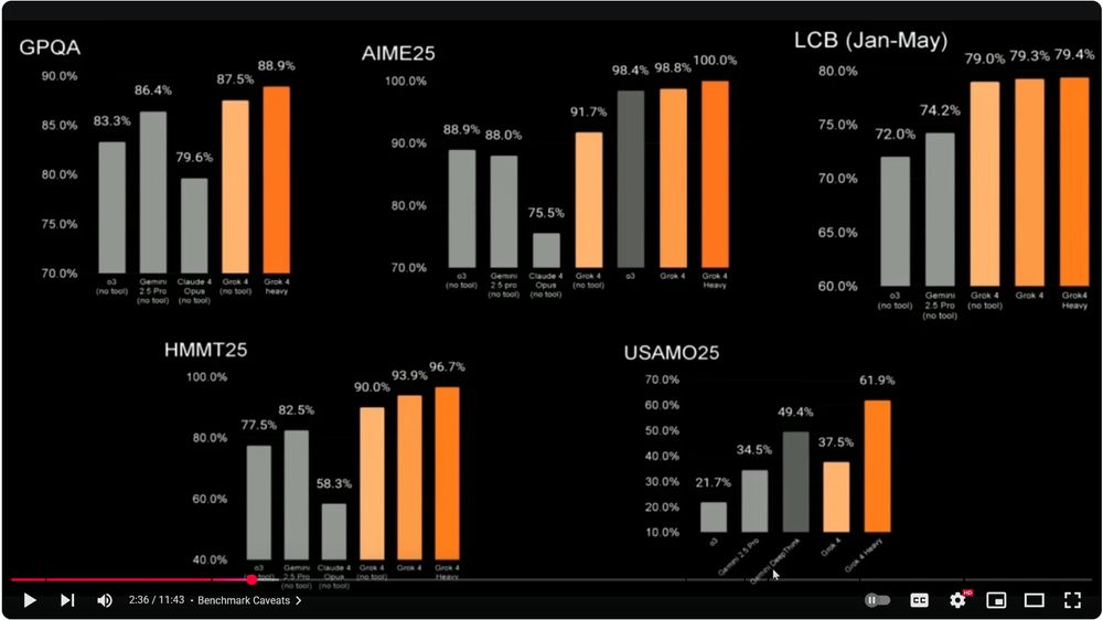
Just heard Musk say that xAI's latest benchmark testing proves that "...Grok 4 is better than PhD-level at everything...".
I guess PhDs don't know that showing bars on truncated scales is a bad idea.
I guess PhDs don't know that showing bars on truncated scales is a bad idea.
July 11, 2025 at 11:53 AM
Just heard Musk say that xAI's latest benchmark testing proves that "...Grok 4 is better than PhD-level at everything...".
I guess PhDs don't know that showing bars on truncated scales is a bad idea.
I guess PhDs don't know that showing bars on truncated scales is a bad idea.
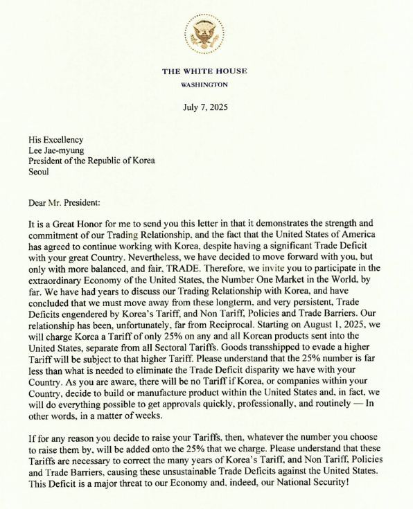
Imagine receiving a letter that threatens your country's entire economy, and that also contains so many grammatical errors and poorly constructed sentences that it would get an F if it were submitted in a high school English writing class. Just... surreal.
July 8, 2025 at 4:35 AM
Imagine receiving a letter that threatens your country's entire economy, and that also contains so many grammatical errors and poorly constructed sentences that it would get an F if it were submitted in a high school English writing class. Just... surreal.
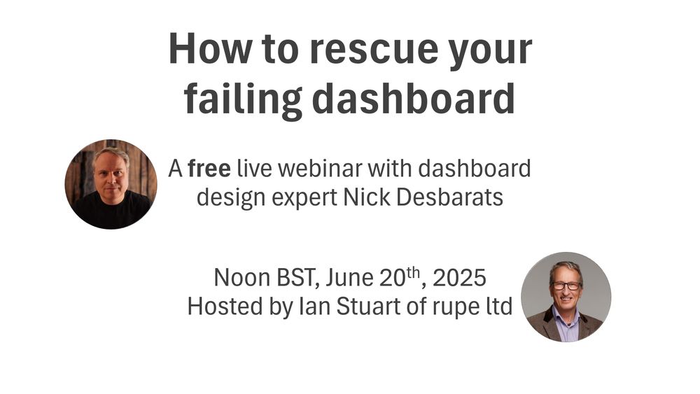
𝗛𝗼𝘄 𝘁𝗼 𝗿𝗲𝘀𝗰𝘂𝗲 𝘆𝗼𝘂𝗿 𝗳𝗮𝗶𝗹𝗶𝗻𝗴 𝗱𝗮𝘀𝗵𝗯𝗼𝗮𝗿𝗱 😬
Unfortunately, many dashboards end up under-used or (worse) abandoned entirely. Why? I'll be covering the top reasons in a FREE webinar at noon BST Jun20. Hope to see you there!
Pre-register for the webinar here: events.teams.microsoft.com/event/4908a1...
Unfortunately, many dashboards end up under-used or (worse) abandoned entirely. Why? I'll be covering the top reasons in a FREE webinar at noon BST Jun20. Hope to see you there!
Pre-register for the webinar here: events.teams.microsoft.com/event/4908a1...
June 10, 2025 at 8:39 PM
𝗛𝗼𝘄 𝘁𝗼 𝗿𝗲𝘀𝗰𝘂𝗲 𝘆𝗼𝘂𝗿 𝗳𝗮𝗶𝗹𝗶𝗻𝗴 𝗱𝗮𝘀𝗵𝗯𝗼𝗮𝗿𝗱 😬
Unfortunately, many dashboards end up under-used or (worse) abandoned entirely. Why? I'll be covering the top reasons in a FREE webinar at noon BST Jun20. Hope to see you there!
Pre-register for the webinar here: events.teams.microsoft.com/event/4908a1...
Unfortunately, many dashboards end up under-used or (worse) abandoned entirely. Why? I'll be covering the top reasons in a FREE webinar at noon BST Jun20. Hope to see you there!
Pre-register for the webinar here: events.teams.microsoft.com/event/4908a1...
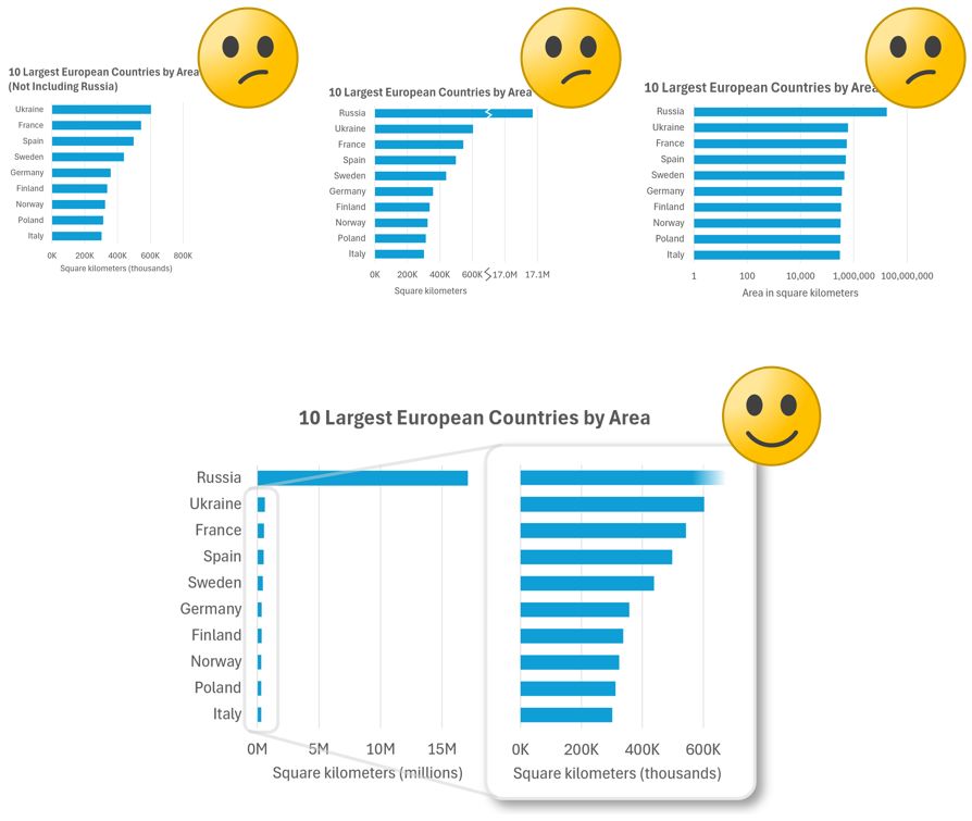
𝗛𝗼𝘄 𝘀𝗵𝗼𝘂𝗹𝗱 𝘆𝗼𝘂 𝘀𝗵𝗼𝘄 𝗢𝗨𝗧𝗟𝗜𝗘𝗥𝗦 𝗶𝗻 𝗰𝗵𝗮𝗿𝘁𝘀?
Check out three common-but-not-ideal methods and one good one (IMHO, anyway) in my latest post: www.linkedin.com/feed/update/...
Check out three common-but-not-ideal methods and one good one (IMHO, anyway) in my latest post: www.linkedin.com/feed/update/...
May 26, 2025 at 7:08 PM
𝗛𝗼𝘄 𝘀𝗵𝗼𝘂𝗹𝗱 𝘆𝗼𝘂 𝘀𝗵𝗼𝘄 𝗢𝗨𝗧𝗟𝗜𝗘𝗥𝗦 𝗶𝗻 𝗰𝗵𝗮𝗿𝘁𝘀?
Check out three common-but-not-ideal methods and one good one (IMHO, anyway) in my latest post: www.linkedin.com/feed/update/...
Check out three common-but-not-ideal methods and one good one (IMHO, anyway) in my latest post: www.linkedin.com/feed/update/...
Agreed. I cover this situation in my "Practical Charts" course and book:
May 17, 2025 at 4:12 AM
Agreed. I cover this situation in my "Practical Charts" course and book:
April 24, 2025 at 2:40 PM
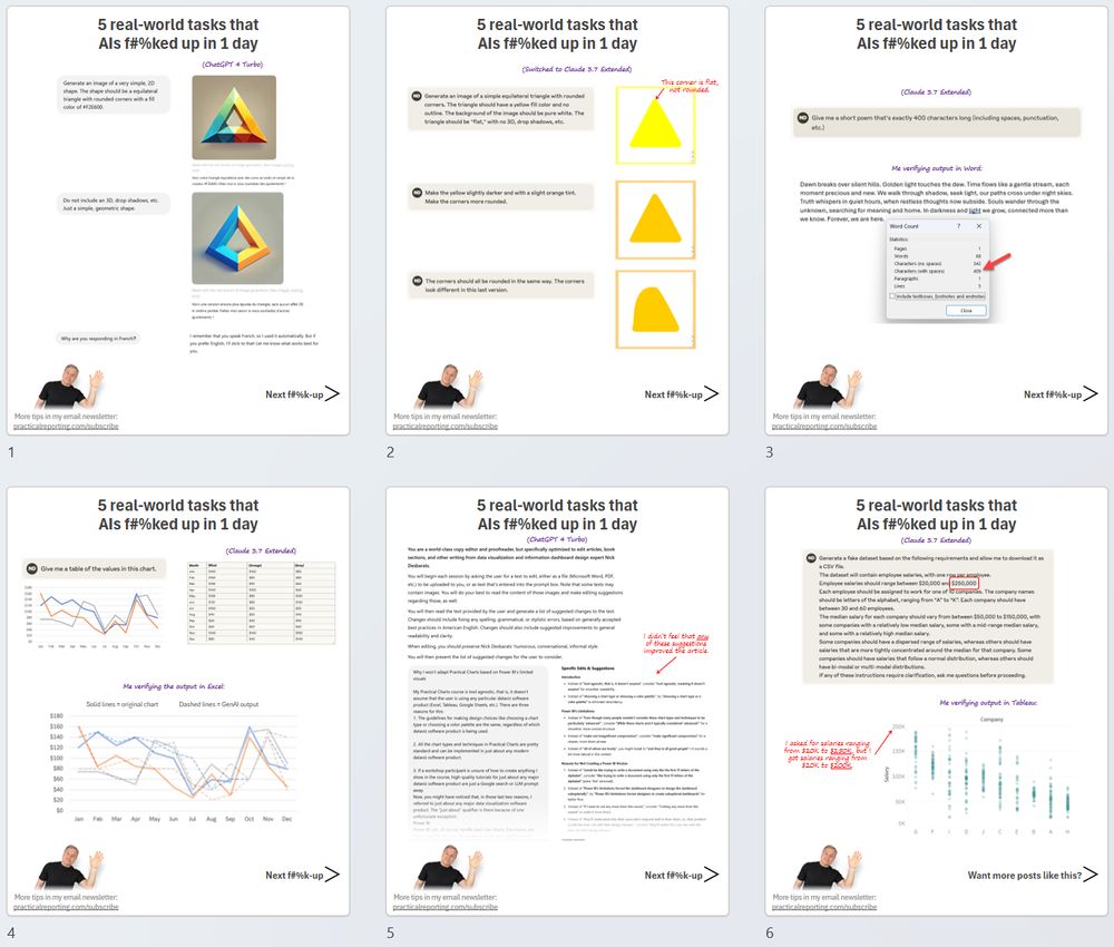
Friendly reminder: LLMs like ChatGPT and Claude still f*$k up SIMPLE tasks all the time.
All the failures in the screenshots below happened in a single day of typical usage for me. Full-res screenshots: www.linkedin.com/feed/update/...
All the failures in the screenshots below happened in a single day of typical usage for me. Full-res screenshots: www.linkedin.com/feed/update/...
April 1, 2025 at 3:40 PM
Friendly reminder: LLMs like ChatGPT and Claude still f*$k up SIMPLE tasks all the time.
All the failures in the screenshots below happened in a single day of typical usage for me. Full-res screenshots: www.linkedin.com/feed/update/...
All the failures in the screenshots below happened in a single day of typical usage for me. Full-res screenshots: www.linkedin.com/feed/update/...
Silver linings, I suppose, but going out of my way to buy Canadian has allowed me to discover that Canadian retailers can be LESS expensive than Amazon. Delivery takes a day or two longer but, personally, I'm fine with that. Buhbye, Jeff.

March 17, 2025 at 4:07 PM
Silver linings, I suppose, but going out of my way to buy Canadian has allowed me to discover that Canadian retailers can be LESS expensive than Amazon. Delivery takes a day or two longer but, personally, I'm fine with that. Buhbye, Jeff.
𝗦𝗵𝗼𝘂𝗹𝗱 𝗽𝗶𝗲 𝗰𝗵𝗮𝗿𝘁 𝗹𝗮𝗯𝗲𝗹𝘀 𝗴𝗼 𝗶𝗻𝘀𝗶𝗱𝗲 𝘁𝗵𝗲 𝘀𝗹𝗶𝗰𝗲𝘀 𝗼𝗿 𝗼𝘂𝘁𝘀𝗶𝗱𝗲?
BTW, European friends! I'll be in your neck of the woods in May. Interested in a private in-person workshop for your org or in hosting an open-registration workshop? DM me...
BTW, European friends! I'll be in your neck of the woods in May. Interested in a private in-person workshop for your org or in hosting an open-registration workshop? DM me...

February 25, 2025 at 9:58 PM
𝗦𝗵𝗼𝘂𝗹𝗱 𝗽𝗶𝗲 𝗰𝗵𝗮𝗿𝘁 𝗹𝗮𝗯𝗲𝗹𝘀 𝗴𝗼 𝗶𝗻𝘀𝗶𝗱𝗲 𝘁𝗵𝗲 𝘀𝗹𝗶𝗰𝗲𝘀 𝗼𝗿 𝗼𝘂𝘁𝘀𝗶𝗱𝗲?
BTW, European friends! I'll be in your neck of the woods in May. Interested in a private in-person workshop for your org or in hosting an open-registration workshop? DM me...
BTW, European friends! I'll be in your neck of the woods in May. Interested in a private in-person workshop for your org or in hosting an open-registration workshop? DM me...

Finally caved and decided to try Gemini for Gmail after Google's incessant nagging to use it. Nice work, guys.

January 17, 2025 at 9:10 PM
Finally caved and decided to try Gemini for Gmail after Google's incessant nagging to use it. Nice work, guys.
My latest post: "Basic" chart types that many audiences don't know how to read: www.linkedin.com/feed/update/...

December 17, 2024 at 1:36 PM
My latest post: "Basic" chart types that many audiences don't know how to read: www.linkedin.com/feed/update/...
Most people (even many in leadership roles) don't know how to read chart types such as scatterplots or histograms. Don't believe me? Check out my latest post: www.linkedin.com/feed/update/...

December 12, 2024 at 1:28 PM
Most people (even many in leadership roles) don't know how to read chart types such as scatterplots or histograms. Don't believe me? Check out my latest post: www.linkedin.com/feed/update/...
Oh look. A new tweet... er, I mean, "truth" (or whatever tweets are called on that platform) from the premier of the 14th Canadian province. I wonder if he can see my maple-syrup-covered middle finger from down there?

December 11, 2024 at 7:43 PM
Oh look. A new tweet... er, I mean, "truth" (or whatever tweets are called on that platform) from the premier of the 14th Canadian province. I wonder if he can see my maple-syrup-covered middle finger from down there?
Delivered a workshop in the beautiful country of Georgia 🇬🇪 a few wks ago. Heartbreaking to see that they're living on the razor's edge, with the constant threat of a Russian invasion that would wipe away the democracy that they so dearly cherish.


December 3, 2024 at 12:24 PM
Delivered a workshop in the beautiful country of Georgia 🇬🇪 a few wks ago. Heartbreaking to see that they're living on the razor's edge, with the constant threat of a Russian invasion that would wipe away the democracy that they so dearly cherish.
𝗡𝗲𝘄 𝗰𝗵𝗮𝗿𝘁 𝗺𝗮𝗸𝗲𝗼𝘃𝗲𝗿! When choosing chart colors, think about what those colors should 𝘮𝘦𝘢𝘯 to the audience.
BTW, my 𝘗𝘳𝘢𝘤𝘵𝘪𝘤𝘢𝘭 𝘊𝘩𝘢𝘳𝘵𝘴 on-demand course and books are now on sale for Black Friday week! 𝗚𝗲𝘁 𝟮𝟱% 𝗼𝗳𝗳 𝘂𝗻𝘁𝗶𝗹 𝗗𝗲𝗰. 𝟮 in our online store: www.practicalreporting.com/store
BTW, my 𝘗𝘳𝘢𝘤𝘵𝘪𝘤𝘢𝘭 𝘊𝘩𝘢𝘳𝘵𝘴 on-demand course and books are now on sale for Black Friday week! 𝗚𝗲𝘁 𝟮𝟱% 𝗼𝗳𝗳 𝘂𝗻𝘁𝗶𝗹 𝗗𝗲𝗰. 𝟮 in our online store: www.practicalreporting.com/store


November 28, 2024 at 12:03 PM
𝗡𝗲𝘄 𝗰𝗵𝗮𝗿𝘁 𝗺𝗮𝗸𝗲𝗼𝘃𝗲𝗿! When choosing chart colors, think about what those colors should 𝘮𝘦𝘢𝘯 to the audience.
BTW, my 𝘗𝘳𝘢𝘤𝘵𝘪𝘤𝘢𝘭 𝘊𝘩𝘢𝘳𝘵𝘴 on-demand course and books are now on sale for Black Friday week! 𝗚𝗲𝘁 𝟮𝟱% 𝗼𝗳𝗳 𝘂𝗻𝘁𝗶𝗹 𝗗𝗲𝗰. 𝟮 in our online store: www.practicalreporting.com/store
BTW, my 𝘗𝘳𝘢𝘤𝘵𝘪𝘤𝘢𝘭 𝘊𝘩𝘢𝘳𝘵𝘴 on-demand course and books are now on sale for Black Friday week! 𝗚𝗲𝘁 𝟮𝟱% 𝗼𝗳𝗳 𝘂𝗻𝘁𝗶𝗹 𝗗𝗲𝗰. 𝟮 in our online store: www.practicalreporting.com/store
Walmart can do it, so why can't I? 😊
Been on the fence about taking my 𝘗𝘳𝘢𝘤𝘵𝘪𝘤𝘢𝘭 𝘊𝘩𝘢𝘳𝘵𝘴 𝘰𝘯 𝘋𝘦𝘮𝘢𝘯𝘥 course, or buying my books? They're all 𝟮𝟱% 𝗼𝗳𝗳 until Dec. 2 in my online store: www.practicalreporting.com/store
Been on the fence about taking my 𝘗𝘳𝘢𝘤𝘵𝘪𝘤𝘢𝘭 𝘊𝘩𝘢𝘳𝘵𝘴 𝘰𝘯 𝘋𝘦𝘮𝘢𝘯𝘥 course, or buying my books? They're all 𝟮𝟱% 𝗼𝗳𝗳 until Dec. 2 in my online store: www.practicalreporting.com/store

November 27, 2024 at 11:58 AM
Walmart can do it, so why can't I? 😊
Been on the fence about taking my 𝘗𝘳𝘢𝘤𝘵𝘪𝘤𝘢𝘭 𝘊𝘩𝘢𝘳𝘵𝘴 𝘰𝘯 𝘋𝘦𝘮𝘢𝘯𝘥 course, or buying my books? They're all 𝟮𝟱% 𝗼𝗳𝗳 until Dec. 2 in my online store: www.practicalreporting.com/store
Been on the fence about taking my 𝘗𝘳𝘢𝘤𝘵𝘪𝘤𝘢𝘭 𝘊𝘩𝘢𝘳𝘵𝘴 𝘰𝘯 𝘋𝘦𝘮𝘢𝘯𝘥 course, or buying my books? They're all 𝟮𝟱% 𝗼𝗳𝗳 until Dec. 2 in my online store: www.practicalreporting.com/store
Should you avoid using "advanced" chart types like histograms, scatterplots or ribbon charts in "everyday" reports and presentations?
My take in this LinkedIn article: www.linkedin.com/feed/update/...
My take in this LinkedIn article: www.linkedin.com/feed/update/...

November 26, 2024 at 12:27 PM
Should you avoid using "advanced" chart types like histograms, scatterplots or ribbon charts in "everyday" reports and presentations?
My take in this LinkedIn article: www.linkedin.com/feed/update/...
My take in this LinkedIn article: www.linkedin.com/feed/update/...
Makes sense--in theory. Until I see at least one actual example, though, I find it hard to agree.
It's very easy to find examples of the opposite, though, i.e., insights that are very obvious in line charts but not in CSPs:
It's very easy to find examples of the opposite, though, i.e., insights that are very obvious in line charts but not in CSPs:

November 25, 2024 at 6:56 PM
Makes sense--in theory. Until I see at least one actual example, though, I find it hard to agree.
It's very easy to find examples of the opposite, though, i.e., insights that are very obvious in line charts but not in CSPs:
It's very easy to find examples of the opposite, though, i.e., insights that are very obvious in line charts but not in CSPs:
...assuming your audience is familiar with scatterplots, which many audiences are not (sadly).
I think the SM also suggests correlation pretty clearly:
I think the SM also suggests correlation pretty clearly:

November 21, 2024 at 11:26 PM
...assuming your audience is familiar with scatterplots, which many audiences are not (sadly).
I think the SM also suggests correlation pretty clearly:
I think the SM also suggests correlation pretty clearly:
Yes, there many type of time series data (e.g., more volatile) that don't work well in a CSP. All types of data work will in simpler chart types, though 😊
I think the SM shows all the insights you mentioned pretty clearly, no?
I think the SM shows all the insights you mentioned pretty clearly, no?

November 21, 2024 at 9:43 PM
Yes, there many type of time series data (e.g., more volatile) that don't work well in a CSP. All types of data work will in simpler chart types, though 😊
I think the SM shows all the insights you mentioned pretty clearly, no?
I think the SM shows all the insights you mentioned pretty clearly, no?
Could also reverse the sort order for the regions to avoid the "continuous line" effect (which is a fluke because of this specific sample data).

November 21, 2024 at 8:23 PM
Could also reverse the sort order for the regions to avoid the "continuous line" effect (which is a fluke because of this specific sample data).
To my eye, anyway, the first two types of insights are at least as clear in the small multiples, no? Re compactness, yes, of course, the CSP is more compact.
November 21, 2024 at 7:59 PM
To my eye, anyway, the first two types of insights are at least as clear in the small multiples, no? Re compactness, yes, of course, the CSP is more compact.
@maartenzam.bsky.social @sonjakuijpers.bsky.social @xangregg.bsky.social @besegal.bsky.social @theneilrichards.bsky.social A common comment was that the SM doesn't show correlation as clearly as the CSP. I suspect that most readers would notice it pretty quickly, though, no?
November 21, 2024 at 7:39 PM
@maartenzam.bsky.social @sonjakuijpers.bsky.social @xangregg.bsky.social @besegal.bsky.social @theneilrichards.bsky.social A common comment was that the SM doesn't show correlation as clearly as the CSP. I suspect that most readers would notice it pretty quickly, though, no?