


Molly Hellmuth Tsacudakis
@mollyhellmuth.bsky.social
Teaching what I know about Figma & Design Systems
Newsletter http://uiprep.com/newsletter
Course https://maven.com/dive/design-system-bootcamp
Newsletter http://uiprep.com/newsletter
Course https://maven.com/dive/design-system-bootcamp
Congrats Catt!!!
June 16, 2025 at 5:08 PM
Congrats Catt!!!
The next cohort kicks off July 7th!
Special guests @brad_frost (Atomic Design) and Sukanya Bhattacharya (Uber) will join us for live Q&As.
To celebrate being featured by @Maven, the course is 20% off until Sunday.
Perfect time to level up for that new role or promotion 💪
maven.com/ui-prep/des...
Special guests @brad_frost (Atomic Design) and Sukanya Bhattacharya (Uber) will join us for live Q&As.
To celebrate being featured by @Maven, the course is 20% off until Sunday.
Perfect time to level up for that new role or promotion 💪
maven.com/ui-prep/des...

June 16, 2025 at 4:59 PM
The next cohort kicks off July 7th!
Special guests @brad_frost (Atomic Design) and Sukanya Bhattacharya (Uber) will join us for live Q&As.
To celebrate being featured by @Maven, the course is 20% off until Sunday.
Perfect time to level up for that new role or promotion 💪
maven.com/ui-prep/des...
Special guests @brad_frost (Atomic Design) and Sukanya Bhattacharya (Uber) will join us for live Q&As.
To celebrate being featured by @Maven, the course is 20% off until Sunday.
Perfect time to level up for that new role or promotion 💪
maven.com/ui-prep/des...
Subscribe to my newsletter, Friday Five, to get tips like this directly in your inbox!
✨ Join 25,000+ subscribers
✨ Learn about Figma & Design Systems
✨ Great tips, no fluff
www.uiprep.com/newsletter
✨ Join 25,000+ subscribers
✨ Learn about Figma & Design Systems
✨ Great tips, no fluff
www.uiprep.com/newsletter

UI Prep: Friday Five Newsletter
Become a more confident designer by joining the Friday Five newsletter. Get 5 practical tips about Figma and design systems every Friday. Always free. No fluff.
www.uiprep.com
June 13, 2025 at 1:00 PM
Subscribe to my newsletter, Friday Five, to get tips like this directly in your inbox!
✨ Join 25,000+ subscribers
✨ Learn about Figma & Design Systems
✨ Great tips, no fluff
www.uiprep.com/newsletter
✨ Join 25,000+ subscribers
✨ Learn about Figma & Design Systems
✨ Great tips, no fluff
www.uiprep.com/newsletter
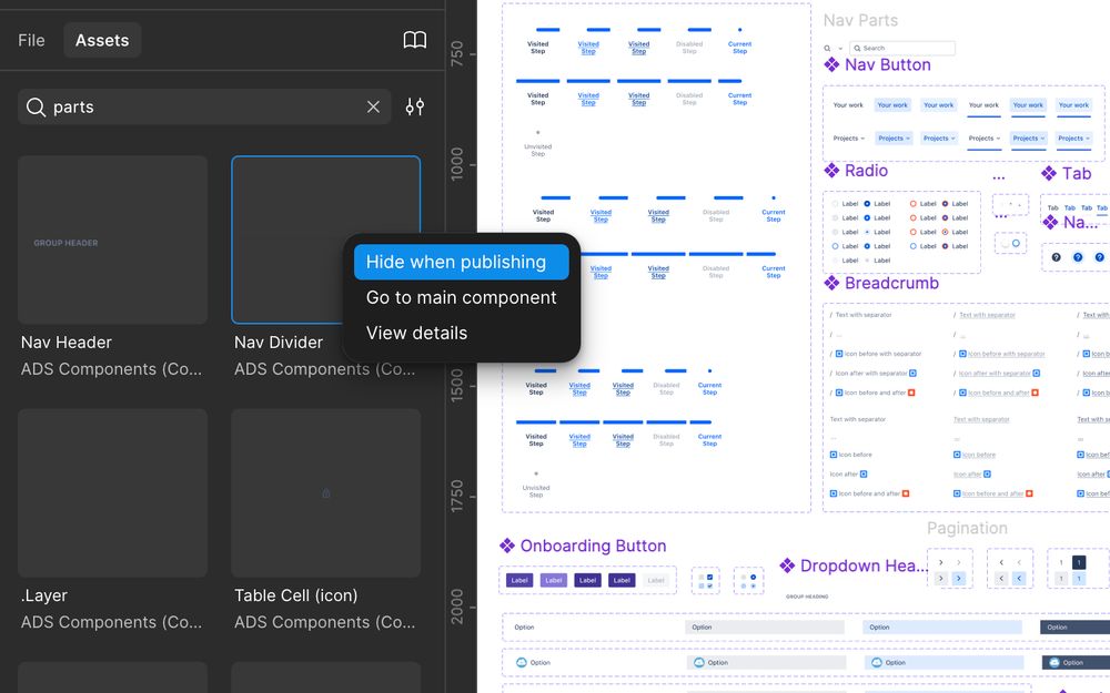
..And makes a clear distinction for what components should be "hidden" from the published library.
June 13, 2025 at 1:00 PM
..And makes a clear distinction for what components should be "hidden" from the published library.
The advantage of this?
It keeps your other component pages clutter free..
It keeps your other component pages clutter free..
June 13, 2025 at 1:00 PM
The advantage of this?
It keeps your other component pages clutter free..
It keeps your other component pages clutter free..
These small "parts" are important for the building of other components, but are not meant to be used on their own.

June 13, 2025 at 1:00 PM
These small "parts" are important for the building of other components, but are not meant to be used on their own.
Subscribe to my newsletter, Friday Five, to get tips like this directly in your inbox!
✨ Join 25,000+ subscribers
✨ Learn about Figma & Design Systems
✨ Great tips, no fluff
www.uiprep.com/newsletter
✨ Join 25,000+ subscribers
✨ Learn about Figma & Design Systems
✨ Great tips, no fluff
www.uiprep.com/newsletter
UI Prep: Friday Five Newsletter
Become a more confident designer by joining the Friday Five newsletter. Get 5 practical tips about Figma and design systems every Friday. Always free. No fluff.
www.uiprep.com
June 5, 2025 at 1:15 PM
Subscribe to my newsletter, Friday Five, to get tips like this directly in your inbox!
✨ Join 25,000+ subscribers
✨ Learn about Figma & Design Systems
✨ Great tips, no fluff
www.uiprep.com/newsletter
✨ Join 25,000+ subscribers
✨ Learn about Figma & Design Systems
✨ Great tips, no fluff
www.uiprep.com/newsletter
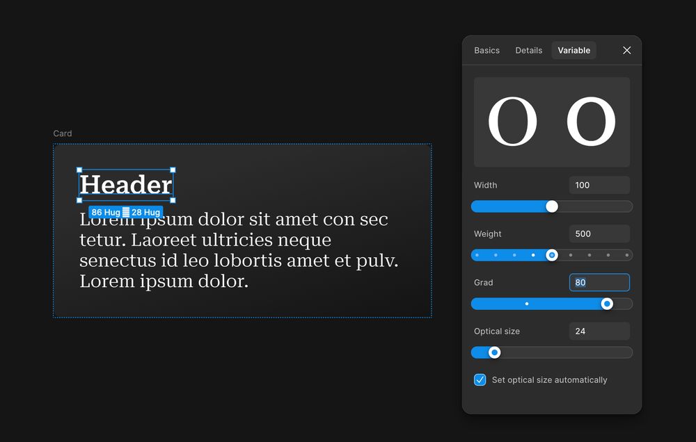
The good news?
Adjusting weight is easy and supported by most fonts.
You can set different weights in Figma variables so your text automatically thickens when switching to dark mode.
Adjusting weight is easy and supported by most fonts.
You can set different weights in Figma variables so your text automatically thickens when switching to dark mode.

June 5, 2025 at 1:15 PM
The good news?
Adjusting weight is easy and supported by most fonts.
You can set different weights in Figma variables so your text automatically thickens when switching to dark mode.
Adjusting weight is easy and supported by most fonts.
You can set different weights in Figma variables so your text automatically thickens when switching to dark mode.
Ideally, you'd adjust grade when switching themes. But..
1. Not all fonts support grade
2. Figma (currently) doesn’t have the proper variable support
So... most teams go with weight instead.
1. Not all fonts support grade
2. Figma (currently) doesn’t have the proper variable support
So... most teams go with weight instead.
June 5, 2025 at 1:15 PM
Ideally, you'd adjust grade when switching themes. But..
1. Not all fonts support grade
2. Figma (currently) doesn’t have the proper variable support
So... most teams go with weight instead.
1. Not all fonts support grade
2. Figma (currently) doesn’t have the proper variable support
So... most teams go with weight instead.
This can be done by adjusting the text weight or the text grade.
Text grade = subtle stroke thickness, same spacing & size.
Great for fine-tuning without breaking layout.
Text weight = heavier or lighter font style (e.g. Regular → Semibold)
More noticeable and affects spacing a bit.
Text grade = subtle stroke thickness, same spacing & size.
Great for fine-tuning without breaking layout.
Text weight = heavier or lighter font style (e.g. Regular → Semibold)
More noticeable and affects spacing a bit.
June 5, 2025 at 1:15 PM
This can be done by adjusting the text weight or the text grade.
Text grade = subtle stroke thickness, same spacing & size.
Great for fine-tuning without breaking layout.
Text weight = heavier or lighter font style (e.g. Regular → Semibold)
More noticeable and affects spacing a bit.
Text grade = subtle stroke thickness, same spacing & size.
Great for fine-tuning without breaking layout.
Text weight = heavier or lighter font style (e.g. Regular → Semibold)
More noticeable and affects spacing a bit.
Subscribe to my newsletter, Friday Five, to get tips like this directly in your inbox!
✨ Join 25,000+ subscribers
✨ Learn about Figma & Design Systems
✨ Great tips, no fluff
www.uiprep.com/newsletter
✨ Join 25,000+ subscribers
✨ Learn about Figma & Design Systems
✨ Great tips, no fluff
www.uiprep.com/newsletter
UI Prep: Friday Five Newsletter
Become a more confident designer by joining the Friday Five newsletter. Get 5 practical tips about Figma and design systems every Friday. Always free. No fluff.
www.uiprep.com
May 30, 2025 at 12:57 PM
Subscribe to my newsletter, Friday Five, to get tips like this directly in your inbox!
✨ Join 25,000+ subscribers
✨ Learn about Figma & Design Systems
✨ Great tips, no fluff
www.uiprep.com/newsletter
✨ Join 25,000+ subscribers
✨ Learn about Figma & Design Systems
✨ Great tips, no fluff
www.uiprep.com/newsletter
UI Prep: Friday Five Newsletter
Become a more confident designer by joining the Friday Five newsletter. Get 5 practical tips about Figma and design systems every Friday. Always free. No fluff.
www.uiprep.com
May 28, 2025 at 1:00 PM
Subscribe to my newsletter, Friday Five, to get tips like this directly in your inbox!
✨ Join 25,000+ subscribers
✨ Learn about Figma & Design Systems
✨ Great tips, no fluff
www.uiprep.com/newsletter
✨ Join 25,000+ subscribers
✨ Learn about Figma & Design Systems
✨ Great tips, no fluff
www.uiprep.com/newsletter
Now, you can just apply Grids to one frame!
1. Select a frame and apply Grids (adjust rows/columns if needed)
2. Add content to frame
1. Select a frame and apply Grids (adjust rows/columns if needed)
2. Add content to frame
May 28, 2025 at 1:00 PM
Now, you can just apply Grids to one frame!
1. Select a frame and apply Grids (adjust rows/columns if needed)
2. Add content to frame
1. Select a frame and apply Grids (adjust rows/columns if needed)
2. Add content to frame
Before, to make a list like this, you would need to..
1. Create three vertical auto layout lists
2. Place all three lists inside a larger horizontal auto layout
3. Make sure all the hug/fill settings are correct
1. Create three vertical auto layout lists
2. Place all three lists inside a larger horizontal auto layout
3. Make sure all the hug/fill settings are correct

May 28, 2025 at 1:00 PM
Before, to make a list like this, you would need to..
1. Create three vertical auto layout lists
2. Place all three lists inside a larger horizontal auto layout
3. Make sure all the hug/fill settings are correct
1. Create three vertical auto layout lists
2. Place all three lists inside a larger horizontal auto layout
3. Make sure all the hug/fill settings are correct
@brad_frost and I had a ton of fun collaborating on this Figma design file that highlights examples from his new course, Subatomic.
Get a copy of the file by joining either of our courses!
designtokenscourse.com/
maven.com/ui-prep/des...
Get a copy of the file by joining either of our courses!
designtokenscourse.com/
maven.com/ui-prep/des...

May 2, 2025 at 1:00 PM
@brad_frost and I had a ton of fun collaborating on this Figma design file that highlights examples from his new course, Subatomic.
Get a copy of the file by joining either of our courses!
designtokenscourse.com/
maven.com/ui-prep/des...
Get a copy of the file by joining either of our courses!
designtokenscourse.com/
maven.com/ui-prep/des...
Which can then be shared across multiple brand modes in your tier 2 collection (aka the semantic collection).

May 2, 2025 at 1:00 PM
Which can then be shared across multiple brand modes in your tier 2 collection (aka the semantic collection).
..and neutral, utility, and transparent colors.

May 2, 2025 at 1:00 PM
..and neutral, utility, and transparent colors.
If your DS is supporting multiple brands.. reduce the tokens needed by letting the brands share some “core” tokens for things like spacing numbers..

May 2, 2025 at 1:00 PM
If your DS is supporting multiple brands.. reduce the tokens needed by letting the brands share some “core” tokens for things like spacing numbers..
