


Matthew Kay
@mjskay.com
Assoc Prof Computer Science and Communication Studies at Northwestern. Infovis, HCI. Author of tidybayes & ggdist R pkgs. he/him. 🏳️🌈 https://mjskay.com/
Co-director https://mucollective.northwestern.edu
Co-founder https://journalovi.org
Co-director https://mucollective.northwestern.edu
Co-founder https://journalovi.org
The font would appear to be English 111 Adagio CE, available for the highly presidential sum of just $39.75 USD
Note "The" is not kerned correctly
(see perspective-corrected still for reference)
Note "The" is not kerned correctly
(see perspective-corrected still for reference)


November 12, 2025 at 5:11 AM
The font would appear to be English 111 Adagio CE, available for the highly presidential sum of just $39.75 USD
Note "The" is not kerned correctly
(see perspective-corrected still for reference)
Note "The" is not kerned correctly
(see perspective-corrected still for reference)

would you say you're more a 75° or a 10°

October 9, 2025 at 2:33 PM
would you say you're more a 75° or a 10°
though this is more "can you eyeball about 10% of the mass being above water and the center of mass being in the middle so the thing doesn't move from initial conditions" which obviously doesn't tell you if it could have *formed* that way in the first place

October 9, 2025 at 7:22 AM
though this is more "can you eyeball about 10% of the mass being above water and the center of mass being in the middle so the thing doesn't move from initial conditions" which obviously doesn't tell you if it could have *formed* that way in the first place
and also
(this is fun I'm getting pretty good at this)
(this is fun I'm getting pretty good at this)

October 9, 2025 at 7:14 AM
and also
(this is fun I'm getting pretty good at this)
(this is fun I'm getting pretty good at this)

to appear at #alt.vis 2025: THEORY IS SHAPES
sure "theory figures" are great, but @matthew.wiki, @maryamhed.bsky.social, me, and Carolina Nobre wonder: why always a 2D plane or a flowchart? why not icebergs, horseshoes, Möbius strips, or BLT sandwiches?
arxiv.org/abs/2510.01382
#ieeevis #hci
sure "theory figures" are great, but @matthew.wiki, @maryamhed.bsky.social, me, and Carolina Nobre wonder: why always a 2D plane or a flowchart? why not icebergs, horseshoes, Möbius strips, or BLT sandwiches?
arxiv.org/abs/2510.01382
#ieeevis #hci

October 9, 2025 at 3:03 AM
to appear at #alt.vis 2025: THEORY IS SHAPES
sure "theory figures" are great, but @matthew.wiki, @maryamhed.bsky.social, me, and Carolina Nobre wonder: why always a 2D plane or a flowchart? why not icebergs, horseshoes, Möbius strips, or BLT sandwiches?
arxiv.org/abs/2510.01382
#ieeevis #hci
sure "theory figures" are great, but @matthew.wiki, @maryamhed.bsky.social, me, and Carolina Nobre wonder: why always a 2D plane or a flowchart? why not icebergs, horseshoes, Möbius strips, or BLT sandwiches?
arxiv.org/abs/2510.01382
#ieeevis #hci
fun! are we allowed to improve the chart?
that density estimator doesn't account for the boundedness of group C and it's usually possible to do better than random jitter
that density estimator doesn't account for the boundedness of group C and it's usually possible to do better than random jitter

September 30, 2025 at 4:15 AM
fun! are we allowed to improve the chart?
that density estimator doesn't account for the boundedness of group C and it's usually possible to do better than random jitter
that density estimator doesn't account for the boundedness of group C and it's usually possible to do better than random jitter
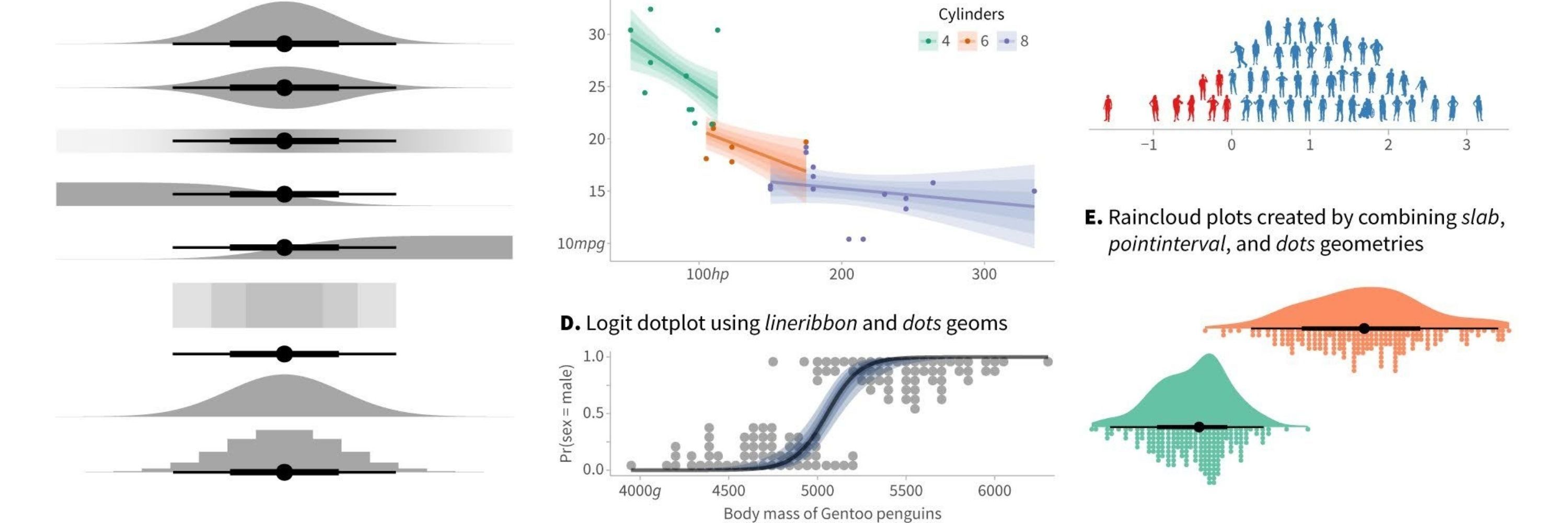
it's doable! they're like little hats

![library(ggplot2)
library(ggdist)
library(distributional)
theme_set(theme_ggdist())
data.frame(
x = dist_normal(1:5, exp(4:0 / 8)),
y = letters[1:5]
) |>
ggplot(aes(xdist = x, y = y)) +
stat_slabinterval(
aes(thickness = 1 - abs(2 * !!Pr_(X <= x) - 1))
)](https://cdn.bsky.app/img/feed_thumbnail/plain/did:plc:6fs5x6cofzyz4si2xhqiqj37/bafkreic777xb5yfbgkiqicl6gagprsottthrj2e2n5t3pvad3aifb3phei@jpeg)
August 13, 2025 at 5:53 PM
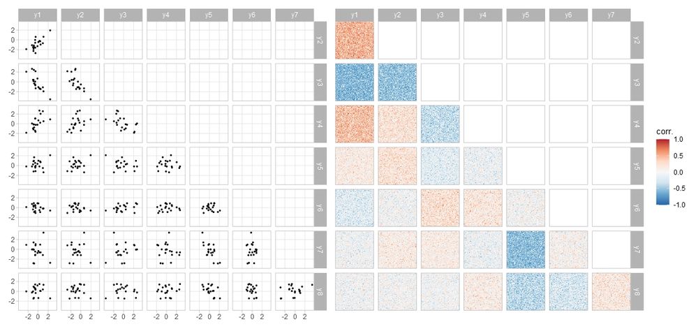
it's doable! they're like little hats
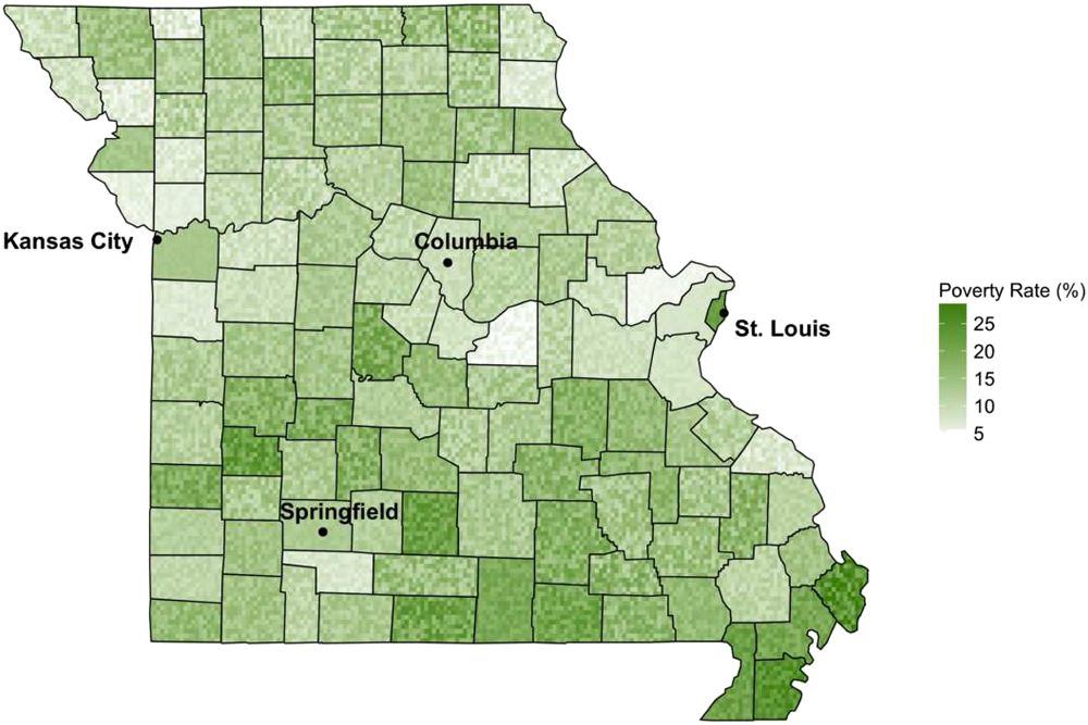
Yeah with a map I think that interpretation is reasonable - it's what that visual form usually means. Makes the technique potentially tricky to apply (and also therefore interesting!)
Some time ago I played with these on correlation heatmaps which don't have that baggage
Some time ago I played with these on correlation heatmaps which don't have that baggage
July 30, 2025 at 6:41 AM
Yeah with a map I think that interpretation is reasonable - it's what that visual form usually means. Makes the technique potentially tricky to apply (and also therefore interesting!)
Some time ago I played with these on correlation heatmaps which don't have that baggage
Some time ago I played with these on correlation heatmaps which don't have that baggage
It's been studied a bit, but not enough IMO (occasionally I contemplate it...)
Lucchesi & Wikle (doi.org/10.1002/sta4...) discuss it (and link to earlier work I've only found illegible scans of: doi.org/10.1016/S009..., and Preston & Ma did a study on some variations (doi.org/10.1109/TVCG...)
Lucchesi & Wikle (doi.org/10.1002/sta4...) discuss it (and link to earlier work I've only found illegible scans of: doi.org/10.1016/S009..., and Preston & Ma did a study on some variations (doi.org/10.1109/TVCG...)
July 30, 2025 at 4:12 AM
It's been studied a bit, but not enough IMO (occasionally I contemplate it...)
Lucchesi & Wikle (doi.org/10.1002/sta4...) discuss it (and link to earlier work I've only found illegible scans of: doi.org/10.1016/S009..., and Preston & Ma did a study on some variations (doi.org/10.1109/TVCG...)
Lucchesi & Wikle (doi.org/10.1002/sta4...) discuss it (and link to earlier work I've only found illegible scans of: doi.org/10.1016/S009..., and Preston & Ma did a study on some variations (doi.org/10.1109/TVCG...)
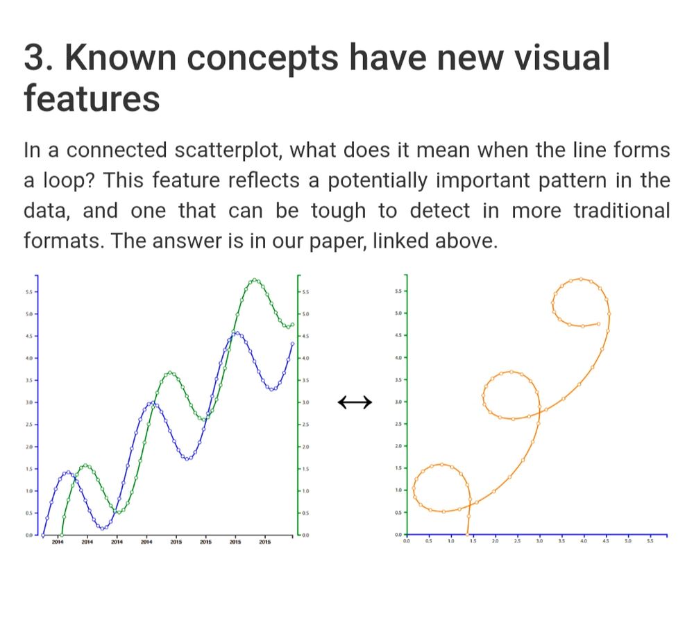
@steveharoz.com has a nice page+paper that includes pros/cons of connected scatterplots and how to read them: steveharoz.com/research/con...
July 26, 2025 at 5:30 PM
@steveharoz.com has a nice page+paper that includes pros/cons of connected scatterplots and how to read them: steveharoz.com/research/con...
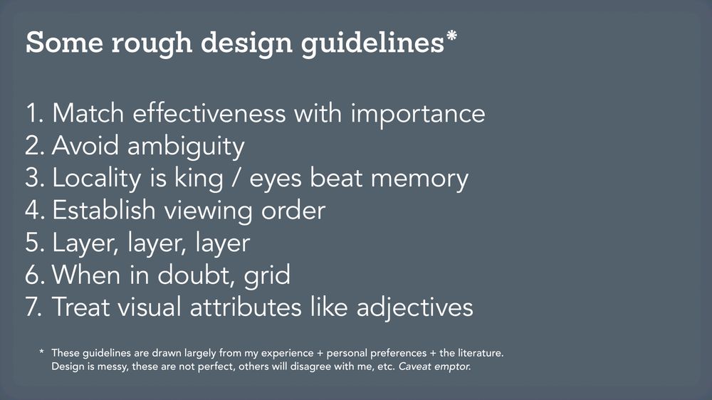
7. Treat visual attributes like adjectives
You wouldn't write "the very tall building is very extremely tall"; don't do the visual equivalent. If everything is emphasized nothing is.
Corrolary: obey the pen. If you drew it by hand, line widths and font weights would match, creating even texture.
You wouldn't write "the very tall building is very extremely tall"; don't do the visual equivalent. If everything is emphasized nothing is.
Corrolary: obey the pen. If you drew it by hand, line widths and font weights would match, creating even texture.


July 3, 2025 at 6:22 PM
7. Treat visual attributes like adjectives
You wouldn't write "the very tall building is very extremely tall"; don't do the visual equivalent. If everything is emphasized nothing is.
Corrolary: obey the pen. If you drew it by hand, line widths and font weights would match, creating even texture.
You wouldn't write "the very tall building is very extremely tall"; don't do the visual equivalent. If everything is emphasized nothing is.
Corrolary: obey the pen. If you drew it by hand, line widths and font weights would match, creating even texture.
6. When in doubt, grid
Vis design is a high-dimensional optimization problem and it's easy to get stuck in a bad corner of the design space
Grids (flexible ones) add constraints that help you start and stay in better parts of the design space
Vis design is a high-dimensional optimization problem and it's easy to get stuck in a bad corner of the design space
Grids (flexible ones) add constraints that help you start and stay in better parts of the design space

July 3, 2025 at 6:22 PM
6. When in doubt, grid
Vis design is a high-dimensional optimization problem and it's easy to get stuck in a bad corner of the design space
Grids (flexible ones) add constraints that help you start and stay in better parts of the design space
Vis design is a high-dimensional optimization problem and it's easy to get stuck in a bad corner of the design space
Grids (flexible ones) add constraints that help you start and stay in better parts of the design space
5. Layer, layer, layer
Design to be read at multiple levels
e.g. this vis lets you see fine detail over time at the state level and high-level geographic patterns across the country: web.archive.org/web/20161220152747/http://graphics.wsj.com/elections/2016/field-guide-red-blue-america/
Design to be read at multiple levels
e.g. this vis lets you see fine detail over time at the state level and high-level geographic patterns across the country: web.archive.org/web/20161220152747/http://graphics.wsj.com/elections/2016/field-guide-red-blue-america/

July 3, 2025 at 6:22 PM
5. Layer, layer, layer
Design to be read at multiple levels
e.g. this vis lets you see fine detail over time at the state level and high-level geographic patterns across the country: web.archive.org/web/20161220152747/http://graphics.wsj.com/elections/2016/field-guide-red-blue-america/
Design to be read at multiple levels
e.g. this vis lets you see fine detail over time at the state level and high-level geographic patterns across the country: web.archive.org/web/20161220152747/http://graphics.wsj.com/elections/2016/field-guide-red-blue-america/
4. Establish viewing order
If you don't do this deliberately, it will be an accident of your design (and likely not a good one)
I like to play an excerpt from this clip on film: the techniques we use for emphasis in vis aren't exactly the same, but the need is similar: youtu.be/v4seDVfgwOg?...
If you don't do this deliberately, it will be an accident of your design (and likely not a good one)
I like to play an excerpt from this clip on film: the techniques we use for emphasis in vis aren't exactly the same, but the need is similar: youtu.be/v4seDVfgwOg?...


July 3, 2025 at 6:22 PM
4. Establish viewing order
If you don't do this deliberately, it will be an accident of your design (and likely not a good one)
I like to play an excerpt from this clip on film: the techniques we use for emphasis in vis aren't exactly the same, but the need is similar: youtu.be/v4seDVfgwOg?...
If you don't do this deliberately, it will be an accident of your design (and likely not a good one)
I like to play an excerpt from this clip on film: the techniques we use for emphasis in vis aren't exactly the same, but the need is similar: youtu.be/v4seDVfgwOg?...
3. Locality is king / eyes beat memory
If people have to commit stuff to memory - or worse multiple things and compare them in their memory - you defeat the purpose of vis in the first place
Implies prefer direct labels over legends/captions, avoid tooltips, make comparisons visual, ...
If people have to commit stuff to memory - or worse multiple things and compare them in their memory - you defeat the purpose of vis in the first place
Implies prefer direct labels over legends/captions, avoid tooltips, make comparisons visual, ...


July 3, 2025 at 6:22 PM
3. Locality is king / eyes beat memory
If people have to commit stuff to memory - or worse multiple things and compare them in their memory - you defeat the purpose of vis in the first place
Implies prefer direct labels over legends/captions, avoid tooltips, make comparisons visual, ...
If people have to commit stuff to memory - or worse multiple things and compare them in their memory - you defeat the purpose of vis in the first place
Implies prefer direct labels over legends/captions, avoid tooltips, make comparisons visual, ...
2. Avoid ambiguity
Marks should not have multiple reasonable interpretations
Compare this to a guideline that doesn't work: maximizing the data-ink ratio. Avoiding ambiguity will identify most of the actual design problems the data-ink ratio would identify without its numerous false positives
Marks should not have multiple reasonable interpretations
Compare this to a guideline that doesn't work: maximizing the data-ink ratio. Avoiding ambiguity will identify most of the actual design problems the data-ink ratio would identify without its numerous false positives


July 3, 2025 at 6:22 PM
2. Avoid ambiguity
Marks should not have multiple reasonable interpretations
Compare this to a guideline that doesn't work: maximizing the data-ink ratio. Avoiding ambiguity will identify most of the actual design problems the data-ink ratio would identify without its numerous false positives
Marks should not have multiple reasonable interpretations
Compare this to a guideline that doesn't work: maximizing the data-ink ratio. Avoiding ambiguity will identify most of the actual design problems the data-ink ratio would identify without its numerous false positives
1. Match effectiveness with importance
Pick the most perceptually effective encodings for your data. This is not a hard rule - other considerations (visual metaphor, audience familiarity, etc) will intercede, but it's often a good place to start design iteration from.
Pick the most perceptually effective encodings for your data. This is not a hard rule - other considerations (visual metaphor, audience familiarity, etc) will intercede, but it's often a good place to start design iteration from.

July 3, 2025 at 6:22 PM
1. Match effectiveness with importance
Pick the most perceptually effective encodings for your data. This is not a hard rule - other considerations (visual metaphor, audience familiarity, etc) will intercede, but it's often a good place to start design iteration from.
Pick the most perceptually effective encodings for your data. This is not a hard rule - other considerations (visual metaphor, audience familiarity, etc) will intercede, but it's often a good place to start design iteration from.
These are the design guidelines I teach. From halfway through this deck: www.mjskay.com/presentation...
These days (for academic vis) I'd add "ensure natural visual operations correspond to meaningful operations in data space". Need to make slides for that.
These days (for academic vis) I'd add "ensure natural visual operations correspond to meaningful operations in data space". Need to make slides for that.
July 3, 2025 at 6:22 PM
These are the design guidelines I teach. From halfway through this deck: www.mjskay.com/presentation...
These days (for academic vis) I'd add "ensure natural visual operations correspond to meaningful operations in data space". Need to make slides for that.
These days (for academic vis) I'd add "ensure natural visual operations correspond to meaningful operations in data space". Need to make slides for that.
man me too, now I need the mashup with Waterworld
(mid 90s Costner was end-of-the-world Costner)
(mid 90s Costner was end-of-the-world Costner)

June 10, 2025 at 8:35 PM
man me too, now I need the mashup with Waterworld
(mid 90s Costner was end-of-the-world Costner)
(mid 90s Costner was end-of-the-world Costner)
Since you asked, there is tidybayes::gather_pairs(), but I wrote it before tidyselect and the pivot to "pivot_" so yours is nicer
this:
penguins |>
pivot_pairwise(bill_len:body_mass)
is roughly:
penguins |>
pivot_longer(bill_len:body_mass) |>
gather_pairs(name, value, triangle = "both")
this:
penguins |>
pivot_pairwise(bill_len:body_mass)
is roughly:
penguins |>
pivot_longer(bill_len:body_mass) |>
gather_pairs(name, value, triangle = "both")

June 4, 2025 at 1:12 AM
Since you asked, there is tidybayes::gather_pairs(), but I wrote it before tidyselect and the pivot to "pivot_" so yours is nicer
this:
penguins |>
pivot_pairwise(bill_len:body_mass)
is roughly:
penguins |>
pivot_longer(bill_len:body_mass) |>
gather_pairs(name, value, triangle = "both")
this:
penguins |>
pivot_pairwise(bill_len:body_mass)
is roughly:
penguins |>
pivot_longer(bill_len:body_mass) |>
gather_pairs(name, value, triangle = "both")
these are always so fascinating
what would it look like if a series showed how the probabilities of the two teams evolved over time, maybe as a stacked area? then you could see how that series went and teams would visually drop off during the round they lose rather than just before it
what would it look like if a series showed how the probabilities of the two teams evolved over time, maybe as a stacked area? then you could see how that series went and teams would visually drop off during the round they lose rather than just before it

May 30, 2025 at 5:25 PM
these are always so fascinating
what would it look like if a series showed how the probabilities of the two teams evolved over time, maybe as a stacked area? then you could see how that series went and teams would visually drop off during the round they lose rather than just before it
what would it look like if a series showed how the probabilities of the two teams evolved over time, maybe as a stacked area? then you could see how that series went and teams would visually drop off during the round they lose rather than just before it
hahaha we're too late, this is too perfect
OP: I want to build it
Commenter: so you totally missed the point of the book right
OP: exactly
OP: I want to build it
Commenter: so you totally missed the point of the book right
OP: exactly


May 27, 2025 at 4:38 PM
hahaha we're too late, this is too perfect
OP: I want to build it
Commenter: so you totally missed the point of the book right
OP: exactly
OP: I want to build it
Commenter: so you totally missed the point of the book right
OP: exactly
perhaps a case for gridlines?
on asymmetric layouts I think they can guide the eye to the right "center" in each group since it isn't the center of mass
on asymmetric layouts I think they can guide the eye to the right "center" in each group since it isn't the center of mass


May 2, 2025 at 6:19 PM
perhaps a case for gridlines?
on asymmetric layouts I think they can guide the eye to the right "center" in each group since it isn't the center of mass
on asymmetric layouts I think they can guide the eye to the right "center" in each group since it isn't the center of mass