


@mattwulff.bsky.social
Just need to play our game Saturday. Nothing else matters
October 10, 2025 at 2:07 PM
Just need to play our game Saturday. Nothing else matters
I’ll get back on my uni reviews soon enough as well
September 23, 2025 at 2:22 AM
I’ll get back on my uni reviews soon enough as well
Back on here to say Brewers are once again division champs. Now let’s go clinch the one seed
September 23, 2025 at 2:20 AM
Back on here to say Brewers are once again division champs. Now let’s go clinch the one seed
The Real World/Challenge ran so Love Island could walk
July 24, 2025 at 10:55 PM
The Real World/Challenge ran so Love Island could walk
Packers Alternate/Throwback Uniforms
-jersey is incredible. Colors are perfect together
-helmet is atrocious. Worst in the league.
-wish the helmet was the solid gold color of the numbers & stripes
-7.1/10
-jersey is incredible. Colors are perfect together
-helmet is atrocious. Worst in the league.
-wish the helmet was the solid gold color of the numbers & stripes
-7.1/10

July 24, 2025 at 1:21 PM
Packers Alternate/Throwback Uniforms
-jersey is incredible. Colors are perfect together
-helmet is atrocious. Worst in the league.
-wish the helmet was the solid gold color of the numbers & stripes
-7.1/10
-jersey is incredible. Colors are perfect together
-helmet is atrocious. Worst in the league.
-wish the helmet was the solid gold color of the numbers & stripes
-7.1/10
SWEEP SWEEP AGAINST THE DEFENDING WORLD CHAMPIONS
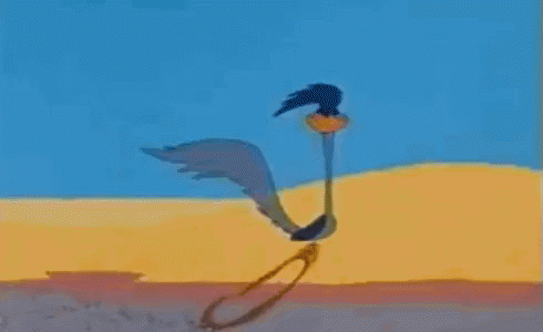
a cartoon of a cactus with a bird on it 's back .
ALT: a cartoon of a cactus with a bird on it 's back .
media.tenor.com
July 9, 2025 at 9:56 PM
SWEEP SWEEP AGAINST THE DEFENDING WORLD CHAMPIONS
IT TOOK TWO MONTHS BUT WE FINALLY HAVE OUR FIRST SWEEP SWEEP OF THE SEASON
a cartoon of a cactus with a bird on it 's back .
ALT: a cartoon of a cactus with a bird on it 's back .
media.tenor.com
May 28, 2025 at 9:20 PM
IT TOOK TWO MONTHS BUT WE FINALLY HAVE OUR FIRST SWEEP SWEEP OF THE SEASON
Red Sox City Connect
-love how the Fenway shade of green turned out on the uni
-numbers, script, collars, everything fits fantastically
-wouldn’t have minded a different hat logo but the traditional look plays
-matte helmets are gorgeous
-8.8/10
-love how the Fenway shade of green turned out on the uni
-numbers, script, collars, everything fits fantastically
-wouldn’t have minded a different hat logo but the traditional look plays
-matte helmets are gorgeous
-8.8/10

May 18, 2025 at 2:52 AM
Red Sox City Connect
-love how the Fenway shade of green turned out on the uni
-numbers, script, collars, everything fits fantastically
-wouldn’t have minded a different hat logo but the traditional look plays
-matte helmets are gorgeous
-8.8/10
-love how the Fenway shade of green turned out on the uni
-numbers, script, collars, everything fits fantastically
-wouldn’t have minded a different hat logo but the traditional look plays
-matte helmets are gorgeous
-8.8/10
Arsenal Home Kit
-clean & simple, just how a home kit should be
-the old English A design is one I actually like!
-the cannon logo is great but going back to the traditional crest feels right
-8.3/10
-clean & simple, just how a home kit should be
-the old English A design is one I actually like!
-the cannon logo is great but going back to the traditional crest feels right
-8.3/10

May 15, 2025 at 11:44 AM
Arsenal Home Kit
-clean & simple, just how a home kit should be
-the old English A design is one I actually like!
-the cannon logo is great but going back to the traditional crest feels right
-8.3/10
-clean & simple, just how a home kit should be
-the old English A design is one I actually like!
-the cannon logo is great but going back to the traditional crest feels right
-8.3/10
Every Giannis hypothetical trade is garbage
May 14, 2025 at 4:21 AM
Every Giannis hypothetical trade is garbage
USA Away Kit
-FINALLY a navy kit I like
-pinstripes can be hard to pull off but I think they work very well here
-I prefer the front number to be center chest, men usually have it below the Nike logo
-pumped to see these in action
-7.8/10
-FINALLY a navy kit I like
-pinstripes can be hard to pull off but I think they work very well here
-I prefer the front number to be center chest, men usually have it below the Nike logo
-pumped to see these in action
-7.8/10

May 13, 2025 at 5:22 PM
USA Away Kit
-FINALLY a navy kit I like
-pinstripes can be hard to pull off but I think they work very well here
-I prefer the front number to be center chest, men usually have it below the Nike logo
-pumped to see these in action
-7.8/10
-FINALLY a navy kit I like
-pinstripes can be hard to pull off but I think they work very well here
-I prefer the front number to be center chest, men usually have it below the Nike logo
-pumped to see these in action
-7.8/10
USWNT Home Kit
-great to see the WNT get their own kit
-star design isn’t too busy but still noticeable
-a slight upgrade from the current home kit
-6.8/10
-great to see the WNT get their own kit
-star design isn’t too busy but still noticeable
-a slight upgrade from the current home kit
-6.8/10

May 13, 2025 at 5:19 PM
USWNT Home Kit
-great to see the WNT get their own kit
-star design isn’t too busy but still noticeable
-a slight upgrade from the current home kit
-6.8/10
-great to see the WNT get their own kit
-star design isn’t too busy but still noticeable
-a slight upgrade from the current home kit
-6.8/10
Manchester City Home Kit
-don’t like the sash design
-full collar should be white to match the sleeves
-overall boring
-4.8/10
-don’t like the sash design
-full collar should be white to match the sleeves
-overall boring
-4.8/10

May 13, 2025 at 3:04 PM
Manchester City Home Kit
-don’t like the sash design
-full collar should be white to match the sleeves
-overall boring
-4.8/10
-don’t like the sash design
-full collar should be white to match the sleeves
-overall boring
-4.8/10
Diamondbacks City Connect
-colors are fantastic
-love they’re sticking with the Serpientes brand.
-don’t need the faint black pinstripes
-not as good as their first CCs, which were one of the leagues best
-6.5/10
-colors are fantastic
-love they’re sticking with the Serpientes brand.
-don’t need the faint black pinstripes
-not as good as their first CCs, which were one of the leagues best
-6.5/10

May 5, 2025 at 5:31 PM
Diamondbacks City Connect
-colors are fantastic
-love they’re sticking with the Serpientes brand.
-don’t need the faint black pinstripes
-not as good as their first CCs, which were one of the leagues best
-6.5/10
-colors are fantastic
-love they’re sticking with the Serpientes brand.
-don’t need the faint black pinstripes
-not as good as their first CCs, which were one of the leagues best
-6.5/10
Marlins City Connect
-the colors play
-wish the jersey design would be consistent throughout
-the hat is very bad
-4.4/10
-the colors play
-wish the jersey design would be consistent throughout
-the hat is very bad
-4.4/10

April 30, 2025 at 5:07 PM
Marlins City Connect
-the colors play
-wish the jersey design would be consistent throughout
-the hat is very bad
-4.4/10
-the colors play
-wish the jersey design would be consistent throughout
-the hat is very bad
-4.4/10
White Sox City Connect
-copying a team from another sports uni is unbelievably dumb
-replace the red with white and you have a decent alternate
-2.6/10
-copying a team from another sports uni is unbelievably dumb
-replace the red with white and you have a decent alternate
-2.6/10

April 29, 2025 at 11:44 AM
White Sox City Connect
-copying a team from another sports uni is unbelievably dumb
-replace the red with white and you have a decent alternate
-2.6/10
-copying a team from another sports uni is unbelievably dumb
-replace the red with white and you have a decent alternate
-2.6/10
Rockies City Connect
-looks like a cheap screen printed shirt
-too many colors going on
-another city connect L for me
-3.7/10
-looks like a cheap screen printed shirt
-too many colors going on
-another city connect L for me
-3.7/10

April 12, 2025 at 7:41 PM
Rockies City Connect
-looks like a cheap screen printed shirt
-too many colors going on
-another city connect L for me
-3.7/10
-looks like a cheap screen printed shirt
-too many colors going on
-another city connect L for me
-3.7/10
Giants City Connect
-another awful rendition
-everything about this stinks, don’t think it’s better than their old (bad) ones
-At least it says Giants and not some lame nickname
-1.1/10
-another awful rendition
-everything about this stinks, don’t think it’s better than their old (bad) ones
-At least it says Giants and not some lame nickname
-1.1/10

April 8, 2025 at 3:21 PM
Giants City Connect
-another awful rendition
-everything about this stinks, don’t think it’s better than their old (bad) ones
-At least it says Giants and not some lame nickname
-1.1/10
-another awful rendition
-everything about this stinks, don’t think it’s better than their old (bad) ones
-At least it says Giants and not some lame nickname
-1.1/10
Nationals City Connect
-downgrade from the cherry blossoms
-jersey design looks cheap
-colors don’t speak Nats at all
-3.8/10
-downgrade from the cherry blossoms
-jersey design looks cheap
-colors don’t speak Nats at all
-3.8/10

March 23, 2025 at 3:02 PM
Nationals City Connect
-downgrade from the cherry blossoms
-jersey design looks cheap
-colors don’t speak Nats at all
-3.8/10
-downgrade from the cherry blossoms
-jersey design looks cheap
-colors don’t speak Nats at all
-3.8/10
Astros City Connect Uniforms
-upgrade from space city
-love the jersey logo, just have it say Astros though
-hat is okay, don’t love the two panel design
-sleeve trim might be a little thick
-7.4/10
-upgrade from space city
-love the jersey logo, just have it say Astros though
-hat is okay, don’t love the two panel design
-sleeve trim might be a little thick
-7.4/10

March 19, 2025 at 5:40 PM
Astros City Connect Uniforms
-upgrade from space city
-love the jersey logo, just have it say Astros though
-hat is okay, don’t love the two panel design
-sleeve trim might be a little thick
-7.4/10
-upgrade from space city
-love the jersey logo, just have it say Astros though
-hat is okay, don’t love the two panel design
-sleeve trim might be a little thick
-7.4/10
I still don’t understand why the Big Ten tournament insisted on making everything racing themed. Doesn’t hit the same without the color wheel
March 14, 2025 at 2:28 AM
I still don’t understand why the Big Ten tournament insisted on making everything racing themed. Doesn’t hit the same without the color wheel