


Christophe Lamperti
@lamperti.me
Engineer turned designer lamperti.me
I like when things are perfectly aligned.
Previously at Apple, Sunrise, Microsoft
I like when things are perfectly aligned.
Previously at Apple, Sunrise, Microsoft
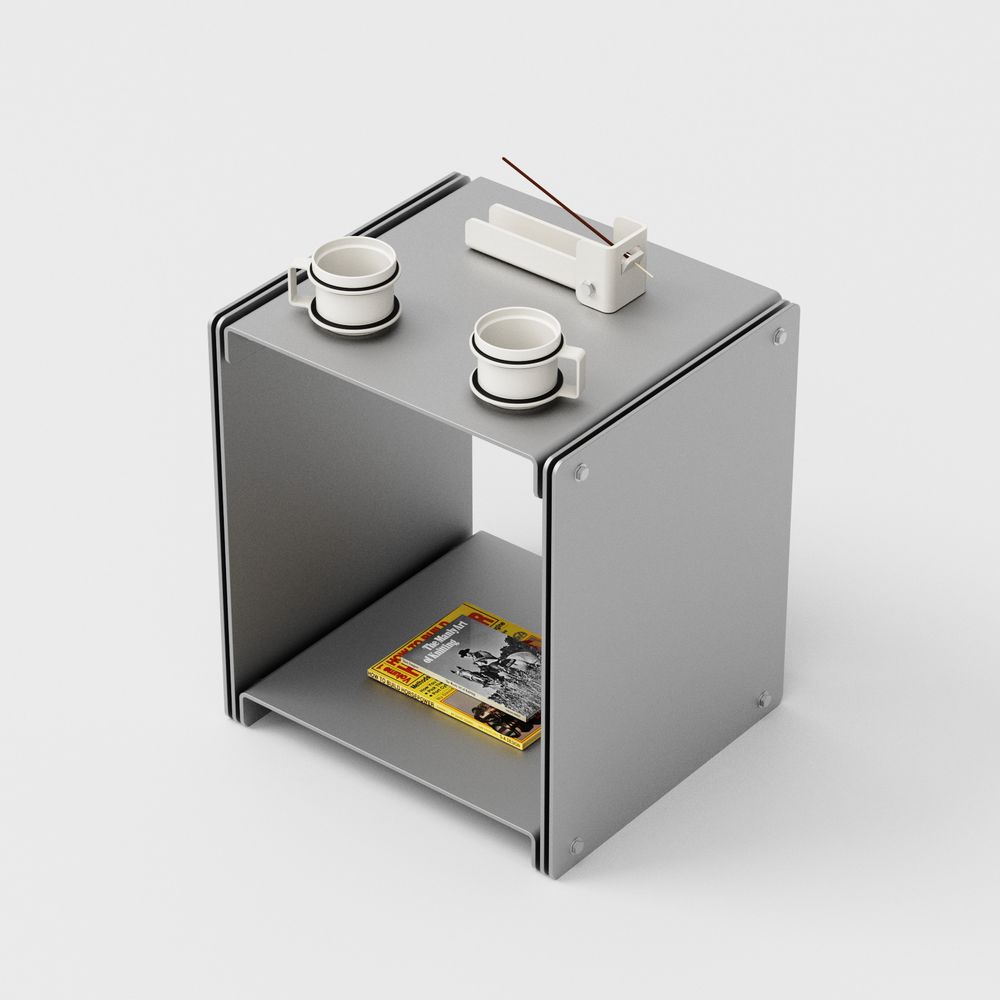
Just found the ideal side table to casually leave my perfectly aligned set of two coffee mugs and vintage magazines. www.standardequipment.ca/product/3075...
March 3, 2025 at 5:47 PM
Just found the ideal side table to casually leave my perfectly aligned set of two coffee mugs and vintage magazines. www.standardequipment.ca/product/3075...
New Thermomix! Noise and UI responsiveness were the biggest issues, so that looks promising. A bit sad they got rid of the physical dial. I’m going to wait for other colors, this one is too sci-fi. www.vorwerk.com/gb/en/thermo...
February 17, 2025 at 7:01 PM
New Thermomix! Noise and UI responsiveness were the biggest issues, so that looks promising. A bit sad they got rid of the physical dial. I’m going to wait for other colors, this one is too sci-fi. www.vorwerk.com/gb/en/thermo...
Love this new icon font, with variable weight, optical size and roundness typotheque.com/blog/zed-icons-for-communication-beyond-language (via @arun.is)
February 12, 2025 at 3:08 PM
Love this new icon font, with variable weight, optical size and roundness typotheque.com/blog/zed-icons-for-communication-beyond-language (via @arun.is)
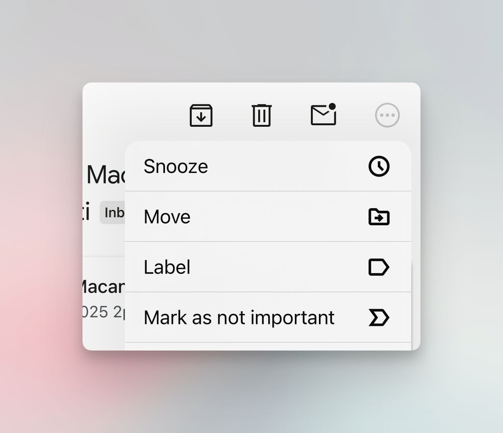
This icon weight mismatch in the new Gmail iOS app stresses me out a bit 😅
January 31, 2025 at 4:10 PM
This icon weight mismatch in the new Gmail iOS app stresses me out a bit 😅
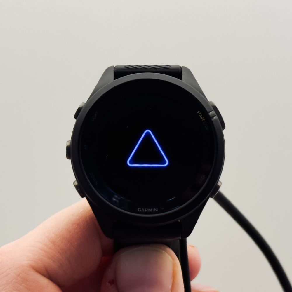
Seems like Garmin doesn’t test updates before deploying them to users. Also, a blue triangle, really? What about some guidance on how to fix the crash instead?
January 28, 2025 at 9:50 PM
Seems like Garmin doesn’t test updates before deploying them to users. Also, a blue triangle, really? What about some guidance on how to fix the crash instead?
I thought Porsche started the full-width taillight trend (die Heckblende in German) with the 911 in the 70's. Turns out Dodge already had them in 1966.
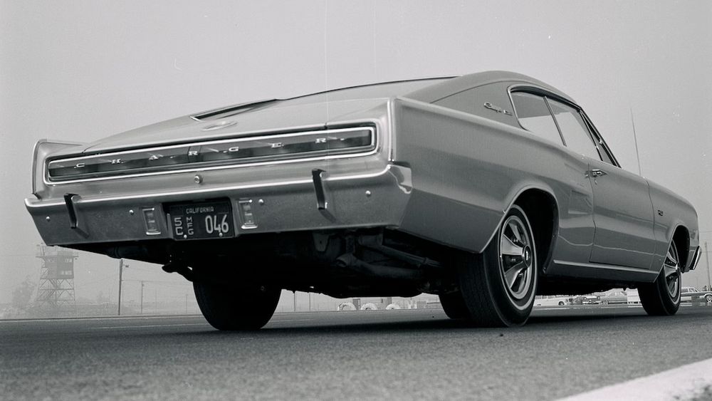
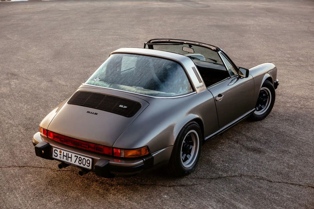
January 28, 2025 at 8:14 PM
I thought Porsche started the full-width taillight trend (die Heckblende in German) with the 911 in the 70's. Turns out Dodge already had them in 1966.
Yeah it could be less boxy for sure. There is something that I really like about this design though, it just feels a bit too faux-retro. Re: EV6, it looks great from the side! I do find the pinched front fascia a bit weird.
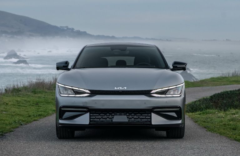
January 24, 2025 at 11:29 PM
Yeah it could be less boxy for sure. There is something that I really like about this design though, it just feels a bit too faux-retro. Re: EV6, it looks great from the side! I do find the pinched front fascia a bit weird.
Love the mix of usability and minimal aesthetic in this German coffee machine. The right way to make an interface without a touchscreen: satisfying physical dial, simple navigation, colorful icons.
January 16, 2025 at 10:23 PM
Love the mix of usability and minimal aesthetic in this German coffee machine. The right way to make an interface without a touchscreen: satisfying physical dial, simple navigation, colorful icons.
You think a thin long screen won’t help? The left and right edge of my digital cluster are hidden by the wheel and that’s annoying. Older Renaults like the Twingo had a thing digital speedometer and it wasn’t bad, although a bit close to the center probably.
January 7, 2025 at 9:06 PM
You think a thin long screen won’t help? The left and right edge of my digital cluster are hidden by the wheel and that’s annoying. Older Renaults like the Twingo had a thing digital speedometer and it wasn’t bad, although a bit close to the center probably.
Really like that you can change the weight of separators in Craft 👌
January 7, 2025 at 7:47 PM
Really like that you can change the weight of separators in Craft 👌
Tell us more! This is the UI of the new Renault 5. Contrast is definitely better, but the buttons look quite small, and the navigation feels heavy.

December 20, 2024 at 9:19 PM
Tell us more! This is the UI of the new Renault 5. Contrast is definitely better, but the buttons look quite small, and the navigation feels heavy.
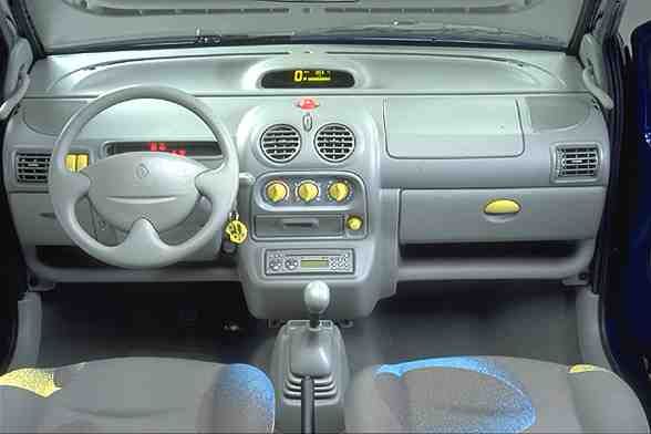
This infotainment UI for a French car gives me peak pre-iPhone vibes. If your goal is visual noise, the Christmas wrapping paper background is perfect – less so when you need to use the buttons while driving.

December 20, 2024 at 4:40 PM
This infotainment UI for a French car gives me peak pre-iPhone vibes. If your goal is visual noise, the Christmas wrapping paper background is perfect – less so when you need to use the buttons while driving.
Been using Claude for a few weeks and its splitscreen UI with live preview is brilliant. Finally a chatbot that feels like an actual collaborating experience.
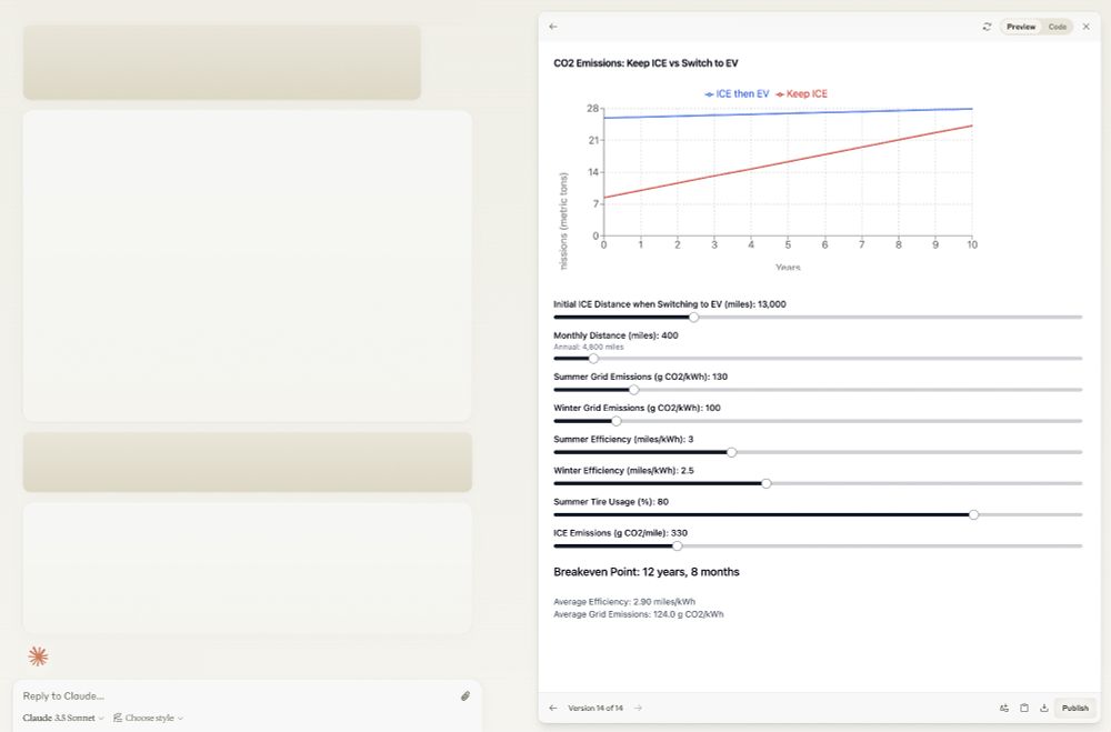
December 9, 2024 at 5:13 PM
Been using Claude for a few weeks and its splitscreen UI with live preview is brilliant. Finally a chatbot that feels like an actual collaborating experience.
Cancel your Amazon Prime? www.theverge.com/2024/11/26/2...

November 29, 2024 at 7:30 PM
Cancel your Amazon Prime? www.theverge.com/2024/11/26/2...
The Mac OS Control Panel by Susan Kare is such a remarkable UI. It was designed in 1984 without any text labels and fits in only 315x158 pixels.

November 27, 2024 at 3:42 PM
The Mac OS Control Panel by Susan Kare is such a remarkable UI. It was designed in 1984 without any text labels and fits in only 315x158 pixels.
Finally, I bought a precision batter dispenser, and before turning 40. My life is close to complete.

November 23, 2024 at 1:58 PM
Finally, I bought a precision batter dispenser, and before turning 40. My life is close to complete.
Me: stops listening for a while
App: let me rewind a bit.
Easily my favorite feature lately.
App: let me rewind a bit.
Easily my favorite feature lately.

November 18, 2024 at 2:08 PM
Me: stops listening for a while
App: let me rewind a bit.
Easily my favorite feature lately.
App: let me rewind a bit.
Easily my favorite feature lately.
Just tried the genAI playground on iOS, and I’m pretty sure the prompt was: “What if the dog from Up was human?”
November 14, 2024 at 8:04 PM
Just tried the genAI playground on iOS, and I’m pretty sure the prompt was: “What if the dog from Up was human?”
We didn’t win the popular vote, but we can be #1 on the App Store 🙃

November 13, 2024 at 2:04 PM
We didn’t win the popular vote, but we can be #1 on the App Store 🙃