


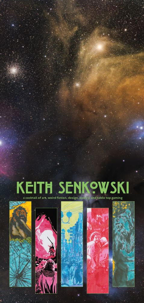
Keith
@keithsenkowski.com
I create a cocktail of art, weird fiction, design, poetry, and table top gaming.
Free Newsletter 👉 keithsenkowski.com
Books, Art, & Magazines 👉 shop.keithsenkowski.com
Support 👉 thetrevorproject.org
Free Newsletter 👉 keithsenkowski.com
Books, Art, & Magazines 👉 shop.keithsenkowski.com
Support 👉 thetrevorproject.org
13 lino cut prints each uniquely treated. Used a loose pastels dust that was fun and a little chaotic to work with.

November 8, 2025 at 6:25 PM
13 lino cut prints each uniquely treated. Used a loose pastels dust that was fun and a little chaotic to work with.
I’m at Rock Con in Rockford Illinois this weekend. Come say hello. rock-con.com

November 7, 2025 at 10:46 PM
I’m at Rock Con in Rockford Illinois this weekend. Come say hello. rock-con.com
I decided I wanted a full page illustration of the Tyrant, so I made one. The cover and other illustrations they are kind of hidden in the designs, so wanted to do something bright and disarming. Something simple. I also gave him 6 toes on each foot cause it is just weird.

November 7, 2025 at 3:15 PM
I decided I wanted a full page illustration of the Tyrant, so I made one. The cover and other illustrations they are kind of hidden in the designs, so wanted to do something bright and disarming. Something simple. I also gave him 6 toes on each foot cause it is just weird.
Happy with how these spreads are coming together. A couple more tweaks and off to the printer we will go. If I am lucky, I will be able to ship issue 3 of volume 2 by early December.

November 6, 2025 at 4:40 PM
Happy with how these spreads are coming together. A couple more tweaks and off to the printer we will go. If I am lucky, I will be able to ship issue 3 of volume 2 by early December.
I pulled and worked 13 of these this week to have ready for rock-con.com this weekend where I will have a table. One of them I am using as a cover for Yggdrasil MGZ.
If you find yourself in Rockford, come say hello. #linoprint #ttrpg #rpg
If you find yourself in Rockford, come say hello. #linoprint #ttrpg #rpg

November 4, 2025 at 3:21 PM
I pulled and worked 13 of these this week to have ready for rock-con.com this weekend where I will have a table. One of them I am using as a cover for Yggdrasil MGZ.
If you find yourself in Rockford, come say hello. #linoprint #ttrpg #rpg
If you find yourself in Rockford, come say hello. #linoprint #ttrpg #rpg
And here are the last three of the series of 18. Our friends did not make it out of the Citadel.
Now to finish editing before sending off to the printer.
Now to finish editing before sending off to the printer.

November 1, 2025 at 3:19 PM
And here are the last three of the series of 18. Our friends did not make it out of the Citadel.
Now to finish editing before sending off to the printer.
Now to finish editing before sending off to the printer.
Illustrations 11-15 out of 18 in the series. Each on 3x9 Strathmore 400 series paper. Marker, ink, and colored pencil.
3 more to go.
3 more to go.

October 31, 2025 at 8:38 PM
Illustrations 11-15 out of 18 in the series. Each on 3x9 Strathmore 400 series paper. Marker, ink, and colored pencil.
3 more to go.
3 more to go.
Really happy with how these are coming out. For lots of people D&D and Torchbearer is a medieval imaginary space, but for me it sits in this art deco/art nouveau kaleidoscope color, design, and fashion. I rarely do work like this, so it has been fun to bring it to life.


October 30, 2025 at 12:36 PM
Really happy with how these are coming out. For lots of people D&D and Torchbearer is a medieval imaginary space, but for me it sits in this art deco/art nouveau kaleidoscope color, design, and fashion. I rarely do work like this, so it has been fun to bring it to life.
Into the Citadel
Illustrations 1-5 out of 18 in the series. Each on 3x9 Strathmore 400 series paper. Marker, ink, and colored pencil.
For the forthcoming issue of Yggdrasil.
Illustrations 1-5 out of 18 in the series. Each on 3x9 Strathmore 400 series paper. Marker, ink, and colored pencil.
For the forthcoming issue of Yggdrasil.

October 28, 2025 at 11:38 AM
Into the Citadel
Illustrations 1-5 out of 18 in the series. Each on 3x9 Strathmore 400 series paper. Marker, ink, and colored pencil.
For the forthcoming issue of Yggdrasil.
Illustrations 1-5 out of 18 in the series. Each on 3x9 Strathmore 400 series paper. Marker, ink, and colored pencil.
For the forthcoming issue of Yggdrasil.
Finished number 2 of 18 but sketched out all 18 so these should finish up pretty quick. Then I can get the next issue of Yggdrasil to the printer as they are the last thing holding the issue back. Gonna be a weird one.

October 26, 2025 at 2:12 PM
Finished number 2 of 18 but sketched out all 18 so these should finish up pretty quick. Then I can get the next issue of Yggdrasil to the printer as they are the last thing holding the issue back. Gonna be a weird one.
The hard part of doing a 'zine solo is sometimes the art director, meaning me, comes up with a new idea late and you are suddenly on the hook for 18 new illustrations in a style you haven't worked in for over a decade.
The 18 pieces will make up a silent comic strip inspired by the Liber Necris
The 18 pieces will make up a silent comic strip inspired by the Liber Necris

October 23, 2025 at 5:31 PM
The hard part of doing a 'zine solo is sometimes the art director, meaning me, comes up with a new idea late and you are suddenly on the hook for 18 new illustrations in a style you haven't worked in for over a decade.
The 18 pieces will make up a silent comic strip inspired by the Liber Necris
The 18 pieces will make up a silent comic strip inspired by the Liber Necris
I imagine this is what it would have felt like in 14th century France and if they had social media.

October 21, 2025 at 4:58 PM
I imagine this is what it would have felt like in 14th century France and if they had social media.
I really like these ads I worked up for my books. They make me wistful though for an era of magazines that doesn't exist anymore.
The disposable nature of digital ads leaves a bad taste in everyone's mouth. Audience and creator. That ashtray vomit taste after a bender.
keithsenkowski.com/books/
The disposable nature of digital ads leaves a bad taste in everyone's mouth. Audience and creator. That ashtray vomit taste after a bender.
keithsenkowski.com/books/

October 17, 2025 at 12:50 PM
I really like these ads I worked up for my books. They make me wistful though for an era of magazines that doesn't exist anymore.
The disposable nature of digital ads leaves a bad taste in everyone's mouth. Audience and creator. That ashtray vomit taste after a bender.
keithsenkowski.com/books/
The disposable nature of digital ads leaves a bad taste in everyone's mouth. Audience and creator. That ashtray vomit taste after a bender.
keithsenkowski.com/books/
Hello #PortfolioDay !
I am an artist & writer in Illinois. I don't work digitally, but otherwise have no fixed medium. Most of my work is in service of my own writing & occasionally the writing of others.
You can check out my work & free newsletter here: keithsenkowski.com
I am an artist & writer in Illinois. I don't work digitally, but otherwise have no fixed medium. Most of my work is in service of my own writing & occasionally the writing of others.
You can check out my work & free newsletter here: keithsenkowski.com


October 14, 2025 at 12:52 PM
Hello #PortfolioDay !
I am an artist & writer in Illinois. I don't work digitally, but otherwise have no fixed medium. Most of my work is in service of my own writing & occasionally the writing of others.
You can check out my work & free newsletter here: keithsenkowski.com
I am an artist & writer in Illinois. I don't work digitally, but otherwise have no fixed medium. Most of my work is in service of my own writing & occasionally the writing of others.
You can check out my work & free newsletter here: keithsenkowski.com
I got my 2025 annual yesterday from @epidiah.bsky.social and @ndpdesign.com and it is really something. I'm looking forward to reading through it and adapting the adventurous scenarios for my own games.
The map by @tonydowler.bsky.social is stunning. He really has no peers.
The map by @tonydowler.bsky.social is stunning. He really has no peers.

October 5, 2025 at 2:09 PM
I got my 2025 annual yesterday from @epidiah.bsky.social and @ndpdesign.com and it is really something. I'm looking forward to reading through it and adapting the adventurous scenarios for my own games.
The map by @tonydowler.bsky.social is stunning. He really has no peers.
The map by @tonydowler.bsky.social is stunning. He really has no peers.
Continuing to refine new ways to present my work since it doesn't translate well into the typical online book advertising models. I like these walk ups as they show what is inside the books, which is kinda important for a handmade art project.
keithsenkowski.com/books/
#booksky
keithsenkowski.com/books/
#booksky
October 5, 2025 at 1:55 PM
Continuing to refine new ways to present my work since it doesn't translate well into the typical online book advertising models. I like these walk ups as they show what is inside the books, which is kinda important for a handmade art project.
keithsenkowski.com/books/
#booksky
keithsenkowski.com/books/
#booksky
Spent some time futzing around with my store last night and working on better images for the books. Trying out some new ways to stretch those 5 images per product. Here is the 9 page walk up for my latest book, Swepnos.
shop.keithsenkowski.com/product/test...
shop.keithsenkowski.com/product/test...

October 1, 2025 at 12:18 PM
Spent some time futzing around with my store last night and working on better images for the books. Trying out some new ways to stretch those 5 images per product. Here is the 9 page walk up for my latest book, Swepnos.
shop.keithsenkowski.com/product/test...
shop.keithsenkowski.com/product/test...
I got my table runner back from my local printer. Super happy with how it turned out. It will contrast nicely with my stone gray table cloth for my occasional con attendance.
September 28, 2025 at 2:48 PM
I got my table runner back from my local printer. Super happy with how it turned out. It will contrast nicely with my stone gray table cloth for my occasional con attendance.
The real challenge became the size of the thing. As the ambition grew with each issue, the time it took to create the art and the writing and do the design increased. It forced me to make even more choices and add new constraints, which sharpened the tools in the toolbox.

September 27, 2025 at 2:37 PM
The real challenge became the size of the thing. As the ambition grew with each issue, the time it took to create the art and the writing and do the design increased. It forced me to make even more choices and add new constraints, which sharpened the tools in the toolbox.
And so the third was each issue had to use a new set of artistic tools from a new Sketchbox subscription box. I think with the fourth issue that became most apparent as not only did the form of the issue change but the function as it was a full on adventure.

September 27, 2025 at 2:37 PM
And so the third was each issue had to use a new set of artistic tools from a new Sketchbox subscription box. I think with the fourth issue that became most apparent as not only did the form of the issue change but the function as it was a full on adventure.
The first is it is a magazine of a certain size and shape with specific paper choices. It also must be a print only product.
The second is the typography is a constant as they best reflect my general artistic style that sits somewhere between Art Nouveau and Art Deco with a dash of film noir.
The second is the typography is a constant as they best reflect my general artistic style that sits somewhere between Art Nouveau and Art Deco with a dash of film noir.

September 27, 2025 at 2:37 PM
The first is it is a magazine of a certain size and shape with specific paper choices. It also must be a print only product.
The second is the typography is a constant as they best reflect my general artistic style that sits somewhere between Art Nouveau and Art Deco with a dash of film noir.
The second is the typography is a constant as they best reflect my general artistic style that sits somewhere between Art Nouveau and Art Deco with a dash of film noir.
Each issue needed to be its own artistic and design challenge. That really started with the third issue fully where I picked up the contents of one of my Sketchbox subscriptions and made that a design constraint. It is one of only three self imposed constraints for the magazine.

September 27, 2025 at 2:37 PM
Each issue needed to be its own artistic and design challenge. That really started with the third issue fully where I picked up the contents of one of my Sketchbox subscriptions and made that a design constraint. It is one of only three self imposed constraints for the magazine.
When I started working on the second issue after the very positive response I got from the first issue, I kept some elements but started to push the form and function further. It started with the cover, but as I continued to work on the content I realized what I really wanted was something else.

September 27, 2025 at 2:37 PM
When I started working on the second issue after the very positive response I got from the first issue, I kept some elements but started to push the form and function further. It started with the cover, but as I continued to work on the content I realized what I really wanted was something else.
I think my favorite part of working on this zine has been redesigning the visual language with each issue. When I set on to do this, I originally thought of it as a sort of "rinse and repeat" model so I could focus more on writing as much material as possible. That quickly went by the wayside.

September 27, 2025 at 2:37 PM
I think my favorite part of working on this zine has been redesigning the visual language with each issue. When I set on to do this, I originally thought of it as a sort of "rinse and repeat" model so I could focus more on writing as much material as possible. That quickly went by the wayside.
Did I stutter? Missed. Opportunity.

September 26, 2025 at 4:04 PM
Did I stutter? Missed. Opportunity.