


Neat Letters/Sloppy Letters
@hamburgefonstiv.bsky.social
Random type, neat or sloppy. Ideally more interesting than perfect
Of personal interest; did you use a reference for the typographic ornament on the spine of the book just left of the cat? If there is a ref, I’d love if you shared it, it’s such a nice shape
April 18, 2025 at 3:48 PM
Of personal interest; did you use a reference for the typographic ornament on the spine of the book just left of the cat? If there is a ref, I’d love if you shared it, it’s such a nice shape
Handmade letters are really magical! They’re also great fun to make (especially with the brush) but the physical object made is worth the effort even if they weren’t. Last year I got the chance to look through and study Jan van Krimpen’s type drawings. I’ll add one or two below; they’re amazing.


April 18, 2025 at 2:52 PM
Handmade letters are really magical! They’re also great fun to make (especially with the brush) but the physical object made is worth the effort even if they weren’t. Last year I got the chance to look through and study Jan van Krimpen’s type drawings. I’ll add one or two below; they’re amazing.
I like the sentence ‘The computer is not the thing; it’s the thing that gets us to the thing’.
January 3, 2025 at 12:09 AM
I like the sentence ‘The computer is not the thing; it’s the thing that gets us to the thing’.
Oh! Enjoy the rabbit hole then! Gerrit Noodzij is very famous in the Dutch type design scene—this particular book is pretty rare, but there are available copies out there of the newer ‘The Stroke’, and it’s an extremely interesting read! Imo it’s the best short book on type out there, but I’m biased
January 1, 2025 at 9:13 PM
Oh! Enjoy the rabbit hole then! Gerrit Noodzij is very famous in the Dutch type design scene—this particular book is pretty rare, but there are available copies out there of the newer ‘The Stroke’, and it’s an extremely interesting read! Imo it’s the best short book on type out there, but I’m biased
This gave me such ‘what the heck’ flavour pause.
sometimes very specific literature intersects through an unspecific phrase and it’s so bizarre and surreal for a moment. also happens when two completely unrelated videos use the same music
sometimes very specific literature intersects through an unspecific phrase and it’s so bizarre and surreal for a moment. also happens when two completely unrelated videos use the same music

January 1, 2025 at 8:47 PM
This gave me such ‘what the heck’ flavour pause.
sometimes very specific literature intersects through an unspecific phrase and it’s so bizarre and surreal for a moment. also happens when two completely unrelated videos use the same music
sometimes very specific literature intersects through an unspecific phrase and it’s so bizarre and surreal for a moment. also happens when two completely unrelated videos use the same music
Obsessed with how far the brown spine carries on to the blue cover. Not to mention the typographic ornaments
January 1, 2025 at 8:41 PM
Obsessed with how far the brown spine carries on to the blue cover. Not to mention the typographic ornaments
My secret loophole in the face of the saying is judging books by their dust-jackets
December 29, 2024 at 7:48 PM
My secret loophole in the face of the saying is judging books by their dust-jackets
Well… I suppose a white rose is still a rose, right
December 29, 2024 at 7:47 PM
Well… I suppose a white rose is still a rose, right
To ban Handmaid’s Tale is hilarious yet pitiful, and to ban books like The Bluest Eye is downright criminal. Though I suppose all book bans are downright criminal. And extremely pathetic.
December 25, 2024 at 10:59 AM
To ban Handmaid’s Tale is hilarious yet pitiful, and to ban books like The Bluest Eye is downright criminal. Though I suppose all book bans are downright criminal. And extremely pathetic.
love the typography so much.. old type sometimes is so physical and direct. The riveted plate works so well with the physicality of the raised letters
December 1, 2024 at 5:14 PM
love the typography so much.. old type sometimes is so physical and direct. The riveted plate works so well with the physicality of the raised letters
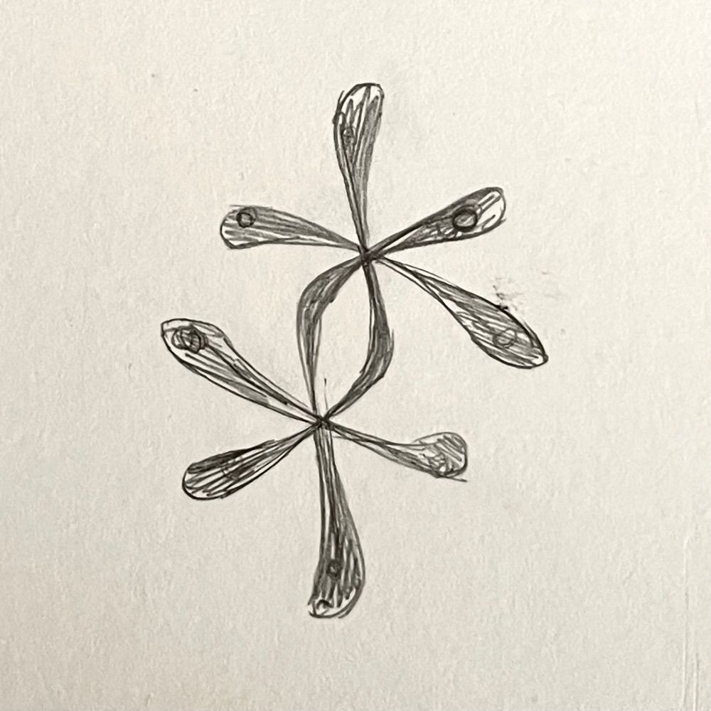
Can confirm; definitely the octothorpe 1 reasons for unfair prejudice against fractions
November 29, 2024 at 7:45 PM
Can confirm; definitely the octothorpe 1 reasons for unfair prejudice against fractions
(photo taken by Sarah Holland-Batt)

November 27, 2024 at 3:04 PM
(photo taken by Sarah Holland-Batt)
Each stroke requires control of pressure and rotation, and to some extent speed. In particular the O is the devil; Both strokes include subtle rotation, not to mention it’s basically drawing a perfect circle in two slow strokes.
Loosely based on The Origin of the Serif by Edward Catich
(2/2)
Loosely based on The Origin of the Serif by Edward Catich
(2/2)


November 26, 2024 at 4:38 PM
Each stroke requires control of pressure and rotation, and to some extent speed. In particular the O is the devil; Both strokes include subtle rotation, not to mention it’s basically drawing a perfect circle in two slow strokes.
Loosely based on The Origin of the Serif by Edward Catich
(2/2)
Loosely based on The Origin of the Serif by Edward Catich
(2/2)
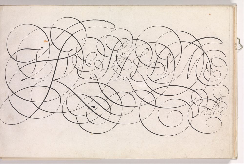
I sometimes think of the famous calligrapher Jan van de Velde, widely considered to be the GOAT. The things he would draw with his hands — insane. There are some unbelievable perfect circles he drew with a *pointed nib*, I must’ve lost that image somewhere. But this is related and also crazy.

November 26, 2024 at 1:35 PM
I sometimes think of the famous calligrapher Jan van de Velde, widely considered to be the GOAT. The things he would draw with his hands — insane. There are some unbelievable perfect circles he drew with a *pointed nib*, I must’ve lost that image somewhere. But this is related and also crazy.
You get a similar problem with a lot of calligraphy. Especially broad nib scripts like the foundational hand and some italic hands. At least it’s oriented the Buddhist way instead of the 20th century German way.. It’s a pity those shapes gained nasty connotations.

November 20, 2024 at 11:01 PM
You get a similar problem with a lot of calligraphy. Especially broad nib scripts like the foundational hand and some italic hands. At least it’s oriented the Buddhist way instead of the 20th century German way.. It’s a pity those shapes gained nasty connotations.
An issue in many parts; if you commit to narrow inner margins, you can salvage the book by using proper bookbinding glue (more flexible vs hot glue popular for print on demand) or thread binding (which isn’t that much more expensive). This is cost cutting away potential solutions one after another.
November 19, 2024 at 5:13 PM
An issue in many parts; if you commit to narrow inner margins, you can salvage the book by using proper bookbinding glue (more flexible vs hot glue popular for print on demand) or thread binding (which isn’t that much more expensive). This is cost cutting away potential solutions one after another.