


Games by Stitch - Out Now: Elsewhere Electric ⚡️
@gamesbystitch.com
A remote indie studio based in Toronto creating story-driven puzzle games. (Our games division for @stitch.media)
Our co-op VR puzzle game ELSEWHERE ELECTRIC⚡is now available on Meta Quest, Steam, and mobile: elsewhereelectric.com
Our co-op VR puzzle game ELSEWHERE ELECTRIC⚡is now available on Meta Quest, Steam, and mobile: elsewhereelectric.com
Q: How do you know you've got The One?
A: I know I've got The One when I can look at the design and not immediately feel the urge to tweak some tiny, almost unnoticeable aspect of it!
~fin~
Give us a wishlist: store.steampowered.com/app/4006340/...
A: I know I've got The One when I can look at the design and not immediately feel the urge to tweak some tiny, almost unnoticeable aspect of it!
~fin~
Give us a wishlist: store.steampowered.com/app/4006340/...

First Moon of Mercury on Steam
Solve and construct sci-fi puzzle boxes into the First Moon of Mercury, a space station designed to study and deflect dangerous solar flares. Will you trust the right crew members to ensure the safety...
store.steampowered.com
November 12, 2025 at 6:17 PM
Q: How do you know you've got The One?
A: I know I've got The One when I can look at the design and not immediately feel the urge to tweak some tiny, almost unnoticeable aspect of it!
~fin~
Give us a wishlist: store.steampowered.com/app/4006340/...
A: I know I've got The One when I can look at the design and not immediately feel the urge to tweak some tiny, almost unnoticeable aspect of it!
~fin~
Give us a wishlist: store.steampowered.com/app/4006340/...
Are the elements overlapping in just the right amount, at the right angle? Will this design work in black and white? What typeface to use for "First" and "Of Mercury" and how to make them fit?

November 12, 2025 at 6:17 PM
Are the elements overlapping in just the right amount, at the right angle? Will this design work in black and white? What typeface to use for "First" and "Of Mercury" and how to make them fit?
Once a direction was decided upon, what followed was a number of smaller challenges. What version of letter shapes were ideal? How many textures to incorporate? Do the textures have the right shape language? Do we want textures at all?
November 12, 2025 at 6:17 PM
Once a direction was decided upon, what followed was a number of smaller challenges. What version of letter shapes were ideal? How many textures to incorporate? Do the textures have the right shape language? Do we want textures at all?
This change meant that I didn't have completed gameplay to work off of, nor the tone of the game to match. Colour palettes hadn’t been established, nor any typography.
That being said, it was also freeing by not having to fit any of those aspects into the design.
That being said, it was also freeing by not having to fit any of those aspects into the design.
November 12, 2025 at 6:17 PM
This change meant that I didn't have completed gameplay to work off of, nor the tone of the game to match. Colour palettes hadn’t been established, nor any typography.
That being said, it was also freeing by not having to fit any of those aspects into the design.
That being said, it was also freeing by not having to fit any of those aspects into the design.
Q: What were some difficulties or challenges you faced with this logo design?
A: This time around we decided to do something different: we started with the trailer with only a concept for the game. We were just starting production when I began to design the logo.
A: This time around we decided to do something different: we started with the trailer with only a concept for the game. We were just starting production when I began to design the logo.
November 12, 2025 at 6:17 PM
Q: What were some difficulties or challenges you faced with this logo design?
A: This time around we decided to do something different: we started with the trailer with only a concept for the game. We were just starting production when I began to design the logo.
A: This time around we decided to do something different: we started with the trailer with only a concept for the game. We were just starting production when I began to design the logo.
Well, there was a small dot that was part of the "Puzzle O." As soon as I moved it outside the letter it looked like something orbiting a planet. It was a simple solution that reframed the Sun-Mercury-Station relationship.
November 12, 2025 at 6:17 PM
Well, there was a small dot that was part of the "Puzzle O." As soon as I moved it outside the letter it looked like something orbiting a planet. It was a simple solution that reframed the Sun-Mercury-Station relationship.
But that change sparked another question: what would happen to the station? How would it be incorporated into the logo?
November 12, 2025 at 6:17 PM
But that change sparked another question: what would happen to the station? How would it be incorporated into the logo?
For much of the exploration, the two "O"s were meant to represent Mercury and the space station that orbits it. During a discussion with Evan it was brought up that maybe these would instead be Mercury and the Sun, since at that stage there was a large red circle behind one of them.

November 12, 2025 at 6:17 PM
For much of the exploration, the two "O"s were meant to represent Mercury and the space station that orbits it. During a discussion with Evan it was brought up that maybe these would instead be Mercury and the Sun, since at that stage there was a large red circle behind one of them.
I tossed it into a logo concept as a placeholder since it had the same puzzle characteristic visuals that I was looking for. It ended up only needing slight adjustments for the final version.
Later in the process, we had a small design change that changed the concept entirely.
Later in the process, we had a small design change that changed the concept entirely.
November 12, 2025 at 6:17 PM
I tossed it into a logo concept as a placeholder since it had the same puzzle characteristic visuals that I was looking for. It ended up only needing slight adjustments for the final version.
Later in the process, we had a small design change that changed the concept entirely.
Later in the process, we had a small design change that changed the concept entirely.
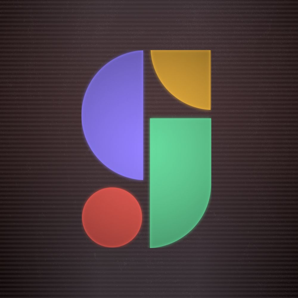
Q: What do the various elements of the logo communicate?
A: The design of the first "O" ended up being a happy fluke. I initially designed that as a part of an animated graphic element to go alongside one of the module shots in the trailer.
A: The design of the first "O" ended up being a happy fluke. I initially designed that as a part of an animated graphic element to go alongside one of the module shots in the trailer.
November 12, 2025 at 6:17 PM
Q: What do the various elements of the logo communicate?
A: The design of the first "O" ended up being a happy fluke. I initially designed that as a part of an animated graphic element to go alongside one of the module shots in the trailer.
A: The design of the first "O" ended up being a happy fluke. I initially designed that as a part of an animated graphic element to go alongside one of the module shots in the trailer.
Though that idea follows through in the animated version of the logo, it's less noticeable in the final static version.
November 12, 2025 at 6:17 PM
Though that idea follows through in the animated version of the logo, it's less noticeable in the final static version.
Q: What were some inspirations for the logo?
A: A lot of the early inspirations for the initial designs revolved around photo collage and assemblage art. I really wanted to emphasise the idea that the logo would be made of many distinct elements.
A: A lot of the early inspirations for the initial designs revolved around photo collage and assemblage art. I really wanted to emphasise the idea that the logo would be made of many distinct elements.

November 12, 2025 at 6:17 PM
Q: What were some inspirations for the logo?
A: A lot of the early inspirations for the initial designs revolved around photo collage and assemblage art. I really wanted to emphasise the idea that the logo would be made of many distinct elements.
A: A lot of the early inspirations for the initial designs revolved around photo collage and assemblage art. I really wanted to emphasise the idea that the logo would be made of many distinct elements.
Once I have a more firm direction, I gather feedback from the art team first, and finally from the Games by Stitch founder, Evan. Using this feedback, I take the elements we all liked and puzzle out a way to use those ideas in a single cohesive design. From there, it’s various rounds of refinement.
November 12, 2025 at 6:17 PM
Once I have a more firm direction, I gather feedback from the art team first, and finally from the Games by Stitch founder, Evan. Using this feedback, I take the elements we all liked and puzzle out a way to use those ideas in a single cohesive design. From there, it’s various rounds of refinement.
After that, I slow down a bit and spend time developing more complex ideas as well as further exploring elements that felt right from the first pass.
November 12, 2025 at 6:17 PM
After that, I slow down a bit and spend time developing more complex ideas as well as further exploring elements that felt right from the first pass.
Q: Tell us about your process when approaching logo design.
A: First came brainstorming a wide range of designs. This initial phase is very experimental. I’m loose with quality, look at different arrangements and points of emphasis, and I do not limit myself to readability.
A: First came brainstorming a wide range of designs. This initial phase is very experimental. I’m loose with quality, look at different arrangements and points of emphasis, and I do not limit myself to readability.

November 12, 2025 at 6:17 PM
Q: Tell us about your process when approaching logo design.
A: First came brainstorming a wide range of designs. This initial phase is very experimental. I’m loose with quality, look at different arrangements and points of emphasis, and I do not limit myself to readability.
A: First came brainstorming a wide range of designs. This initial phase is very experimental. I’m loose with quality, look at different arrangements and points of emphasis, and I do not limit myself to readability.
Q: What were your main goals for the First Moon of Mercury logo?
A: My main goals heading into the design were to depict a relationship between our space station and Mercury, a hint at puzzle elements, and then, to a lesser degree, have it feel evocative of the sci-fi genre.
A: My main goals heading into the design were to depict a relationship between our space station and Mercury, a hint at puzzle elements, and then, to a lesser degree, have it feel evocative of the sci-fi genre.
November 12, 2025 at 6:17 PM
Q: What were your main goals for the First Moon of Mercury logo?
A: My main goals heading into the design were to depict a relationship between our space station and Mercury, a hint at puzzle elements, and then, to a lesser degree, have it feel evocative of the sci-fi genre.
A: My main goals heading into the design were to depict a relationship between our space station and Mercury, a hint at puzzle elements, and then, to a lesser degree, have it feel evocative of the sci-fi genre.
Thank you!
November 3, 2025 at 2:19 PM
Thank you!