


Fenrizia
@fenrizia.bsky.social
Reposted by Fenrizia

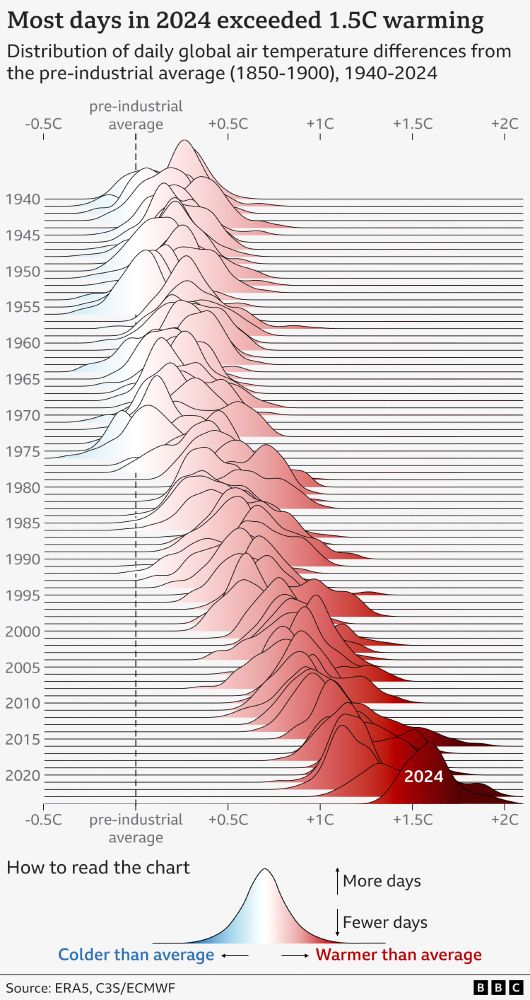
NEW: 2024 has just been confirmed as the warmest year on record, and the first to breach the 1.5C threshold.
We used a ridgeline (Joy Division inspired) chart to visualise daily temperature anomalies since 1940.
2024 clearly stands out with 100% of its days above 1.3C and 75% above 1.5C.
We used a ridgeline (Joy Division inspired) chart to visualise daily temperature anomalies since 1940.
2024 clearly stands out with 100% of its days above 1.3C and 75% above 1.5C.
January 10, 2025 at 8:04 AM
NEW: 2024 has just been confirmed as the warmest year on record, and the first to breach the 1.5C threshold.
We used a ridgeline (Joy Division inspired) chart to visualise daily temperature anomalies since 1940.
2024 clearly stands out with 100% of its days above 1.3C and 75% above 1.5C.
We used a ridgeline (Joy Division inspired) chart to visualise daily temperature anomalies since 1940.
2024 clearly stands out with 100% of its days above 1.3C and 75% above 1.5C.
Reposted by Fenrizia

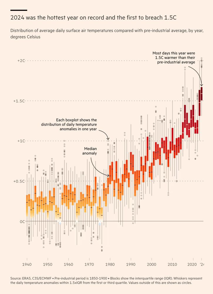
Remarkable chart by @data.ft.com
Many readers won't fully understand boxplots. At a quick glance, they don't add much information here. But then, look at the lower end of the 2024 whisker (or 2015 for the previous El Niño)!
Also: I just love the aesthetic 🤩 #dataviz
www.ft.com/content/fd91...
Many readers won't fully understand boxplots. At a quick glance, they don't add much information here. But then, look at the lower end of the 2024 whisker (or 2015 for the previous El Niño)!
Also: I just love the aesthetic 🤩 #dataviz
www.ft.com/content/fd91...
January 14, 2025 at 9:07 PM
Remarkable chart by @data.ft.com
Many readers won't fully understand boxplots. At a quick glance, they don't add much information here. But then, look at the lower end of the 2024 whisker (or 2015 for the previous El Niño)!
Also: I just love the aesthetic 🤩 #dataviz
www.ft.com/content/fd91...
Many readers won't fully understand boxplots. At a quick glance, they don't add much information here. But then, look at the lower end of the 2024 whisker (or 2015 for the previous El Niño)!
Also: I just love the aesthetic 🤩 #dataviz
www.ft.com/content/fd91...