


Edinburgh Financial Analytics
@edinburghfa.bsky.social
EFA is a business with a mission to provide high quality analytics to investors so they can build robust and strongly performing portfolios.
www.edinburghfinancialanalytics.com
www.edinburghfinancialanalytics.com
Low volatility doesn’t mean safe markets.
Chart shows 1y fwd equity returns split by EFA signal strength.
We’re now in the 2nd decile, where average returns & vol are typically low but negatively skewed with fat tails. Fragility not stability. What's the catalyst?
Chart shows 1y fwd equity returns split by EFA signal strength.
We’re now in the 2nd decile, where average returns & vol are typically low but negatively skewed with fat tails. Fragility not stability. What's the catalyst?

January 14, 2026 at 12:26 PM
Low volatility doesn’t mean safe markets.
Chart shows 1y fwd equity returns split by EFA signal strength.
We’re now in the 2nd decile, where average returns & vol are typically low but negatively skewed with fat tails. Fragility not stability. What's the catalyst?
Chart shows 1y fwd equity returns split by EFA signal strength.
We’re now in the 2nd decile, where average returns & vol are typically low but negatively skewed with fat tails. Fragility not stability. What's the catalyst?
It starts with spotting opportunities like Peru — where systematic signals triggered entry and exit.
Those decisions feed through to model performance quarter by quarter.
Over time, a disciplined process delivers consistent results.
Those decisions feed through to model performance quarter by quarter.
Over time, a disciplined process delivers consistent results.


January 5, 2026 at 5:51 PM
It starts with spotting opportunities like Peru — where systematic signals triggered entry and exit.
Those decisions feed through to model performance quarter by quarter.
Over time, a disciplined process delivers consistent results.
Those decisions feed through to model performance quarter by quarter.
Over time, a disciplined process delivers consistent results.

Equity benchmarks are highly concentrated.
We rank investable equity indices using behavioural signals (to improve your odds). Right now, Asia sits at the top of the rankings.
Passive exposure isn’t neutral when concentration is extreme. Time to diversify?
Link in reply.
We rank investable equity indices using behavioural signals (to improve your odds). Right now, Asia sits at the top of the rankings.
Passive exposure isn’t neutral when concentration is extreme. Time to diversify?
Link in reply.
December 23, 2025 at 4:50 PM
Equity benchmarks are highly concentrated.
We rank investable equity indices using behavioural signals (to improve your odds). Right now, Asia sits at the top of the rankings.
Passive exposure isn’t neutral when concentration is extreme. Time to diversify?
Link in reply.
We rank investable equity indices using behavioural signals (to improve your odds). Right now, Asia sits at the top of the rankings.
Passive exposure isn’t neutral when concentration is extreme. Time to diversify?
Link in reply.
9/
If 10y yields continue to slide, the risk is drifting firmly into that top-left quadrant.
That’s the one where growth stalls — and unpleasant things start happening to the real economy.
If 10y yields continue to slide, the risk is drifting firmly into that top-left quadrant.
That’s the one where growth stalls — and unpleasant things start happening to the real economy.

December 15, 2025 at 10:08 AM
9/
If 10y yields continue to slide, the risk is drifting firmly into that top-left quadrant.
That’s the one where growth stalls — and unpleasant things start happening to the real economy.
If 10y yields continue to slide, the risk is drifting firmly into that top-left quadrant.
That’s the one where growth stalls — and unpleasant things start happening to the real economy.
6/
Bear steepeners (top right):
Long-end yields selling off faster.
These tend to coincide with strong bank performance.
This is the “growth is robust” version of steepening.
Bear steepeners (top right):
Long-end yields selling off faster.
These tend to coincide with strong bank performance.
This is the “growth is robust” version of steepening.

December 15, 2025 at 10:08 AM
6/
Bear steepeners (top right):
Long-end yields selling off faster.
These tend to coincide with strong bank performance.
This is the “growth is robust” version of steepening.
Bear steepeners (top right):
Long-end yields selling off faster.
These tend to coincide with strong bank performance.
This is the “growth is robust” version of steepening.
4/
But is it actually true?
The chart below plots banks’ relative performance across the four classic curve regimes:
• bear / bull
• flattening / steepening
Green = good. Red = bad.
But is it actually true?
The chart below plots banks’ relative performance across the four classic curve regimes:
• bear / bull
• flattening / steepening
Green = good. Red = bad.
December 15, 2025 at 10:08 AM
4/
But is it actually true?
The chart below plots banks’ relative performance across the four classic curve regimes:
• bear / bull
• flattening / steepening
Green = good. Red = bad.
But is it actually true?
The chart below plots banks’ relative performance across the four classic curve regimes:
• bear / bull
• flattening / steepening
Green = good. Red = bad.
4/7 Where it gets interesting: The Euro (€). Our chaos-theory analysis is now flashing an end-of-trend exhaustion signal. This pattern has mattered several times over the last decade. Odds of Euro weakness are meaningfully higher. #EUR

November 26, 2025 at 5:08 PM
4/7 Where it gets interesting: The Euro (€). Our chaos-theory analysis is now flashing an end-of-trend exhaustion signal. This pattern has mattered several times over the last decade. Odds of Euro weakness are meaningfully higher. #EUR
3/7 The US Dollar (USD): Also still "unloved" by many, despite bouncing from long-term support (vs. G10 basket). Models say stay long USD for now. (Awaiting delayed CFTC positioning data... Part-timers.) #USD

November 26, 2025 at 5:08 PM
3/7 The US Dollar (USD): Also still "unloved" by many, despite bouncing from long-term support (vs. G10 basket). Models say stay long USD for now. (Awaiting delayed CFTC positioning data... Part-timers.) #USD
4/
To isolate the issue, we rebuilt the dot-plots using only the most liquid global markets (core).
Left chart = core markets (recent orange & red warnings)
Right chart = broad coverage (nothing recently)
Very different picture.
To isolate the issue, we rebuilt the dot-plots using only the most liquid global markets (core).
Left chart = core markets (recent orange & red warnings)
Right chart = broad coverage (nothing recently)
Very different picture.


November 21, 2025 at 11:15 AM
4/
To isolate the issue, we rebuilt the dot-plots using only the most liquid global markets (core).
Left chart = core markets (recent orange & red warnings)
Right chart = broad coverage (nothing recently)
Very different picture.
To isolate the issue, we rebuilt the dot-plots using only the most liquid global markets (core).
Left chart = core markets (recent orange & red warnings)
Right chart = broad coverage (nothing recently)
Very different picture.
1/
Divergence is everywhere.
Plenty of stocks are rising, plenty are falling. Breadth is fractured across markets.
And searches for the Hindenburg Omen hit a 5-year high!
Divergence is everywhere.
Plenty of stocks are rising, plenty are falling. Breadth is fractured across markets.
And searches for the Hindenburg Omen hit a 5-year high!

November 21, 2025 at 11:15 AM
1/
Divergence is everywhere.
Plenty of stocks are rising, plenty are falling. Breadth is fractured across markets.
And searches for the Hindenburg Omen hit a 5-year high!
Divergence is everywhere.
Plenty of stocks are rising, plenty are falling. Breadth is fractured across markets.
And searches for the Hindenburg Omen hit a 5-year high!
The next charts show Bitcoin and private equity’s year-on-year moves. Both have started tracking the liquidity downturn closely.
[4/7]
[4/7]


November 12, 2025 at 3:40 PM
The next charts show Bitcoin and private equity’s year-on-year moves. Both have started tracking the liquidity downturn closely.
[4/7]
[4/7]
The first chart shows which assets are most driven by liquidity.
No surprises: S&P 500, private equity, and crypto (especially Bitcoin) sit right at the vulnerable end of the spectrum.
[3/7]
No surprises: S&P 500, private equity, and crypto (especially Bitcoin) sit right at the vulnerable end of the spectrum.
[3/7]

November 12, 2025 at 3:40 PM
The first chart shows which assets are most driven by liquidity.
No surprises: S&P 500, private equity, and crypto (especially Bitcoin) sit right at the vulnerable end of the spectrum.
[3/7]
No surprises: S&P 500, private equity, and crypto (especially Bitcoin) sit right at the vulnerable end of the spectrum.
[3/7]
You can see that the gamma model sees similarities to end-2021 (dark green dots) while the boxplot chart forecasts a more negative distribution than average...
[6/8]
[6/8]


November 10, 2025 at 12:09 PM
You can see that the gamma model sees similarities to end-2021 (dark green dots) while the boxplot chart forecasts a more negative distribution than average...
[6/8]
[6/8]
As the market goes higher a natural tendency is to pay more for downside protection (by buying put options) and you can see that in the general direction of "skew" (green line) trending the same way as the market. A 𝐡𝐞𝐚𝐥𝐭𝐡𝐲 𝐝𝐨𝐬𝐞 𝐨𝐟 𝐟𝐞𝐚𝐫 perhaps...
[3/8]
[3/8]

November 10, 2025 at 12:09 PM
As the market goes higher a natural tendency is to pay more for downside protection (by buying put options) and you can see that in the general direction of "skew" (green line) trending the same way as the market. A 𝐡𝐞𝐚𝐥𝐭𝐡𝐲 𝐝𝐨𝐬𝐞 𝐨𝐟 𝐟𝐞𝐚𝐫 perhaps...
[3/8]
[3/8]
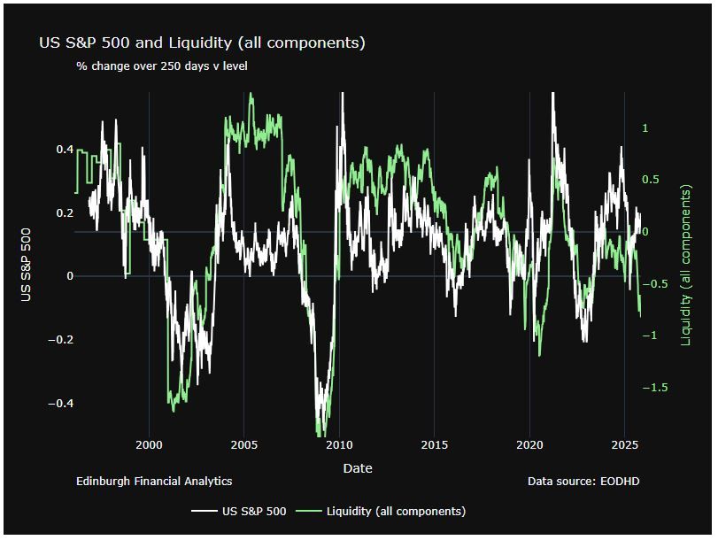
The double whammy of a US govt shutdown 🧵
Liquidity is taking centre stage in markets right now.
A US shutdown hits in two key ways...
But first here's a chart of SPX (yoy) v our (falling) index of liquidity (green).
#Markets #USEconomy #Liquidity #AssetAllocation
[1/6]
Liquidity is taking centre stage in markets right now.
A US shutdown hits in two key ways...
But first here's a chart of SPX (yoy) v our (falling) index of liquidity (green).
#Markets #USEconomy #Liquidity #AssetAllocation
[1/6]
November 7, 2025 at 11:52 AM
The double whammy of a US govt shutdown 🧵
Liquidity is taking centre stage in markets right now.
A US shutdown hits in two key ways...
But first here's a chart of SPX (yoy) v our (falling) index of liquidity (green).
#Markets #USEconomy #Liquidity #AssetAllocation
[1/6]
Liquidity is taking centre stage in markets right now.
A US shutdown hits in two key ways...
But first here's a chart of SPX (yoy) v our (falling) index of liquidity (green).
#Markets #USEconomy #Liquidity #AssetAllocation
[1/6]
Now look at what the model said in April (just after “Liberation Day”) when the forecast distribution looked far more positive.
The setup has flipped.
[4/5]
The setup has flipped.
[4/5]

October 24, 2025 at 11:05 AM
Now look at what the model said in April (just after “Liberation Day”) when the forecast distribution looked far more positive.
The setup has flipped.
[4/5]
The setup has flipped.
[4/5]
Take our Volatility model.
This is what it’s currently saying about global equities - for the next 6 months 👇
Not looking great. The forecast distribution is on the right, compare it with the typical distribution on the left.
[3/5]
This is what it’s currently saying about global equities - for the next 6 months 👇
Not looking great. The forecast distribution is on the right, compare it with the typical distribution on the left.
[3/5]

October 24, 2025 at 11:05 AM
Take our Volatility model.
This is what it’s currently saying about global equities - for the next 6 months 👇
Not looking great. The forecast distribution is on the right, compare it with the typical distribution on the left.
[3/5]
This is what it’s currently saying about global equities - for the next 6 months 👇
Not looking great. The forecast distribution is on the right, compare it with the typical distribution on the left.
[3/5]
Curious what’s really driving markets?
Our 𝐟𝐫𝐞𝐞 weekly Chart Pack distils behavioural & macro signals into a few key visuals, for investors who prefer signal to noise.
🔗https://edinburghfinancialanalytics.com/#sign_up
#BehaviouralFinance #MarketInsights #Investing #CatsOfBluesky
🧵[1/5]
Our 𝐟𝐫𝐞𝐞 weekly Chart Pack distils behavioural & macro signals into a few key visuals, for investors who prefer signal to noise.
🔗https://edinburghfinancialanalytics.com/#sign_up
#BehaviouralFinance #MarketInsights #Investing #CatsOfBluesky
🧵[1/5]

October 24, 2025 at 11:05 AM
Curious what’s really driving markets?
Our 𝐟𝐫𝐞𝐞 weekly Chart Pack distils behavioural & macro signals into a few key visuals, for investors who prefer signal to noise.
🔗https://edinburghfinancialanalytics.com/#sign_up
#BehaviouralFinance #MarketInsights #Investing #CatsOfBluesky
🧵[1/5]
Our 𝐟𝐫𝐞𝐞 weekly Chart Pack distils behavioural & macro signals into a few key visuals, for investors who prefer signal to noise.
🔗https://edinburghfinancialanalytics.com/#sign_up
#BehaviouralFinance #MarketInsights #Investing #CatsOfBluesky
🧵[1/5]
🔹Q3 2025 performance review 🔹
How did Edinburgh Financial Analytics’ models fare this quarter?
Here’s the breakdown ⬇️
#PerformanceReview #Investing
How did Edinburgh Financial Analytics’ models fare this quarter?
Here’s the breakdown ⬇️
#PerformanceReview #Investing

October 3, 2025 at 10:47 AM
🔹Q3 2025 performance review 🔹
How did Edinburgh Financial Analytics’ models fare this quarter?
Here’s the breakdown ⬇️
#PerformanceReview #Investing
How did Edinburgh Financial Analytics’ models fare this quarter?
Here’s the breakdown ⬇️
#PerformanceReview #Investing
[4/5]
In Q1 this year we did not see divergence at the peak. With hindsight we can see the market was driven by events (Liberation day).
However, the SKEW index has now fallen from 180 to below 150 and divergence shows up on 2 timescales.
The model interprets this as negative.
In Q1 this year we did not see divergence at the peak. With hindsight we can see the market was driven by events (Liberation day).
However, the SKEW index has now fallen from 180 to below 150 and divergence shows up on 2 timescales.
The model interprets this as negative.

September 26, 2025 at 1:38 PM
[4/5]
In Q1 this year we did not see divergence at the peak. With hindsight we can see the market was driven by events (Liberation day).
However, the SKEW index has now fallen from 180 to below 150 and divergence shows up on 2 timescales.
The model interprets this as negative.
In Q1 this year we did not see divergence at the peak. With hindsight we can see the market was driven by events (Liberation day).
However, the SKEW index has now fallen from 180 to below 150 and divergence shows up on 2 timescales.
The model interprets this as negative.
[3/5]
#SKEW often diverges with price at peaks.
Initially when the market goes up the SKEW index will rise as investors pay more attention to left tail risks.
But as investors become complacent the pricing of downside options becomes less aggressive.
Chart 2018 to 2023.
#SKEW often diverges with price at peaks.
Initially when the market goes up the SKEW index will rise as investors pay more attention to left tail risks.
But as investors become complacent the pricing of downside options becomes less aggressive.
Chart 2018 to 2023.

September 26, 2025 at 1:38 PM
[3/5]
#SKEW often diverges with price at peaks.
Initially when the market goes up the SKEW index will rise as investors pay more attention to left tail risks.
But as investors become complacent the pricing of downside options becomes less aggressive.
Chart 2018 to 2023.
#SKEW often diverges with price at peaks.
Initially when the market goes up the SKEW index will rise as investors pay more attention to left tail risks.
But as investors become complacent the pricing of downside options becomes less aggressive.
Chart 2018 to 2023.
[2/5]
The model gives us a distribution expectation (right) for the market over the next 6 months.
It suggests anything from a 10% rally to a 15% fall with a definite negative bias compared to average (left).
Notice that the mean and median expectation has fallen to -5%.
The model gives us a distribution expectation (right) for the market over the next 6 months.
It suggests anything from a 10% rally to a 15% fall with a definite negative bias compared to average (left).
Notice that the mean and median expectation has fallen to -5%.

September 26, 2025 at 1:38 PM
[2/5]
The model gives us a distribution expectation (right) for the market over the next 6 months.
It suggests anything from a 10% rally to a 15% fall with a definite negative bias compared to average (left).
Notice that the mean and median expectation has fallen to -5%.
The model gives us a distribution expectation (right) for the market over the next 6 months.
It suggests anything from a 10% rally to a 15% fall with a definite negative bias compared to average (left).
Notice that the mean and median expectation has fallen to -5%.
[1/5]
Our volatility model (using #VIX, #SKEW & #GAMMA) shows us where in the past conditions in #options activity are like today.
The most similar period is the end of 2021 closely followed by the pre-covid peak in early 2020.
#Markets #Equities #Volatility #QuantFinance
Our volatility model (using #VIX, #SKEW & #GAMMA) shows us where in the past conditions in #options activity are like today.
The most similar period is the end of 2021 closely followed by the pre-covid peak in early 2020.
#Markets #Equities #Volatility #QuantFinance

September 26, 2025 at 1:38 PM
[1/5]
Our volatility model (using #VIX, #SKEW & #GAMMA) shows us where in the past conditions in #options activity are like today.
The most similar period is the end of 2021 closely followed by the pre-covid peak in early 2020.
#Markets #Equities #Volatility #QuantFinance
Our volatility model (using #VIX, #SKEW & #GAMMA) shows us where in the past conditions in #options activity are like today.
The most similar period is the end of 2021 closely followed by the pre-covid peak in early 2020.
#Markets #Equities #Volatility #QuantFinance
14/n
The model gives us this distribution expectation (light green) for the market over the next 6 months.
It suggests anything from a 10% rally to a 15% fall with a definite negative bias compared to average conditions.
#equities #volatility #gamma #riskmanagement
The model gives us this distribution expectation (light green) for the market over the next 6 months.
It suggests anything from a 10% rally to a 15% fall with a definite negative bias compared to average conditions.
#equities #volatility #gamma #riskmanagement

September 16, 2025 at 2:55 PM
14/n
The model gives us this distribution expectation (light green) for the market over the next 6 months.
It suggests anything from a 10% rally to a 15% fall with a definite negative bias compared to average conditions.
#equities #volatility #gamma #riskmanagement
The model gives us this distribution expectation (light green) for the market over the next 6 months.
It suggests anything from a 10% rally to a 15% fall with a definite negative bias compared to average conditions.
#equities #volatility #gamma #riskmanagement