


Michiel Duvekot
@duvekot.bsky.social
#kakistographs
from Ancient Greek κάκιστος (kákistos, 'worst')
from Ancient Greek κάκιστος (kákistos, 'worst')

fixed it for you

September 28, 2025 at 11:25 PM
fixed it for you

If you thought that was bad, I'll give you this beauty from the American Society of Plastic Surgeons' 2024 report on cosmetic surgery trends that the WSJ cites:

September 25, 2025 at 3:52 PM
If you thought that was bad, I'll give you this beauty from the American Society of Plastic Surgeons' 2024 report on cosmetic surgery trends that the WSJ cites:
The patterns are easier to see in a small multiple

September 18, 2025 at 9:32 PM
The patterns are easier to see in a small multiple
That could have been so much clearer:

July 15, 2025 at 8:39 PM
That could have been so much clearer:
Noticed when I rotated the whole chart that Democrats seem to think that "other people" experience discrimination. Republicans think that nobody really does, perhaps a little, except them.

July 15, 2025 at 3:51 PM
Noticed when I rotated the whole chart that Democrats seem to think that "other people" experience discrimination. Republicans think that nobody really does, perhaps a little, except them.
Can you see which of the area charts on the right matches the stacked area on the left?

July 1, 2025 at 6:08 PM
Can you see which of the area charts on the right matches the stacked area on the left?
another fun thing to do is use the alignment of the labels to encode the direction of the line, left = up , right = down right, center = min|max, etc., which also helps to avoid overlapping.

July 1, 2025 at 5:12 PM
another fun thing to do is use the alignment of the labels to encode the direction of the line, left = up , right = down right, center = min|max, etc., which also helps to avoid overlapping.
These are all wrong in their own unique way, but they all have one major flaw in common: The area under the curve means nothing.

July 1, 2025 at 1:36 PM
These are all wrong in their own unique way, but they all have one major flaw in common: The area under the curve means nothing.

Good stuff from @abmakulec.bsky.social
vizresponsibly.substack.com/p/why-humans...
Here's my version of the Edelman Trust Barometer visualization"
vizresponsibly.substack.com/p/why-humans...
Here's my version of the Edelman Trust Barometer visualization"

June 18, 2025 at 7:01 PM
Good stuff from @abmakulec.bsky.social
vizresponsibly.substack.com/p/why-humans...
Here's my version of the Edelman Trust Barometer visualization"
vizresponsibly.substack.com/p/why-humans...
Here's my version of the Edelman Trust Barometer visualization"

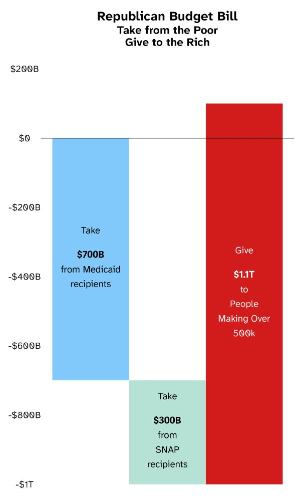
This might work if you want to make it easier to compare each budget item. Not so great for comparing the totals though.

June 6, 2025 at 10:13 PM
This might work if you want to make it easier to compare each budget item. Not so great for comparing the totals though.
Here's a fun way of showing the same data that doesn't use a bar chart:

May 27, 2025 at 3:30 PM
Here's a fun way of showing the same data that doesn't use a bar chart:

It doesn't know that it could simply write a SPARQL query for Wikidata. Code in the alt text.
![SELECT ?Spice_Girls ?Spice_GirlsLabel ?date_of_birth ?age WHERE {
SERVICE wikibase:label { bd:serviceParam wikibase:language "[AUTO_LANGUAGE],mul,en". }
?Spice_Girls wdt:P463 wd:Q55641.
OPTIONAL { ?Spice_Girls wdt:P569 ?date_of_birth.
BIND(YEAR(NOW()) - YEAR(?date_of_birth) AS ?age)
}
}](https://cdn.bsky.app/img/feed_thumbnail/plain/did:plc:2bydw5aty4dinx3onwrbfhqw/bafkreid2vjjer7uhnqtd74k6jtms6tz2bb54bguq23wqap3rvypngm2aru@jpeg)
May 25, 2025 at 8:46 PM
It doesn't know that it could simply write a SPARQL query for Wikidata. Code in the alt text.
When the answer to "is it any good?" is "obviously not":

May 15, 2025 at 3:48 PM
When the answer to "is it any good?" is "obviously not":

I think it's possible to show all values, both the individual and the cumulative sums you'd show—but not label—in a stacked bar chart.

May 9, 2025 at 9:10 PM
I think it's possible to show all values, both the individual and the cumulative sums you'd show—but not label—in a stacked bar chart.
Now I understand this:

May 9, 2025 at 1:40 PM
Now I understand this:
Here's a remake of the chart with the lengths of the bars that have been omitted. The wages in the original show values of $1337 and $1138 , but the bars show $1337 and $556. Almost half of the bars for healthcare and paid sick days have also been left off. The chart for retirement is correct.

May 5, 2025 at 7:18 PM
Here's a remake of the chart with the lengths of the bars that have been omitted. The wages in the original show values of $1337 and $1138 , but the bars show $1337 and $556. Almost half of the bars for healthcare and paid sick days have also been left off. The chart for retirement is correct.
Weird decision to remove $1000 from the wages chart to exaggerate the difference between union and non-union wages, but hardly something an innumerate designer would do. It would have worked just as well is the data was presented correctly:

May 4, 2025 at 4:09 PM
Weird decision to remove $1000 from the wages chart to exaggerate the difference between union and non-union wages, but hardly something an innumerate designer would do. It would have worked just as well is the data was presented correctly:
Or just get rid of the legends altogether:

May 1, 2025 at 6:54 PM
Or just get rid of the legends altogether: