


Max Yaromau
@distroux.bsky.social
Category: accurate forecasts for the near future.

October 28, 2025 at 3:02 PM
Category: accurate forecasts for the near future.
Following the previous post about the gambler AI.
Now the bigger picture. AI content has taken over the internet. Not long ago humans created ninety eight percent of everything online. Now most of it comes from machines. There is no way back.
Now the bigger picture. AI content has taken over the internet. Not long ago humans created ninety eight percent of everything online. Now most of it comes from machines. There is no way back.
October 27, 2025 at 7:59 PM
Following the previous post about the gambler AI.
Now the bigger picture. AI content has taken over the internet. Not long ago humans created ninety eight percent of everything online. Now most of it comes from machines. There is no way back.
Now the bigger picture. AI content has taken over the internet. Not long ago humans created ninety eight percent of everything online. Now most of it comes from machines. There is no way back.
@Pinterest just launched Tuner a small but smart control that lets you decide how much AI generated content appears in your feed
You can tweak the AI mix across art fashion and home decor right inside settings
Less flawless fakes more real people more texture
Finally someone giving users a choice
You can tweak the AI mix across art fashion and home decor right inside settings
Less flawless fakes more real people more texture
Finally someone giving users a choice

October 27, 2025 at 3:00 PM
@Pinterest just launched Tuner a small but smart control that lets you decide how much AI generated content appears in your feed
You can tweak the AI mix across art fashion and home decor right inside settings
Less flawless fakes more real people more texture
Finally someone giving users a choice
You can tweak the AI mix across art fashion and home decor right inside settings
Less flawless fakes more real people more texture
Finally someone giving users a choice
ChatGPT has finally reached human-level intelligence.
They gave an AI ten thousand dollars and instructed it to trade crypto. It lost seven thousand two hundred after forty-two losing trades out of forty-four. But it keeps going.
They gave an AI ten thousand dollars and instructed it to trade crypto. It lost seven thousand two hundred after forty-two losing trades out of forty-four. But it keeps going.

October 26, 2025 at 8:01 PM
ChatGPT has finally reached human-level intelligence.
They gave an AI ten thousand dollars and instructed it to trade crypto. It lost seven thousand two hundred after forty-two losing trades out of forty-four. But it keeps going.
They gave an AI ten thousand dollars and instructed it to trade crypto. It lost seven thousand two hundred after forty-two losing trades out of forty-four. But it keeps going.
@Apple finally made a proper tool for app icons
Icon Composer from @AppleDeveloper lets you build layered icons for iPhone iPad Mac and Watch from a single design with real Liquid Glass effects and live lighting
No more manual exports or @Xcode pain just one click and done
(link in comments)
Icon Composer from @AppleDeveloper lets you build layered icons for iPhone iPad Mac and Watch from a single design with real Liquid Glass effects and live lighting
No more manual exports or @Xcode pain just one click and done
(link in comments)

October 25, 2025 at 8:01 PM
@Apple finally made a proper tool for app icons
Icon Composer from @AppleDeveloper lets you build layered icons for iPhone iPad Mac and Watch from a single design with real Liquid Glass effects and live lighting
No more manual exports or @Xcode pain just one click and done
(link in comments)
Icon Composer from @AppleDeveloper lets you build layered icons for iPhone iPad Mac and Watch from a single design with real Liquid Glass effects and live lighting
No more manual exports or @Xcode pain just one click and done
(link in comments)
I love exploring design communities but usually it’s chaos
Telegram, Slack, Discord, a hundred links and half of them are dead
Then I stumbled upon Designer Slack Community, a neat collection of active groups
Opened it, scrolled a bit, found a few lively spaces and got hooked
Telegram, Slack, Discord, a hundred links and half of them are dead
Then I stumbled upon Designer Slack Community, a neat collection of active groups
Opened it, scrolled a bit, found a few lively spaces and got hooked
October 14, 2025 at 3:02 PM
I love exploring design communities but usually it’s chaos
Telegram, Slack, Discord, a hundred links and half of them are dead
Then I stumbled upon Designer Slack Community, a neat collection of active groups
Opened it, scrolled a bit, found a few lively spaces and got hooked
Telegram, Slack, Discord, a hundred links and half of them are dead
Then I stumbled upon Designer Slack Community, a neat collection of active groups
Opened it, scrolled a bit, found a few lively spaces and got hooked
Design tool shoutout: the Stark plugin (for Figma) to check accessibility. It flags low contrast, simulates color blindness, etc. Inclusive design made easier! What tool boosts your workflow? #UX #DesignTools

October 11, 2025 at 2:58 PM
Design tool shoutout: the Stark plugin (for Figma) to check accessibility. It flags low contrast, simulates color blindness, etc. Inclusive design made easier! What tool boosts your workflow? #UX #DesignTools
Innovations we deserve… Would you buy an iPhone without a camera?
October 8, 2025 at 2:56 PM
Innovations we deserve… Would you buy an iPhone without a camera?
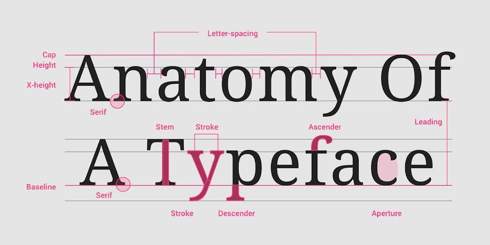
Your spacing system isn't broken; you just never had one.

August 19, 2025 at 1:00 PM
Your spacing system isn't broken; you just never had one.
“Just use H1” doesn't scale.
One team abandoned global typography styles like H1, Body, and Caption. Why? Because text isn't global—it's contextual. An H3 looks right in a card, too big in a modal, and unreadable in a tooltip. Designers override; developers tweak spacing; chaos grows.
One team abandoned global typography styles like H1, Body, and Caption. Why? Because text isn't global—it's contextual. An H3 looks right in a card, too big in a modal, and unreadable in a tooltip. Designers override; developers tweak spacing; chaos grows.
August 19, 2025 at 8:00 AM
“Just use H1” doesn't scale.
One team abandoned global typography styles like H1, Body, and Caption. Why? Because text isn't global—it's contextual. An H3 looks right in a card, too big in a modal, and unreadable in a tooltip. Designers override; developers tweak spacing; chaos grows.
One team abandoned global typography styles like H1, Body, and Caption. Why? Because text isn't global—it's contextual. An H3 looks right in a card, too big in a modal, and unreadable in a tooltip. Designers override; developers tweak spacing; chaos grows.
"Just add a prop."
"Just tweak the style."
"Just one more variant."
This is how components slowly die. One team broke this cycle by making context the priority. Instead of cluttering the Card with props like isCompact, inFavorite, or forAdmin, they developed structured context logic.
"Just tweak the style."
"Just one more variant."
This is how components slowly die. One team broke this cycle by making context the priority. Instead of cluttering the Card with props like isCompact, inFavorite, or forAdmin, they developed structured context logic.

August 18, 2025 at 1:00 PM
"Just add a prop."
"Just tweak the style."
"Just one more variant."
This is how components slowly die. One team broke this cycle by making context the priority. Instead of cluttering the Card with props like isCompact, inFavorite, or forAdmin, they developed structured context logic.
"Just tweak the style."
"Just one more variant."
This is how components slowly die. One team broke this cycle by making context the priority. Instead of cluttering the Card with props like isCompact, inFavorite, or forAdmin, they developed structured context logic.
Design systems don’t break at five components. They break at five teams.
In a compelling case by Design Bootcamp, a Fortune 200 company scaled 50+ brands using React, Vue, and Web Components. Their secret? Start with governance, not Figma.
In a compelling case by Design Bootcamp, a Fortune 200 company scaled 50+ brands using React, Vue, and Web Components. Their secret? Start with governance, not Figma.

August 15, 2025 at 1:00 PM
Design systems don’t break at five components. They break at five teams.
In a compelling case by Design Bootcamp, a Fortune 200 company scaled 50+ brands using React, Vue, and Web Components. Their secret? Start with governance, not Figma.
In a compelling case by Design Bootcamp, a Fortune 200 company scaled 50+ brands using React, Vue, and Web Components. Their secret? Start with governance, not Figma.
Design systems thrive on clean hierarchies: palette, semantics, components.
But Туту took a different approach. They introduced "On white" and "On gray" modes—not for light versus dark, but for intent.
On white: for clean, bright marketing screens.
On gray: for forms, cards, and structure.
But Туту took a different approach. They introduced "On white" and "On gray" modes—not for light versus dark, but for intent.
On white: for clean, bright marketing screens.
On gray: for forms, cards, and structure.

August 15, 2025 at 8:00 AM
Design systems thrive on clean hierarchies: palette, semantics, components.
But Туту took a different approach. They introduced "On white" and "On gray" modes—not for light versus dark, but for intent.
On white: for clean, bright marketing screens.
On gray: for forms, cards, and structure.
But Туту took a different approach. They introduced "On white" and "On gray" modes—not for light versus dark, but for intent.
On white: for clean, bright marketing screens.
On gray: for forms, cards, and structure.
Your dark mode might be draining your battery, not conserving it.
One team redesigned their dark theme and achieved an 18% increase in battery life on OLED screens.
How did they do it? They abandoned the typical gray-on-black scheme and created a new palette from scratch:
One team redesigned their dark theme and achieved an 18% increase in battery life on OLED screens.
How did they do it? They abandoned the typical gray-on-black scheme and created a new palette from scratch:

August 14, 2025 at 1:00 PM
Your dark mode might be draining your battery, not conserving it.
One team redesigned their dark theme and achieved an 18% increase in battery life on OLED screens.
How did they do it? They abandoned the typical gray-on-black scheme and created a new palette from scratch:
One team redesigned their dark theme and achieved an 18% increase in battery life on OLED screens.
How did they do it? They abandoned the typical gray-on-black scheme and created a new palette from scratch:
Repainting your UI isn't merely about changing colors; it's a risk.
Helix redefined their color logic by prioritizing governance over Figma.
Helix redefined their color logic by prioritizing governance over Figma.

August 14, 2025 at 8:00 AM
Repainting your UI isn't merely about changing colors; it's a risk.
Helix redefined their color logic by prioritizing governance over Figma.
Helix redefined their color logic by prioritizing governance over Figma.
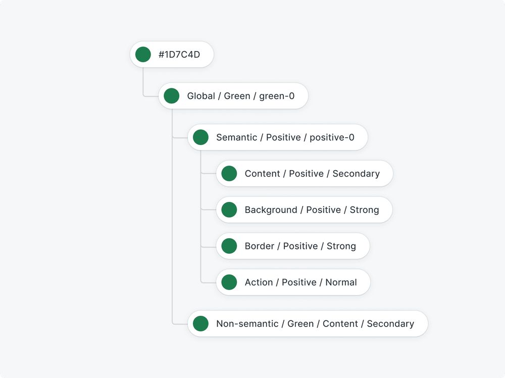
Still naming tokens like blue-500 and spacing-8? That's just the beginning.

August 13, 2025 at 1:00 PM
Still naming tokens like blue-500 and spacing-8? That's just the beginning.
"Design systems must be semantic!" - Not always. Туту did the opposite, and it worked.
Instead of following the typical hierarchy of palette → semantic → component, they skipped the semantic layer. No "neutral.surface.200" magic. They used direct component tokens with no overrides allowed.
Instead of following the typical hierarchy of palette → semantic → component, they skipped the semantic layer. No "neutral.surface.200" magic. They used direct component tokens with no overrides allowed.
August 13, 2025 at 8:00 AM
"Design systems must be semantic!" - Not always. Туту did the opposite, and it worked.
Instead of following the typical hierarchy of palette → semantic → component, they skipped the semantic layer. No "neutral.surface.200" magic. They used direct component tokens with no overrides allowed.
Instead of following the typical hierarchy of palette → semantic → component, they skipped the semantic layer. No "neutral.surface.200" magic. They used direct component tokens with no overrides allowed.
If your product has only 5-star reviews, it suggests you're hiding something—not just the flaws, but the truth. Too many e-commerce sites fake trust instead of earning it. No filters, no photos, all praise. Click once to see a review. Click again to expand.

August 12, 2025 at 1:00 PM
If your product has only 5-star reviews, it suggests you're hiding something—not just the flaws, but the truth. Too many e-commerce sites fake trust instead of earning it. No filters, no photos, all praise. Click once to see a review. Click again to expand.
Figma has just gone public, marking a significant milestone for everyone involved in digital product development.

August 12, 2025 at 8:00 AM
Figma has just gone public, marking a significant milestone for everyone involved in digital product development.
Spotify doesn’t try to guilt you when you cancel. It just sends you a playlist.
The title says “Goodbye for now”, the songs form a subtle message if you read them in order, and the cover has a sad little pug staring into your soul.
The title says “Goodbye for now”, the songs form a subtle message if you read them in order, and the cover has a sad little pug staring into your soul.

August 11, 2025 at 1:00 PM
Spotify doesn’t try to guilt you when you cancel. It just sends you a playlist.
The title says “Goodbye for now”, the songs form a subtle message if you read them in order, and the cover has a sad little pug staring into your soul.
The title says “Goodbye for now”, the songs form a subtle message if you read them in order, and the cover has a sad little pug staring into your soul.
YouTube just announced: "Go ahead, swear in the first 7 seconds." No joke. You can now use light profanity right at the start and still keep monetization.

August 11, 2025 at 8:00 AM
YouTube just announced: "Go ahead, swear in the first 7 seconds." No joke. You can now use light profanity right at the start and still keep monetization.
Have you ever noticed how easy it is to lose focus when an interface doesn’t remember where you left off?

August 1, 2025 at 8:00 AM
Have you ever noticed how easy it is to lose focus when an interface doesn’t remember where you left off?
An interface that learns. Not through testing, but by watching.
I came across a recent arXiv study describing an adaptive UI model powered by reinforcement learning. The idea is simple - the interface doesn’t just deliver content, it observes how you interact with it and then adjusts itself.
I came across a recent arXiv study describing an adaptive UI model powered by reinforcement learning. The idea is simple - the interface doesn’t just deliver content, it observes how you interact with it and then adjusts itself.

July 31, 2025 at 1:00 PM
An interface that learns. Not through testing, but by watching.
I came across a recent arXiv study describing an adaptive UI model powered by reinforcement learning. The idea is simple - the interface doesn’t just deliver content, it observes how you interact with it and then adjusts itself.
I came across a recent arXiv study describing an adaptive UI model powered by reinforcement learning. The idea is simple - the interface doesn’t just deliver content, it observes how you interact with it and then adjusts itself.
AI is doing less instead of you - and more alongside you.

July 30, 2025 at 8:00 AM
AI is doing less instead of you - and more alongside you.
Color is faster than text.
Google is testing a new approach to visual feedback in the Fast Pair interface. Instead of showing “earbuds charged at 20%” - it’s just a bold red ring. Green, yellow, red - and you instantly get the message.
Google is testing a new approach to visual feedback in the Fast Pair interface. Instead of showing “earbuds charged at 20%” - it’s just a bold red ring. Green, yellow, red - and you instantly get the message.

July 29, 2025 at 1:00 PM
Color is faster than text.
Google is testing a new approach to visual feedback in the Fast Pair interface. Instead of showing “earbuds charged at 20%” - it’s just a bold red ring. Green, yellow, red - and you instantly get the message.
Google is testing a new approach to visual feedback in the Fast Pair interface. Instead of showing “earbuds charged at 20%” - it’s just a bold red ring. Green, yellow, red - and you instantly get the message.