


Christoph Nieberding
@designation.bsky.social
Data analyst, loving outdoor 🌻 activities like hiking 🏞, swimming 🏊 and cycling 🚴♀️.
Visit my website www.designation.eu if you are interested in custom dashboards for business experts. If you want to follow me on LinkedIn: https://www.linkedin.com/
Visit my website www.designation.eu if you are interested in custom dashboards for business experts. If you want to follow me on LinkedIn: https://www.linkedin.com/
Reposted by Christoph Nieberding

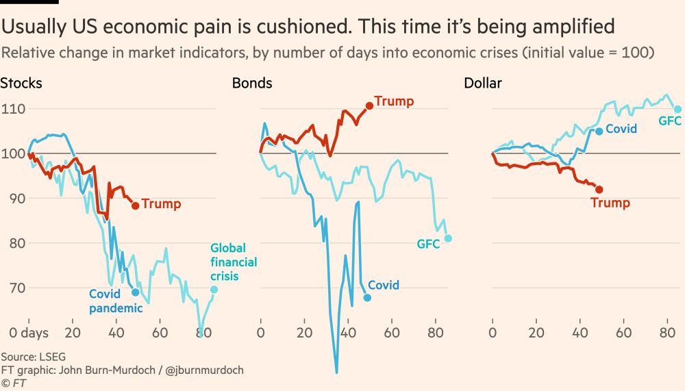
The key chart right now:
Usually US economic pain is cushioned by falling bond yields and a strengthening dollar, which mean lower interest rates and more spending power for consumers.
This time we’re seeing the opposite, meaning the pain will be amplified.
Usually US economic pain is cushioned by falling bond yields and a strengthening dollar, which mean lower interest rates and more spending power for consumers.
This time we’re seeing the opposite, meaning the pain will be amplified.
April 22, 2025 at 1:41 PM
The key chart right now:
Usually US economic pain is cushioned by falling bond yields and a strengthening dollar, which mean lower interest rates and more spending power for consumers.
This time we’re seeing the opposite, meaning the pain will be amplified.
Usually US economic pain is cushioned by falling bond yields and a strengthening dollar, which mean lower interest rates and more spending power for consumers.
This time we’re seeing the opposite, meaning the pain will be amplified.
Day twenty-one of the #30DayChartChallenge 2025
Topic: Time series / Fossils
Data: After 2022, gas consumption in Germany has changed a lot due to the boycott of Russian imports.
Chart: Faceting breaks down complex data into easy-to-read chunks by showing separate traces for each category.
Topic: Time series / Fossils
Data: After 2022, gas consumption in Germany has changed a lot due to the boycott of Russian imports.
Chart: Faceting breaks down complex data into easy-to-read chunks by showing separate traces for each category.

April 21, 2025 at 5:34 AM
Day twenty-one of the #30DayChartChallenge 2025
Topic: Time series / Fossils
Data: After 2022, gas consumption in Germany has changed a lot due to the boycott of Russian imports.
Chart: Faceting breaks down complex data into easy-to-read chunks by showing separate traces for each category.
Topic: Time series / Fossils
Data: After 2022, gas consumption in Germany has changed a lot due to the boycott of Russian imports.
Chart: Faceting breaks down complex data into easy-to-read chunks by showing separate traces for each category.
To Understand Global Migration, You Have to See It First
Mindblowing article by the New York Times about worldwide migration ...
www.nytimes.com/interactive/...
Mindblowing article by the New York Times about worldwide migration ...
www.nytimes.com/interactive/...

April 20, 2025 at 6:30 AM
To Understand Global Migration, You Have to See It First
Mindblowing article by the New York Times about worldwide migration ...
www.nytimes.com/interactive/...
Mindblowing article by the New York Times about worldwide migration ...
www.nytimes.com/interactive/...
Day twenty of the #30DayChartChallenge 2025
Topic: Timeseries / Urbanization
Big question: how to explain the 'world'? Small multiples are a powerful way of providing an overview of important developments over time, while still providing the opp to delve into detail if required.
#PowerBI #Deneb
Topic: Timeseries / Urbanization
Big question: how to explain the 'world'? Small multiples are a powerful way of providing an overview of important developments over time, while still providing the opp to delve into detail if required.
#PowerBI #Deneb

April 20, 2025 at 6:14 AM
Day twenty of the #30DayChartChallenge 2025
Topic: Timeseries / Urbanization
Big question: how to explain the 'world'? Small multiples are a powerful way of providing an overview of important developments over time, while still providing the opp to delve into detail if required.
#PowerBI #Deneb
Topic: Timeseries / Urbanization
Big question: how to explain the 'world'? Small multiples are a powerful way of providing an overview of important developments over time, while still providing the opp to delve into detail if required.
#PowerBI #Deneb
Day nineteen of the #30DayChartChallenge 2025
Topic: Timeseries / Smooth
This is a remake of a famous type of chart introduced in 1786 by William Playfair in his book "Commercial and Political Atlas". WP is credited with introducing graphical methods to statistics.
#PowerBI #DENEB
Topic: Timeseries / Smooth
This is a remake of a famous type of chart introduced in 1786 by William Playfair in his book "Commercial and Political Atlas". WP is credited with introducing graphical methods to statistics.
#PowerBI #DENEB

April 19, 2025 at 6:57 AM
Day nineteen of the #30DayChartChallenge 2025
Topic: Timeseries / Smooth
This is a remake of a famous type of chart introduced in 1786 by William Playfair in his book "Commercial and Political Atlas". WP is credited with introducing graphical methods to statistics.
#PowerBI #DENEB
Topic: Timeseries / Smooth
This is a remake of a famous type of chart introduced in 1786 by William Playfair in his book "Commercial and Political Atlas". WP is credited with introducing graphical methods to statistics.
#PowerBI #DENEB
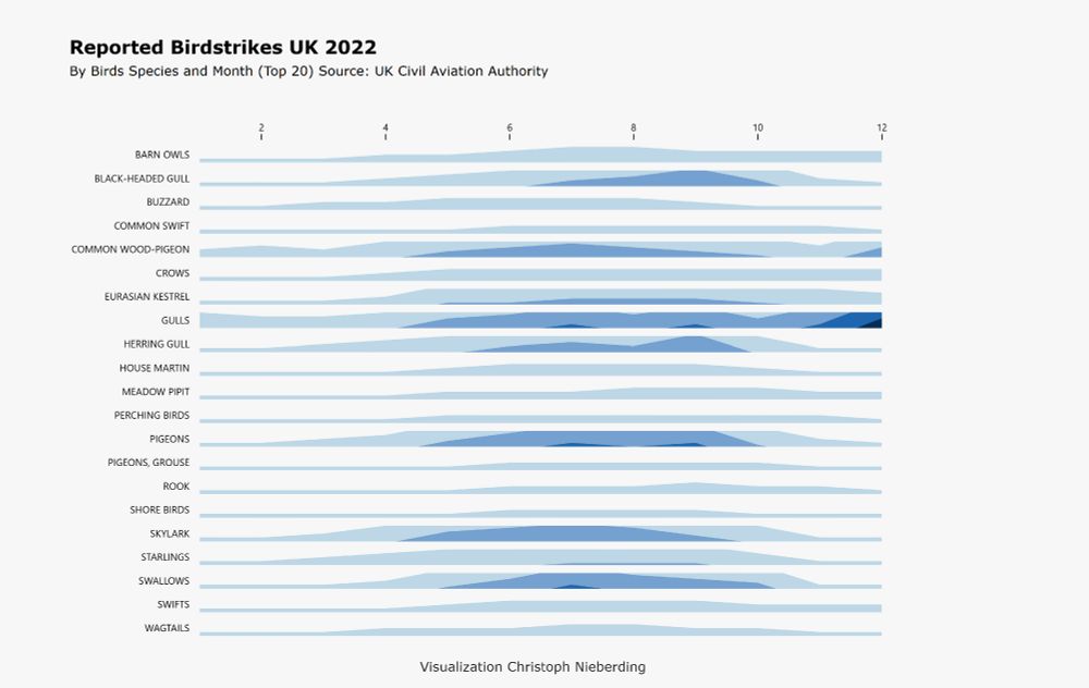
Day seventeen of the #30DayChartChallenge 2025
Topic: Relationships / Birds
Horizon charts are great for showing multiple time series in a limited amount of space. Sometimes, you really don’t have much room but still want to show the density or intensity of events over time.
#PowerBI #D3JS
Topic: Relationships / Birds
Horizon charts are great for showing multiple time series in a limited amount of space. Sometimes, you really don’t have much room but still want to show the density or intensity of events over time.
#PowerBI #D3JS
April 17, 2025 at 5:57 AM
Day seventeen of the #30DayChartChallenge 2025
Topic: Relationships / Birds
Horizon charts are great for showing multiple time series in a limited amount of space. Sometimes, you really don’t have much room but still want to show the density or intensity of events over time.
#PowerBI #D3JS
Topic: Relationships / Birds
Horizon charts are great for showing multiple time series in a limited amount of space. Sometimes, you really don’t have much room but still want to show the density or intensity of events over time.
#PowerBI #D3JS
Day sixteen of the #30DayChartChallenge 2025
Relationship / negative
Can a negative relationship be positive? I thought about Hans Rosling for inspiration and came up with this dataset. I've never seen such a strong correlation (the y-scale is logarithmic) in data I work with.
#PowerBI #DENEB
Relationship / negative
Can a negative relationship be positive? I thought about Hans Rosling for inspiration and came up with this dataset. I've never seen such a strong correlation (the y-scale is logarithmic) in data I work with.
#PowerBI #DENEB

April 16, 2025 at 3:09 AM
Day sixteen of the #30DayChartChallenge 2025
Relationship / negative
Can a negative relationship be positive? I thought about Hans Rosling for inspiration and came up with this dataset. I've never seen such a strong correlation (the y-scale is logarithmic) in data I work with.
#PowerBI #DENEB
Relationship / negative
Can a negative relationship be positive? I thought about Hans Rosling for inspiration and came up with this dataset. I've never seen such a strong correlation (the y-scale is logarithmic) in data I work with.
#PowerBI #DENEB
Day fourten of the #30DayChartChallenge 2025
Topic: Relationship / complicated
This chart is an unfinished digital remake of the famous train timetable from Paris to Lyon by E.J. Marey, printed in Tufte's book "The Visual Display of Quantitative Information".
#PowerBI #DENEB
Topic: Relationship / complicated
This chart is an unfinished digital remake of the famous train timetable from Paris to Lyon by E.J. Marey, printed in Tufte's book "The Visual Display of Quantitative Information".
#PowerBI #DENEB

April 14, 2025 at 5:32 AM
Day fourten of the #30DayChartChallenge 2025
Topic: Relationship / complicated
This chart is an unfinished digital remake of the famous train timetable from Paris to Lyon by E.J. Marey, printed in Tufte's book "The Visual Display of Quantitative Information".
#PowerBI #DENEB
Topic: Relationship / complicated
This chart is an unfinished digital remake of the famous train timetable from Paris to Lyon by E.J. Marey, printed in Tufte's book "The Visual Display of Quantitative Information".
#PowerBI #DENEB
Day eleven of the hashtag#30DayChartChallenge 2025
Topic: Distributions / Stripes
Climate scientist Ed Hawkins created the iconic “warming stripes” to show global temperature changes in a clear, visual way and powerful in climate communication.
This dataset compares two time spans of Munich.
Topic: Distributions / Stripes
Climate scientist Ed Hawkins created the iconic “warming stripes” to show global temperature changes in a clear, visual way and powerful in climate communication.
This dataset compares two time spans of Munich.

April 11, 2025 at 5:04 AM
Day eleven of the hashtag#30DayChartChallenge 2025
Topic: Distributions / Stripes
Climate scientist Ed Hawkins created the iconic “warming stripes” to show global temperature changes in a clear, visual way and powerful in climate communication.
This dataset compares two time spans of Munich.
Topic: Distributions / Stripes
Climate scientist Ed Hawkins created the iconic “warming stripes” to show global temperature changes in a clear, visual way and powerful in climate communication.
This dataset compares two time spans of Munich.
Day ten of the #30DayChartChallenge 2025
Topic: Distributions / Multimodel
I felt overwhelmed by this one, not being able to find a good dataset. I decided to use a dummy set and simulate sth, without having a specific question in mind. Perfect conditions to fail 🤣 ... here is my input 👾
Topic: Distributions / Multimodel
I felt overwhelmed by this one, not being able to find a good dataset. I decided to use a dummy set and simulate sth, without having a specific question in mind. Perfect conditions to fail 🤣 ... here is my input 👾

April 10, 2025 at 5:58 AM
Day ten of the #30DayChartChallenge 2025
Topic: Distributions / Multimodel
I felt overwhelmed by this one, not being able to find a good dataset. I decided to use a dummy set and simulate sth, without having a specific question in mind. Perfect conditions to fail 🤣 ... here is my input 👾
Topic: Distributions / Multimodel
I felt overwhelmed by this one, not being able to find a good dataset. I decided to use a dummy set and simulate sth, without having a specific question in mind. Perfect conditions to fail 🤣 ... here is my input 👾
Day nine of the #30DayChartChallenge 2025
Theme: Distributions / Divergence
What is Healthy Life Expectancy (HALE)? It's the number of years you can expect to live in good health, without serious illness or disability. One of the most important indicators of quality of life.
#PowerBI #DENEB
Theme: Distributions / Divergence
What is Healthy Life Expectancy (HALE)? It's the number of years you can expect to live in good health, without serious illness or disability. One of the most important indicators of quality of life.
#PowerBI #DENEB

April 9, 2025 at 6:03 AM
Day nine of the #30DayChartChallenge 2025
Theme: Distributions / Divergence
What is Healthy Life Expectancy (HALE)? It's the number of years you can expect to live in good health, without serious illness or disability. One of the most important indicators of quality of life.
#PowerBI #DENEB
Theme: Distributions / Divergence
What is Healthy Life Expectancy (HALE)? It's the number of years you can expect to live in good health, without serious illness or disability. One of the most important indicators of quality of life.
#PowerBI #DENEB
Friedrich Merz am 19. Januar 2025: "Wir haben die CDU, den großen Tanker, wieder richtig auf Kurs gebracht ....
Quelle: Zeit Online Podcast "Alles gesagt" ...
OMG 🙃
Quelle: Zeit Online Podcast "Alles gesagt" ...
OMG 🙃
April 8, 2025 at 11:48 AM
Friedrich Merz am 19. Januar 2025: "Wir haben die CDU, den großen Tanker, wieder richtig auf Kurs gebracht ....
Quelle: Zeit Online Podcast "Alles gesagt" ...
OMG 🙃
Quelle: Zeit Online Podcast "Alles gesagt" ...
OMG 🙃
Day eight of the #30DayChartChallenge 2025
Theme: Distributions/Histogram
Continuous data are for histograms. Helps to reveal skewness, central tendency or outliers. This makes them particularly useful for understanding the shape and spread of data sets at a glance.
#PowerBI #DENEB
Theme: Distributions/Histogram
Continuous data are for histograms. Helps to reveal skewness, central tendency or outliers. This makes them particularly useful for understanding the shape and spread of data sets at a glance.
#PowerBI #DENEB

April 8, 2025 at 5:29 AM
Day eight of the #30DayChartChallenge 2025
Theme: Distributions/Histogram
Continuous data are for histograms. Helps to reveal skewness, central tendency or outliers. This makes them particularly useful for understanding the shape and spread of data sets at a glance.
#PowerBI #DENEB
Theme: Distributions/Histogram
Continuous data are for histograms. Helps to reveal skewness, central tendency or outliers. This makes them particularly useful for understanding the shape and spread of data sets at a glance.
#PowerBI #DENEB
Day seven of the #30DayChartChallenge 2025
Topic: Distribution / Outliers
A key goal of data visualisation is always to identify patterns. And patterns become visible when they are broken: Outliers. Then you can see, for example, that something is really not working.
#PowerBI #DENEB
Topic: Distribution / Outliers
A key goal of data visualisation is always to identify patterns. And patterns become visible when they are broken: Outliers. Then you can see, for example, that something is really not working.
#PowerBI #DENEB

April 7, 2025 at 6:01 AM
Day seven of the #30DayChartChallenge 2025
Topic: Distribution / Outliers
A key goal of data visualisation is always to identify patterns. And patterns become visible when they are broken: Outliers. Then you can see, for example, that something is really not working.
#PowerBI #DENEB
Topic: Distribution / Outliers
A key goal of data visualisation is always to identify patterns. And patterns become visible when they are broken: Outliers. Then you can see, for example, that something is really not working.
#PowerBI #DENEB
Reposted by Christoph Nieberding

How Hans Mustermann and Gabi Musterfrau spend their day.
Averages from the German Time Utilisation Survey 2022.
Some shared preferences for eating times, it appears.
#30DayChartChallenge #Day03 Circular 📊 #rstats
Averages from the German Time Utilisation Survey 2022.
Some shared preferences for eating times, it appears.
#30DayChartChallenge #Day03 Circular 📊 #rstats

April 4, 2025 at 11:27 AM
How Hans Mustermann and Gabi Musterfrau spend their day.
Averages from the German Time Utilisation Survey 2022.
Some shared preferences for eating times, it appears.
#30DayChartChallenge #Day03 Circular 📊 #rstats
Averages from the German Time Utilisation Survey 2022.
Some shared preferences for eating times, it appears.
#30DayChartChallenge #Day03 Circular 📊 #rstats
Day five of the #𝟑𝟎𝐃𝐚𝐲𝐂𝐡𝐚𝐫𝐭𝐂𝐡𝐚𝐥𝐥𝐞𝐧𝐠𝐞
2025 Topic: Comparisons / Rankings
Germany generally is currently seen as somehow backward. But not with patent applications 😉. Impressive big shift by CH.
This one is inspired by the chart of the famous Big Mac Index by 𝐓𝐡𝐞 𝐄𝐜𝐨𝐧𝐨𝐦𝐢𝐬𝐭.
#PowerBI #DENEB
2025 Topic: Comparisons / Rankings
Germany generally is currently seen as somehow backward. But not with patent applications 😉. Impressive big shift by CH.
This one is inspired by the chart of the famous Big Mac Index by 𝐓𝐡𝐞 𝐄𝐜𝐨𝐧𝐨𝐦𝐢𝐬𝐭.
#PowerBI #DENEB

April 5, 2025 at 6:11 AM
Day five of the #𝟑𝟎𝐃𝐚𝐲𝐂𝐡𝐚𝐫𝐭𝐂𝐡𝐚𝐥𝐥𝐞𝐧𝐠𝐞
2025 Topic: Comparisons / Rankings
Germany generally is currently seen as somehow backward. But not with patent applications 😉. Impressive big shift by CH.
This one is inspired by the chart of the famous Big Mac Index by 𝐓𝐡𝐞 𝐄𝐜𝐨𝐧𝐨𝐦𝐢𝐬𝐭.
#PowerBI #DENEB
2025 Topic: Comparisons / Rankings
Germany generally is currently seen as somehow backward. But not with patent applications 😉. Impressive big shift by CH.
This one is inspired by the chart of the famous Big Mac Index by 𝐓𝐡𝐞 𝐄𝐜𝐨𝐧𝐨𝐦𝐢𝐬𝐭.
#PowerBI #DENEB
Reposted by Christoph Nieberding
Die Neuigkeit hierbei ist, dass Spahn Interna nicht nur an seine Buddies von BILD und NIUS durchsticht.

Zu Beginn der Corona-Pandemie schickte der damalige Gesundheitsminister Jens #Spahn vertrauliche Unterlagen an René Benko. Darin ging es um die Frage, ob große Warenhäuser wieder öffnen dürfen. Kurze Zeit später war es so weit - was Benko entgegenkam.
www.focus.de/politik/deut...
www.focus.de/politik/deut...

Mails zeigen vertraulichen Kontakt von Spahn und Benko mitten im Corona-Lockdown
Ex-Gesundheitsminister Jens Spahn hat sich während des ersten Corona-Lockdowns im April und Mai 2020 intensiv mit dem damaligen Eigentümer der Kaufhauskette Galeria, René Benko, beraten.
www.focus.de
April 4, 2025 at 6:46 AM
Die Neuigkeit hierbei ist, dass Spahn Interna nicht nur an seine Buddies von BILD und NIUS durchsticht.
Day four of the #30DayChartChallenge 2025
Topic: Comparisons / Small or Big
Big numbers are hard to relate to. How much is a billion fortune? My question for today was, how can we explain this amount in a meaningful way? So I took Heath/Starr's "Making Numbers Count" approach. 😅
#PowerBI #DENEB
Topic: Comparisons / Small or Big
Big numbers are hard to relate to. How much is a billion fortune? My question for today was, how can we explain this amount in a meaningful way? So I took Heath/Starr's "Making Numbers Count" approach. 😅
#PowerBI #DENEB

April 4, 2025 at 6:25 AM
Day four of the #30DayChartChallenge 2025
Topic: Comparisons / Small or Big
Big numbers are hard to relate to. How much is a billion fortune? My question for today was, how can we explain this amount in a meaningful way? So I took Heath/Starr's "Making Numbers Count" approach. 😅
#PowerBI #DENEB
Topic: Comparisons / Small or Big
Big numbers are hard to relate to. How much is a billion fortune? My question for today was, how can we explain this amount in a meaningful way? So I took Heath/Starr's "Making Numbers Count" approach. 😅
#PowerBI #DENEB
Third day of the #30DayChartChallenge 2025
Topic: Comparisons / Circles
Circles are perfect shapes and beautiful. And powerful in conveying simple but important messages.
Here is an example of the different weighting of our federal states in the last federal election.
#PowerBI #DENEB
Topic: Comparisons / Circles
Circles are perfect shapes and beautiful. And powerful in conveying simple but important messages.
Here is an example of the different weighting of our federal states in the last federal election.
#PowerBI #DENEB

April 3, 2025 at 6:38 AM
Third day of the #30DayChartChallenge 2025
Topic: Comparisons / Circles
Circles are perfect shapes and beautiful. And powerful in conveying simple but important messages.
Here is an example of the different weighting of our federal states in the last federal election.
#PowerBI #DENEB
Topic: Comparisons / Circles
Circles are perfect shapes and beautiful. And powerful in conveying simple but important messages.
Here is an example of the different weighting of our federal states in the last federal election.
#PowerBI #DENEB
Reposted by Christoph Nieberding

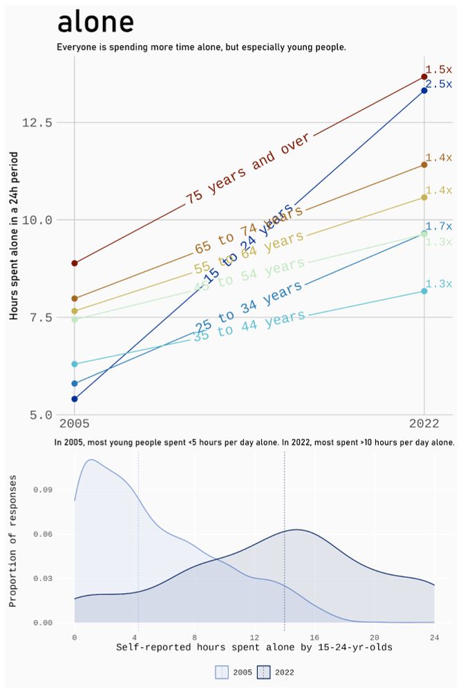
Day 2 of #30DayChartChallenge: Slope.
Canadians spent a *lot* more time alone in 2022 compared to 2005. But that comparison is especially stark for young Canadians.
Code: github.com/ivabrunec/30...
Canadians spent a *lot* more time alone in 2022 compared to 2005. But that comparison is especially stark for young Canadians.
Code: github.com/ivabrunec/30...
April 2, 2025 at 9:39 PM
Day 2 of #30DayChartChallenge: Slope.
Canadians spent a *lot* more time alone in 2022 compared to 2005. But that comparison is especially stark for young Canadians.
Code: github.com/ivabrunec/30...
Canadians spent a *lot* more time alone in 2022 compared to 2005. But that comparison is especially stark for young Canadians.
Code: github.com/ivabrunec/30...
Day two of the #30DayChartChallenge 2025
When you want to show change between two points in time, slope charts are a powerful choice. Simple, clean and easy to understand.
My data is about the current energy transition and transformation of the energy industry in Germany.
#PowerBI #DENEB
When you want to show change between two points in time, slope charts are a powerful choice. Simple, clean and easy to understand.
My data is about the current energy transition and transformation of the energy industry in Germany.
#PowerBI #DENEB

April 2, 2025 at 6:17 AM
Day two of the #30DayChartChallenge 2025
When you want to show change between two points in time, slope charts are a powerful choice. Simple, clean and easy to understand.
My data is about the current energy transition and transformation of the energy industry in Germany.
#PowerBI #DENEB
When you want to show change between two points in time, slope charts are a powerful choice. Simple, clean and easy to understand.
My data is about the current energy transition and transformation of the energy industry in Germany.
#PowerBI #DENEB
😅 Oops, first day of #30DayChartChallenge 2025 for me.
Topic: Comparisons/Fractions
Today I provide map tiles for some EU countries, showing min wages in a Euro bill, filled as related to the highest minimum wage in Europe Luxembourg (100%). Some countries have no min wage like AT and SUI.
Today I provide map tiles for some EU countries, showing min wages in a Euro bill, filled as related to the highest minimum wage in Europe Luxembourg (100%). Some countries have no min wage like AT and SUI.

April 1, 2025 at 11:36 AM
😅 Oops, first day of #30DayChartChallenge 2025 for me.
Topic: Comparisons/Fractions
Today I provide map tiles for some EU countries, showing min wages in a Euro bill, filled as related to the highest minimum wage in Europe Luxembourg (100%). Some countries have no min wage like AT and SUI.
Today I provide map tiles for some EU countries, showing min wages in a Euro bill, filled as related to the highest minimum wage in Europe Luxembourg (100%). Some countries have no min wage like AT and SUI.
Power BI with web technology? 🥳
The development of UI on the web has made great progress. As users, we quickly get used to it and only realise when sth is missing.
The D3.js visual is a possibility to catch up..
Here is onee with highlighting effect when moving the mouse over it
#PowerBI #D3js
The development of UI on the web has made great progress. As users, we quickly get used to it and only realise when sth is missing.
The D3.js visual is a possibility to catch up..
Here is onee with highlighting effect when moving the mouse over it
#PowerBI #D3js
February 23, 2025 at 8:15 AM
Power BI offers some nice possibilities with custom visuals. I recently had the chance to play around with the D3.js visual from the Marketplace. This visual runs on Version 3 (Version 7 is current).
What are your experiences with this so far?
#D3JS #PowerBI #CustomVisuals
What are your experiences with this so far?
#D3JS #PowerBI #CustomVisuals
February 20, 2025 at 8:28 AM
Power BI offers some nice possibilities with custom visuals. I recently had the chance to play around with the D3.js visual from the Marketplace. This visual runs on Version 3 (Version 7 is current).
What are your experiences with this so far?
#D3JS #PowerBI #CustomVisuals
What are your experiences with this so far?
#D3JS #PowerBI #CustomVisuals
What does 𝗗𝘂𝗻𝗸𝗲𝗹𝗳𝗹𝗮𝘂𝘁𝗲 look like?
Dunkelflaute or 'dark doldrums' or 'dark wind lull' is a period of time when little or no energy can be generated by wind and solar power because there is no ...
The thing is, with AI, Dunkelflauten are predictable several days ahead ... 😀
#ClimateChange #Energy
Dunkelflaute or 'dark doldrums' or 'dark wind lull' is a period of time when little or no energy can be generated by wind and solar power because there is no ...
The thing is, with AI, Dunkelflauten are predictable several days ahead ... 😀
#ClimateChange #Energy

January 17, 2025 at 6:52 AM
What does 𝗗𝘂𝗻𝗸𝗲𝗹𝗳𝗹𝗮𝘂𝘁𝗲 look like?
Dunkelflaute or 'dark doldrums' or 'dark wind lull' is a period of time when little or no energy can be generated by wind and solar power because there is no ...
The thing is, with AI, Dunkelflauten are predictable several days ahead ... 😀
#ClimateChange #Energy
Dunkelflaute or 'dark doldrums' or 'dark wind lull' is a period of time when little or no energy can be generated by wind and solar power because there is no ...
The thing is, with AI, Dunkelflauten are predictable several days ahead ... 😀
#ClimateChange #Energy