


David Leather
@davidleather.bsky.social
Research Associate at CRESR, graphics editor for PPP journal. GIS, Tableau, GIS etc.
https://www.shu.ac.uk/about-us/our-people/staff-profiles/david-leather#firstSection
https://www.shu.ac.uk/about-us/our-people/staff-profiles/david-leather#firstSection
#30DayMapChallenge: Day30: The Final Map
Here is the second map I forgot to post. I realised I hadn't done a bivariate map yet so here is one showing the average broadband speed and percentage of people who work mainly from home, in LSOAs in Yorkshire and Humberside.
Here is the second map I forgot to post. I realised I hadn't done a bivariate map yet so here is one showing the average broadband speed and percentage of people who work mainly from home, in LSOAs in Yorkshire and Humberside.

December 5, 2024 at 9:56 AM
#30DayMapChallenge: Day30: The Final Map
Here is the second map I forgot to post. I realised I hadn't done a bivariate map yet so here is one showing the average broadband speed and percentage of people who work mainly from home, in LSOAs in Yorkshire and Humberside.
Here is the second map I forgot to post. I realised I hadn't done a bivariate map yet so here is one showing the average broadband speed and percentage of people who work mainly from home, in LSOAs in Yorkshire and Humberside.
#30DayMapChallenge: Day29: Overture Data
Just realised that despite making them in time, I forgot to post my last two days of the challenge here. Whoops. Anyway, here is a map of the location of castles in the UK. Better late than never.
Just realised that despite making them in time, I forgot to post my last two days of the challenge here. Whoops. Anyway, here is a map of the location of castles in the UK. Better late than never.

December 5, 2024 at 9:54 AM
#30DayMapChallenge: Day29: Overture Data
Just realised that despite making them in time, I forgot to post my last two days of the challenge here. Whoops. Anyway, here is a map of the location of castles in the UK. Better late than never.
Just realised that despite making them in time, I forgot to post my last two days of the challenge here. Whoops. Anyway, here is a map of the location of castles in the UK. Better late than never.
#30DayMapChallenge Day 28: The Blue Planet
Known shipwreck locations across the world. I have been looking for an excuse to shoehorn this dataset into one of the daily theme and finally found a way.
Known shipwreck locations across the world. I have been looking for an excuse to shoehorn this dataset into one of the daily theme and finally found a way.

November 28, 2024 at 12:24 PM
#30DayMapChallenge Day 28: The Blue Planet
Known shipwreck locations across the world. I have been looking for an excuse to shoehorn this dataset into one of the daily theme and finally found a way.
Known shipwreck locations across the world. I have been looking for an excuse to shoehorn this dataset into one of the daily theme and finally found a way.
#30DayMapChallenge Day 27: Micromapping
I will reiterate again that I love map in a circle so here is another one. A map of Low Bradfield village in Sheffield where I have had many a family walk and more recently attempted to take up tennis.
I will reiterate again that I love map in a circle so here is another one. A map of Low Bradfield village in Sheffield where I have had many a family walk and more recently attempted to take up tennis.

November 27, 2024 at 5:37 PM
#30DayMapChallenge Day 27: Micromapping
I will reiterate again that I love map in a circle so here is another one. A map of Low Bradfield village in Sheffield where I have had many a family walk and more recently attempted to take up tennis.
I will reiterate again that I love map in a circle so here is another one. A map of Low Bradfield village in Sheffield where I have had many a family walk and more recently attempted to take up tennis.
#30DayMapChallenge Day26: Map Projections
Wasn't particularly inspired by todays theme but after trying different projections at random, I somehow ended up with whatever this is, maybe some sort of world cube template? Thankfully I will never be able to recreate it.
Wasn't particularly inspired by todays theme but after trying different projections at random, I somehow ended up with whatever this is, maybe some sort of world cube template? Thankfully I will never be able to recreate it.

November 26, 2024 at 8:35 PM
#30DayMapChallenge Day26: Map Projections
Wasn't particularly inspired by todays theme but after trying different projections at random, I somehow ended up with whatever this is, maybe some sort of world cube template? Thankfully I will never be able to recreate it.
Wasn't particularly inspired by todays theme but after trying different projections at random, I somehow ended up with whatever this is, maybe some sort of world cube template? Thankfully I will never be able to recreate it.
#30DayMapChallenge Day25: Heat
This shows Fuel Poverty in small areas in England as defined by households with an energy efficiency rating D or below and a disposable income 60% below the national median.
This shows Fuel Poverty in small areas in England as defined by households with an energy efficiency rating D or below and a disposable income 60% below the national median.

November 26, 2024 at 2:19 PM
#30DayMapChallenge Day25: Heat
This shows Fuel Poverty in small areas in England as defined by households with an energy efficiency rating D or below and a disposable income 60% below the national median.
This shows Fuel Poverty in small areas in England as defined by households with an energy efficiency rating D or below and a disposable income 60% below the national median.
#30DayMapChallenge Day 24: Circular Shapes
Had a go at creating a Dorling Cartogram in @tableau based on world pop densities. Turned out OK other than the USA and Canada floating out to sea. Technique was learned from this @professorkao.bsky.social tutorial: typefully.com/professorkao...
Had a go at creating a Dorling Cartogram in @tableau based on world pop densities. Turned out OK other than the USA and Canada floating out to sea. Technique was learned from this @professorkao.bsky.social tutorial: typefully.com/professorkao...

November 26, 2024 at 2:15 PM
#30DayMapChallenge Day 24: Circular Shapes
Had a go at creating a Dorling Cartogram in @tableau based on world pop densities. Turned out OK other than the USA and Canada floating out to sea. Technique was learned from this @professorkao.bsky.social tutorial: typefully.com/professorkao...
Had a go at creating a Dorling Cartogram in @tableau based on world pop densities. Turned out OK other than the USA and Canada floating out to sea. Technique was learned from this @professorkao.bsky.social tutorial: typefully.com/professorkao...
#30DayMapChallenge Day23: Memory
I tried to draw the centre of the village where I grew from memory then compared it to the real thing. Not a bad effort considering I have only been back once in the last 20 years or so.
I tried to draw the centre of the village where I grew from memory then compared it to the real thing. Not a bad effort considering I have only been back once in the last 20 years or so.

November 23, 2024 at 4:34 PM
#30DayMapChallenge Day23: Memory
I tried to draw the centre of the village where I grew from memory then compared it to the real thing. Not a bad effort considering I have only been back once in the last 20 years or so.
I tried to draw the centre of the village where I grew from memory then compared it to the real thing. Not a bad effort considering I have only been back once in the last 20 years or so.
#30DayMapChallenge: Day 22: Two Colours
A simple map of Sheffield city with a nice pink/grey combo, again using OSM. Not much else to say about it other than that.
A simple map of Sheffield city with a nice pink/grey combo, again using OSM. Not much else to say about it other than that.

November 22, 2024 at 10:01 AM
#30DayMapChallenge: Day 22: Two Colours
A simple map of Sheffield city with a nice pink/grey combo, again using OSM. Not much else to say about it other than that.
A simple map of Sheffield city with a nice pink/grey combo, again using OSM. Not much else to say about it other than that.
#30DayMapChallenge: Day21: Conflict
This shows the approximate location of battlefields in Great Britain by the historic period they occurred in. The list of battles as well as the categories used are sourced from www.battlefieldstrust.com.
This shows the approximate location of battlefields in Great Britain by the historic period they occurred in. The list of battles as well as the categories used are sourced from www.battlefieldstrust.com.

November 21, 2024 at 9:32 AM
#30DayMapChallenge: Day21: Conflict
This shows the approximate location of battlefields in Great Britain by the historic period they occurred in. The list of battles as well as the categories used are sourced from www.battlefieldstrust.com.
This shows the approximate location of battlefields in Great Britain by the historic period they occurred in. The list of battles as well as the categories used are sourced from www.battlefieldstrust.com.
#30DayMapChallenge Day20: #OpenStreetMap
OSM meets WSM - I love a map in a circle so will take any excuse to produce one. This time I chose Weston-super-Mare as I grew up near the town. The colour palette is inspired by old vintage seaside posters.
OSM meets WSM - I love a map in a circle so will take any excuse to produce one. This time I chose Weston-super-Mare as I grew up near the town. The colour palette is inspired by old vintage seaside posters.

November 21, 2024 at 8:12 AM
#30DayMapChallenge Day20: #OpenStreetMap
OSM meets WSM - I love a map in a circle so will take any excuse to produce one. This time I chose Weston-super-Mare as I grew up near the town. The colour palette is inspired by old vintage seaside posters.
OSM meets WSM - I love a map in a circle so will take any excuse to produce one. This time I chose Weston-super-Mare as I grew up near the town. The colour palette is inspired by old vintage seaside posters.
#30DayMapChallenge Day19: Typography
I asked ChatGPT to produce a list of fonts named after places and then I mapped the results. Resisting the temptation label each place in its own font is one of the hardest things I have ever had to do, so they are all in Berlin Sans instead.
I asked ChatGPT to produce a list of fonts named after places and then I mapped the results. Resisting the temptation label each place in its own font is one of the hardest things I have ever had to do, so they are all in Berlin Sans instead.

November 20, 2024 at 8:27 PM
#30DayMapChallenge Day19: Typography
I asked ChatGPT to produce a list of fonts named after places and then I mapped the results. Resisting the temptation label each place in its own font is one of the hardest things I have ever had to do, so they are all in Berlin Sans instead.
I asked ChatGPT to produce a list of fonts named after places and then I mapped the results. Resisting the temptation label each place in its own font is one of the hardest things I have ever had to do, so they are all in Berlin Sans instead.
#30DayMapChallenge Day 18: 3D
Catching up after a few days off mapping with my annual attempt to get my head around Blender. This time I persisted with it until the bitter end with this map of Yorkshire and Humberside using this rather helpful tutorial:
github.com/joewdavies/g...
Catching up after a few days off mapping with my annual attempt to get my head around Blender. This time I persisted with it until the bitter end with this map of Yorkshire and Humberside using this rather helpful tutorial:
github.com/joewdavies/g...

November 20, 2024 at 6:02 PM
#30DayMapChallenge Day 18: 3D
Catching up after a few days off mapping with my annual attempt to get my head around Blender. This time I persisted with it until the bitter end with this map of Yorkshire and Humberside using this rather helpful tutorial:
github.com/joewdavies/g...
Catching up after a few days off mapping with my annual attempt to get my head around Blender. This time I persisted with it until the bitter end with this map of Yorkshire and Humberside using this rather helpful tutorial:
github.com/joewdavies/g...
#30DayMapChallenge Day 17: Collaborative Map
I don't get the change to do many collaborative GIS projects, sadly, but I did recently work with colleagues Amy Grace and Steve Parkes to visualise South Yorkshire's consumption distribution for an journal article:
ppp-online.org/view-all-vol...
I don't get the change to do many collaborative GIS projects, sadly, but I did recently work with colleagues Amy Grace and Steve Parkes to visualise South Yorkshire's consumption distribution for an journal article:
ppp-online.org/view-all-vol...

November 19, 2024 at 10:46 AM
#30DayMapChallenge Day 17: Collaborative Map
I don't get the change to do many collaborative GIS projects, sadly, but I did recently work with colleagues Amy Grace and Steve Parkes to visualise South Yorkshire's consumption distribution for an journal article:
ppp-online.org/view-all-vol...
I don't get the change to do many collaborative GIS projects, sadly, but I did recently work with colleagues Amy Grace and Steve Parkes to visualise South Yorkshire's consumption distribution for an journal article:
ppp-online.org/view-all-vol...
#30daymapchallenge Day 16: Choropleth
The #dog and #cat population per postcode district in Great Britain based on data from the Animal and Plant Health Agency.
The #dog and #cat population per postcode district in Great Britain based on data from the Animal and Plant Health Agency.

November 19, 2024 at 10:09 AM
#30daymapchallenge Day 16: Choropleth
The #dog and #cat population per postcode district in Great Britain based on data from the Animal and Plant Health Agency.
The #dog and #cat population per postcode district in Great Britain based on data from the Animal and Plant Health Agency.
#30DayMapChallenge Day15: My Data
Expanding on my effort from Day 5 this shows a trip we took to California, but expanded to show the whole journey. Largely inspired by a lack of time and imagination but it fits the brief.
Expanding on my effort from Day 5 this shows a trip we took to California, but expanded to show the whole journey. Largely inspired by a lack of time and imagination but it fits the brief.

November 15, 2024 at 6:11 PM
#30DayMapChallenge Day15: My Data
Expanding on my effort from Day 5 this shows a trip we took to California, but expanded to show the whole journey. Largely inspired by a lack of time and imagination but it fits the brief.
Expanding on my effort from Day 5 this shows a trip we took to California, but expanded to show the whole journey. Largely inspired by a lack of time and imagination but it fits the brief.
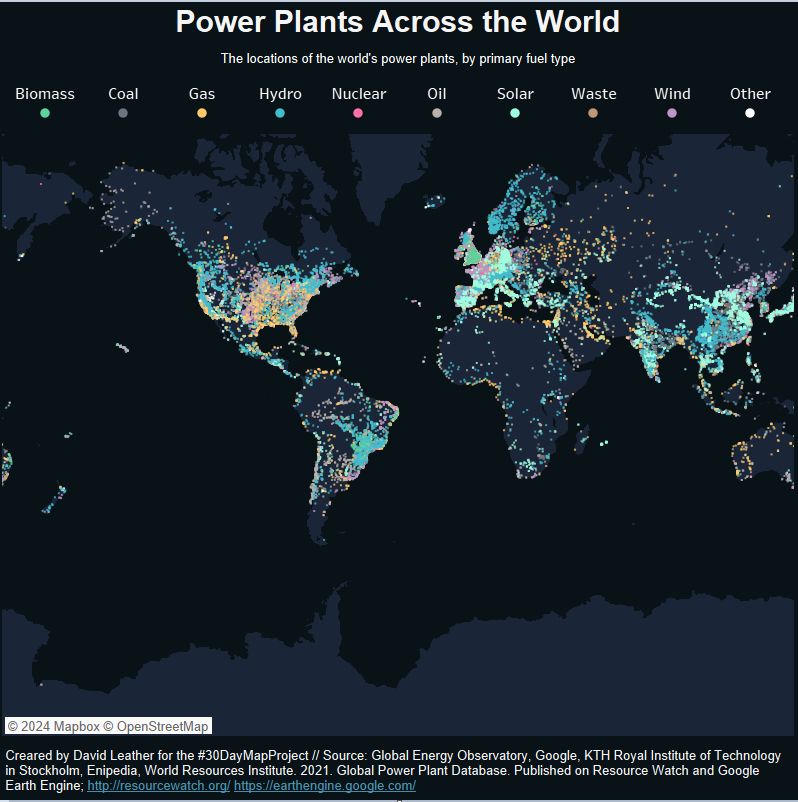
#30DayMapChallenge Day 14: A World Map
This is an update of something I did a while ago - A map of power plants across the world by primary fuel type. This time using Tableau Public.
A link to the online version:
public.tableau.com/app/profile/...
This is an update of something I did a while ago - A map of power plants across the world by primary fuel type. This time using Tableau Public.
A link to the online version:
public.tableau.com/app/profile/...
November 15, 2024 at 3:16 PM
#30DayMapChallenge Day 14: A World Map
This is an update of something I did a while ago - A map of power plants across the world by primary fuel type. This time using Tableau Public.
A link to the online version:
public.tableau.com/app/profile/...
This is an update of something I did a while ago - A map of power plants across the world by primary fuel type. This time using Tableau Public.
A link to the online version:
public.tableau.com/app/profile/...
#30DayMapChallenge Day13: A New Tool
Playing catch up after a couple of day off mapping. I have been meaning to get round to using R for ages so this was a good excuse. I made this basic pop density map of California by religiously following this helpful tutorial: eriqande.github.io/rep-res-eeb-...
Playing catch up after a couple of day off mapping. I have been meaning to get round to using R for ages so this was a good excuse. I made this basic pop density map of California by religiously following this helpful tutorial: eriqande.github.io/rep-res-eeb-...

November 15, 2024 at 3:07 PM
#30DayMapChallenge Day13: A New Tool
Playing catch up after a couple of day off mapping. I have been meaning to get round to using R for ages so this was a good excuse. I made this basic pop density map of California by religiously following this helpful tutorial: eriqande.github.io/rep-res-eeb-...
Playing catch up after a couple of day off mapping. I have been meaning to get round to using R for ages so this was a good excuse. I made this basic pop density map of California by religiously following this helpful tutorial: eriqande.github.io/rep-res-eeb-...
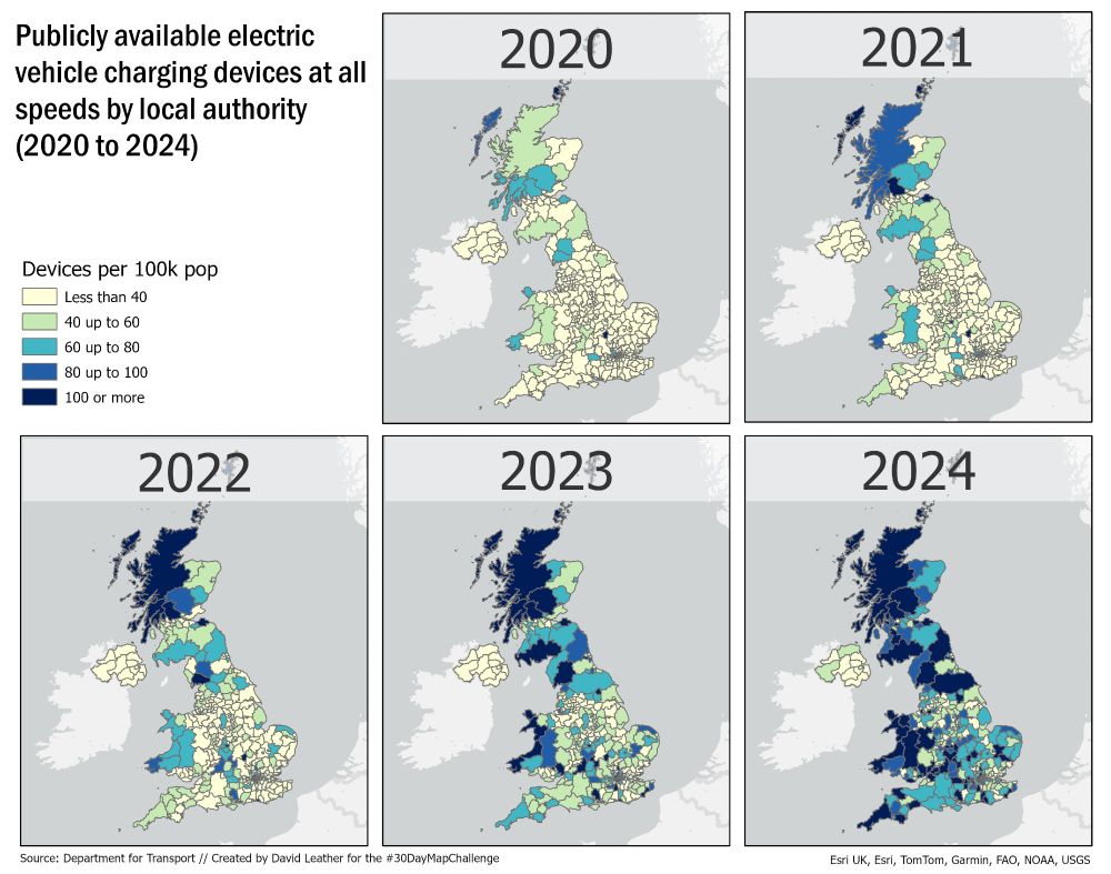
#30DayMapChallenge Day 12: Time and Space
Focusing on the growth of public electric vehicle charging points per 100k population in each UK local authority over each of the last 5 years using Department for Transport data.
Focusing on the growth of public electric vehicle charging points per 100k population in each UK local authority over each of the last 5 years using Department for Transport data.
November 12, 2024 at 1:00 PM
#30DayMapChallenge Day 12: Time and Space
Focusing on the growth of public electric vehicle charging points per 100k population in each UK local authority over each of the last 5 years using Department for Transport data.
Focusing on the growth of public electric vehicle charging points per 100k population in each UK local authority over each of the last 5 years using Department for Transport data.
#30DayMapChallenge Day11: Arctic
About 10 years ago my Grandad was posthumously given The Arctic Star for serving as a navy signalman in the Arctic Convoys in WW2 on the HMS Mackay.
I couldn't find the route of his convoy (PQ18) but this is an approximation, based on info from naval-history.net.
About 10 years ago my Grandad was posthumously given The Arctic Star for serving as a navy signalman in the Arctic Convoys in WW2 on the HMS Mackay.
I couldn't find the route of his convoy (PQ18) but this is an approximation, based on info from naval-history.net.

November 11, 2024 at 2:27 PM
#30DayMapChallenge Day11: Arctic
About 10 years ago my Grandad was posthumously given The Arctic Star for serving as a navy signalman in the Arctic Convoys in WW2 on the HMS Mackay.
I couldn't find the route of his convoy (PQ18) but this is an approximation, based on info from naval-history.net.
About 10 years ago my Grandad was posthumously given The Arctic Star for serving as a navy signalman in the Arctic Convoys in WW2 on the HMS Mackay.
I couldn't find the route of his convoy (PQ18) but this is an approximation, based on info from naval-history.net.
#30DayMapChallenge Day 10: Pen & Paper.
A highly detailed map of my average commute to the office. The biggest challenge was finding a working pen.
A highly detailed map of my average commute to the office. The biggest challenge was finding a working pen.

November 11, 2024 at 10:02 AM
#30DayMapChallenge Day 10: Pen & Paper.
A highly detailed map of my average commute to the office. The biggest challenge was finding a working pen.
A highly detailed map of my average commute to the office. The biggest challenge was finding a working pen.
#30DayMapChallenge Day 9: AI Only
Chat GTPs interpretation of a Tolkien-style map of the Peak District National Park. Could have done with just the one compass and more legible labels, but on the flipside there is a volcano and some castles.
Chat GTPs interpretation of a Tolkien-style map of the Peak District National Park. Could have done with just the one compass and more legible labels, but on the flipside there is a volcano and some castles.

November 9, 2024 at 12:11 PM
#30DayMapChallenge Day 9: AI Only
Chat GTPs interpretation of a Tolkien-style map of the Peak District National Park. Could have done with just the one compass and more legible labels, but on the flipside there is a volcano and some castles.
Chat GTPs interpretation of a Tolkien-style map of the Peak District National Park. Could have done with just the one compass and more legible labels, but on the flipside there is a volcano and some castles.
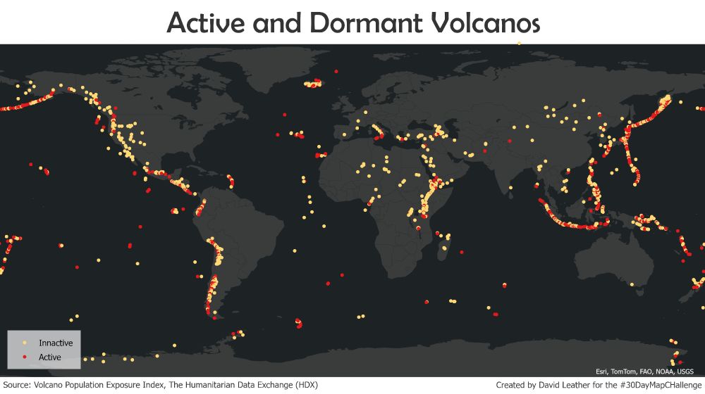
#30DayMapChallenge Day 8: Humanitarian Data Exchange (HDX)
The location of active and inactive volcanoes across the world based on data from the intriguingly named Volcano Population Exposure Index.
The location of active and inactive volcanoes across the world based on data from the intriguingly named Volcano Population Exposure Index.
November 8, 2024 at 9:22 AM
#30DayMapChallenge Day 8: Humanitarian Data Exchange (HDX)
The location of active and inactive volcanoes across the world based on data from the intriguingly named Volcano Population Exposure Index.
The location of active and inactive volcanoes across the world based on data from the intriguingly named Volcano Population Exposure Index.
#30DayMapChallenge Day 7: Vintage
Created by messing around with a combination of base maps from the Living Atlas and some gradient fill effects.
Created by messing around with a combination of base maps from the Living Atlas and some gradient fill effects.

November 7, 2024 at 10:49 AM
#30DayMapChallenge Day 7: Vintage
Created by messing around with a combination of base maps from the Living Atlas and some gradient fill effects.
Created by messing around with a combination of base maps from the Living Atlas and some gradient fill effects.
#30DayMapChallenge Day 6: Raster
Bit of a late effort today as I nearly forgot to do it so a quick UK population density map, which was a good excuse to work out how to do drop shadows in ArcGIS Pro.
Bit of a late effort today as I nearly forgot to do it so a quick UK population density map, which was a good excuse to work out how to do drop shadows in ArcGIS Pro.

November 6, 2024 at 11:11 PM
#30DayMapChallenge Day 6: Raster
Bit of a late effort today as I nearly forgot to do it so a quick UK population density map, which was a good excuse to work out how to do drop shadows in ArcGIS Pro.
Bit of a late effort today as I nearly forgot to do it so a quick UK population density map, which was a good excuse to work out how to do drop shadows in ArcGIS Pro.