


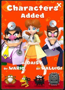
Princess Daisy's Dreamland
@daisysdreamland.bsky.social
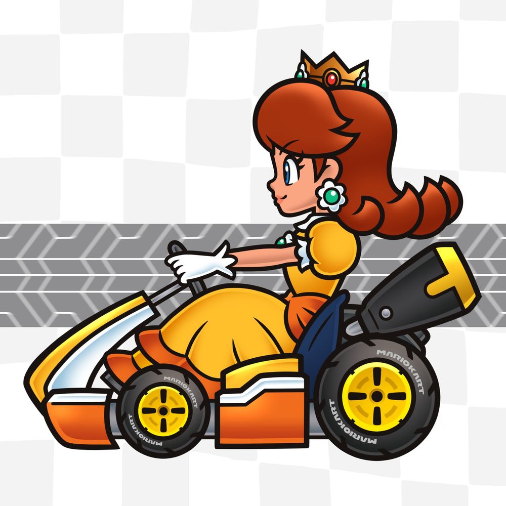
Comparing the original lines and my revamp.
I don't know why, but they made Daisy a body-double for Peach. I made her shorter to be true to canon.
They can't seem to get her head profile details right, either, so a lot of focus went there.
The bike itself has a lot more now, too.
I don't know why, but they made Daisy a body-double for Peach. I made her shorter to be true to canon.
They can't seem to get her head profile details right, either, so a lot of focus went there.
The bike itself has a lot more now, too.


December 6, 2024 at 4:15 AM
Comparing the original lines and my revamp.
I don't know why, but they made Daisy a body-double for Peach. I made her shorter to be true to canon.
They can't seem to get her head profile details right, either, so a lot of focus went there.
The bike itself has a lot more now, too.
I don't know why, but they made Daisy a body-double for Peach. I made her shorter to be true to canon.
They can't seem to get her head profile details right, either, so a lot of focus went there.
The bike itself has a lot more now, too.
Mario Kart 8 Princess Daisy Standard Bike

December 6, 2024 at 3:44 AM
Mario Kart 8 Princess Daisy Standard Bike
Princess Daisy, Mario Kart 8 Standard
November 30, 2024 at 4:46 AM
Princess Daisy, Mario Kart 8 Standard
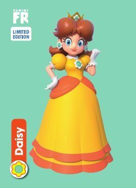
There's a better update to this art they used in the Panini cards that I'm not sure why they're not using since they are using the 2021 version literally in-game in Jamboree, as well as many marketing materials. It drives me crazy. People used it to shit all over her recently.
November 26, 2024 at 2:26 AM
There's a better update to this art they used in the Panini cards that I'm not sure why they're not using since they are using the 2021 version literally in-game in Jamboree, as well as many marketing materials. It drives me crazy. People used it to shit all over her recently.
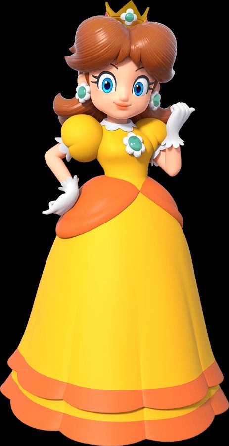
Promotional render 2021
I do not think this is an adequate remake of the original art. The original art was flawed, and so is this one. This is from 2021 when they were doing this de-saturated color-scheme a lot and more than most recent art DOES NOT match her current design. F-
I do not think this is an adequate remake of the original art. The original art was flawed, and so is this one. This is from 2021 when they were doing this de-saturated color-scheme a lot and more than most recent art DOES NOT match her current design. F-
November 26, 2024 at 2:26 AM
Promotional render 2021
I do not think this is an adequate remake of the original art. The original art was flawed, and so is this one. This is from 2021 when they were doing this de-saturated color-scheme a lot and more than most recent art DOES NOT match her current design. F-
I do not think this is an adequate remake of the original art. The original art was flawed, and so is this one. This is from 2021 when they were doing this de-saturated color-scheme a lot and more than most recent art DOES NOT match her current design. F-
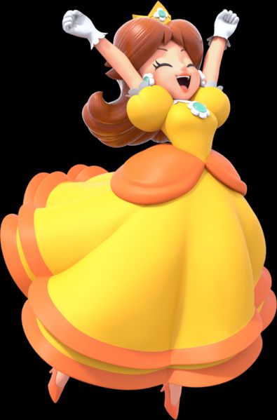
Mario Party Jamboree 2024
This is game cover art. This kind of art tends to be wrong colors-wise because they usually overdo the effects. I'm glad her hair is more saturated than desaturated, but it really does not match her in-game model. The tan is way too subtle here.
This is game cover art. This kind of art tends to be wrong colors-wise because they usually overdo the effects. I'm glad her hair is more saturated than desaturated, but it really does not match her in-game model. The tan is way too subtle here.

November 26, 2024 at 2:26 AM
Mario Party Jamboree 2024
This is game cover art. This kind of art tends to be wrong colors-wise because they usually overdo the effects. I'm glad her hair is more saturated than desaturated, but it really does not match her in-game model. The tan is way too subtle here.
This is game cover art. This kind of art tends to be wrong colors-wise because they usually overdo the effects. I'm glad her hair is more saturated than desaturated, but it really does not match her in-game model. The tan is way too subtle here.
Super Mario Bros. Wonder 2023
There is a big difference between the in-game models and the art for this game, but that's okay because this art is really amazing. The colors are good, the tan is almost perfect, but I feel it was more noticeable in-game than in the art. Details A+
There is a big difference between the in-game models and the art for this game, but that's okay because this art is really amazing. The colors are good, the tan is almost perfect, but I feel it was more noticeable in-game than in the art. Details A+

November 26, 2024 at 2:26 AM
Super Mario Bros. Wonder 2023
There is a big difference between the in-game models and the art for this game, but that's okay because this art is really amazing. The colors are good, the tan is almost perfect, but I feel it was more noticeable in-game than in the art. Details A+
There is a big difference between the in-game models and the art for this game, but that's okay because this art is really amazing. The colors are good, the tan is almost perfect, but I feel it was more noticeable in-game than in the art. Details A+
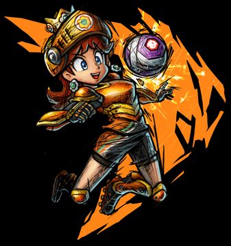
Mario Strikers: Battle League 2022
Some nitpicks between in-game and in the art. In the art, the face is not super impressive, but the colors are really great. She's too skinny in the art, but in-game they did great with the physiques. The tan is a touch too subtle, honestly.
Some nitpicks between in-game and in the art. In the art, the face is not super impressive, but the colors are really great. She's too skinny in the art, but in-game they did great with the physiques. The tan is a touch too subtle, honestly.

November 26, 2024 at 2:26 AM
Mario Strikers: Battle League 2022
Some nitpicks between in-game and in the art. In the art, the face is not super impressive, but the colors are really great. She's too skinny in the art, but in-game they did great with the physiques. The tan is a touch too subtle, honestly.
Some nitpicks between in-game and in the art. In the art, the face is not super impressive, but the colors are really great. She's too skinny in the art, but in-game they did great with the physiques. The tan is a touch too subtle, honestly.
Mario Party Superstars 2021
Surprisingly, this artwork actually did one of the only decent jobs recently in trying to match her hair and skin color in game and in the art. This art is bomb because of that, and is overall some of her best ever considering the pose and all.
Surprisingly, this artwork actually did one of the only decent jobs recently in trying to match her hair and skin color in game and in the art. This art is bomb because of that, and is overall some of her best ever considering the pose and all.

November 26, 2024 at 2:26 AM
Mario Party Superstars 2021
Surprisingly, this artwork actually did one of the only decent jobs recently in trying to match her hair and skin color in game and in the art. This art is bomb because of that, and is overall some of her best ever considering the pose and all.
Surprisingly, this artwork actually did one of the only decent jobs recently in trying to match her hair and skin color in game and in the art. This art is bomb because of that, and is overall some of her best ever considering the pose and all.
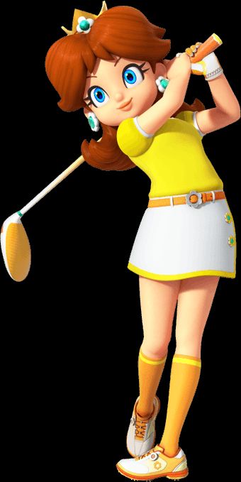
Mario Golf: Super Rush 2021
The return of Daisy's tan, but more inconsistency between the art and game. Art has a much more orange tone to it, and you can tell they wanted to make her eyes greener, too, but it seems like a missed opportunity to commit.
The return of Daisy's tan, but more inconsistency between the art and game. Art has a much more orange tone to it, and you can tell they wanted to make her eyes greener, too, but it seems like a missed opportunity to commit.

November 26, 2024 at 2:26 AM
Mario Golf: Super Rush 2021
The return of Daisy's tan, but more inconsistency between the art and game. Art has a much more orange tone to it, and you can tell they wanted to make her eyes greener, too, but it seems like a missed opportunity to commit.
The return of Daisy's tan, but more inconsistency between the art and game. Art has a much more orange tone to it, and you can tell they wanted to make her eyes greener, too, but it seems like a missed opportunity to commit.
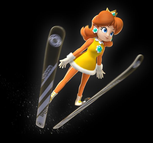
Mario & Sonic at the Olympic Games Tokyo 2020 2019
This game came out in 2019, it just meshes with the title badly in that they decided to put the year of the Olympic- whatever, anyway. This art is fire. Sega did not miss. Sega could get it.
This game came out in 2019, it just meshes with the title badly in that they decided to put the year of the Olympic- whatever, anyway. This art is fire. Sega did not miss. Sega could get it.
November 26, 2024 at 2:26 AM
Mario & Sonic at the Olympic Games Tokyo 2020 2019
This game came out in 2019, it just meshes with the title badly in that they decided to put the year of the Olympic- whatever, anyway. This art is fire. Sega did not miss. Sega could get it.
This game came out in 2019, it just meshes with the title badly in that they decided to put the year of the Olympic- whatever, anyway. This art is fire. Sega did not miss. Sega could get it.
Mario Kart Tour 2019
Speaking of muddy colors. This looks really washed-out to me. I think this is more of a generic promotional render. Ironically, Daisy's main promotional renders tend to be some of her most off-model, historically. It doesn't look right.
Speaking of muddy colors. This looks really washed-out to me. I think this is more of a generic promotional render. Ironically, Daisy's main promotional renders tend to be some of her most off-model, historically. It doesn't look right.
November 26, 2024 at 2:26 AM
Mario Kart Tour 2019
Speaking of muddy colors. This looks really washed-out to me. I think this is more of a generic promotional render. Ironically, Daisy's main promotional renders tend to be some of her most off-model, historically. It doesn't look right.
Speaking of muddy colors. This looks really washed-out to me. I think this is more of a generic promotional render. Ironically, Daisy's main promotional renders tend to be some of her most off-model, historically. It doesn't look right.
Dr. Mario World 2019
For mobile game renders and having a whole new costume these were decent. More so, the one on the right here. Her colors look a little muddy, though.
For mobile game renders and having a whole new costume these were decent. More so, the one on the right here. Her colors look a little muddy, though.

November 26, 2024 at 2:26 AM
Dr. Mario World 2019
For mobile game renders and having a whole new costume these were decent. More so, the one on the right here. Her colors look a little muddy, though.
For mobile game renders and having a whole new costume these were decent. More so, the one on the right here. Her colors look a little muddy, though.
Super Smash Bros Ultimate 2018
If Ultimate just came out later in the Switch life cycle we could've gotten tan Daisy in a Smash again. This render actually is not as good as her in-game model, either. Also, Peach and therefore Daisy are too damn lanky in Smash. Orangutan arms.
If Ultimate just came out later in the Switch life cycle we could've gotten tan Daisy in a Smash again. This render actually is not as good as her in-game model, either. Also, Peach and therefore Daisy are too damn lanky in Smash. Orangutan arms.


November 26, 2024 at 2:26 AM
Super Smash Bros Ultimate 2018
If Ultimate just came out later in the Switch life cycle we could've gotten tan Daisy in a Smash again. This render actually is not as good as her in-game model, either. Also, Peach and therefore Daisy are too damn lanky in Smash. Orangutan arms.
If Ultimate just came out later in the Switch life cycle we could've gotten tan Daisy in a Smash again. This render actually is not as good as her in-game model, either. Also, Peach and therefore Daisy are too damn lanky in Smash. Orangutan arms.
Super Mario Party 2018
Everything about this is good except for the colors. Looking washed out. The hair color's not that bad, but it's not as good as a lot of her other renders. Her face is overexposed, lighting wise. FIX IT
Everything about this is good except for the colors. Looking washed out. The hair color's not that bad, but it's not as good as a lot of her other renders. Her face is overexposed, lighting wise. FIX IT

November 26, 2024 at 2:26 AM
Super Mario Party 2018
Everything about this is good except for the colors. Looking washed out. The hair color's not that bad, but it's not as good as a lot of her other renders. Her face is overexposed, lighting wise. FIX IT
Everything about this is good except for the colors. Looking washed out. The hair color's not that bad, but it's not as good as a lot of her other renders. Her face is overexposed, lighting wise. FIX IT
Same game. This one, I wished I liked it more. They overdid it with the effects here. It could be worse, though. Peach looks goofy, honestly. This one could've been so good.

November 26, 2024 at 2:26 AM
Same game. This one, I wished I liked it more. They overdid it with the effects here. It could be worse, though. Peach looks goofy, honestly. This one could've been so good.
Mario Tennis Aces 2018
I feel like this render is almost perfect, actually. The effects are used right, and the pose is better than the last Tennis one. Her hair is posed kind of badly, though. It's giving Knuckles' tendrils when it should be giving glamour.
I feel like this render is almost perfect, actually. The effects are used right, and the pose is better than the last Tennis one. Her hair is posed kind of badly, though. It's giving Knuckles' tendrils when it should be giving glamour.


November 26, 2024 at 2:26 AM
Mario Tennis Aces 2018
I feel like this render is almost perfect, actually. The effects are used right, and the pose is better than the last Tennis one. Her hair is posed kind of badly, though. It's giving Knuckles' tendrils when it should be giving glamour.
I feel like this render is almost perfect, actually. The effects are used right, and the pose is better than the last Tennis one. Her hair is posed kind of badly, though. It's giving Knuckles' tendrils when it should be giving glamour.
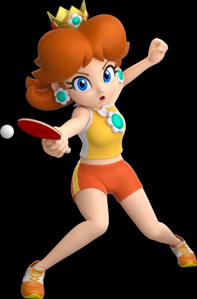
Mario Sports Superstars 2017
This render is really mixed. The detail involved is really fierce, and the expression is good. I think where the effects in the other renders were overwhelming recently, they work stylistically here, but she looks off, right? What is it? Her lips?
This render is really mixed. The detail involved is really fierce, and the expression is good. I think where the effects in the other renders were overwhelming recently, they work stylistically here, but she looks off, right? What is it? Her lips?

November 26, 2024 at 2:26 AM
Mario Sports Superstars 2017
This render is really mixed. The detail involved is really fierce, and the expression is good. I think where the effects in the other renders were overwhelming recently, they work stylistically here, but she looks off, right? What is it? Her lips?
This render is really mixed. The detail involved is really fierce, and the expression is good. I think where the effects in the other renders were overwhelming recently, they work stylistically here, but she looks off, right? What is it? Her lips?
Mario Party: Star Rush 2016
The weird blue curse is still lingering from her last Nintendo render. She looks ill, I can't deny. It's not as bad. Her lips look good, and it's really nice to see a front-facing render for a change. She still looks too blue, though.
The weird blue curse is still lingering from her last Nintendo render. She looks ill, I can't deny. It's not as bad. Her lips look good, and it's really nice to see a front-facing render for a change. She still looks too blue, though.

November 26, 2024 at 2:26 AM
Mario Party: Star Rush 2016
The weird blue curse is still lingering from her last Nintendo render. She looks ill, I can't deny. It's not as bad. Her lips look good, and it's really nice to see a front-facing render for a change. She still looks too blue, though.
The weird blue curse is still lingering from her last Nintendo render. She looks ill, I can't deny. It's not as bad. Her lips look good, and it's really nice to see a front-facing render for a change. She still looks too blue, though.
Mario & Sonic at the Rio 2016 Olympic Games 2016
Oh, it actually came out the year of? Anyway, these are cool enough. It is weird to see Daisy in a swimsuit. I think the swimsuit render could be better, but these appear to be more rushed out than the previous Mario & Sonic ones.
Oh, it actually came out the year of? Anyway, these are cool enough. It is weird to see Daisy in a swimsuit. I think the swimsuit render could be better, but these appear to be more rushed out than the previous Mario & Sonic ones.


November 26, 2024 at 2:26 AM
Mario & Sonic at the Rio 2016 Olympic Games 2016
Oh, it actually came out the year of? Anyway, these are cool enough. It is weird to see Daisy in a swimsuit. I think the swimsuit render could be better, but these appear to be more rushed out than the previous Mario & Sonic ones.
Oh, it actually came out the year of? Anyway, these are cool enough. It is weird to see Daisy in a swimsuit. I think the swimsuit render could be better, but these appear to be more rushed out than the previous Mario & Sonic ones.
Mario Tennis: Ultra Smash 2015
I didn't buy this game and I feel like this AWFUL render is part of why. It's because it lacked content, TBH, but WHY is my girl getting swallowed up in this nasty ill blue effect? Why are the inner corners of her eyes like that? What is this pose?
I didn't buy this game and I feel like this AWFUL render is part of why. It's because it lacked content, TBH, but WHY is my girl getting swallowed up in this nasty ill blue effect? Why are the inner corners of her eyes like that? What is this pose?

November 26, 2024 at 2:26 AM
Mario Tennis: Ultra Smash 2015
I didn't buy this game and I feel like this AWFUL render is part of why. It's because it lacked content, TBH, but WHY is my girl getting swallowed up in this nasty ill blue effect? Why are the inner corners of her eyes like that? What is this pose?
I didn't buy this game and I feel like this AWFUL render is part of why. It's because it lacked content, TBH, but WHY is my girl getting swallowed up in this nasty ill blue effect? Why are the inner corners of her eyes like that? What is this pose?
Mario Golf: World Tour 2014
Oh, she ate. I hate this minidress, but she ATE. She gets to look PISSED for once. Let Daisy get mad more, Nintendo! I know some people like this dress, too. So good for them, at least. This is a good one. Toad variant should've been official.
Oh, she ate. I hate this minidress, but she ATE. She gets to look PISSED for once. Let Daisy get mad more, Nintendo! I know some people like this dress, too. So good for them, at least. This is a good one. Toad variant should've been official.

November 26, 2024 at 2:26 AM
Mario Golf: World Tour 2014
Oh, she ate. I hate this minidress, but she ATE. She gets to look PISSED for once. Let Daisy get mad more, Nintendo! I know some people like this dress, too. So good for them, at least. This is a good one. Toad variant should've been official.
Oh, she ate. I hate this minidress, but she ATE. She gets to look PISSED for once. Let Daisy get mad more, Nintendo! I know some people like this dress, too. So good for them, at least. This is a good one. Toad variant should've been official.
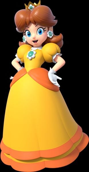
Mario Party: Island Tour 2013
This is obviously just her render from the group cover art. It is really cute, but come on, Nintendon't. Don't even release a new game if you ain't givin' this girl a new render.
This is obviously just her render from the group cover art. It is really cute, but come on, Nintendon't. Don't even release a new game if you ain't givin' this girl a new render.

November 26, 2024 at 2:26 AM
Mario Party: Island Tour 2013
This is obviously just her render from the group cover art. It is really cute, but come on, Nintendon't. Don't even release a new game if you ain't givin' this girl a new render.
This is obviously just her render from the group cover art. It is really cute, but come on, Nintendon't. Don't even release a new game if you ain't givin' this girl a new render.
Mario & Sonic at the Sochi 2014 Olympic Winter Games 2013
You may have noticed these games come out the year preceding their matching real world Olympic game dates. Again, SEGA DOES NOT MISS. Look at her big full hair. The colors?! DON'T @ ME
You may have noticed these games come out the year preceding their matching real world Olympic game dates. Again, SEGA DOES NOT MISS. Look at her big full hair. The colors?! DON'T @ ME
November 26, 2024 at 2:26 AM
Mario & Sonic at the Sochi 2014 Olympic Winter Games 2013
You may have noticed these games come out the year preceding their matching real world Olympic game dates. Again, SEGA DOES NOT MISS. Look at her big full hair. The colors?! DON'T @ ME
You may have noticed these games come out the year preceding their matching real world Olympic game dates. Again, SEGA DOES NOT MISS. Look at her big full hair. The colors?! DON'T @ ME
Mario Party 9 2012
They updated this one recently to look just a liiiittle better, but this render is still really good. It does prove my point that Daisy deserves her own pupils, though. Overall, I love it.
They updated this one recently to look just a liiiittle better, but this render is still really good. It does prove my point that Daisy deserves her own pupils, though. Overall, I love it.

November 26, 2024 at 2:26 AM
Mario Party 9 2012
They updated this one recently to look just a liiiittle better, but this render is still really good. It does prove my point that Daisy deserves her own pupils, though. Overall, I love it.
They updated this one recently to look just a liiiittle better, but this render is still really good. It does prove my point that Daisy deserves her own pupils, though. Overall, I love it.