


Civic Grit
@civicgrit.bsky.social
Urbanist and Philadelphia fan.
"The community preferred that Vine Street become one lane eastbound. PennDOT would not approve the change. Vine Street is an alternate route for the expressway, and PennDOT says it needs to stay at least two lanes."
PennDOT puts Philly's highways over Philly itself.
www.phila.gov/2025-10-17-c...
PennDOT puts Philly's highways over Philly itself.
www.phila.gov/2025-10-17-c...

October 19, 2025 at 1:24 AM
"The community preferred that Vine Street become one lane eastbound. PennDOT would not approve the change. Vine Street is an alternate route for the expressway, and PennDOT says it needs to stay at least two lanes."
PennDOT puts Philly's highways over Philly itself.
www.phila.gov/2025-10-17-c...
PennDOT puts Philly's highways over Philly itself.
www.phila.gov/2025-10-17-c...
One cool thing about cities with great public transit to stadiums is fewer people leave playoff games early to get a jump on traffic.


October 9, 2025 at 4:15 AM
One cool thing about cities with great public transit to stadiums is fewer people leave playoff games early to get a jump on traffic.
An accomplished Philadelphia design firm that's been killing it lately is Smith & Diction.
I think a local studio like them could have pulled off better branding that's more authentic to Philadelphia's character and the museum's legacy, while still being new.
I think a local studio like them could have pulled off better branding that's more authentic to Philadelphia's character and the museum's legacy, while still being new.


October 8, 2025 at 6:44 PM
An accomplished Philadelphia design firm that's been killing it lately is Smith & Diction.
I think a local studio like them could have pulled off better branding that's more authentic to Philadelphia's character and the museum's legacy, while still being new.
I think a local studio like them could have pulled off better branding that's more authentic to Philadelphia's character and the museum's legacy, while still being new.
But my biggest complaint is that this new branding is meant to be about putting Philadelphia first, and yet they again hired a NYC design firm to do the branding.
It could be in my head but the 'voice' in the branding, and the style, feels like a Brooklynite cosplaying a Philadelphian.
It could be in my head but the 'voice' in the branding, and the style, feels like a Brooklynite cosplaying a Philadelphian.


October 8, 2025 at 6:44 PM
But my biggest complaint is that this new branding is meant to be about putting Philadelphia first, and yet they again hired a NYC design firm to do the branding.
It could be in my head but the 'voice' in the branding, and the style, feels like a Brooklynite cosplaying a Philadelphian.
It could be in my head but the 'voice' in the branding, and the style, feels like a Brooklynite cosplaying a Philadelphian.
The brand is very typography forward and I think the design language looks fantastic on print and on posters.
The streetwear inspiration also makes it look great on the new clothes and merch, which I expect will sell well.
But on the walls of the museum, and next to the art, it looks awkward.
The streetwear inspiration also makes it look great on the new clothes and merch, which I expect will sell well.
But on the walls of the museum, and next to the art, it looks awkward.


October 8, 2025 at 6:44 PM
The brand is very typography forward and I think the design language looks fantastic on print and on posters.
The streetwear inspiration also makes it look great on the new clothes and merch, which I expect will sell well.
But on the walls of the museum, and next to the art, it looks awkward.
The streetwear inspiration also makes it look great on the new clothes and merch, which I expect will sell well.
But on the walls of the museum, and next to the art, it looks awkward.
Which brings me to another observation: a rebranding is a chance to reintroduce yourself. You aren't just saying "Here's my new card" you're saying "Here's me in a new light".
Their rollout is all about the branding and the merch, not about showing how the new branding frames the existing museum.
Their rollout is all about the branding and the merch, not about showing how the new branding frames the existing museum.


October 8, 2025 at 6:44 PM
Which brings me to another observation: a rebranding is a chance to reintroduce yourself. You aren't just saying "Here's my new card" you're saying "Here's me in a new light".
Their rollout is all about the branding and the merch, not about showing how the new branding frames the existing museum.
Their rollout is all about the branding and the merch, not about showing how the new branding frames the existing museum.
Looking at their Instagram my gut feeling was that this feels like a well branded creative small art gallery, or maybe a streetwear brand.

October 8, 2025 at 6:44 PM
Looking at their Instagram my gut feeling was that this feels like a well branded creative small art gallery, or maybe a streetwear brand.
And that's where I think the branding goes astray.
Fun is great! But in a literal sense I don't think the branding 'reads the room'. It's fighting the actual architecture of the museum to try to be a different sort of place.
Fun is great! But in a literal sense I don't think the branding 'reads the room'. It's fighting the actual architecture of the museum to try to be a different sort of place.


October 8, 2025 at 6:44 PM
And that's where I think the branding goes astray.
Fun is great! But in a literal sense I don't think the branding 'reads the room'. It's fighting the actual architecture of the museum to try to be a different sort of place.
Fun is great! But in a literal sense I don't think the branding 'reads the room'. It's fighting the actual architecture of the museum to try to be a different sort of place.
First: the name. Changing to "Philadelphia Art Museum" is fine by me. It's what a lot of people call it anyways and in 10-20 years most will accept it.
The acronym: PhAM. It's cute but I think the playfulness of it draws too much attention and sets a tone that undermines some of the gravitas.
The acronym: PhAM. It's cute but I think the playfulness of it draws too much attention and sets a tone that undermines some of the gravitas.


October 8, 2025 at 6:44 PM
First: the name. Changing to "Philadelphia Art Museum" is fine by me. It's what a lot of people call it anyways and in 10-20 years most will accept it.
The acronym: PhAM. It's cute but I think the playfulness of it draws too much attention and sets a tone that undermines some of the gravitas.
The acronym: PhAM. It's cute but I think the playfulness of it draws too much attention and sets a tone that undermines some of the gravitas.
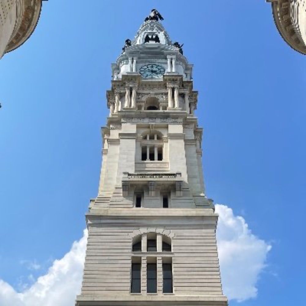
The full new Philadelphia Art Museum branding is out. I have mixed feelings, which is normal for rebrandings.
Directionally there's some good (I really like the griffin), but I think it also invites an identity crisis.
A thread with some thoughts:
Directionally there's some good (I really like the griffin), but I think it also invites an identity crisis.
A thread with some thoughts:


October 8, 2025 at 6:44 PM
The full new Philadelphia Art Museum branding is out. I have mixed feelings, which is normal for rebrandings.
Directionally there's some good (I really like the griffin), but I think it also invites an identity crisis.
A thread with some thoughts:
Directionally there's some good (I really like the griffin), but I think it also invites an identity crisis.
A thread with some thoughts:
8. The Furness Gateway. An ornate staircase designed by famed Philadelphia architect Frank Furness
Now it's totally cut off by one of the most dangerous stretches of Kelly Drive.
This would have once been one of the main ways to get from Strawberry Mansion to the Schuylkill River Trail.
Now it's totally cut off by one of the most dangerous stretches of Kelly Drive.
This would have once been one of the main ways to get from Strawberry Mansion to the Schuylkill River Trail.


October 6, 2025 at 5:31 PM
8. The Furness Gateway. An ornate staircase designed by famed Philadelphia architect Frank Furness
Now it's totally cut off by one of the most dangerous stretches of Kelly Drive.
This would have once been one of the main ways to get from Strawberry Mansion to the Schuylkill River Trail.
Now it's totally cut off by one of the most dangerous stretches of Kelly Drive.
This would have once been one of the main ways to get from Strawberry Mansion to the Schuylkill River Trail.
7. Another spring and a stone staircase leading up from the river to Reservoir Drive.
Now it's inaccessible to pedestrians and the staircase is buried under dirt and overgrowth.
Even if it were accessible the pedestrian side path on Reservoir Drive has been removed.
Now it's inaccessible to pedestrians and the staircase is buried under dirt and overgrowth.
Even if it were accessible the pedestrian side path on Reservoir Drive has been removed.


October 6, 2025 at 5:31 PM
7. Another spring and a stone staircase leading up from the river to Reservoir Drive.
Now it's inaccessible to pedestrians and the staircase is buried under dirt and overgrowth.
Even if it were accessible the pedestrian side path on Reservoir Drive has been removed.
Now it's inaccessible to pedestrians and the staircase is buried under dirt and overgrowth.
Even if it were accessible the pedestrian side path on Reservoir Drive has been removed.
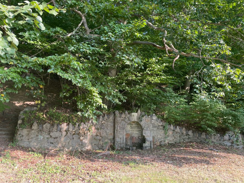
6. An ornate natural spring with staircases connected to paths leading up the hill into the upper portion of the park.
Now entirely inaccessible to pedestrians
Now entirely inaccessible to pedestrians


October 6, 2025 at 5:31 PM
6. An ornate natural spring with staircases connected to paths leading up the hill into the upper portion of the park.
Now entirely inaccessible to pedestrians
Now entirely inaccessible to pedestrians
5. A connection from the river to Boxer's trail complete with a public toilet.
Even today people still clearly risk their life crossing here, as seen by the path worn in the dirt.
Even today people still clearly risk their life crossing here, as seen by the path worn in the dirt.


October 6, 2025 at 5:31 PM
5. A connection from the river to Boxer's trail complete with a public toilet.
Even today people still clearly risk their life crossing here, as seen by the path worn in the dirt.
Even today people still clearly risk their life crossing here, as seen by the path worn in the dirt.
4. Two staircases up from the river and a pedestrian footbridge to cross the train tracks near the Columbia Bridge.
This footbridge I believe was relatively short lived because I have yet to find a good photo of it.
This footbridge I believe was relatively short lived because I have yet to find a good photo of it.

October 6, 2025 at 5:31 PM
4. Two staircases up from the river and a pedestrian footbridge to cross the train tracks near the Columbia Bridge.
This footbridge I believe was relatively short lived because I have yet to find a good photo of it.
This footbridge I believe was relatively short lived because I have yet to find a good photo of it.
3. A pedestrian crossing by the rock tunnel, a scenic gazebo atop, and a reclusive landscaped garden built with stone.


October 6, 2025 at 5:31 PM
3. A pedestrian crossing by the rock tunnel, a scenic gazebo atop, and a reclusive landscaped garden built with stone.
2. A safe footbridge attached to the underside of the Girard Ave Bridge, again providing safe access between the river trail and Brewerytown.
This also provided a far more pleasant crossing of the Schuylkill, into West Fairmount Park.
This also provided a far more pleasant crossing of the Schuylkill, into West Fairmount Park.


October 6, 2025 at 5:31 PM
2. A safe footbridge attached to the underside of the Girard Ave Bridge, again providing safe access between the river trail and Brewerytown.
This also provided a far more pleasant crossing of the Schuylkill, into West Fairmount Park.
This also provided a far more pleasant crossing of the Schuylkill, into West Fairmount Park.
Kelly Drive in Fairmount Park has been engineered to remove most pedestrian crossings and amenities, to speed up traffic.
A thread with 8 examples of things that have been lost, with historical images. South to north.
1. A staircase from the river trail to the Girard Ave Bridge, and Brewerytown:
A thread with 8 examples of things that have been lost, with historical images. South to north.
1. A staircase from the river trail to the Girard Ave Bridge, and Brewerytown:


October 6, 2025 at 5:31 PM
Kelly Drive in Fairmount Park has been engineered to remove most pedestrian crossings and amenities, to speed up traffic.
A thread with 8 examples of things that have been lost, with historical images. South to north.
1. A staircase from the river trail to the Girard Ave Bridge, and Brewerytown:
A thread with 8 examples of things that have been lost, with historical images. South to north.
1. A staircase from the river trail to the Girard Ave Bridge, and Brewerytown:
The Philadelphia Museum of Art is teasing a rebrand to be fully revealed 10/8.
I'm a fan so far. Embracing the griffin is funky and memorable.
"Putting Philly front and center" is also a great direction. The logo seems to aspire to be the go-to non-sports merch someone buys to rep Philly.
I'm a fan so far. Embracing the griffin is funky and memorable.
"Putting Philly front and center" is also a great direction. The logo seems to aspire to be the go-to non-sports merch someone buys to rep Philly.


October 1, 2025 at 1:47 AM
The Philadelphia Museum of Art is teasing a rebrand to be fully revealed 10/8.
I'm a fan so far. Embracing the griffin is funky and memorable.
"Putting Philly front and center" is also a great direction. The logo seems to aspire to be the go-to non-sports merch someone buys to rep Philly.
I'm a fan so far. Embracing the griffin is funky and memorable.
"Putting Philly front and center" is also a great direction. The logo seems to aspire to be the go-to non-sports merch someone buys to rep Philly.
West Fairmount Park has too many large roads that discourage its use as a park.
Here's an AI-assisted reimagining of Avenue of the Republic turned back over to people, instead of cars.
Before, early intervention, and permanent upgrade:
Here's an AI-assisted reimagining of Avenue of the Republic turned back over to people, instead of cars.
Before, early intervention, and permanent upgrade:


September 27, 2025 at 5:32 PM
West Fairmount Park has too many large roads that discourage its use as a park.
Here's an AI-assisted reimagining of Avenue of the Republic turned back over to people, instead of cars.
Before, early intervention, and permanent upgrade:
Here's an AI-assisted reimagining of Avenue of the Republic turned back over to people, instead of cars.
Before, early intervention, and permanent upgrade:
Yes that's correct! Here are 2 comparison aerial images. The first from 1959 and the latter from 2024.
The first two rows of buildings along Delaware Ave were removed for I-95. Penn's Landing was built out into the water where the ferry terminal and other piers used to be.
The first two rows of buildings along Delaware Ave were removed for I-95. Penn's Landing was built out into the water where the ferry terminal and other piers used to be.


September 27, 2025 at 3:57 PM
Yes that's correct! Here are 2 comparison aerial images. The first from 1959 and the latter from 2024.
The first two rows of buildings along Delaware Ave were removed for I-95. Penn's Landing was built out into the water where the ferry terminal and other piers used to be.
The first two rows of buildings along Delaware Ave were removed for I-95. Penn's Landing was built out into the water where the ferry terminal and other piers used to be.
I gave an AI a historic image of Philadelphia's Delaware Ave waterfront and asked it to imagine what it would be like if it weren't replaced with I-95.
A bit of a gut punch.
A bit of a gut punch.


September 27, 2025 at 4:51 AM
I gave an AI a historic image of Philadelphia's Delaware Ave waterfront and asked it to imagine what it would be like if it weren't replaced with I-95.
A bit of a gut punch.
A bit of a gut punch.
Reimagining (with AI) a South Philly street to have a curbless design that creates space for more trees.


September 27, 2025 at 4:12 AM
Reimagining (with AI) a South Philly street to have a curbless design that creates space for more trees.
I was brainstorming the other day and was considering what it would be like if part of the Ave of the Republic were closed to cars, and South Concourse left open.
It'd still leave the parking lot open but create a more contiguous park area to the east.
This was my doodle to visualize it:
It'd still leave the parking lot open but create a more contiguous park area to the east.
This was my doodle to visualize it:

September 27, 2025 at 2:00 AM
I was brainstorming the other day and was considering what it would be like if part of the Ave of the Republic were closed to cars, and South Concourse left open.
It'd still leave the parking lot open but create a more contiguous park area to the east.
This was my doodle to visualize it:
It'd still leave the parking lot open but create a more contiguous park area to the east.
This was my doodle to visualize it:
Great news! As an aside your website has a pretty glaring typo on the landing page. This should say "and Canada".

September 26, 2025 at 9:19 PM
Great news! As an aside your website has a pretty glaring typo on the landing page. This should say "and Canada".