


Christopher @ GlobalComix
@cc.globalcomix.com
Product guy and CEO / Founder of @GlobalComix. I know more about digital comics than I'd like to admit. My thoughts and anecdotes here are my own.
Oh cool! I dig the art style, it's nice and consistent and unique ❤️
One thing that caught my attention that's irking me a bit as I read through is the typeface/font chosen and the lettering. It feels a bit inconsistent and all over the place, triggering my OCD on padding/margins and sizing :(
One thing that caught my attention that's irking me a bit as I read through is the typeface/font chosen and the lettering. It feels a bit inconsistent and all over the place, triggering my OCD on padding/margins and sizing :(

September 8, 2025 at 2:39 AM
Oh cool! I dig the art style, it's nice and consistent and unique ❤️
One thing that caught my attention that's irking me a bit as I read through is the typeface/font chosen and the lettering. It feels a bit inconsistent and all over the place, triggering my OCD on padding/margins and sizing :(
One thing that caught my attention that's irking me a bit as I read through is the typeface/font chosen and the lettering. It feels a bit inconsistent and all over the place, triggering my OCD on padding/margins and sizing :(
1/2 Actually, that is a false common misconception sourced from businesses that had no interest in even trying to promote, curate and spotlight smaller creators.
GC is different, and I bring data to prove it.
Here is our historical readership % by month broken out by owner type (creator/publisher)
GC is different, and I bring data to prove it.
Here is our historical readership % by month broken out by owner type (creator/publisher)

August 21, 2025 at 5:44 AM
1/2 Actually, that is a false common misconception sourced from businesses that had no interest in even trying to promote, curate and spotlight smaller creators.
GC is different, and I bring data to prove it.
Here is our historical readership % by month broken out by owner type (creator/publisher)
GC is different, and I bring data to prove it.
Here is our historical readership % by month broken out by owner type (creator/publisher)
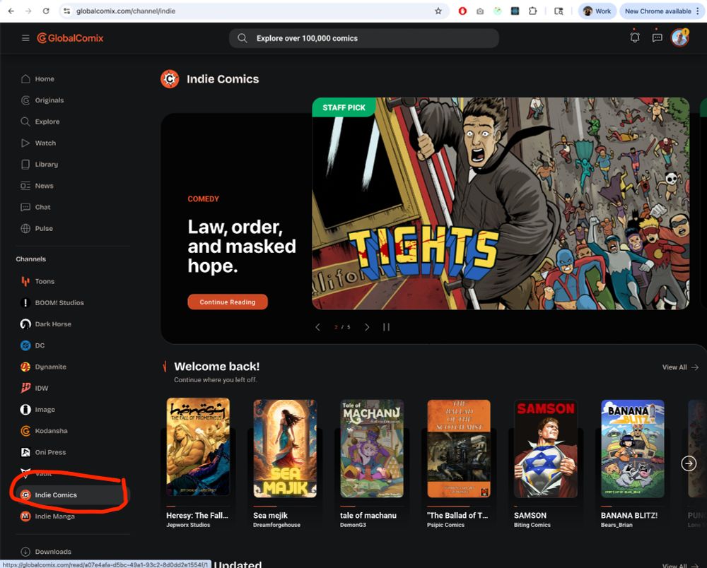
This is why we have publisher specific channels and indie creator channels for easy access to what you're specifically looking for: globalcomix.com/channel/indie
Am I still missing something? 😳
Am I still missing something? 😳
August 20, 2025 at 7:30 AM
This is why we have publisher specific channels and indie creator channels for easy access to what you're specifically looking for: globalcomix.com/channel/indie
Am I still missing something? 😳
Am I still missing something? 😳
Curious why you dislike GC for having both publishers and indie when we make such distinctively different discovery channels for the stories and can prove to creator audience growth significantly!
1/2
1/2

August 18, 2025 at 10:53 AM
Curious why you dislike GC for having both publishers and indie when we make such distinctively different discovery channels for the stories and can prove to creator audience growth significantly!
1/2
1/2

The best answer to this kind of question is raw facts and data.
I've attached two graphs and one screenshot:
1: Absolute views since jan1 2022 for both groups.
2: Percent of total views for each group.
3: Screenshot of most read series in last 30 days with creators outlined
I've attached two graphs and one screenshot:
1: Absolute views since jan1 2022 for both groups.
2: Percent of total views for each group.
3: Screenshot of most read series in last 30 days with creators outlined


December 9, 2024 at 12:57 AM
The best answer to this kind of question is raw facts and data.
I've attached two graphs and one screenshot:
1: Absolute views since jan1 2022 for both groups.
2: Percent of total views for each group.
3: Screenshot of most read series in last 30 days with creators outlined
I've attached two graphs and one screenshot:
1: Absolute views since jan1 2022 for both groups.
2: Percent of total views for each group.
3: Screenshot of most read series in last 30 days with creators outlined
Go into your account settings and enable it now, or wait until Monday when we enable it for everyone 😎😇

December 7, 2024 at 8:00 PM
Go into your account settings and enable it now, or wait until Monday when we enable it for everyone 😎😇

We just turned on the new web experience for 50% of new users to @globalcomix.com today. We will monitor this over the weekend, and likely roll it out to everyone on monday 😎
Let me know what ya'll think!
Let me know what ya'll think!

December 6, 2024 at 10:36 PM
We just turned on the new web experience for 50% of new users to @globalcomix.com today. We will monitor this over the weekend, and likely roll it out to everyone on monday 😎
Let me know what ya'll think!
Let me know what ya'll think!
The new @globalcomix.com gold signup page UX at anon is a masterclass at simplification and front loading 💕🙇♂️😎

December 3, 2024 at 5:42 AM
The new @globalcomix.com gold signup page UX at anon is a masterclass at simplification and front loading 💕🙇♂️😎
we're going to update the UX on that when anonymous / not logged in with the upcoming launch of our new Web UX. This will include all price display w/discounts and offers also :)

December 3, 2024 at 12:38 AM
we're going to update the UX on that when anonymous / not logged in with the upcoming launch of our new Web UX. This will include all price display w/discounts and offers also :)
I'm such a fan of the Pho at Obao in Hells Kitchen, NYC. OMG so goooooood! 🥰

November 23, 2024 at 6:51 PM
I'm such a fan of the Pho at Obao in Hells Kitchen, NYC. OMG so goooooood! 🥰