


Bram Meehan
@brammeehan.ohai.social.ap.brid.gy
Designing things and teaching stuff in the American desert southwest. Days mostly spent listening to #EDM, but all about the #YachtRock. Em dash enthusiast. || Avatar […]
🌉 bridged from ⁂ https://ohai.social/@BramMeehan, follow @ap.brid.gy to interact
🌉 bridged from ⁂ https://ohai.social/@BramMeehan, follow @ap.brid.gy to interact
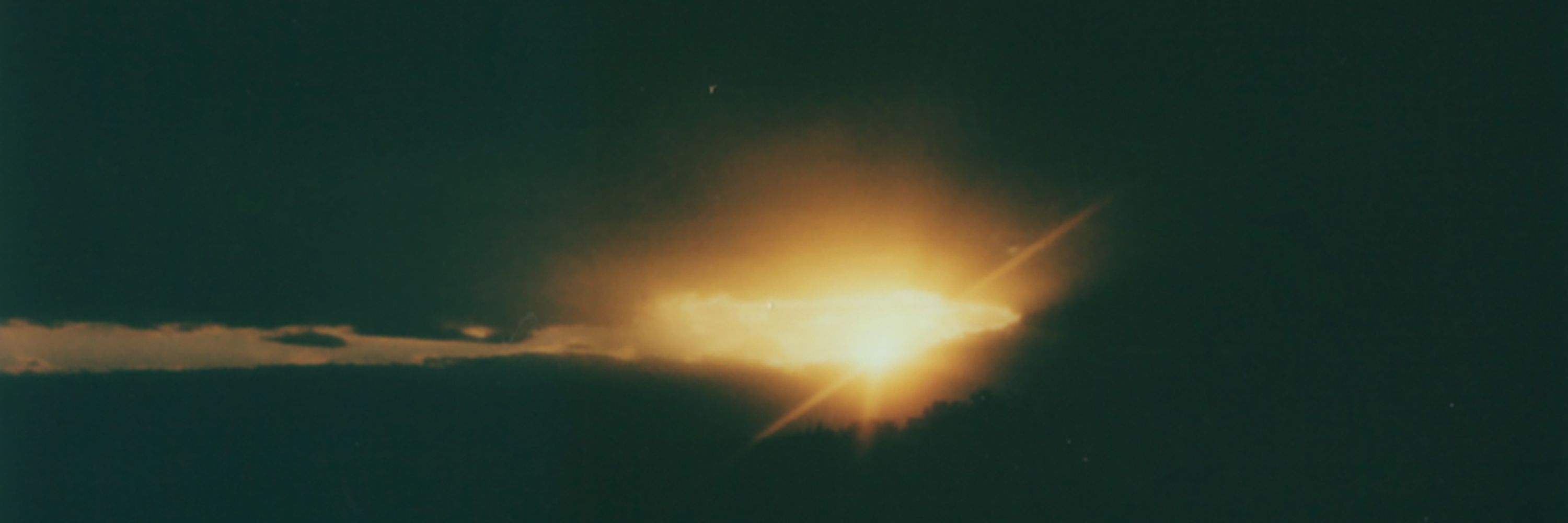
… aaaaaand that was pretty much all we got.
December 4, 2025 at 5:39 PM
… aaaaaand that was pretty much all we got.
https://kleinletters.com/Blog/my-logos-a-z-comics-to-crisis/ still going, with plenty of fun stuff along the way. Mostly, I just have this fondness for The Barren Earth.

My Logos A-Z: COMICS to CRISIS
_Image © Entertainment Weekly_
**Comics.** Client: Entertainment Weekly. Medium: digital. Date: 2016. The word comics in the style of Marvel’s Hulk might make more sense if you read the article it was done for in the Comic-Con Preview Issue of that year. Or not.
_Image © Comic-Con International_
**Comic-Con International San Diego.** Client: Comic-Con International. Medium: digital. Date: 2017. I worked with Gary Sassaman on this project, more about it HERE. The logo began as a pencil sketch that was developed in Adobe Illustrator. The burst at bottom uses one of my title fonts.
_Image © Fantagraphics_
**The Comics Journal.** Client: Fantagrahics. Medium: pen and ink. Date: 1981. All I did here was draw an outline version of the existing type logo they were already using, so it’s barely a Klein logo, but I was paid a logo rate, so it counts in my book. Might have first appeared an issue or two earlier. Not sure how often it was used.
_Image © Rick Norwood_
**Comics Revue.** Client: Rick Norwood. Medium: pen and ink. Date: 1985. I don’t recall how Rick contacted me, possibly through a fellow DC staffer, but I was happy to do this logo for his small press magazine, even though I’d never seen it at that point. The logo was first used on issue #11, and remarkably, has appeared on nearly every issue to date, well over 300 issues spanning almost 40 years. It has to be my most-used logo of all time. Thanks, Rick!
**Conan.** Client: Sal Quartuccio. Medium: pen and ink. Date: 1988. I’ve searched for this online and not found it. My guess is it was intended for one of Sal’s artist portfolios, but not used, and I don’t have a copy.
_Image © DC Comics_
**Conqueror of the Barren Earth.** Client: DC Comics. Medium: pen and ink. Date: 1984. I gave this one the full epic movie logo treatment with tall serif letters, an upward arch, and open telescoping. Appeared on four issues.
_Image © DC Comics_
**Controllers.** Client: DC Comics. Medium: pen and ink or marker. Date: 1985. For Who’s Who #5. This reminds me of the time art director Richard Bruning came to me and said, “These logos you’re doing for Who’s Who all tend to look the same.” My reply was, “What do you expect, they’re all done by the same person.” He didn’t have a good answer for that, and they didn’t take me off doing them.
_Image © DC Comics_
**Cosmic Boy.** Client: DC Comics. Medium: pen and ink or marker. Date: 1985. Also for Who’s Who #5, and made to fit a very wide space.
_© unknown_
**Cosmic Encounters.** Client: unknown. Medium: pen and ink. Date: 1978. This logo has been in my files for almost 50 years, and I can’t say if it was commissioned by a client, or merely done by me as a sample of what I could do. It’s early, from not long after I started at DC, but not for them. I can’t find any such title online. Even though it might just be something I did on spec, I think it counts, but I won’t list it as a comics-related logo. The stars are added with white paint.
_Image © DC Comics_
**Cosmic King.** Client: DC Comics. Medium: pen and ink or marker. Date: 1985. For Who’s Who #5, has some interesting shapes, and I like the background box. Some of the scans of these online are not so good.
_Image © Tundra_
**Counter Parts.** Client: Tundra. Medium: pen and ink. Date: 1992. I’m sure I sent this to Tundra, but it didn’t appear on the book. What they did use also looks like something I might have done, but I have no copy of it, so I’m showing this one, which I like better. Probably that was another sketch that they decided they also wanted. More on this HERE. A three issue series.
_Image © DC Comics._
**Cow and Chicken.** Client: DC Comics. Medium: digital. Date: 1999. Another one for DC’s CARTOON NETWORK PRESENTS, and copied from reference I was given from the cartoons. A taller version was used on covers, so perhaps this was for splash pages, or was used somewhere else. I haven’t found it on a cover.
_Image © DC Comics_
**The Creature Commandos!** Client: DC Comics. Medium: pen and ink. Date: 1979. An interior feature logo that first appeared in WEIRD WAR TALES #93, as seen here. The feature was a hit, and this logo began appearing on covers starting with issue #105. This shows that any logo can have continued use and success on the right property.
_Image © DC Comics_
**The Creeper.** Client: DC Comics. Medium: digital. Date: 1997. I recall there being many versions of this before one was chosen. The black logo looks like type that was digitally roughened. The gray one behind it was made with a brush and then scanned and traced in Illustrator. Appeared on ten issues.
_Image © DC Comics._
**The Creeper.** Client: DC Comics. Medium: digital. Date: 2006. I like this one better. It began with one of my title fonts to which I added the broken ends and roughened interior shape. THE is one of my sound effect fonts. Appeared on six issues.
_Image © Marvel_
**The Crew.** Client: Marvel. Medium: digital. Date: 2003. Another one that I think had a lot of versions before this was chosen. It started with one of my title fonts, I think the scratches inside the letters began in Photoshop and then were converted to vector files in Illustrator. Appeared on seven issues.
_Image © Gladstone Comics_
**Crimebuster!** Client: Gladstone. Medium: pen and ink. Date: 1994. A 1940s character from publisher Lev Gleason that Gladstone was apparently planning to do a new series about, but it never happened. More on this HERE. The logo was developed from a marker sketch with letter shapes I would soon be using for one of my title fonts.
_Image © DC Comics_
**Crime Syndicate.** Client: DC Comics. Medium: pen and ink or marker. Date: 1985. Created for Who’s Who #5, clearly in the style of the Justice League of America logo, so a criminal version of that group. Stretching the first line to match the second worked okay.
_Image © DC Comics_
**The Crimson Avenger.** Client: DC Comics. Medium: pen and ink. Date: 1987. A new series about a long forgotten character from the early days of DC comics. His adventures take place in the 1930s, though I don’t know that I really captured that in the logo. Used on four issues.
_Image © DC Comics_
**The Crimson Comet.** Client: DC Comics. Medium: pen and ink. Date: 1982. I inked many logos pencilled by the brilliant José Luis García-López for the DC Style Guide, but I’m not including them here for two reasons. One: I simply inked what Jose put down, I did not change or design anything. Two: I was paid by Dick Giordano for background inking on those and some other non-logo backgrounds, not a logo rate. For some reason that I don’t recall, this one alone was inked separately, and possibly designed by me as well. Perhaps DC wasn’t happy with the one José did on the Flash page in question and wanted something else, I don’t know. It’s the only interior Style Guide lettering I have.
_Image © DC Comics_
**Crisis on Infinite Earths.** Client: DC Comics. Medium: pen and ink. Date: 1984. This was Neal Pozner’s design, I simply inked over his tight layout. The subtitle was separate to be placed later, and the row of Earths was done by someone else and also added later. I was actually paid twice for this when DC wanted a digital version, and hired me to recreate it in Adobe Illustrator. Can I count that as another logo? I suppose I can.
_Image © DC Comics_
**Crisis on Infinite Earths (recreation).** Client: DC Comics. Medium: digital. Date: 1998. I don’t see this on the 1998 reprint, but it may have appeared inside.
_Image © DC Comics_
**Crisis on Multiple Earths.** Client: DC Comics. Medium: digital. Date: 2002. For a series that reprinted the many Justice League and Justice Society team ups from the pages of JUSTICE LEAGUE OF AMERICA in the 1960s and 1970s. I see there was another reprint of Crisis in 2001 that had CRISIS almost exactly like this, so I may only have needed to create the word MULTIPLE here, but since I was paid again, it counts. Appeared on six issues.
Posts in this series are listed on the Logo Links page of my blog.
### Share this:
* Click to share on Facebook (Opens in new window) Facebook
* Click to share on LinkedIn (Opens in new window) LinkedIn
* Click to share on X (Opens in new window) X
* Click to share on Reddit (Opens in new window) Reddit
* Click to share on Tumblr (Opens in new window) Tumblr
* More
*
* Click to email a link to a friend (Opens in new window) Email
* Click to share on Pinterest (Opens in new window) Pinterest
*
kleinletters.com
November 30, 2025 at 5:16 AM
https://kleinletters.com/Blog/my-logos-a-z-comics-to-crisis/ still going, with plenty of fun stuff along the way. Mostly, I just have this fondness for The Barren Earth.
@Virginicus Well, that explains it.
November 29, 2025 at 5:42 PM
@Virginicus Well, that explains it.
There is no good answer to “what is your favorite Steely Dan song?,” there’s only what kind of weirdo you want to be seen as.
November 28, 2025 at 10:29 PM
There is no good answer to “what is your favorite Steely Dan song?,” there’s only what kind of weirdo you want to be seen as.