


Björn Jónsson
@bjornjonsson.bsky.social
Software engineer interested in solar system exploration + many other things. Advanced amateur planetary image processor. Ruler of several non-existent planets.
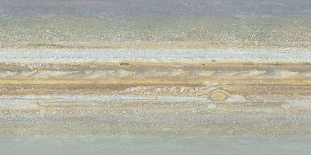
I recently improved the color of my Voyager 1 map of Jupiter that I created in 2022. The main improvement is better synthetic green data (the original data doesn't include green).
Below are small previews of the old and new version of the map. The map is available here: bjj.mmedia.is/data/jupiter...
Below are small previews of the old and new version of the map. The map is available here: bjj.mmedia.is/data/jupiter...


September 15, 2025 at 6:47 PM
I recently improved the color of my Voyager 1 map of Jupiter that I created in 2022. The main improvement is better synthetic green data (the original data doesn't include green).
Below are small previews of the old and new version of the map. The map is available here: bjj.mmedia.is/data/jupiter...
Below are small previews of the old and new version of the map. The map is available here: bjj.mmedia.is/data/jupiter...
(1/4) Test renders of Jupiter using my Voyager 1 global map (first image) and a version of the map with improved color (second image). Versions with and without enhanced contrast/colors are shown. The raw source data consists of orange and violet filtered images only.


September 3, 2025 at 9:20 PM
(1/4) Test renders of Jupiter using my Voyager 1 global map (first image) and a version of the map with improved color (second image). Versions with and without enhanced contrast/colors are shown. The raw source data consists of orange and violet filtered images only.
I recently finished a Voyager 2 map of Jupiter using orange, green and violet images obtained at a range of ~10 million km. It's of higher quality than my old Voyager 2 map, even though the resolution is a bit lower. Here is a small 'preview' image showing the map.
bjj.mmedia.is/data/jupiter...
bjj.mmedia.is/data/jupiter...
August 12, 2025 at 2:40 PM
I recently finished a Voyager 2 map of Jupiter using orange, green and violet images obtained at a range of ~10 million km. It's of higher quality than my old Voyager 2 map, even though the resolution is a bit lower. Here is a small 'preview' image showing the map.
bjj.mmedia.is/data/jupiter...
bjj.mmedia.is/data/jupiter...
The PJ73 JunoCam images are noisy and have reduced dynamic range due to radiation that affected the camera. These are very early image versions from the PJ73_19 raw image data obtained on June 8, 2025. The color is a mess and is probably not easy to correct. The grayscale image is from red data only


June 12, 2025 at 2:27 AM
The PJ73 JunoCam images are noisy and have reduced dynamic range due to radiation that affected the camera. These are very early image versions from the PJ73_19 raw image data obtained on June 8, 2025. The color is a mess and is probably not easy to correct. The grayscale image is from red data only
(2) And these computer generated images show the viewing and illumination geometry. The illumination geometry is almost identical but the viewing geometry is significantly different.

June 7, 2025 at 12:48 AM
(2) And these computer generated images show the viewing and illumination geometry. The illumination geometry is almost identical but the viewing geometry is significantly different.
(1/2) Europa's color and contrast varies greatly depending on the viewing geometry, even when the illumination geometry doesn't change much. Here is a particularly striking example using Galileo G1 and E14 images.
June 7, 2025 at 12:48 AM
(1/2) Europa's color and contrast varies greatly depending on the viewing geometry, even when the illumination geometry doesn't change much. Here is a particularly striking example using Galileo G1 and E14 images.
(1/3) Many Voyager color observations were done using two colors, often orange & violet. To get realistic color images, synthetic green images must be created. Usually a weighted average of orange & violet is used. Better results are possible using more complicated methods as this test image shows.

April 29, 2025 at 1:19 AM
(1/3) Many Voyager color observations were done using two colors, often orange & violet. To get realistic color images, synthetic green images must be created. Usually a weighted average of orange & violet is used. Better results are possible using more complicated methods as this test image shows.
Jupiter from Voyager 2 on May 29, 1979. Color composite from orange, green and violet images. Processed as part of color calibration work involving lots of experimentation, including a new way to generate synthetic green images when required. Approx true color, might be slightly too bluish though.

April 22, 2025 at 12:28 AM
Jupiter from Voyager 2 on May 29, 1979. Color composite from orange, green and violet images. Processed as part of color calibration work involving lots of experimentation, including a new way to generate synthetic green images when required. Approx true color, might be slightly too bluish though.
A map-projected mosaic of JunoCam images PJ70_26, PJ70_28 and PJ70_29 obtained on March 2, 2025. Approximately true color/contrast and enhanced versions. The North Temperate Belt outbreak is prominent near latitude 30 degrees north. This area has changed completely since early January.


March 18, 2025 at 11:26 PM
A map-projected mosaic of JunoCam images PJ70_26, PJ70_28 and PJ70_29 obtained on March 2, 2025. Approximately true color/contrast and enhanced versions. The North Temperate Belt outbreak is prominent near latitude 30 degrees north. This area has changed completely since early January.
A test image created by spectrum interpolation between Voyager 2 violet (effective wavelength 402 nm), green (564 nm) and orange (589 nm) images and then using CIE matching functions. In effect the 'input' was Jupiter's global visible light spectrum and calibrated Voyager 2 images from June 28, 1979

February 24, 2025 at 11:33 PM
A test image created by spectrum interpolation between Voyager 2 violet (effective wavelength 402 nm), green (564 nm) and orange (589 nm) images and then using CIE matching functions. In effect the 'input' was Jupiter's global visible light spectrum and calibrated Voyager 2 images from June 28, 1979
A crazy (?) image processing test: Using an orange/violet ratio image as red, contrast stretched green as green and the VI/GR ratio as blue. May not make a lot of sense - e.g. the whitish zones have an aqua color. But at least differences in the strength of red become obvious, even small differences

February 7, 2025 at 12:50 AM
A crazy (?) image processing test: Using an orange/violet ratio image as red, contrast stretched green as green and the VI/GR ratio as blue. May not make a lot of sense - e.g. the whitish zones have an aqua color. But at least differences in the strength of red become obvious, even small differences
Fun with Voyager 2 Jupiter images: This is a map-projected orange/violet ratio image using images obtained on June 28, 1979.

February 5, 2025 at 11:01 PM
Fun with Voyager 2 Jupiter images: This is a map-projected orange/violet ratio image using images obtained on June 28, 1979.
Color mixing/calibration experiments using Vgr 2 Jupiter images. The images were obtained using orange, green and violet filters. In higher-res image sets, green is often missing. At upper right this case is simulated using a synthetic G image. Lower right: OGV composite without color channel mixing

January 30, 2025 at 9:07 PM
Color mixing/calibration experiments using Vgr 2 Jupiter images. The images were obtained using orange, green and violet filters. In higher-res image sets, green is often missing. At upper right this case is simulated using a synthetic G image. Lower right: OGV composite without color channel mixing
Work in progress: Test renders using an improved Voyager 2 global Jupiter map. Approx true color/contrast (usually not very trivial when processing Voyager images) and a heavily processed enhanced version where the effects of the varying illumination also have been removed. The map is not yet global


January 19, 2025 at 1:39 AM
Work in progress: Test renders using an improved Voyager 2 global Jupiter map. Approx true color/contrast (usually not very trivial when processing Voyager images) and a heavily processed enhanced version where the effects of the varying illumination also have been removed. The map is not yet global
On January 4 I watched the Moon occult Saturn. Once Saturn had reappeared I planned to start imaging but this was delayed a bit due to technical problems. This image obtained at 18:34:38 UTC is a stack of ~500 images with Saturn processed separately from the Moon.

January 6, 2025 at 8:52 PM
On January 4 I watched the Moon occult Saturn. Once Saturn had reappeared I planned to start imaging but this was delayed a bit due to technical problems. This image obtained at 18:34:38 UTC is a stack of ~500 images with Saturn processed separately from the Moon.
It's not available since I haven't completed it - it's not yet global. Here is a crop from the 9000x4500 pixel simple cylindrical specular map with Loki at upper left. In addition I'm using a heavily modified version of fig. 2 in this JGR paper: agupubs.onlinelibrary.wiley.com/doi/10.1029/...

January 4, 2025 at 2:01 AM
It's not available since I haven't completed it - it's not yet global. Here is a crop from the 9000x4500 pixel simple cylindrical specular map with Loki at upper left. In addition I'm using a heavily modified version of fig. 2 in this JGR paper: agupubs.onlinelibrary.wiley.com/doi/10.1029/...
Image PJ68_35 obtained by the Juno spacecraft on December 27, 2024. Approximately true color/contrast and enhanced versions.


January 3, 2025 at 5:04 PM
Image PJ68_35 obtained by the Juno spacecraft on December 27, 2024. Approximately true color/contrast and enhanced versions.
Vesta from Dawn on Aug 20, 2011. Approx true color image and a false color one. The true color image is from red, green and blue images with the overall color corrected using Vesta's spectrum. The false color is from 918, 749 and 438 nm displayed as RGB. Each image is a mosaic of 17 color frames.


December 12, 2024 at 1:02 AM
Vesta from Dawn on Aug 20, 2011. Approx true color image and a false color one. The true color image is from red, green and blue images with the overall color corrected using Vesta's spectrum. The false color is from 918, 749 and 438 nm displayed as RGB. Each image is a mosaic of 17 color frames.
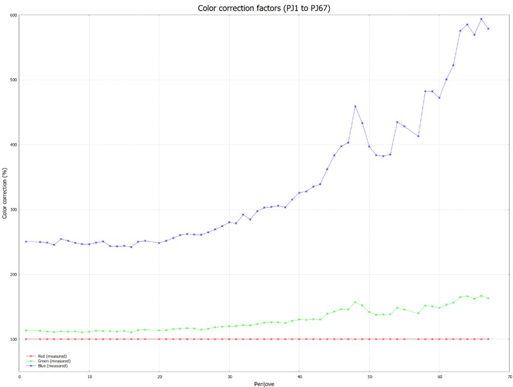
Apparently the color of the JunoCam images didn't change significantly at perijove 67 compared to perijove 66. However, as the graph shows, the images are gradually getting redder (or less blue) as the mission progresses.
December 10, 2024 at 12:02 AM
Apparently the color of the JunoCam images didn't change significantly at perijove 67 compared to perijove 66. However, as the graph shows, the images are gradually getting redder (or less blue) as the mission progresses.
Image PJ67_34 obtained by Juno on Nov 24, 2024 in approx true color/contrast and enhanced versions. The colors in the dimly lit areas might be inaccurate since noise/bias probably affects the color. Most of the central North Polar Cyclone is visible left of and above center; see the gridded image.


December 10, 2024 at 12:02 AM
Image PJ67_34 obtained by Juno on Nov 24, 2024 in approx true color/contrast and enhanced versions. The colors in the dimly lit areas might be inaccurate since noise/bias probably affects the color. Most of the central North Polar Cyclone is visible left of and above center; see the gridded image.
A map-projected time-lapse of contrast enhanced Cassini images obtained from September 6, 2004 to October 1, 2004 with the MT1 filter. The interval between the images isn't uniform. The prominent spot above and left of center is at planetographic latitude ~45 degrees south.
November 27, 2024 at 11:41 PM
A map-projected time-lapse of contrast enhanced Cassini images obtained from September 6, 2004 to October 1, 2004 with the MT1 filter. The interval between the images isn't uniform. The prominent spot above and left of center is at planetographic latitude ~45 degrees south.
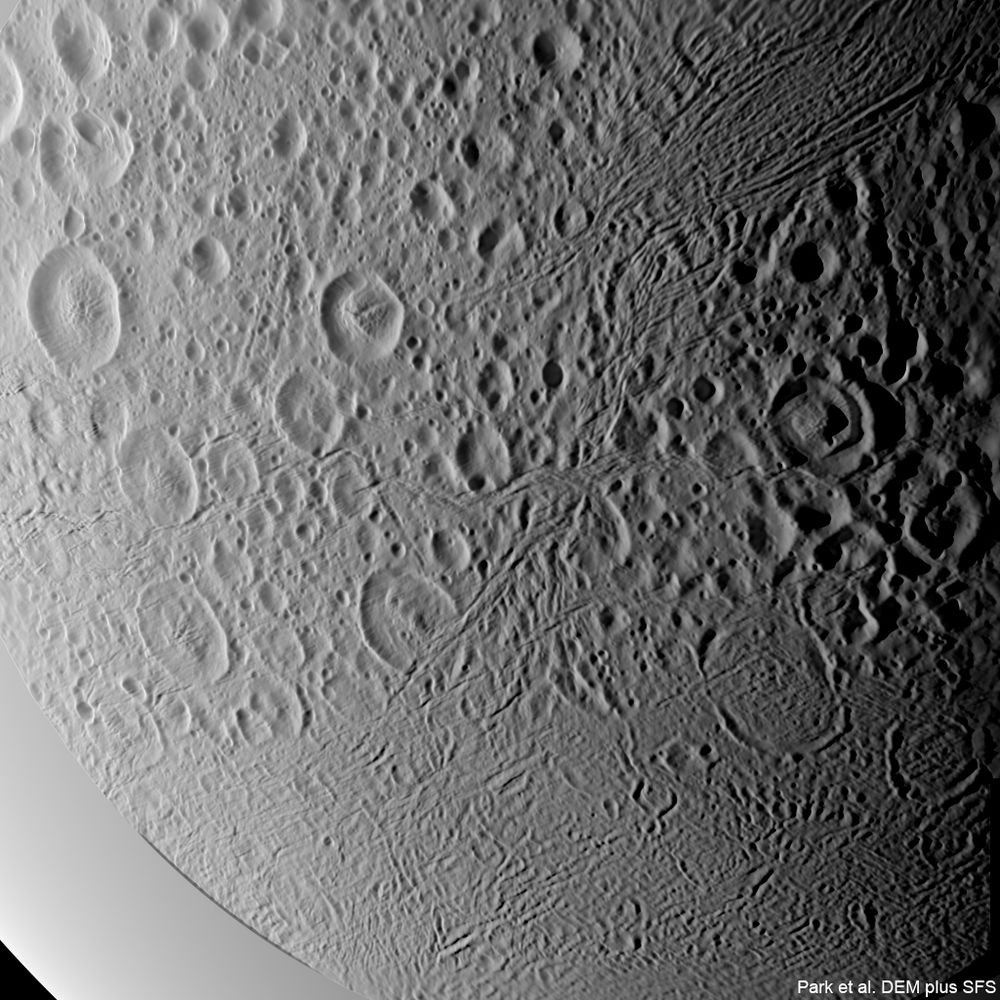
Test 3D renders: Park et al. DEM and a quick and dirty test DEM where it was combined with my SFS DEM. This is *very* preliminary, I have made only crude corrections to force the two DEMs to match (the locations of features like craters differ slightly) and some paramaters can be fine-tuned.


November 22, 2024 at 12:44 AM
Test 3D renders: Park et al. DEM and a quick and dirty test DEM where it was combined with my SFS DEM. This is *very* preliminary, I have made only crude corrections to force the two DEMs to match (the locations of features like craters differ slightly) and some paramaters can be fine-tuned.
3D renders from this DEM appear a bit noisy (not unexpected). However, a quick and dirty attempt to combine it with a DEM created using shape-from-shading (SFS) is very promising. The SFS DEM is from my (seemingly eternal) image processing project: To create a very hi-res global SFS DEM of Enceladus


November 18, 2024 at 12:54 AM
3D renders from this DEM appear a bit noisy (not unexpected). However, a quick and dirty attempt to combine it with a DEM created using shape-from-shading (SFS) is very promising. The SFS DEM is from my (seemingly eternal) image processing project: To create a very hi-res global SFS DEM of Enceladus
The JunoCam Jupiter images continue getting redder (or less blue). The graph shows the color correction factors I have used. The PJ66 values are from measurements of image PJ66_22. I mainly used the bright zones in Jupiter's N hemisphere as reference, their average color should be close to white.

November 17, 2024 at 12:03 AM
The JunoCam Jupiter images continue getting redder (or less blue). The graph shows the color correction factors I have used. The PJ66 values are from measurements of image PJ66_22. I mainly used the bright zones in Jupiter's N hemisphere as reference, their average color should be close to white.
Experimental computer generated images created by combining elevation data from ArcticDEM with imaging data from the Satellitfoto Grønland data set and images from the Sentinel-2A and 2B satellites. The images show terrain in southern Greenland.


November 14, 2024 at 11:04 PM
Experimental computer generated images created by combining elevation data from ArcticDEM with imaging data from the Satellitfoto Grønland data set and images from the Sentinel-2A and 2B satellites. The images show terrain in southern Greenland.