


Ana Tudor
@anatudor.bsky.social
Same me, another platform. I code stuff. It usually involves some Maths. I enjoy music mandatory religion classes warned me about. And other things that may kill me.
https://thebabydino.github.io/
https://thebabydino.github.io/

November 22, 2025 at 5:05 PM

November 22, 2025 at 12:56 PM
If you're a Ko-fi or Patreon supporter, then first of all, thank you for helping this stray cat stay afloat. And second, you should know I've posted a few things this past week.
❇️ ko-fi.com/anatudor
❇️ www.patreon.com/c/anatudor
#CSS #SVG
❇️ ko-fi.com/anatudor
❇️ www.patreon.com/c/anatudor
#CSS #SVG

November 21, 2025 at 10:50 AM
If you're a Ko-fi or Patreon supporter, then first of all, thank you for helping this stray cat stay afloat. And second, you should know I've posted a few things this past week.
❇️ ko-fi.com/anatudor
❇️ www.patreon.com/c/anatudor
#CSS #SVG
❇️ ko-fi.com/anatudor
❇️ www.patreon.com/c/anatudor
#CSS #SVG
My original article on @frontendmasters.com frontendmasters.com/blog/overlap...
It took 3 weeks to write and being able to come up with the solution in there is the result of years of work. Just under the svg-filter tag, there are hundreds of demos on my @codepen.io codepen.io/thebabydino/...
#SVG
It took 3 weeks to write and being able to come up with the solution in there is the result of years of work. Just under the svg-filter tag, there are hundreds of demos on my @codepen.io codepen.io/thebabydino/...
#SVG

November 21, 2025 at 8:08 AM
My original article on @frontendmasters.com frontendmasters.com/blog/overlap...
It took 3 weeks to write and being able to come up with the solution in there is the result of years of work. Just under the svg-filter tag, there are hundreds of demos on my @codepen.io codepen.io/thebabydino/...
#SVG
It took 3 weeks to write and being able to come up with the solution in there is the result of years of work. Just under the svg-filter tag, there are hundreds of demos on my @codepen.io codepen.io/thebabydino/...
#SVG
Today in thieves, cheats & grifters on the internet.
Talent500, who have a gold check account on twitter, copied a few bits of my article that I worked for 3 weeks on. Could not even be bothered to copy enough to get to a working solution, stopped at intermediary steps. And "forgot" to give credit.
Talent500, who have a gold check account on twitter, copied a few bits of my article that I worked for 3 weeks on. Could not even be bothered to copy enough to get to a working solution, stopped at intermediary steps. And "forgot" to give credit.


November 21, 2025 at 7:51 AM
Today in thieves, cheats & grifters on the internet.
Talent500, who have a gold check account on twitter, copied a few bits of my article that I worked for 3 weeks on. Could not even be bothered to copy enough to get to a working solution, stopped at intermediary steps. And "forgot" to give credit.
Talent500, who have a gold check account on twitter, copied a few bits of my article that I worked for 3 weeks on. Could not even be bothered to copy enough to get to a working solution, stopped at intermediary steps. And "forgot" to give credit.
This works cross-browser however.

November 20, 2025 at 11:07 AM
This works cross-browser however.
Soon going back to the country where my SVG filter journey started for real two years ago.
Can you guess without looking up?
www.youtube.com/watch?v=qc98...
Too cryptic?
www.youtube.com/watch?v=vYNA...
Not enough?
www.youtube.com/watch?v=CO8C...
Oh, come on!
www.youtube.com/watch?v=WBs3...
Can you guess without looking up?
www.youtube.com/watch?v=qc98...
Too cryptic?
www.youtube.com/watch?v=vYNA...
Not enough?
www.youtube.com/watch?v=CO8C...
Oh, come on!
www.youtube.com/watch?v=WBs3...

November 20, 2025 at 7:53 AM
Soon going back to the country where my SVG filter journey started for real two years ago.
Can you guess without looking up?
www.youtube.com/watch?v=qc98...
Too cryptic?
www.youtube.com/watch?v=vYNA...
Not enough?
www.youtube.com/watch?v=CO8C...
Oh, come on!
www.youtube.com/watch?v=WBs3...
Can you guess without looking up?
www.youtube.com/watch?v=qc98...
Too cryptic?
www.youtube.com/watch?v=vYNA...
Not enough?
www.youtube.com/watch?v=CO8C...
Oh, come on!
www.youtube.com/watch?v=WBs3...
Good point.
Guess I'm just too used to the guardrails because my most common uses are for angles and similar.
Guess I'm just too used to the guardrails because my most common uses are for angles and similar.

November 20, 2025 at 7:41 AM
Good point.
Guess I'm just too used to the guardrails because my most common uses are for angles and similar.
Guess I'm just too used to the guardrails because my most common uses are for angles and similar.
No need to multiply by 9999, nest min() & max() now that we have sign()!
We can get the sign of the difference
--sgn: sign(100vw - var(-cutoff))
a bit value (0 if sign is -1 or 0, 1 otherwise)
--bit: round(down, .5*(1 + var(--sgn)))
finally
border-radius: calc(var(--bit)*8px)
#tinyCSStip #CSS
We can get the sign of the difference
--sgn: sign(100vw - var(-cutoff))
a bit value (0 if sign is -1 or 0, 1 otherwise)
--bit: round(down, .5*(1 + var(--sgn)))
finally
border-radius: calc(var(--bit)*8px)
#tinyCSStip #CSS

November 20, 2025 at 7:01 AM
No need to multiply by 9999, nest min() & max() now that we have sign()!
We can get the sign of the difference
--sgn: sign(100vw - var(-cutoff))
a bit value (0 if sign is -1 or 0, 1 otherwise)
--bit: round(down, .5*(1 + var(--sgn)))
finally
border-radius: calc(var(--bit)*8px)
#tinyCSStip #CSS
We can get the sign of the difference
--sgn: sign(100vw - var(-cutoff))
a bit value (0 if sign is -1 or 0, 1 otherwise)
--bit: round(down, .5*(1 + var(--sgn)))
finally
border-radius: calc(var(--bit)*8px)
#tinyCSStip #CSS
I am begging you, please don't split your heading into two separate `h2` elements with an `img` in between just to have the image in between your heading words.
This is what subgrid was made for!
#CSS
This is what subgrid was made for!
#CSS

November 18, 2025 at 3:26 PM
I am begging you, please don't split your heading into two separate `h2` elements with an `img` in between just to have the image in between your heading words.
This is what subgrid was made for!
#CSS
This is what subgrid was made for!
#CSS
Funky forms on @codepen.io codepen.io/thebabydino/...
Full 3D form option vs. weird 2D shape. Which do you prefer?
#CSS
Full 3D form option vs. weird 2D shape. Which do you prefer?
#CSS

November 18, 2025 at 8:20 AM
Funky forms on @codepen.io codepen.io/thebabydino/...
Full 3D form option vs. weird 2D shape. Which do you prefer?
#CSS
Full 3D form option vs. weird 2D shape. Which do you prefer?
#CSS
Guess who's going back to Germany in about a week?
(you have no idea how grateful I am this is happening and how relieved I am to have something to force me to take a break...)
(you have no idea how grateful I am this is happening and how relieved I am to have something to force me to take a break...)

November 15, 2025 at 1:10 PM
Guess who's going back to Germany in about a week?
(you have no idea how grateful I am this is happening and how relieved I am to have something to force me to take a break...)
(you have no idea how grateful I am this is happening and how relieved I am to have something to force me to take a break...)
If you're a Cheetah+ supporter on Ko-fi or Patreon, then first off, thanks for helping this stray cat stay afloat and then know there's something new and cool I've posted for you!
❇️ ko-fi.com/post/CSS-cus...
❇️ www.patreon.com/posts/pure-c...
#CSS
❇️ ko-fi.com/post/CSS-cus...
❇️ www.patreon.com/posts/pure-c...
#CSS

November 13, 2025 at 2:34 PM
If you're a Cheetah+ supporter on Ko-fi or Patreon, then first off, thanks for helping this stray cat stay afloat and then know there's something new and cool I've posted for you!
❇️ ko-fi.com/post/CSS-cus...
❇️ www.patreon.com/posts/pure-c...
#CSS
❇️ ko-fi.com/post/CSS-cus...
❇️ www.patreon.com/posts/pure-c...
#CSS
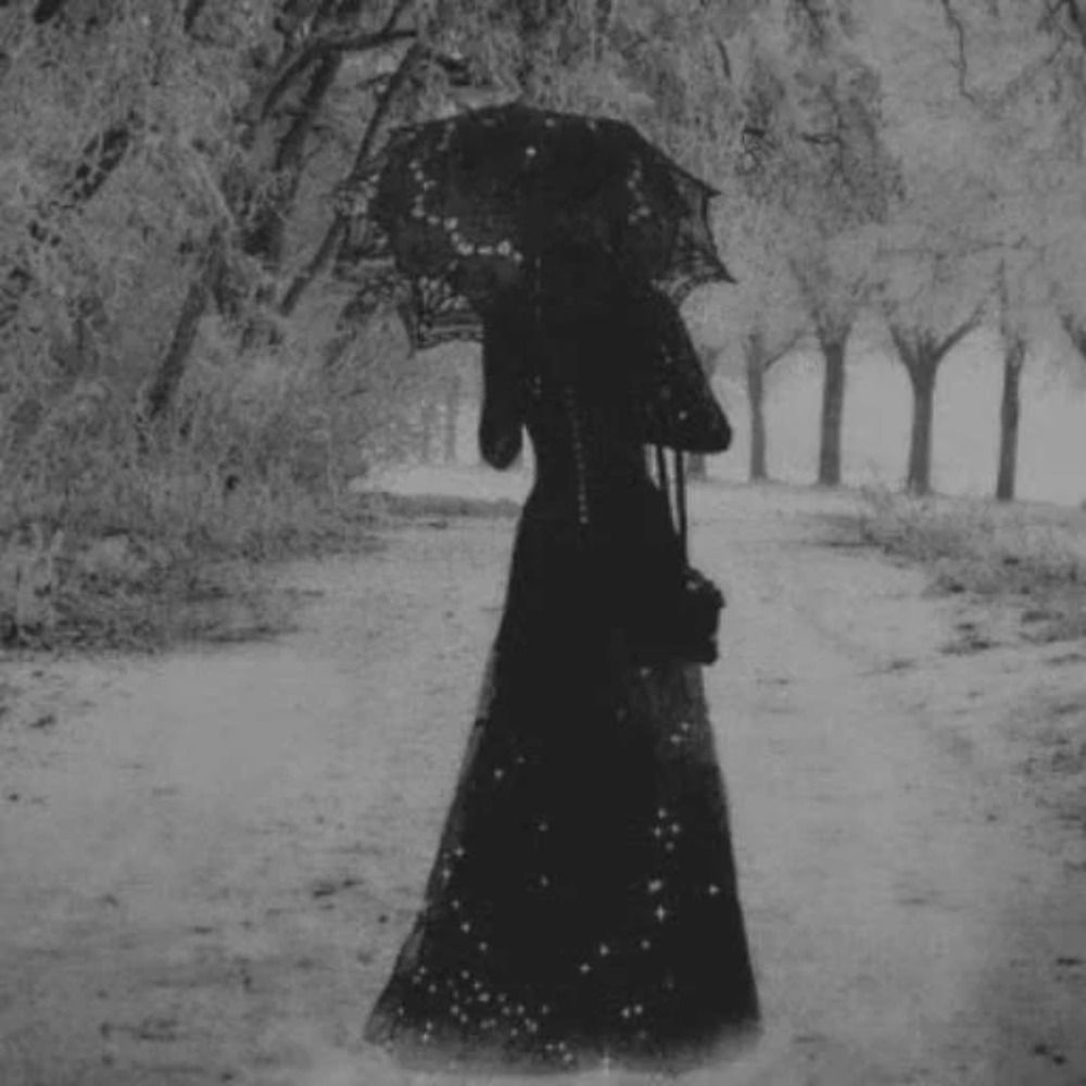
Red and black.
Signed, an authentic Transylvanian vampire.
And lots of metal bands agree. See Kreator's most recent single, Tränenpalast, inspired by the 1977 horror Suspiria, Iron Maiden's The Red and the Black. Or Red Before Black by Cannibal Corpse.
Signed, an authentic Transylvanian vampire.
And lots of metal bands agree. See Kreator's most recent single, Tränenpalast, inspired by the 1977 horror Suspiria, Iron Maiden's The Red and the Black. Or Red Before Black by Cannibal Corpse.


November 13, 2025 at 2:27 PM
Red and black.
Signed, an authentic Transylvanian vampire.
And lots of metal bands agree. See Kreator's most recent single, Tränenpalast, inspired by the 1977 horror Suspiria, Iron Maiden's The Red and the Black. Or Red Before Black by Cannibal Corpse.
Signed, an authentic Transylvanian vampire.
And lots of metal bands agree. See Kreator's most recent single, Tränenpalast, inspired by the 1977 horror Suspiria, Iron Maiden's The Red and the Black. Or Red Before Black by Cannibal Corpse.
I am a cat: a little @codepen.io demo codepen.io/thebabydino/...
(for context www.reddit.com/r/css/commen...)
#CSS
(for context www.reddit.com/r/css/commen...)
#CSS
November 5, 2025 at 3:20 PM
I am a cat: a little @codepen.io demo codepen.io/thebabydino/...
(for context www.reddit.com/r/css/commen...)
#CSS
(for context www.reddit.com/r/css/commen...)
#CSS
#cssChallenge2025
How would you code this (pad non-square image to square with blurred version of itself) using:
✳️ a single `img` elem, no wrappers/ pseudos
✳️ at most 4 #CSS declarations (without the grid layout)
✳️ an #SVG `filter`
How would you code this (pad non-square image to square with blurred version of itself) using:
✳️ a single `img` elem, no wrappers/ pseudos
✳️ at most 4 #CSS declarations (without the grid layout)
✳️ an #SVG `filter`

November 3, 2025 at 8:17 PM
#cssChallenge2025
How would you code this (pad non-square image to square with blurred version of itself) using:
✳️ a single `img` elem, no wrappers/ pseudos
✳️ at most 4 #CSS declarations (without the grid layout)
✳️ an #SVG `filter`
How would you code this (pad non-square image to square with blurred version of itself) using:
✳️ a single `img` elem, no wrappers/ pseudos
✳️ at most 4 #CSS declarations (without the grid layout)
✳️ an #SVG `filter`

Yeah, that was Nightly, I can tell now from the DevTools zoom level in the screenshot. But the same happens in stable.

November 3, 2025 at 3:56 PM
Yeah, that was Nightly, I can tell now from the DevTools zoom level in the screenshot. But the same happens in stable.
Concave rounding header. Shape on the right depends on content on the left. Real transparency. Using #CSS subgrid and #SVG filters.
Live demo on @codepen.io: codepen.io/thebabydino/...
How would you do this? Try to think about it before checking my solution!
Live demo on @codepen.io: codepen.io/thebabydino/...
How would you do this? Try to think about it before checking my solution!

November 3, 2025 at 3:24 PM
Concave rounding header. Shape on the right depends on content on the left. Real transparency. Using #CSS subgrid and #SVG filters.
Live demo on @codepen.io: codepen.io/thebabydino/...
How would you do this? Try to think about it before checking my solution!
Live demo on @codepen.io: codepen.io/thebabydino/...
How would you do this? Try to think about it before checking my solution!
Grainy abstract #SVG backgrounds.
A little @codepen.io demo:
codepen.io/thebabydino/...
Enjoy!
(created for my grainy gradients article frontendmasters.com/blog/grainy-...)
A little @codepen.io demo:
codepen.io/thebabydino/...
Enjoy!
(created for my grainy gradients article frontendmasters.com/blog/grainy-...)

November 3, 2025 at 2:08 PM
Grainy abstract #SVG backgrounds.
A little @codepen.io demo:
codepen.io/thebabydino/...
Enjoy!
(created for my grainy gradients article frontendmasters.com/blog/grainy-...)
A little @codepen.io demo:
codepen.io/thebabydino/...
Enjoy!
(created for my grainy gradients article frontendmasters.com/blog/grainy-...)
Um... Firefox, are you okay?!


November 1, 2025 at 2:07 PM
Um... Firefox, are you okay?!
I have a new article out!
Super Simple Full-Bleed & Breakout Styles
frontendmasters.com/blog/super-s... - my take on an old problem using modern CSS solutions.
Using a spooky made up Halloween recipe to illustrate concepts.
PS @chriscoyier.net told me to be proud of it 😛
#CSS
Super Simple Full-Bleed & Breakout Styles
frontendmasters.com/blog/super-s... - my take on an old problem using modern CSS solutions.
Using a spooky made up Halloween recipe to illustrate concepts.
PS @chriscoyier.net told me to be proud of it 😛
#CSS
October 31, 2025 at 6:28 PM
I have a new article out!
Super Simple Full-Bleed & Breakout Styles
frontendmasters.com/blog/super-s... - my take on an old problem using modern CSS solutions.
Using a spooky made up Halloween recipe to illustrate concepts.
PS @chriscoyier.net told me to be proud of it 😛
#CSS
Super Simple Full-Bleed & Breakout Styles
frontendmasters.com/blog/super-s... - my take on an old problem using modern CSS solutions.
Using a spooky made up Halloween recipe to illustrate concepts.
PS @chriscoyier.net told me to be proud of it 😛
#CSS
Gooey reflowable text: a little Haloween demo on @codepen.io: codepen.io/thebabydino/...
#SVG #filter
#SVG #filter

October 31, 2025 at 4:39 PM
Gooey reflowable text: a little Haloween demo on @codepen.io: codepen.io/thebabydino/...
#SVG #filter
#SVG #filter
Base gradient is:
linear-gradient(in hsl 90deg, #fb8500, #219ebc)
But... you know, should be animated.
The image used is the one below. But the solution should work for any image of any size/ aspect-ratio.
If you're a Cheetah+ supporter on Ko-fi/ Patreon, you know where to find my solution 😼
#CSS
linear-gradient(in hsl 90deg, #fb8500, #219ebc)
But... you know, should be animated.
The image used is the one below. But the solution should work for any image of any size/ aspect-ratio.
If you're a Cheetah+ supporter on Ko-fi/ Patreon, you know where to find my solution 😼
#CSS

October 31, 2025 at 8:34 AM
#cssChallenge2025
How would you do this? A gradient tinted image, the gradient tint gradually disappearing from left to right on hover, then coming back from left to right on exit.
✨ single `img` elem (so no pseudos)
✳️ cross-browser
🚫 no JS
🚫 no SVG filters
#CSS
How would you do this? A gradient tinted image, the gradient tint gradually disappearing from left to right on hover, then coming back from left to right on exit.
✨ single `img` elem (so no pseudos)
✳️ cross-browser
🚫 no JS
🚫 no SVG filters
#CSS
October 31, 2025 at 8:06 AM
#cssChallenge2025
How would you do this? A gradient tinted image, the gradient tint gradually disappearing from left to right on hover, then coming back from left to right on exit.
✨ single `img` elem (so no pseudos)
✳️ cross-browser
🚫 no JS
🚫 no SVG filters
#CSS
How would you do this? A gradient tinted image, the gradient tint gradually disappearing from left to right on hover, then coming back from left to right on exit.
✨ single `img` elem (so no pseudos)
✳️ cross-browser
🚫 no JS
🚫 no SVG filters
#CSS