


Ana De Canha | UX Engineer
@anadecanha.com
💕 Sharing the behind-the-scenes of life, travel & creative work | Honest stories, lessons learned & tiny experiments
💌 Join the journey ↓
https://www.anadecanha.com/links
💌 Join the journey ↓
https://www.anadecanha.com/links
This is the copy when there's no lyrics in a Spotify song
Would you do it differently? What would you write? 👀
Would you do it differently? What would you write? 👀

August 25, 2025 at 10:51 AM
This is the copy when there's no lyrics in a Spotify song
Would you do it differently? What would you write? 👀
Would you do it differently? What would you write? 👀
9/
Direction 2: Manual logging — but with control
🟢 Replace the banner with a button
📋 Show checklist of repeat items
✅ Let users confirm before logging
↩️ Add undo
🙌🏼 Offer clarity, not mystery
Direction 2: Manual logging — but with control
🟢 Replace the banner with a button
📋 Show checklist of repeat items
✅ Let users confirm before logging
↩️ Add undo
🙌🏼 Offer clarity, not mystery

August 7, 2025 at 8:36 AM
9/
Direction 2: Manual logging — but with control
🟢 Replace the banner with a button
📋 Show checklist of repeat items
✅ Let users confirm before logging
↩️ Add undo
🙌🏼 Offer clarity, not mystery
Direction 2: Manual logging — but with control
🟢 Replace the banner with a button
📋 Show checklist of repeat items
✅ Let users confirm before logging
↩️ Add undo
🙌🏼 Offer clarity, not mystery
4/
Worse: when you tap it, all repeat items are logged at that moment
So if I tap at 10am, my 19:00 dessert is logged instantly — and affects my totals right away. Even though it looks like it’s for later
It breaks the mental model completely 🧠💥
Worse: when you tap it, all repeat items are logged at that moment
So if I tap at 10am, my 19:00 dessert is logged instantly — and affects my totals right away. Even though it looks like it’s for later
It breaks the mental model completely 🧠💥

August 7, 2025 at 8:36 AM
4/
Worse: when you tap it, all repeat items are logged at that moment
So if I tap at 10am, my 19:00 dessert is logged instantly — and affects my totals right away. Even though it looks like it’s for later
It breaks the mental model completely 🧠💥
Worse: when you tap it, all repeat items are logged at that moment
So if I tap at 10am, my 19:00 dessert is logged instantly — and affects my totals right away. Even though it looks like it’s for later
It breaks the mental model completely 🧠💥
3/
I thought “LOG ITEMS” was just status text so I tapped the X to close the banner
❌ Nothing logged
❌ No confirmation
❌ No idea what went wrong
Turns out:
“LOG ITEMS” is actually a button. But it doesn’t look like one 👀
I thought “LOG ITEMS” was just status text so I tapped the X to close the banner
❌ Nothing logged
❌ No confirmation
❌ No idea what went wrong
Turns out:
“LOG ITEMS” is actually a button. But it doesn’t look like one 👀

August 7, 2025 at 8:36 AM
3/
I thought “LOG ITEMS” was just status text so I tapped the X to close the banner
❌ Nothing logged
❌ No confirmation
❌ No idea what went wrong
Turns out:
“LOG ITEMS” is actually a button. But it doesn’t look like one 👀
I thought “LOG ITEMS” was just status text so I tapped the X to close the banner
❌ Nothing logged
❌ No confirmation
❌ No idea what went wrong
Turns out:
“LOG ITEMS” is actually a button. But it doesn’t look like one 👀
6/
My process was pretty straightforward:
1. Hand-drawn wireframes
2. Moodboard for visual direction
3. Start with desktop layout to capture client preferences early
My process was pretty straightforward:
1. Hand-drawn wireframes
2. Moodboard for visual direction
3. Start with desktop layout to capture client preferences early

April 23, 2025 at 8:47 AM
6/
My process was pretty straightforward:
1. Hand-drawn wireframes
2. Moodboard for visual direction
3. Start with desktop layout to capture client preferences early
My process was pretty straightforward:
1. Hand-drawn wireframes
2. Moodboard for visual direction
3. Start with desktop layout to capture client preferences early
5/
One small thing I thought about more than expected: rounded vs. straight corners
I initially leaned toward rounded (it matched the tone they wanted) — but their Instagram had very sharp lines
So I created both options, explained the difference, and let them choose
One small thing I thought about more than expected: rounded vs. straight corners
I initially leaned toward rounded (it matched the tone they wanted) — but their Instagram had very sharp lines
So I created both options, explained the difference, and let them choose

April 23, 2025 at 8:47 AM
5/
One small thing I thought about more than expected: rounded vs. straight corners
I initially leaned toward rounded (it matched the tone they wanted) — but their Instagram had very sharp lines
So I created both options, explained the difference, and let them choose
One small thing I thought about more than expected: rounded vs. straight corners
I initially leaned toward rounded (it matched the tone they wanted) — but their Instagram had very sharp lines
So I created both options, explained the difference, and let them choose
4/
They had beautiful illustrations and some photos from their space
I suggested mixing both — to bring personality and structure
They had beautiful illustrations and some photos from their space
I suggested mixing both — to bring personality and structure
April 23, 2025 at 8:47 AM
4/
They had beautiful illustrations and some photos from their space
I suggested mixing both — to bring personality and structure
They had beautiful illustrations and some photos from their space
I suggested mixing both — to bring personality and structure
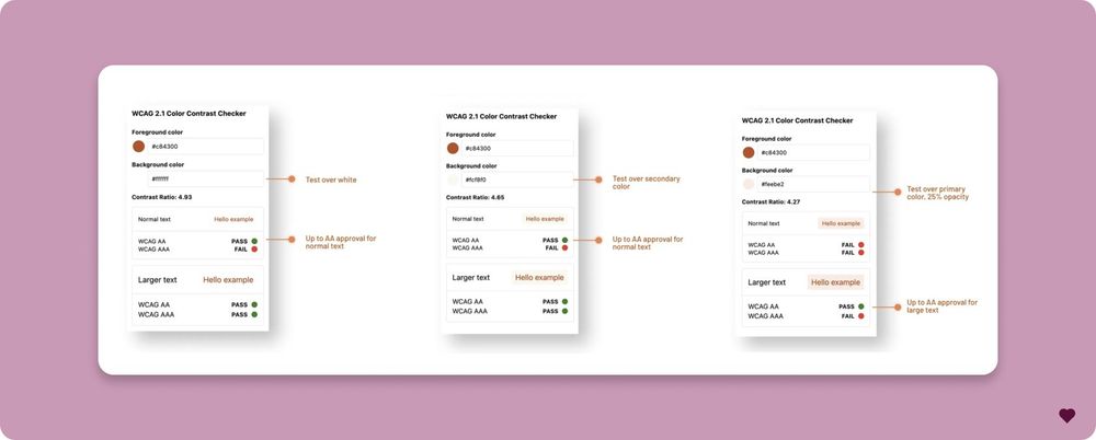
3/
🎨 First thing: the brand color didn’t meet contrast guidelines for text
So I picked a deeper shade of the same hue that worked better for accessibility — and still kept the brand feel
I also considered other options like dark grey, but this one felt more “them”
🎨 First thing: the brand color didn’t meet contrast guidelines for text
So I picked a deeper shade of the same hue that worked better for accessibility — and still kept the brand feel
I also considered other options like dark grey, but this one felt more “them”
April 23, 2025 at 8:47 AM
3/
🎨 First thing: the brand color didn’t meet contrast guidelines for text
So I picked a deeper shade of the same hue that worked better for accessibility — and still kept the brand feel
I also considered other options like dark grey, but this one felt more “them”
🎨 First thing: the brand color didn’t meet contrast guidelines for text
So I picked a deeper shade of the same hue that worked better for accessibility — and still kept the brand feel
I also considered other options like dark grey, but this one felt more “them”
3️⃣ The process:
✅ I wrote a full story about how a user would experience my product
✅ It forced me to think about emotions, decisions, and frustrations
✅ At the end, I used AI to polish my grammar —because, well… my first language is Spanish and English is HARD sometimes 😅
✅ I wrote a full story about how a user would experience my product
✅ It forced me to think about emotions, decisions, and frustrations
✅ At the end, I used AI to polish my grammar —because, well… my first language is Spanish and English is HARD sometimes 😅

February 19, 2025 at 9:32 AM
3️⃣ The process:
✅ I wrote a full story about how a user would experience my product
✅ It forced me to think about emotions, decisions, and frustrations
✅ At the end, I used AI to polish my grammar —because, well… my first language is Spanish and English is HARD sometimes 😅
✅ I wrote a full story about how a user would experience my product
✅ It forced me to think about emotions, decisions, and frustrations
✅ At the end, I used AI to polish my grammar —because, well… my first language is Spanish and English is HARD sometimes 😅
2/
Keyboard Shortcuts ⌨️
- Enter sends messages.
- Shift + Enter adds new lines.
Error Handling ⚠️
- Validated empty messages with error styling.
- Used fixed height to avoid layout shifts.
Mock AI Responses 🤖
- Added sample replies for testing.
Keyboard Shortcuts ⌨️
- Enter sends messages.
- Shift + Enter adds new lines.
Error Handling ⚠️
- Validated empty messages with error styling.
- Used fixed height to avoid layout shifts.
Mock AI Responses 🤖
- Added sample replies for testing.
December 28, 2024 at 11:34 AM
2/
Keyboard Shortcuts ⌨️
- Enter sends messages.
- Shift + Enter adds new lines.
Error Handling ⚠️
- Validated empty messages with error styling.
- Used fixed height to avoid layout shifts.
Mock AI Responses 🤖
- Added sample replies for testing.
Keyboard Shortcuts ⌨️
- Enter sends messages.
- Shift + Enter adds new lines.
Error Handling ⚠️
- Validated empty messages with error styling.
- Used fixed height to avoid layout shifts.
Mock AI Responses 🤖
- Added sample replies for testing.
2/ What I accomplished today:
Added the illustration— asked AI to create it for me
Designed a smooth transition animation between the collaboration section and the footer: body background change & section resizing 🎥🎨
Did a general style cleanup 🧹✨
Added the illustration— asked AI to create it for me
Designed a smooth transition animation between the collaboration section and the footer: body background change & section resizing 🎥🎨
Did a general style cleanup 🧹✨
December 11, 2024 at 12:14 PM
2/ What I accomplished today:
Added the illustration— asked AI to create it for me
Designed a smooth transition animation between the collaboration section and the footer: body background change & section resizing 🎥🎨
Did a general style cleanup 🧹✨
Added the illustration— asked AI to create it for me
Designed a smooth transition animation between the collaboration section and the footer: body background change & section resizing 🎥🎨
Did a general style cleanup 🧹✨
4/
1️⃣ Use it as an accent: buttons, links, or icons.
2️⃣ Create a gradient with other colors.
3️⃣ Add it to hover effects for subtle interactivity.
4️⃣ Dedicate a section (e.g., testimonials) to it.
Remember I already have a deep purple color as well after the hero🥲
1️⃣ Use it as an accent: buttons, links, or icons.
2️⃣ Create a gradient with other colors.
3️⃣ Add it to hover effects for subtle interactivity.
4️⃣ Dedicate a section (e.g., testimonials) to it.
Remember I already have a deep purple color as well after the hero🥲
December 7, 2024 at 12:50 PM
4/
1️⃣ Use it as an accent: buttons, links, or icons.
2️⃣ Create a gradient with other colors.
3️⃣ Add it to hover effects for subtle interactivity.
4️⃣ Dedicate a section (e.g., testimonials) to it.
Remember I already have a deep purple color as well after the hero🥲
1️⃣ Use it as an accent: buttons, links, or icons.
2️⃣ Create a gradient with other colors.
3️⃣ Add it to hover effects for subtle interactivity.
4️⃣ Dedicate a section (e.g., testimonials) to it.
Remember I already have a deep purple color as well after the hero🥲
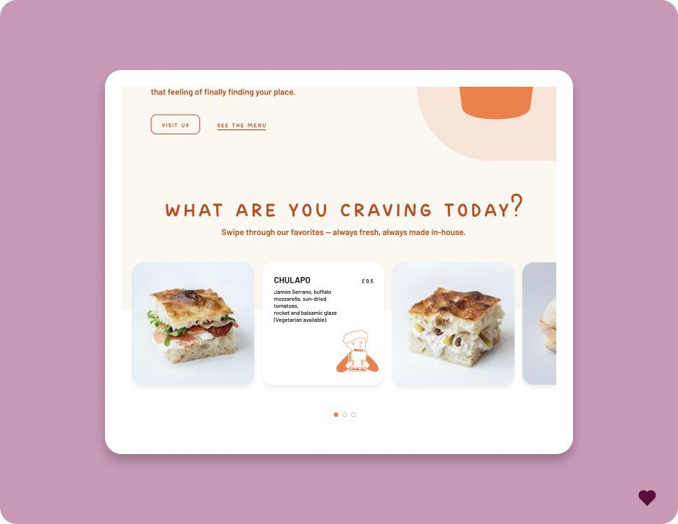
2/
First, today’s progress:
✅ Added the gallery
✅ Built the collaboration section
✅ Added the footer
The landing page is almost done, but I still need to figure out where to use that bold orange!
First, today’s progress:
✅ Added the gallery
✅ Built the collaboration section
✅ Added the footer
The landing page is almost done, but I still need to figure out where to use that bold orange!
December 7, 2024 at 12:50 PM
2/
First, today’s progress:
✅ Added the gallery
✅ Built the collaboration section
✅ Added the footer
The landing page is almost done, but I still need to figure out where to use that bold orange!
First, today’s progress:
✅ Added the gallery
✅ Built the collaboration section
✅ Added the footer
The landing page is almost done, but I still need to figure out where to use that bold orange!
1/ While continuing with the Hero I'm building with Motion, I realized they don’t have built-in support for responsiveness 🧐. I explored these 4 approaches to handle responsive animations effectively.
Here’s what I found! 👇🏼
Here’s what I found! 👇🏼
December 4, 2024 at 11:47 AM
1/ While continuing with the Hero I'm building with Motion, I realized they don’t have built-in support for responsiveness 🧐. I explored these 4 approaches to handle responsive animations effectively.
Here’s what I found! 👇🏼
Here’s what I found! 👇🏼
4/ 🛠 Practical Application
I remade the title animation and started working on scroll-triggered effects for the Hero section.
For the title, I realized it needed more than just arriving from the bottom—it also needed a "paint from the top" effect to bring it to life. 🎨
I remade the title animation and started working on scroll-triggered effects for the Hero section.
For the title, I realized it needed more than just arriving from the bottom—it also needed a "paint from the top" effect to bring it to life. 🎨
December 2, 2024 at 11:14 AM
4/ 🛠 Practical Application
I remade the title animation and started working on scroll-triggered effects for the Hero section.
For the title, I realized it needed more than just arriving from the bottom—it also needed a "paint from the top" effect to bring it to life. 🎨
I remade the title animation and started working on scroll-triggered effects for the Hero section.
For the title, I realized it needed more than just arriving from the bottom—it also needed a "paint from the top" effect to bring it to life. 🎨
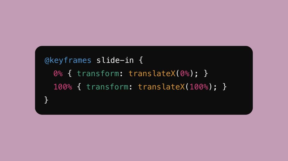
3/ 🎞️ Keyframes: Keyframes define where/when an animation changes
Example:
**Percentages = stages of the animation!
Example:
**Percentages = stages of the animation!
November 29, 2024 at 10:04 AM
3/ 🎞️ Keyframes: Keyframes define where/when an animation changes
Example:
**Percentages = stages of the animation!
Example:
**Percentages = stages of the animation!
5/ Right now, I’m stuck trying to make the background transition work. Turns out I need to change the main component’s background, not just the section. So yeah… tomorrow’s problem. 🛠️
November 28, 2024 at 1:03 PM
5/ Right now, I’m stuck trying to make the background transition work. Turns out I need to change the main component’s background, not just the section. So yeah… tomorrow’s problem. 🛠️
4/ After the video takes center stage, you keep scrolling, and it just stays there. When it finally scrolls away, it shrinks back to its original size, and—surprise!—the background has smoothly transitioned into a new color. Sooo nice👌✨
November 28, 2024 at 1:03 PM
4/ After the video takes center stage, you keep scrolling, and it just stays there. When it finally scrolls away, it shrinks back to its original size, and—surprise!—the background has smoothly transitioned into a new color. Sooo nice👌✨
3/ First: the arriving animation for the title and video. Then, as you scroll, the video grows until it takes up the entire width of the page. Looks simple, right? But there’s more. 😅
November 28, 2024 at 1:03 PM
3/ First: the arriving animation for the title and video. Then, as you scroll, the video grows until it takes up the entire width of the page. Looks simple, right? But there’s more. 😅
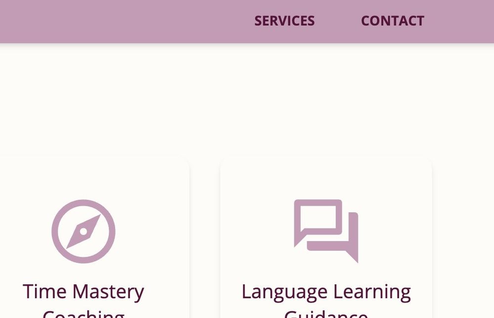
9/ Design Decision 2: Service Cards
I kept my "Services" section minimal with cards and brief descriptions. 🃏
The plan? Expand each service into its own section in the future. For now, less is more. What do you guys think? 🤔
I kept my "Services" section minimal with cards and brief descriptions. 🃏
The plan? Expand each service into its own section in the future. For now, less is more. What do you guys think? 🤔

November 21, 2024 at 11:47 AM
9/ Design Decision 2: Service Cards
I kept my "Services" section minimal with cards and brief descriptions. 🃏
The plan? Expand each service into its own section in the future. For now, less is more. What do you guys think? 🤔
I kept my "Services" section minimal with cards and brief descriptions. 🃏
The plan? Expand each service into its own section in the future. For now, less is more. What do you guys think? 🤔
8/ Design Decision 1: Future Menu
Even though it's a landing page now, I added a menu with placeholders for future pages. 🗂️
For now, it scrolls to "Services" or lets users contact me. Later, I can add submenus easily!
Even though it's a landing page now, I added a menu with placeholders for future pages. 🗂️
For now, it scrolls to "Services" or lets users contact me. Later, I can add submenus easily!
November 21, 2024 at 11:47 AM
8/ Design Decision 1: Future Menu
Even though it's a landing page now, I added a menu with placeholders for future pages. 🗂️
For now, it scrolls to "Services" or lets users contact me. Later, I can add submenus easily!
Even though it's a landing page now, I added a menu with placeholders for future pages. 🗂️
For now, it scrolls to "Services" or lets users contact me. Later, I can add submenus easily!
7/ Step 6: Copy and Design
I adjusted the copy along the way to better fit the design I had in mind. ✍️
It’s crucial for copy and design to work hand in hand to create a cohesive experience. 🤝
I adjusted the copy along the way to better fit the design I had in mind. ✍️
It’s crucial for copy and design to work hand in hand to create a cohesive experience. 🤝

November 21, 2024 at 11:47 AM
7/ Step 6: Copy and Design
I adjusted the copy along the way to better fit the design I had in mind. ✍️
It’s crucial for copy and design to work hand in hand to create a cohesive experience. 🤝
I adjusted the copy along the way to better fit the design I had in mind. ✍️
It’s crucial for copy and design to work hand in hand to create a cohesive experience. 🤝
6/ Step 5: Designing High-Fidelity Wireframes
With content ready, I created high-fidelity wireframes. I kept it simple, clean, and aligned with my style. 🎨
Using Atomic Design Methodology, I built components and structured the pages for scalability. 🧩
With content ready, I created high-fidelity wireframes. I kept it simple, clean, and aligned with my style. 🎨
Using Atomic Design Methodology, I built components and structured the pages for scalability. 🧩

November 21, 2024 at 11:47 AM
6/ Step 5: Designing High-Fidelity Wireframes
With content ready, I created high-fidelity wireframes. I kept it simple, clean, and aligned with my style. 🎨
Using Atomic Design Methodology, I built components and structured the pages for scalability. 🧩
With content ready, I created high-fidelity wireframes. I kept it simple, clean, and aligned with my style. 🎨
Using Atomic Design Methodology, I built components and structured the pages for scalability. 🧩
3/ Step 2: Wireframes
With my essentials in mind, I hand-drew wireframes.
🖋️ The focus? Scalability.
I needed a design that could gradually grow as I added more features and content. Future-proofing is key!
With my essentials in mind, I hand-drew wireframes.
🖋️ The focus? Scalability.
I needed a design that could gradually grow as I added more features and content. Future-proofing is key!

November 21, 2024 at 11:47 AM
3/ Step 2: Wireframes
With my essentials in mind, I hand-drew wireframes.
🖋️ The focus? Scalability.
I needed a design that could gradually grow as I added more features and content. Future-proofing is key!
With my essentials in mind, I hand-drew wireframes.
🖋️ The focus? Scalability.
I needed a design that could gradually grow as I added more features and content. Future-proofing is key!