


Sophia Mersmann
@sophiamersmann.bsky.social
data viz engineer @ourworldindata.org
Reposted by Sophia Mersmann
🔧 Website upgrade: You can now type to select a specific year or date in our interactive charts
Many of our interactive charts feature long time series, and it can be difficult to select the exact year or date that you want to see data for.
Many of our interactive charts feature long time series, and it can be difficult to select the exact year or date that you want to see data for.

January 14, 2026 at 12:21 PM
🔧 Website upgrade: You can now type to select a specific year or date in our interactive charts
Many of our interactive charts feature long time series, and it can be difficult to select the exact year or date that you want to see data for.
Many of our interactive charts feature long time series, and it can be difficult to select the exact year or date that you want to see data for.
Hey OWID fans!
We’re looking into how to improve the time-lapse animation in our charts and would love your input.
If you use the “Play” button on our charts:
When do you use it, and what do you use it for?
What does the animation help you understand?
Thanks for helping us make OWID better 🫶🏻
We’re looking into how to improve the time-lapse animation in our charts and would love your input.
If you use the “Play” button on our charts:
When do you use it, and what do you use it for?
What does the animation help you understand?
Thanks for helping us make OWID better 🫶🏻
January 9, 2026 at 9:53 AM
Hey OWID fans!
We’re looking into how to improve the time-lapse animation in our charts and would love your input.
If you use the “Play” button on our charts:
When do you use it, and what do you use it for?
What does the animation help you understand?
Thanks for helping us make OWID better 🫶🏻
We’re looking into how to improve the time-lapse animation in our charts and would love your input.
If you use the “Play” button on our charts:
When do you use it, and what do you use it for?
What does the animation help you understand?
Thanks for helping us make OWID better 🫶🏻
Reposted by Sophia Mersmann
🔧 New feature: you can now view two maps showing different years side by side!
A useful way to look at change over time for an indicator is to view two maps showing different years side by side.
A useful way to look at change over time for an indicator is to view two maps showing different years side by side.

December 17, 2025 at 1:19 PM
🔧 New feature: you can now view two maps showing different years side by side!
A useful way to look at change over time for an indicator is to view two maps showing different years side by side.
A useful way to look at change over time for an indicator is to view two maps showing different years side by side.
Reposted by Sophia Mersmann
🔍 Introducing our new, more powerful search!
→ ourworldindata.org/search
With such a rich publication—nearly 14,000 charts and 100s of articles on 120+ topics—it can be hard to find what matters to you.
Now, finding what you’re looking for, or discovering something new, has never been easier.
→ ourworldindata.org/search
With such a rich publication—nearly 14,000 charts and 100s of articles on 120+ topics—it can be hard to find what matters to you.
Now, finding what you’re looking for, or discovering something new, has never been easier.

November 6, 2025 at 10:10 AM
🔍 Introducing our new, more powerful search!
→ ourworldindata.org/search
With such a rich publication—nearly 14,000 charts and 100s of articles on 120+ topics—it can be hard to find what matters to you.
Now, finding what you’re looking for, or discovering something new, has never been easier.
→ ourworldindata.org/search
With such a rich publication—nearly 14,000 charts and 100s of articles on 120+ topics—it can be hard to find what matters to you.
Now, finding what you’re looking for, or discovering something new, has never been easier.
Ich wurde gerade so würdelos matt gesetzt
October 27, 2025 at 7:11 PM
Ich wurde gerade so würdelos matt gesetzt
Wer finanziert diese ganzen Kafka Biopics
October 19, 2025 at 8:43 AM
Wer finanziert diese ganzen Kafka Biopics
Rachel McAdams and Regina George are completely different people in my mind
June 27, 2025 at 11:10 AM
Rachel McAdams and Regina George are completely different people in my mind
Gibt nix besseres am heißesten Tag des Jahres

June 22, 2025 at 9:36 AM
Gibt nix besseres am heißesten Tag des Jahres
And we’re not even done yet! Some things are still cooking…. Stay tuned!
💡 Very excited to announce new features: better interactive maps! 🗺️
– Enhanced country/region selection with several sorting options and a bar chart preview
– Selecting a country highlights it and shows its value on the map
– Zooming to your selection brings up a 3D globe view 🌍
– Enhanced country/region selection with several sorting options and a bar chart preview
– Selecting a country highlights it and shows its value on the map
– Zooming to your selection brings up a 3D globe view 🌍
June 5, 2025 at 6:44 PM
And we’re not even done yet! Some things are still cooking…. Stay tuned!
Reposted by Sophia Mersmann

🏳️🌈 It’s lesbian visibility week! 🏳️⚧️
I edited a volume about queer, and specifically trans and lesbian, history and story telling. Despite the German title, most contributions are in English. You can read it for free (open access) or buy a print copy 💗 www.transcript-verlag.de/detail/index...
I edited a volume about queer, and specifically trans and lesbian, history and story telling. Despite the German title, most contributions are in English. You can read it for free (open access) or buy a print copy 💗 www.transcript-verlag.de/detail/index...

April 24, 2025 at 1:04 PM
🏳️🌈 It’s lesbian visibility week! 🏳️⚧️
I edited a volume about queer, and specifically trans and lesbian, history and story telling. Despite the German title, most contributions are in English. You can read it for free (open access) or buy a print copy 💗 www.transcript-verlag.de/detail/index...
I edited a volume about queer, and specifically trans and lesbian, history and story telling. Despite the German title, most contributions are in English. You can read it for free (open access) or buy a print copy 💗 www.transcript-verlag.de/detail/index...
Reposted by Sophia Mersmann
Hab ein Buch herausgegeben und hier könnt ihr es lesen (Open Access als pdf oder als Druck Ausgabe) www.transcript-verlag.de/detail/index...
April 21, 2025 at 2:22 PM
Hab ein Buch herausgegeben und hier könnt ihr es lesen (Open Access als pdf oder als Druck Ausgabe) www.transcript-verlag.de/detail/index...
Gaudi schön und gut aber wart ihr schon mal Darmstadt Hundertwasserhaus
March 21, 2025 at 8:18 PM
Gaudi schön und gut aber wart ihr schon mal Darmstadt Hundertwasserhaus
For every best-practices engineer in a team there should be one yolo engineer to balance things outs
March 4, 2025 at 4:50 PM
For every best-practices engineer in a team there should be one yolo engineer to balance things outs
I don’t usually like story lines that feel too constructed but the narrator in du Maurier’s Rebecca ending up exactly where she started is 🤌 chef’s kiss
March 3, 2025 at 10:53 AM
I don’t usually like story lines that feel too constructed but the narrator in du Maurier’s Rebecca ending up exactly where she started is 🤌 chef’s kiss
It just broke my heart a little that the first ‘question’ on this super important and very personal talk was just some guy mansplaining her.
A Case for Feminism in Programming Languages by Felienne Hermans:
A Case for Feminism in Programming Languages by Felienne Hermans:

[SPLASH'24] Pacific - Onward! (Oct 23th)
YouTube video by ACM SIGPLAN
www.youtube.com
March 2, 2025 at 10:31 AM
It just broke my heart a little that the first ‘question’ on this super important and very personal talk was just some guy mansplaining her.
A Case for Feminism in Programming Languages by Felienne Hermans:
A Case for Feminism in Programming Languages by Felienne Hermans:
How could @ourworldindata.org maps be better?
Do you experience any annoyances or pain points when you interact with our maps?
Is there something you wish you could do that you currently can’t?
What’s the next cool thing we could build on top of our maps?
Any notes welcome! Thank you 🙏
Do you experience any annoyances or pain points when you interact with our maps?
Is there something you wish you could do that you currently can’t?
What’s the next cool thing we could build on top of our maps?
Any notes welcome! Thank you 🙏
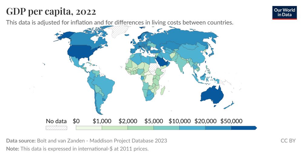
GDP per capita
This data is adjusted for inflation and for differences in living costs between countries.
ourworldindata.org
February 21, 2025 at 9:35 AM
How could @ourworldindata.org maps be better?
Do you experience any annoyances or pain points when you interact with our maps?
Is there something you wish you could do that you currently can’t?
What’s the next cool thing we could build on top of our maps?
Any notes welcome! Thank you 🙏
Do you experience any annoyances or pain points when you interact with our maps?
Is there something you wish you could do that you currently can’t?
What’s the next cool thing we could build on top of our maps?
Any notes welcome! Thank you 🙏
If I were to pitch @gitbutler.com, I’d say it’s a Jujutsu-like workflow packaged as git client
February 17, 2025 at 8:28 AM
If I were to pitch @gitbutler.com, I’d say it’s a Jujutsu-like workflow packaged as git client
Glaube nicht, dass die Illustrator*in Merz besonders mag?

February 13, 2025 at 7:38 AM
Glaube nicht, dass die Illustrator*in Merz besonders mag?
Code formatting
- Doesn’t get in the way
- Real time saver
- Nice and friendly
Linting
- Disrupts work
- Barely helpful
- Mean and annoying
- Doesn’t get in the way
- Real time saver
- Nice and friendly
Linting
- Disrupts work
- Barely helpful
- Mean and annoying
January 31, 2025 at 8:04 AM
Code formatting
- Doesn’t get in the way
- Real time saver
- Nice and friendly
Linting
- Disrupts work
- Barely helpful
- Mean and annoying
- Doesn’t get in the way
- Real time saver
- Nice and friendly
Linting
- Disrupts work
- Barely helpful
- Mean and annoying
Continuous list of things that would be better without touch screens:
Push-to-walk button
Stove
Doorbell
Kettle
Push-to-walk button
Stove
Doorbell
Kettle
January 30, 2025 at 9:24 PM
Continuous list of things that would be better without touch screens:
Push-to-walk button
Stove
Doorbell
Kettle
Push-to-walk button
Stove
Doorbell
Kettle
Advertising for zero backlog at work while my personal reading list keeps growing and growing………
January 22, 2025 at 10:14 PM
Advertising for zero backlog at work while my personal reading list keeps growing and growing………
Does anyone know of a Figma plugin that draws ✨ beautiful arrows ✨ that auto-update when connected shapes are moved?
I‘m thinking @tldraw.com quality arrows but in Figma
I‘m thinking @tldraw.com quality arrows but in Figma
January 15, 2025 at 6:52 PM
Does anyone know of a Figma plugin that draws ✨ beautiful arrows ✨ that auto-update when connected shapes are moved?
I‘m thinking @tldraw.com quality arrows but in Figma
I‘m thinking @tldraw.com quality arrows but in Figma
Starting the year right by rotating Grapher’s y-axis labels


January 2, 2025 at 1:59 PM
Starting the year right by rotating Grapher’s y-axis labels
The trickiest part of refactoring is deciding if the new code is *actually* better or if it just *feels* better because it’s now more familiar to you.
December 22, 2024 at 9:11 PM
The trickiest part of refactoring is deciding if the new code is *actually* better or if it just *feels* better because it’s now more familiar to you.