


@letterhanna.bsky.social
The $10,000 font mistake isn't about choosing wrong fonts—it's not choosing at all. Nike, Apple & Google invest millions in typography because it builds instant trust, speeds reading, and triggers emotional responses that drive conversions.
Read more : letterhanna.com/the-10000-fo...
Read more : letterhanna.com/the-10000-fo...
November 14, 2025 at 8:49 PM
The $10,000 font mistake isn't about choosing wrong fonts—it's not choosing at all. Nike, Apple & Google invest millions in typography because it builds instant trust, speeds reading, and triggers emotional responses that drive conversions.
Read more : letterhanna.com/the-10000-fo...
Read more : letterhanna.com/the-10000-fo...
Handwriting fonts = authenticity in 2025! Brands choose imperfect strokes over sterile text. Perfect for headlines, quotes, packaging. Avoid body text. Best in wellness, food, wedding niches. Layer with minimal backgrounds for organic vibes. Thoughts?
#HandwritingFonts #Typography2025
#HandwritingFonts #Typography2025
November 13, 2025 at 8:19 PM
Handwriting fonts = authenticity in 2025! Brands choose imperfect strokes over sterile text. Perfect for headlines, quotes, packaging. Avoid body text. Best in wellness, food, wedding niches. Layer with minimal backgrounds for organic vibes. Thoughts?
#HandwritingFonts #Typography2025
#HandwritingFonts #Typography2025
The Typography Mistakes That Are Costing You Clients
My typography checklist:
Maximum 3 fonts
1.5 line spacing for body text
Consistent type scale system
4.5:1 contrast minimum
Mobile-tested and approved
📎 Full guide at letterhanna.com/why-99-of-be...
My typography checklist:
Maximum 3 fonts
1.5 line spacing for body text
Consistent type scale system
4.5:1 contrast minimum
Mobile-tested and approved
📎 Full guide at letterhanna.com/why-99-of-be...
November 9, 2025 at 7:49 PM
The Typography Mistakes That Are Costing You Clients
My typography checklist:
Maximum 3 fonts
1.5 line spacing for body text
Consistent type scale system
4.5:1 contrast minimum
Mobile-tested and approved
📎 Full guide at letterhanna.com/why-99-of-be...
My typography checklist:
Maximum 3 fonts
1.5 line spacing for body text
Consistent type scale system
4.5:1 contrast minimum
Mobile-tested and approved
📎 Full guide at letterhanna.com/why-99-of-be...
Font pairing made simple: Use max 3 fonts. Pair bold display + clean sans-serif + handwriting accent. Apply 60-30-10 rule. Fonts from same family = instant harmony. Squint test for hierarchy. Your designs will thank you! Which pairing do you love most?
November 7, 2025 at 8:08 PM
Font pairing made simple: Use max 3 fonts. Pair bold display + clean sans-serif + handwriting accent. Apply 60-30-10 rule. Fonts from same family = instant harmony. Squint test for hierarchy. Your designs will thank you! Which pairing do you love most?
Why can you recognize Coca-Cola from a mile away? Font psychology. 🧠✨ Your brain judges logos in 50 milliseconds—faster than a heartbeat.
#FontPsychology #LogoDesign #BrandingTips
read more : letterhanna.com/the-secret-f...
#FontPsychology #LogoDesign #BrandingTips
read more : letterhanna.com/the-secret-f...
November 5, 2025 at 2:41 AM
Why can you recognize Coca-Cola from a mile away? Font psychology. 🧠✨ Your brain judges logos in 50 milliseconds—faster than a heartbeat.
#FontPsychology #LogoDesign #BrandingTips
read more : letterhanna.com/the-secret-f...
#FontPsychology #LogoDesign #BrandingTips
read more : letterhanna.com/the-secret-f...
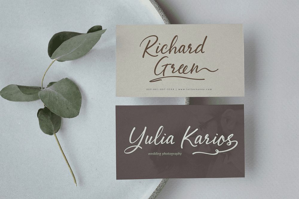
Abellaice Graceful and flowing, Abellai brings an ethereal touch to your designs. Perfect for wedding invitations, elegant branding, and romantic projects that need a delicate, feminine feel. Discover timeless beauty at letterhanna.com/abellaice-sc...
#freefont #handwritingfont #scriptfont
#freefont #handwritingfont #scriptfont


October 31, 2025 at 4:15 AM
Abellaice Graceful and flowing, Abellai brings an ethereal touch to your designs. Perfect for wedding invitations, elegant branding, and romantic projects that need a delicate, feminine feel. Discover timeless beauty at letterhanna.com/abellaice-sc...
#freefont #handwritingfont #scriptfont
#freefont #handwritingfont #scriptfont
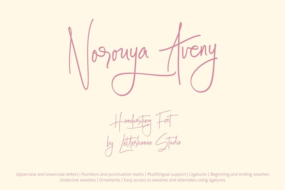
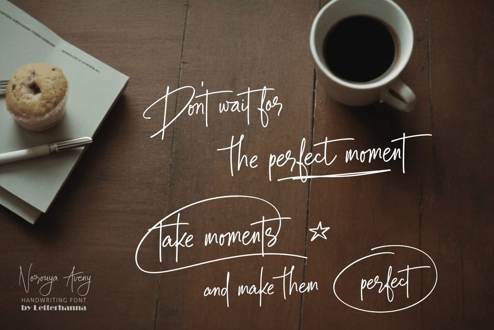
Norouya Aveny – a charming new handwriting script font that brings elegance and personality to every letter you type. perfect for branding, invitations, packaging, social media #handwritingfont #signature #weddingfont
letterhanna.com/norouya-aven...
letterhanna.com/norouya-aven...


June 19, 2025 at 12:03 AM
Norouya Aveny – a charming new handwriting script font that brings elegance and personality to every letter you type. perfect for branding, invitations, packaging, social media #handwritingfont #signature #weddingfont
letterhanna.com/norouya-aven...
letterhanna.com/norouya-aven...
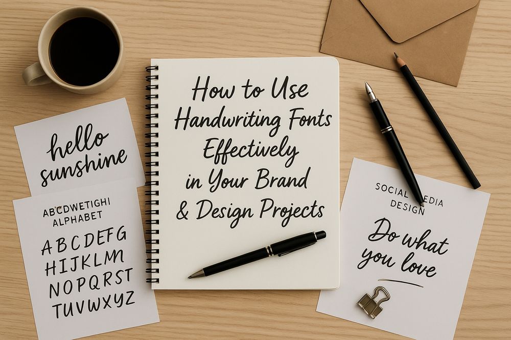
So you’ve fallen in love with handwriting fonts (who hasn’t?). They’re charming, soulful, and just the right amount of imperfect. But the real magic? Knowing how to use them like a pro. In this article,...
read more... letterhanna.com/how-to-use-h...
read more... letterhanna.com/how-to-use-h...
June 15, 2025 at 11:40 PM
So you’ve fallen in love with handwriting fonts (who hasn’t?). They’re charming, soulful, and just the right amount of imperfect. But the real magic? Knowing how to use them like a pro. In this article,...
read more... letterhanna.com/how-to-use-h...
read more... letterhanna.com/how-to-use-h...
Today, we shine a spotlight on a small but mighty character in the world of typography—the lowercase “i.” It’s often overlooked, nestled quietly between other letters, but it holds a fascinating legacy and design elegance...
read more... letterhanna.com/introduction...
read more... letterhanna.com/introduction...

June 15, 2025 at 11:34 PM
Today, we shine a spotlight on a small but mighty character in the world of typography—the lowercase “i.” It’s often overlooked, nestled quietly between other letters, but it holds a fascinating legacy and design elegance...
read more... letterhanna.com/introduction...
read more... letterhanna.com/introduction...
Fonts are more than just letters. They’re the voice of your message. And handwriting fonts? They’re the cozy, charming voice that makes people lean in and listen. In a world obsessed with minimalism and digital...
read more... letterhanna.com/why-handwrit...
read more... letterhanna.com/why-handwrit...

June 15, 2025 at 3:51 AM
Fonts are more than just letters. They’re the voice of your message. And handwriting fonts? They’re the cozy, charming voice that makes people lean in and listen. In a world obsessed with minimalism and digital...
read more... letterhanna.com/why-handwrit...
read more... letterhanna.com/why-handwrit...
Some letters demand attention (cough g), while others carry the show behind the scenes. Meet ‘h’, the dependable backbone of words like hello, hero, and harmony. It may not flaunt loops or flamboyant tails, but...
read more... letterhanna.com/exploring-th...
read more... letterhanna.com/exploring-th...

June 15, 2025 at 2:39 AM
Some letters demand attention (cough g), while others carry the show behind the scenes. Meet ‘h’, the dependable backbone of words like hello, hero, and harmony. It may not flaunt loops or flamboyant tails, but...
read more... letterhanna.com/exploring-th...
read more... letterhanna.com/exploring-th...
The lowercase g might just be the most enigmatic letter in the Latin alphabet. It’s elegant, it’s complicated, and — plot twist — it actually has two main typographic forms. If you’ve ever wondered why...
read more... letterhanna.com/exploring-th...
read more... letterhanna.com/exploring-th...

June 12, 2025 at 7:57 PM
The lowercase g might just be the most enigmatic letter in the Latin alphabet. It’s elegant, it’s complicated, and — plot twist — it actually has two main typographic forms. If you’ve ever wondered why...
read more... letterhanna.com/exploring-th...
read more... letterhanna.com/exploring-th...
Origins of the Letter ‘f’ The story of ‘f’ begins, as many do, in the ancient world: Phoenician: The ancestor was waw (yes, the same ancestor of modern ‘v’, ‘w’, and ‘y’), which looked...
read more... letterhanna.com/exploring-th...
read more... letterhanna.com/exploring-th...

June 12, 2025 at 4:58 AM
Origins of the Letter ‘f’ The story of ‘f’ begins, as many do, in the ancient world: Phoenician: The ancestor was waw (yes, the same ancestor of modern ‘v’, ‘w’, and ‘y’), which looked...
read more... letterhanna.com/exploring-th...
read more... letterhanna.com/exploring-th...
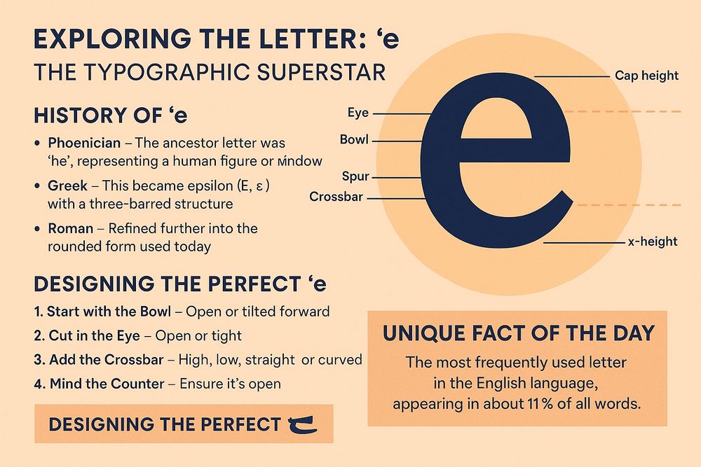
Exploring the Letter: ‘e’ — The Typographic Superstar
✨ Why ‘e’ Deserves the Spotlight Statistically speaking, ‘e’ appears in about 11% of all English words. That’s more than any other letter — making it the Beyoncé of the alphabet (minus the Grammy snubs)read more... letterhanna.com/exploring-th...
✨ Why ‘e’ Deserves the Spotlight Statistically speaking, ‘e’ appears in about 11% of all English words. That’s more than any other letter — making it the Beyoncé of the alphabet (minus the Grammy snubs)read more... letterhanna.com/exploring-th...
June 7, 2025 at 5:07 AM
Exploring the Letter: ‘e’ — The Typographic Superstar
✨ Why ‘e’ Deserves the Spotlight Statistically speaking, ‘e’ appears in about 11% of all English words. That’s more than any other letter — making it the Beyoncé of the alphabet (minus the Grammy snubs)read more... letterhanna.com/exploring-th...
✨ Why ‘e’ Deserves the Spotlight Statistically speaking, ‘e’ appears in about 11% of all English words. That’s more than any other letter — making it the Beyoncé of the alphabet (minus the Grammy snubs)read more... letterhanna.com/exploring-th...
Too much kerning is chaos. Too little? Cramped disaster. Nail the spacing—it’s the unsung hero of great design! 📏✨
#KerningMatters #TypographyTips #FontDesign #SpacingMatters #LetterSpacing #GraphicDesignTips #TypeLovers #DesignDetails #TypographicDesign
#KerningMatters #TypographyTips #FontDesign #SpacingMatters #LetterSpacing #GraphicDesignTips #TypeLovers #DesignDetails #TypographicDesign
June 1, 2025 at 10:49 PM
Too much kerning is chaos. Too little? Cramped disaster. Nail the spacing—it’s the unsung hero of great design! 📏✨
#KerningMatters #TypographyTips #FontDesign #SpacingMatters #LetterSpacing #GraphicDesignTips #TypeLovers #DesignDetails #TypographicDesign
#KerningMatters #TypographyTips #FontDesign #SpacingMatters #LetterSpacing #GraphicDesignTips #TypeLovers #DesignDetails #TypographicDesign
Pairing fonts is like matchmaking. Opposites attract, but harmony rules. Don’t let your body text fight with your headline. 💔💡
#FontPairing #TypographyTips #FontDesign #DesignTips #CreativeDesign #VisualHierarchy #DesignStrategy #GraphicDesign #TypeLovers
#FontPairing #TypographyTips #FontDesign #DesignTips #CreativeDesign #VisualHierarchy #DesignStrategy #GraphicDesign #TypeLovers
June 1, 2025 at 10:48 PM
Pairing fonts is like matchmaking. Opposites attract, but harmony rules. Don’t let your body text fight with your headline. 💔💡
#FontPairing #TypographyTips #FontDesign #DesignTips #CreativeDesign #VisualHierarchy #DesignStrategy #GraphicDesign #TypeLovers
#FontPairing #TypographyTips #FontDesign #DesignTips #CreativeDesign #VisualHierarchy #DesignStrategy #GraphicDesign #TypeLovers
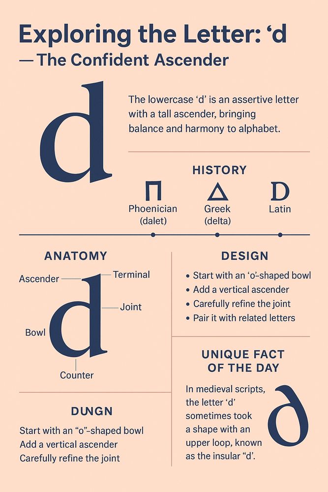
📏 Big Personality, Bigger Structure The lowercase ‘d’ is the architectural marvel of the alphabet. Towering over most lowercase characters with its ascender, ‘d’ is both assertive and graceful. Its structure brings balance and harmony...
read more...
letterhanna.com/exploring-th...
read more...
letterhanna.com/exploring-th...
June 1, 2025 at 7:52 PM
📏 Big Personality, Bigger Structure The lowercase ‘d’ is the architectural marvel of the alphabet. Towering over most lowercase characters with its ascender, ‘d’ is both assertive and graceful. Its structure brings balance and harmony...
read more...
letterhanna.com/exploring-th...
read more...
letterhanna.com/exploring-th...
Leading (line spacing) isn’t just a setting—it’s breathing room for your text. Tight lines = anxiety. Spacious lines = clarity. Let it breathe! 🧘♂️
#TypographyTips #FontDesign #LeadingMatters #WhiteSpace #DesignPrinciples #GraphicDesignTips #TypeTalk #VisualHierarchy #CreativeDesign
#TypographyTips #FontDesign #LeadingMatters #WhiteSpace #DesignPrinciples #GraphicDesignTips #TypeTalk #VisualHierarchy #CreativeDesign
May 31, 2025 at 9:04 PM
Leading (line spacing) isn’t just a setting—it’s breathing room for your text. Tight lines = anxiety. Spacious lines = clarity. Let it breathe! 🧘♂️
#TypographyTips #FontDesign #LeadingMatters #WhiteSpace #DesignPrinciples #GraphicDesignTips #TypeTalk #VisualHierarchy #CreativeDesign
#TypographyTips #FontDesign #LeadingMatters #WhiteSpace #DesignPrinciples #GraphicDesignTips #TypeTalk #VisualHierarchy #CreativeDesign
Good typography = invisible helper. If your reader doesn’t notice it, but understands everything? You nailed it. 👌📚
#TypographyMatters #FontDesign #DesignTips #TypeLove #MinimalDesign #ReadableDesign #GraphicDesigners #CreativeWisdom #InvisibleDesign
#TypographyMatters #FontDesign #DesignTips #TypeLove #MinimalDesign #ReadableDesign #GraphicDesigners #CreativeWisdom #InvisibleDesign
May 31, 2025 at 9:03 PM
Good typography = invisible helper. If your reader doesn’t notice it, but understands everything? You nailed it. 👌📚
#TypographyMatters #FontDesign #DesignTips #TypeLove #MinimalDesign #ReadableDesign #GraphicDesigners #CreativeWisdom #InvisibleDesign
#TypographyMatters #FontDesign #DesignTips #TypeLove #MinimalDesign #ReadableDesign #GraphicDesigners #CreativeWisdom #InvisibleDesign
The second half of the 2010s was like graphic design’s “cleanse and clarify” phase. The internet got faster, phones got sharper, and everyone suddenly cared about UI and UX. Design had to be beautiful—but also...
read more...
letterhanna.com/graphic-desi...
read more...
letterhanna.com/graphic-desi...

May 31, 2025 at 8:58 PM
The second half of the 2010s was like graphic design’s “cleanse and clarify” phase. The internet got faster, phones got sharper, and everyone suddenly cared about UI and UX. Design had to be beautiful—but also...
read more...
letterhanna.com/graphic-desi...
read more...
letterhanna.com/graphic-desi...
Kerning: the fine art of letter spacing. It can make or break a design. Don’t let your text look like a bad breakup 💔
#KerningMatters #TypographyTips #FontDesign #GraphicDesignFails #TypeLove #DesignEducation #TypographicDesign #SpacingIsEverything
#KerningMatters #TypographyTips #FontDesign #GraphicDesignFails #TypeLove #DesignEducation #TypographicDesign #SpacingIsEverything
May 26, 2025 at 8:15 PM
Kerning: the fine art of letter spacing. It can make or break a design. Don’t let your text look like a bad breakup 💔
#KerningMatters #TypographyTips #FontDesign #GraphicDesignFails #TypeLove #DesignEducation #TypographicDesign #SpacingIsEverything
#KerningMatters #TypographyTips #FontDesign #GraphicDesignFails #TypeLove #DesignEducation #TypographicDesign #SpacingIsEverything
🧱 The Foundation of Form If the letter ‘a’ is the spark that ignites a font, ‘b’ is the structure that holds it steady. With its tall stem and perfectly perched bowl, the lowercase ‘b’...
read more... letterhanna.com/exploring-th...
read more... letterhanna.com/exploring-th...
May 26, 2025 at 8:13 PM
🧱 The Foundation of Form If the letter ‘a’ is the spark that ignites a font, ‘b’ is the structure that holds it steady. With its tall stem and perfectly perched bowl, the lowercase ‘b’...
read more... letterhanna.com/exploring-th...
read more... letterhanna.com/exploring-th...
Typography isn’t just about letters—it’s how letters speak. Use contrast, hierarchy, and white space to make your message not just readable, but unforgettable! 🔠✨
#Typography #FontDesign #GraphicDesign #DesignTips #TypeLovers #VisualDesign #CreativeProcess #TypoLove #DesignInspiration
#Typography #FontDesign #GraphicDesign #DesignTips #TypeLovers #VisualDesign #CreativeProcess #TypoLove #DesignInspiration
May 26, 2025 at 8:11 PM
Typography isn’t just about letters—it’s how letters speak. Use contrast, hierarchy, and white space to make your message not just readable, but unforgettable! 🔠✨
#Typography #FontDesign #GraphicDesign #DesignTips #TypeLovers #VisualDesign #CreativeProcess #TypoLove #DesignInspiration
#Typography #FontDesign #GraphicDesign #DesignTips #TypeLovers #VisualDesign #CreativeProcess #TypoLove #DesignInspiration
🔤 Why Start with ‘a’? The letter ‘a’ is the first character in the Latin alphabet, but it didn’t begin that way. It’s one of the oldest and most consistently used letters in writing systems...
letterhanna.com/exploring-th...
letterhanna.com/exploring-th...

May 24, 2025 at 8:12 PM
🔤 Why Start with ‘a’? The letter ‘a’ is the first character in the Latin alphabet, but it didn’t begin that way. It’s one of the oldest and most consistently used letters in writing systems...
letterhanna.com/exploring-th...
letterhanna.com/exploring-th...
Fonts aren’t just pretty letters. They carry mood, personality, trust, and memory. The typeface you choose can make your brand feel like a tech-savvy innovator, a luxury boutique, or a down-to-earth artisan bakery.
Read more...
letterhanna.com/typography-i...
Read more...
letterhanna.com/typography-i...

May 23, 2025 at 8:22 PM
Fonts aren’t just pretty letters. They carry mood, personality, trust, and memory. The typeface you choose can make your brand feel like a tech-savvy innovator, a luxury boutique, or a down-to-earth artisan bakery.
Read more...
letterhanna.com/typography-i...
Read more...
letterhanna.com/typography-i...