


Klaudia J Maddison
@klaudiajmaddison.bsky.social
Data viz, UX, gaming, cats, and pole dance.
Saving the world one spreadsheet at a time.
Saving the world one spreadsheet at a time.
As of July 2025, only 16% of global humanitarian needs have been funded. Amid escalating crises and rising costs of living, humanitarian funding is drying up, leaving millions stranded without the support they urgently need.
#InformationDesign #DataVisualisation #HumanitarianAid #DesignForImpact
#InformationDesign #DataVisualisation #HumanitarianAid #DesignForImpact

July 10, 2025 at 5:17 PM
As of July 2025, only 16% of global humanitarian needs have been funded. Amid escalating crises and rising costs of living, humanitarian funding is drying up, leaving millions stranded without the support they urgently need.
#InformationDesign #DataVisualisation #HumanitarianAid #DesignForImpact
#InformationDesign #DataVisualisation #HumanitarianAid #DesignForImpact
Year after year, the humanitarian community has insisted that we are #NotATarget. But the data tells another story.
In 2025 alone, at least 314 aid workers have already been affected by deliberate acts of violence. This map shows where and how these attacks took place.
In 2025 alone, at least 314 aid workers have already been affected by deliberate acts of violence. This map shows where and how these attacks took place.

July 9, 2025 at 11:14 AM
Year after year, the humanitarian community has insisted that we are #NotATarget. But the data tells another story.
In 2025 alone, at least 314 aid workers have already been affected by deliberate acts of violence. This map shows where and how these attacks took place.
In 2025 alone, at least 314 aid workers have already been affected by deliberate acts of violence. This map shows where and how these attacks took place.
#30DayChartChallenge, aka my not-quite-30 days
Between juggling two projects, delivering training abroad, and being knocked out by illness, I had to choose my battles, and this challenge couldn’t be one of them. Still, I created work I’m proud of, even if some of it never saw the light of day. 1/4
Between juggling two projects, delivering training abroad, and being knocked out by illness, I had to choose my battles, and this challenge couldn’t be one of them. Still, I created work I’m proud of, even if some of it never saw the light of day. 1/4
July 9, 2025 at 11:07 AM
#30DayChartChallenge, aka my not-quite-30 days
Between juggling two projects, delivering training abroad, and being knocked out by illness, I had to choose my battles, and this challenge couldn’t be one of them. Still, I created work I’m proud of, even if some of it never saw the light of day. 1/4
Between juggling two projects, delivering training abroad, and being knocked out by illness, I had to choose my battles, and this challenge couldn’t be one of them. Still, I created work I’m proud of, even if some of it never saw the light of day. 1/4
#30DayChartChallenge Day 14, Kinship
This might not be the most “statistical” take on kinship, as I chose to explore what kinship may look like in practice - in an age of rising living costs, ageing populations, and shifting family structures.
This might not be the most “statistical” take on kinship, as I chose to explore what kinship may look like in practice - in an age of rising living costs, ageing populations, and shifting family structures.

April 15, 2025 at 9:50 AM
#30DayChartChallenge Day 14, Kinship
This might not be the most “statistical” take on kinship, as I chose to explore what kinship may look like in practice - in an age of rising living costs, ageing populations, and shifting family structures.
This might not be the most “statistical” take on kinship, as I chose to explore what kinship may look like in practice - in an age of rising living costs, ageing populations, and shifting family structures.
#30DayChartChallenge Day 13, Clusters
Every dot on this chart represents a country. Some dots are large-more babies die there. Some dots are dark-more money flows there. In some parts of the world, being born means starting life with every advantage. In others, it means surviving against the odds.
Every dot on this chart represents a country. Some dots are large-more babies die there. Some dots are dark-more money flows there. In some parts of the world, being born means starting life with every advantage. In others, it means surviving against the odds.

April 14, 2025 at 2:41 PM
#30DayChartChallenge Day 13, Clusters
Every dot on this chart represents a country. Some dots are large-more babies die there. Some dots are dark-more money flows there. In some parts of the world, being born means starting life with every advantage. In others, it means surviving against the odds.
Every dot on this chart represents a country. Some dots are large-more babies die there. Some dots are dark-more money flows there. In some parts of the world, being born means starting life with every advantage. In others, it means surviving against the odds.
#30DayChartChallenge Day 12, data.gov [re-upload]
In the 2023/24 school year, overall vaccination exemption rates increased to 3.3%, up from 3.0% the previous year. While medical exemptions remain stable at ~0.2%, the uptick is driven almost entirely by non-medical reasons.
In the 2023/24 school year, overall vaccination exemption rates increased to 3.3%, up from 3.0% the previous year. While medical exemptions remain stable at ~0.2%, the uptick is driven almost entirely by non-medical reasons.

April 14, 2025 at 12:25 PM
#30DayChartChallenge Day 12, data.gov [re-upload]
In the 2023/24 school year, overall vaccination exemption rates increased to 3.3%, up from 3.0% the previous year. While medical exemptions remain stable at ~0.2%, the uptick is driven almost entirely by non-medical reasons.
In the 2023/24 school year, overall vaccination exemption rates increased to 3.3%, up from 3.0% the previous year. While medical exemptions remain stable at ~0.2%, the uptick is driven almost entirely by non-medical reasons.
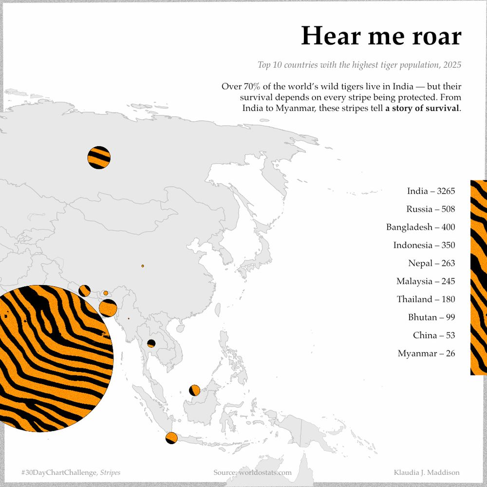
#30DayChartChallenge – Day 11, Stripes
For the “Stripes” prompt, I couldn’t resist a tribute to one of the most iconic striped creatures: the tiger. This visual shows the top 10 countries by wild tiger population as of 2025, with India alone home to over 70% of the global total.
For the “Stripes” prompt, I couldn’t resist a tribute to one of the most iconic striped creatures: the tiger. This visual shows the top 10 countries by wild tiger population as of 2025, with India alone home to over 70% of the global total.
April 14, 2025 at 9:34 AM
#30DayChartChallenge – Day 11, Stripes
For the “Stripes” prompt, I couldn’t resist a tribute to one of the most iconic striped creatures: the tiger. This visual shows the top 10 countries by wild tiger population as of 2025, with India alone home to over 70% of the global total.
For the “Stripes” prompt, I couldn’t resist a tribute to one of the most iconic striped creatures: the tiger. This visual shows the top 10 countries by wild tiger population as of 2025, with India alone home to over 70% of the global total.
#30DayChartChallenge – Day 10, Multimodal
This visual combines science, perception, and data to tell one story: while the scientific consensus on human-driven climate change is clear, public understanding still lags—despite the rising temperature records.
This visual combines science, perception, and data to tell one story: while the scientific consensus on human-driven climate change is clear, public understanding still lags—despite the rising temperature records.

April 10, 2025 at 2:37 PM
#30DayChartChallenge – Day 10, Multimodal
This visual combines science, perception, and data to tell one story: while the scientific consensus on human-driven climate change is clear, public understanding still lags—despite the rising temperature records.
This visual combines science, perception, and data to tell one story: while the scientific consensus on human-driven climate change is clear, public understanding still lags—despite the rising temperature records.
#30DayChartChallenge – Day 8, Diverging
Qatar's population is heavily skewed toward working-age men, a reflection of its reliance on a massive male migrant workforce. This is how labour demand, not natural population growth, drives much of the country’s demographics.
Qatar's population is heavily skewed toward working-age men, a reflection of its reliance on a massive male migrant workforce. This is how labour demand, not natural population growth, drives much of the country’s demographics.

April 10, 2025 at 1:03 PM
#30DayChartChallenge – Day 8, Diverging
Qatar's population is heavily skewed toward working-age men, a reflection of its reliance on a massive male migrant workforce. This is how labour demand, not natural population growth, drives much of the country’s demographics.
Qatar's population is heavily skewed toward working-age men, a reflection of its reliance on a massive male migrant workforce. This is how labour demand, not natural population growth, drives much of the country’s demographics.
#30DayChartChallenge – Day 8, Histogram
Not every chart turns out how you’d like (and I'm not happy with this one visually), but I’m sticking with the challenge—and this data is worth sharing.
This histogram shows how countries distributed their health spending as a % of GDP across 2019-2021.
Not every chart turns out how you’d like (and I'm not happy with this one visually), but I’m sticking with the challenge—and this data is worth sharing.
This histogram shows how countries distributed their health spending as a % of GDP across 2019-2021.

April 9, 2025 at 10:50 AM
#30DayChartChallenge – Day 8, Histogram
Not every chart turns out how you’d like (and I'm not happy with this one visually), but I’m sticking with the challenge—and this data is worth sharing.
This histogram shows how countries distributed their health spending as a % of GDP across 2019-2021.
Not every chart turns out how you’d like (and I'm not happy with this one visually), but I’m sticking with the challenge—and this data is worth sharing.
This histogram shows how countries distributed their health spending as a % of GDP across 2019-2021.
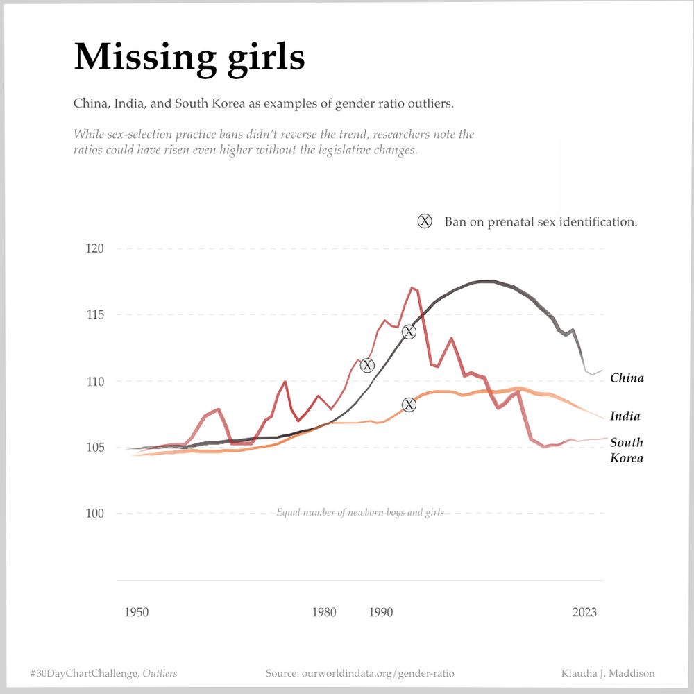
#30DayChartChallenge – Day 7, Outliers
This chart highlights countries where the natural balance between boys and girls at birth has been distorted.
Bans were introduced to restrict sex identification. And while they didn’t fully reverse the trend, it could’ve been worse without them.
This chart highlights countries where the natural balance between boys and girls at birth has been distorted.
Bans were introduced to restrict sex identification. And while they didn’t fully reverse the trend, it could’ve been worse without them.
April 7, 2025 at 3:34 PM
#30DayChartChallenge – Day 7, Outliers
This chart highlights countries where the natural balance between boys and girls at birth has been distorted.
Bans were introduced to restrict sex identification. And while they didn’t fully reverse the trend, it could’ve been worse without them.
This chart highlights countries where the natural balance between boys and girls at birth has been distorted.
Bans were introduced to restrict sex identification. And while they didn’t fully reverse the trend, it could’ve been worse without them.
#30DayChartChallenge Day 6, Florence Nightingale
For this theme, I didn’t want to simply recreate the iconic chart. I wanted to build on it. Each wedge represents a year between 1991 and 2022. Each coloured layer is a form of child malnutrition. And the shape that emerges is hauntingly consistent.
For this theme, I didn’t want to simply recreate the iconic chart. I wanted to build on it. Each wedge represents a year between 1991 and 2022. Each coloured layer is a form of child malnutrition. And the shape that emerges is hauntingly consistent.

April 6, 2025 at 4:01 PM
#30DayChartChallenge Day 6, Florence Nightingale
For this theme, I didn’t want to simply recreate the iconic chart. I wanted to build on it. Each wedge represents a year between 1991 and 2022. Each coloured layer is a form of child malnutrition. And the shape that emerges is hauntingly consistent.
For this theme, I didn’t want to simply recreate the iconic chart. I wanted to build on it. Each wedge represents a year between 1991 and 2022. Each coloured layer is a form of child malnutrition. And the shape that emerges is hauntingly consistent.
#30DayChartChallenge Day 5, Ranking
Countries where girls are most disadvantaged and where they actually outnumber boys in access to education.
However, this index doesn't measure the quality of education or learning outcomes. High access doesn’t always mean better experiences or equal results.
Countries where girls are most disadvantaged and where they actually outnumber boys in access to education.
However, this index doesn't measure the quality of education or learning outcomes. High access doesn’t always mean better experiences or equal results.

April 6, 2025 at 3:43 PM
#30DayChartChallenge Day 5, Ranking
Countries where girls are most disadvantaged and where they actually outnumber boys in access to education.
However, this index doesn't measure the quality of education or learning outcomes. High access doesn’t always mean better experiences or equal results.
Countries where girls are most disadvantaged and where they actually outnumber boys in access to education.
However, this index doesn't measure the quality of education or learning outcomes. High access doesn’t always mean better experiences or equal results.
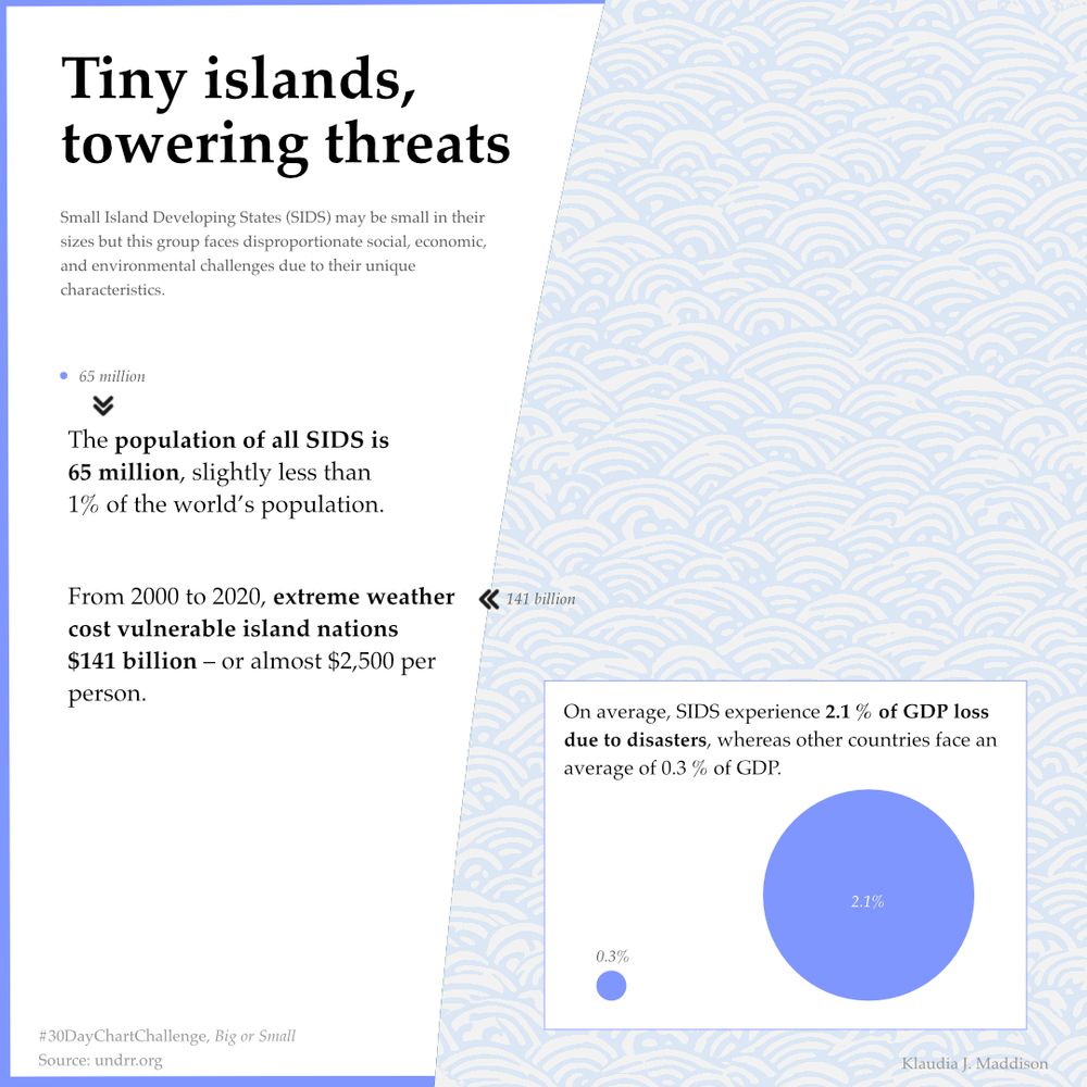
#30DayChartChallenge Day 4, Big or Small
SIDS make up <1% of the world’s population — but face 2x higher disaster mortality, 3x more people affected, and annual losses of 2.1% GDP from climate impacts.
Small islands. Big risk. And they’re on the frontlines — with the least to fall back on.
SIDS make up <1% of the world’s population — but face 2x higher disaster mortality, 3x more people affected, and annual losses of 2.1% GDP from climate impacts.
Small islands. Big risk. And they’re on the frontlines — with the least to fall back on.
April 4, 2025 at 5:08 PM
#30DayChartChallenge Day 4, Big or Small
SIDS make up <1% of the world’s population — but face 2x higher disaster mortality, 3x more people affected, and annual losses of 2.1% GDP from climate impacts.
Small islands. Big risk. And they’re on the frontlines — with the least to fall back on.
SIDS make up <1% of the world’s population — but face 2x higher disaster mortality, 3x more people affected, and annual losses of 2.1% GDP from climate impacts.
Small islands. Big risk. And they’re on the frontlines — with the least to fall back on.
For day 3 of the #30DayChartChallenge, I’m reposting my pomegranate chart.
Each seed represents a seat in parliament. Out of 100, only 15 belong to women. That’s an average of just 15.1%—a handful of seeds trying to represent millions of women across the region.
Each seed represents a seat in parliament. Out of 100, only 15 belong to women. That’s an average of just 15.1%—a handful of seeds trying to represent millions of women across the region.

April 3, 2025 at 9:55 AM
For day 3 of the #30DayChartChallenge, I’m reposting my pomegranate chart.
Each seed represents a seat in parliament. Out of 100, only 15 belong to women. That’s an average of just 15.1%—a handful of seeds trying to represent millions of women across the region.
Each seed represents a seat in parliament. Out of 100, only 15 belong to women. That’s an average of just 15.1%—a handful of seeds trying to represent millions of women across the region.
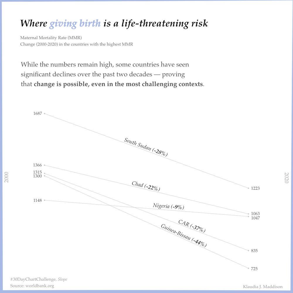
#30DayChartChallenge Day 2
Maternal mortality remains dangerously high in parts of Sub-Saharan Africa. In 2020, women in countries like South Sudan, Chad and Nigeria still faced a 1 in 100 risk of dying from pregnancy-related causes.
Maternal mortality remains dangerously high in parts of Sub-Saharan Africa. In 2020, women in countries like South Sudan, Chad and Nigeria still faced a 1 in 100 risk of dying from pregnancy-related causes.
April 2, 2025 at 10:27 AM
#30DayChartChallenge Day 2
Maternal mortality remains dangerously high in parts of Sub-Saharan Africa. In 2020, women in countries like South Sudan, Chad and Nigeria still faced a 1 in 100 risk of dying from pregnancy-related causes.
Maternal mortality remains dangerously high in parts of Sub-Saharan Africa. In 2020, women in countries like South Sudan, Chad and Nigeria still faced a 1 in 100 risk of dying from pregnancy-related causes.
#30DayChartChallenge Day 1
80% of people displaced by climate emergencies are female.
The chart uses gender pictograms to show how climate disasters hit women and girls hardest — with ripple effects on education, safety, and health.
Gender equity in climate action isn’t optional — it’s essential.
80% of people displaced by climate emergencies are female.
The chart uses gender pictograms to show how climate disasters hit women and girls hardest — with ripple effects on education, safety, and health.
Gender equity in climate action isn’t optional — it’s essential.

April 1, 2025 at 10:34 AM
#30DayChartChallenge Day 1
80% of people displaced by climate emergencies are female.
The chart uses gender pictograms to show how climate disasters hit women and girls hardest — with ripple effects on education, safety, and health.
Gender equity in climate action isn’t optional — it’s essential.
80% of people displaced by climate emergencies are female.
The chart uses gender pictograms to show how climate disasters hit women and girls hardest — with ripple effects on education, safety, and health.
Gender equity in climate action isn’t optional — it’s essential.
A pomegranate symbolises power and abundance. But in MENA parliaments, only 15.1% of seats are held by women—a handful of seeds for millions of voices. Globally? Just 27.3%.
New #dataviz exploring how few represent so many.
#WomenInPolitics #MENA #GenderEquality
New #dataviz exploring how few represent so many.
#WomenInPolitics #MENA #GenderEquality

March 25, 2025 at 1:01 PM
A pomegranate symbolises power and abundance. But in MENA parliaments, only 15.1% of seats are held by women—a handful of seeds for millions of voices. Globally? Just 27.3%.
New #dataviz exploring how few represent so many.
#WomenInPolitics #MENA #GenderEquality
New #dataviz exploring how few represent so many.
#WomenInPolitics #MENA #GenderEquality
As I slowly return to working on #datavisualization projects, I wanted to focus on something meaningful.
Thousands of migrants have drowned or gone missing at sea—people whose journeys ended in tragedy while seeking safety and opportunity.
Source: @iom.int Missing Migrants Project
Thousands of migrants have drowned or gone missing at sea—people whose journeys ended in tragedy while seeking safety and opportunity.
Source: @iom.int Missing Migrants Project

March 10, 2025 at 6:20 PM
As I slowly return to working on #datavisualization projects, I wanted to focus on something meaningful.
Thousands of migrants have drowned or gone missing at sea—people whose journeys ended in tragedy while seeking safety and opportunity.
Source: @iom.int Missing Migrants Project
Thousands of migrants have drowned or gone missing at sea—people whose journeys ended in tragedy while seeking safety and opportunity.
Source: @iom.int Missing Migrants Project
Inspired by the Ukrainian #vyshyvanka embroidery.
It's been ages since I let myself do what I've always loved and dive deep into the world of data visualisation. So, however heartbreaking it is, let it be my first post here.
#data #dataviz #Ukraine
It's been ages since I let myself do what I've always loved and dive deep into the world of data visualisation. So, however heartbreaking it is, let it be my first post here.
#data #dataviz #Ukraine

February 25, 2025 at 2:52 PM
Inspired by the Ukrainian #vyshyvanka embroidery.
It's been ages since I let myself do what I've always loved and dive deep into the world of data visualisation. So, however heartbreaking it is, let it be my first post here.
#data #dataviz #Ukraine
It's been ages since I let myself do what I've always loved and dive deep into the world of data visualisation. So, however heartbreaking it is, let it be my first post here.
#data #dataviz #Ukraine