


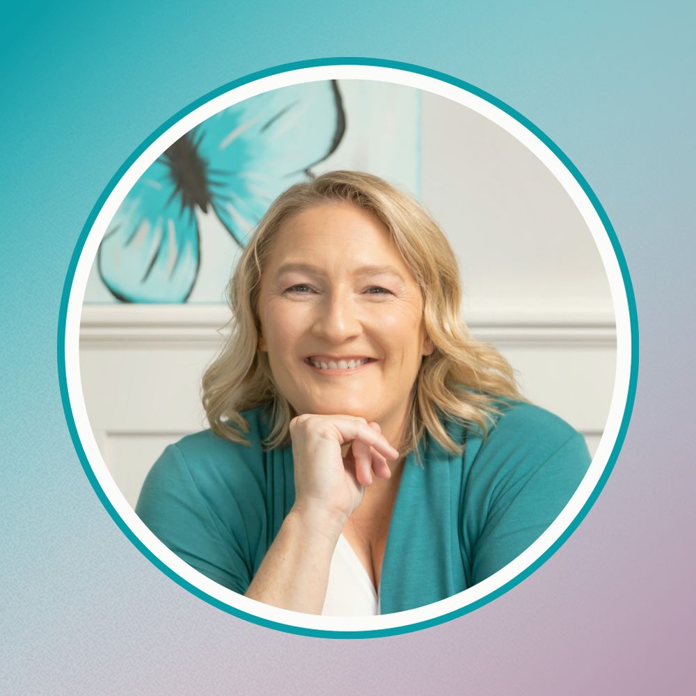
Caryn | Firefly Graphics
@fireflygraphics.bsky.social
Creating user-friendly, more accessible, graphics to help you connect with a wider audience.
https://linktr.ee/fireflygraphicsaus?fbclid=PAZXh0bgNhZW0CMTEAAaYMaU4GArVjyWRZz_yErRLG8_svxtitlR4Di_iUxps_rB97SDlDzm_NSJ8_aem_nkoX9xhvd49omlG15EDRdA
https://linktr.ee/fireflygraphicsaus?fbclid=PAZXh0bgNhZW0CMTEAAaYMaU4GArVjyWRZz_yErRLG8_svxtitlR4Di_iUxps_rB97SDlDzm_NSJ8_aem_nkoX9xhvd49omlG15EDRdA
Pinned

Hey, I’m Caryn!👋 I help businesses expand their branding—big or small—across all touchpoints for a cohesive, professional presence while keeping content as inclusive as possible. Expect dog-themed design insights—because everything’s better with dogs! 🐶 What’s your biggest accessibility frustration?
"𝗜𝗻𝗰𝗹𝘂𝘀𝗶𝘃𝗶𝘁𝘆 𝗶𝗻 𝗱𝗲𝘀𝗶𝗴𝗻 𝗴𝗶𝘃𝗲𝘀 𝗯𝘂𝘀𝗶𝗻𝗲𝘀𝘀𝗲𝘀 𝗮 𝗹𝗲𝗴 𝘂𝗽 𝗼𝗻 𝘁𝗵𝗲 𝗰𝗼𝗺𝗽𝗲𝘁𝗶𝘁𝗶𝗼𝗻."
– McKinsey & Co.
Accessible design isn’t just about compliance—it’s about reaching more customers and standing out!
#InclusiveMarketing #AccessibilityWins #DesignForAll
– McKinsey & Co.
Accessible design isn’t just about compliance—it’s about reaching more customers and standing out!
#InclusiveMarketing #AccessibilityWins #DesignForAll

February 7, 2026 at 7:00 AM
"𝗜𝗻𝗰𝗹𝘂𝘀𝗶𝘃𝗶𝘁𝘆 𝗶𝗻 𝗱𝗲𝘀𝗶𝗴𝗻 𝗴𝗶𝘃𝗲𝘀 𝗯𝘂𝘀𝗶𝗻𝗲𝘀𝘀𝗲𝘀 𝗮 𝗹𝗲𝗴 𝘂𝗽 𝗼𝗻 𝘁𝗵𝗲 𝗰𝗼𝗺𝗽𝗲𝘁𝗶𝘁𝗶𝗼𝗻."
– McKinsey & Co.
Accessible design isn’t just about compliance—it’s about reaching more customers and standing out!
#InclusiveMarketing #AccessibilityWins #DesignForAll
– McKinsey & Co.
Accessible design isn’t just about compliance—it’s about reaching more customers and standing out!
#InclusiveMarketing #AccessibilityWins #DesignForAll
𝗖𝗼𝗹𝗼𝘂𝗿 𝗮𝗹𝗼𝗻𝗲 𝗶𝘀𝗻’𝘁 𝗲𝗻𝗼𝘂𝗴𝗵 to communicate meaning.
1 in 12 men & 1 in 200 women have colour blindness—including my husband. He can often find clues that help, but sometimes, he can miss things.
Have you ever struggled with colour-based info?
#AccessibleDesign #InclusiveGraphics #VisibilityMa
1 in 12 men & 1 in 200 women have colour blindness—including my husband. He can often find clues that help, but sometimes, he can miss things.
Have you ever struggled with colour-based info?
#AccessibleDesign #InclusiveGraphics #VisibilityMa

February 6, 2026 at 8:00 AM
𝗖𝗼𝗹𝗼𝘂𝗿 𝗮𝗹𝗼𝗻𝗲 𝗶𝘀𝗻’𝘁 𝗲𝗻𝗼𝘂𝗴𝗵 to communicate meaning.
1 in 12 men & 1 in 200 women have colour blindness—including my husband. He can often find clues that help, but sometimes, he can miss things.
Have you ever struggled with colour-based info?
#AccessibleDesign #InclusiveGraphics #VisibilityMa
1 in 12 men & 1 in 200 women have colour blindness—including my husband. He can often find clues that help, but sometimes, he can miss things.
Have you ever struggled with colour-based info?
#AccessibleDesign #InclusiveGraphics #VisibilityMa
𝗞𝗲𝗲𝗽 𝗧𝗲𝘅𝘁 𝗟𝗲𝗳𝘁-𝗔𝗹𝗶𝗴𝗻𝗲𝗱
I preferred justified text; it looks so neat, but it can be harder to read.
🔹 Uneven spaces = disrupted reading flow.
🔹 Left-aligned text is easiest for most people.
Align left and help your audience read with ease!
#ReadableText #TypographyMatters #AccessibilityD
I preferred justified text; it looks so neat, but it can be harder to read.
🔹 Uneven spaces = disrupted reading flow.
🔹 Left-aligned text is easiest for most people.
Align left and help your audience read with ease!
#ReadableText #TypographyMatters #AccessibilityD

February 4, 2026 at 3:30 AM
𝗞𝗲𝗲𝗽 𝗧𝗲𝘅𝘁 𝗟𝗲𝗳𝘁-𝗔𝗹𝗶𝗴𝗻𝗲𝗱
I preferred justified text; it looks so neat, but it can be harder to read.
🔹 Uneven spaces = disrupted reading flow.
🔹 Left-aligned text is easiest for most people.
Align left and help your audience read with ease!
#ReadableText #TypographyMatters #AccessibilityD
I preferred justified text; it looks so neat, but it can be harder to read.
🔹 Uneven spaces = disrupted reading flow.
🔹 Left-aligned text is easiest for most people.
Align left and help your audience read with ease!
#ReadableText #TypographyMatters #AccessibilityD
"𝗜𝗻𝗰𝗹𝘂𝘀𝗶𝘃𝗶𝘁𝘆 𝗶𝗻 𝗱𝗲𝘀𝗶𝗴𝗻 𝗴𝗶𝘃𝗲𝘀 𝗯𝘂𝘀𝗶𝗻𝗲𝘀𝘀𝗲𝘀 𝗮 𝗹𝗲𝗴 𝘂𝗽 𝗼𝗻 𝘁𝗵𝗲 𝗰𝗼𝗺𝗽𝗲𝘁𝗶𝘁𝗶𝗼𝗻."
– McKinsey & Co.
Accessible design isn’t just about compliance—it’s about reaching more customers and standing out!
#InclusiveMarketing #AccessibilityWins #DesignForAll
– McKinsey & Co.
Accessible design isn’t just about compliance—it’s about reaching more customers and standing out!
#InclusiveMarketing #AccessibilityWins #DesignForAll
January 31, 2026 at 7:02 AM
"𝗜𝗻𝗰𝗹𝘂𝘀𝗶𝘃𝗶𝘁𝘆 𝗶𝗻 𝗱𝗲𝘀𝗶𝗴𝗻 𝗴𝗶𝘃𝗲𝘀 𝗯𝘂𝘀𝗶𝗻𝗲𝘀𝘀𝗲𝘀 𝗮 𝗹𝗲𝗴 𝘂𝗽 𝗼𝗻 𝘁𝗵𝗲 𝗰𝗼𝗺𝗽𝗲𝘁𝗶𝘁𝗶𝗼𝗻."
– McKinsey & Co.
Accessible design isn’t just about compliance—it’s about reaching more customers and standing out!
#InclusiveMarketing #AccessibilityWins #DesignForAll
– McKinsey & Co.
Accessible design isn’t just about compliance—it’s about reaching more customers and standing out!
#InclusiveMarketing #AccessibilityWins #DesignForAll
𝗟𝗶𝗻𝗲 𝗦𝗽𝗮𝗰𝗶𝗻𝗴:
Don't underestimate the importance of getting this right.
🔹 Use 1.5x line spacing for body text.
🔹 Avoid cramped text—it slows reading.
🔹 Better spacing = better comprehension.
#TypographyMatters #ReadableDesign #AccessibilityTips
Don't underestimate the importance of getting this right.
🔹 Use 1.5x line spacing for body text.
🔹 Avoid cramped text—it slows reading.
🔹 Better spacing = better comprehension.
#TypographyMatters #ReadableDesign #AccessibilityTips

January 30, 2026 at 8:04 AM
𝗟𝗶𝗻𝗲 𝗦𝗽𝗮𝗰𝗶𝗻𝗴:
Don't underestimate the importance of getting this right.
🔹 Use 1.5x line spacing for body text.
🔹 Avoid cramped text—it slows reading.
🔹 Better spacing = better comprehension.
#TypographyMatters #ReadableDesign #AccessibilityTips
Don't underestimate the importance of getting this right.
🔹 Use 1.5x line spacing for body text.
🔹 Avoid cramped text—it slows reading.
🔹 Better spacing = better comprehension.
#TypographyMatters #ReadableDesign #AccessibilityTips
𝗣𝗟𝗘𝗔𝗦𝗘 𝗦𝗧𝗢𝗣 𝗨𝗦𝗜𝗡𝗚 𝗔𝗟𝗟 𝗖𝗔𝗣𝗦.
𝗜𝗧’𝗦 𝗛𝗔𝗥𝗗 𝗧𝗢 𝗥𝗘𝗔𝗗 𝗔𝗡𝗗 𝗟𝗢𝗢𝗞𝗦 𝗟𝗜𝗞𝗘 𝗬𝗢𝗨'𝗥𝗘 𝗦𝗛𝗢𝗨𝗧𝗜𝗡𝗚!
Using all capital letters can slow reading and can confuse screen readers.
🔹 Words lose their shape.
🔹 It can look aggressive.
🔹 Use bold or colour instead.
#ReadableText #AccessibilityMatters #DesignTips
𝗜𝗧’𝗦 𝗛𝗔𝗥𝗗 𝗧𝗢 𝗥𝗘𝗔𝗗 𝗔𝗡𝗗 𝗟𝗢𝗢𝗞𝗦 𝗟𝗜𝗞𝗘 𝗬𝗢𝗨'𝗥𝗘 𝗦𝗛𝗢𝗨𝗧𝗜𝗡𝗚!
Using all capital letters can slow reading and can confuse screen readers.
🔹 Words lose their shape.
🔹 It can look aggressive.
🔹 Use bold or colour instead.
#ReadableText #AccessibilityMatters #DesignTips

January 28, 2026 at 3:30 AM
𝗣𝗟𝗘𝗔𝗦𝗘 𝗦𝗧𝗢𝗣 𝗨𝗦𝗜𝗡𝗚 𝗔𝗟𝗟 𝗖𝗔𝗣𝗦.
𝗜𝗧’𝗦 𝗛𝗔𝗥𝗗 𝗧𝗢 𝗥𝗘𝗔𝗗 𝗔𝗡𝗗 𝗟𝗢𝗢𝗞𝗦 𝗟𝗜𝗞𝗘 𝗬𝗢𝗨'𝗥𝗘 𝗦𝗛𝗢𝗨𝗧𝗜𝗡𝗚!
Using all capital letters can slow reading and can confuse screen readers.
🔹 Words lose their shape.
🔹 It can look aggressive.
🔹 Use bold or colour instead.
#ReadableText #AccessibilityMatters #DesignTips
𝗜𝗧’𝗦 𝗛𝗔𝗥𝗗 𝗧𝗢 𝗥𝗘𝗔𝗗 𝗔𝗡𝗗 𝗟𝗢𝗢𝗞𝗦 𝗟𝗜𝗞𝗘 𝗬𝗢𝗨'𝗥𝗘 𝗦𝗛𝗢𝗨𝗧𝗜𝗡𝗚!
Using all capital letters can slow reading and can confuse screen readers.
🔹 Words lose their shape.
🔹 It can look aggressive.
🔹 Use bold or colour instead.
#ReadableText #AccessibilityMatters #DesignTips
"𝗜𝗻𝗰𝗹𝘂𝘀𝗶𝘃𝗶𝘁𝘆 𝗶𝗻 𝗱𝗲𝘀𝗶𝗴𝗻 𝗴𝗶𝘃𝗲𝘀 𝗯𝘂𝘀𝗶𝗻𝗲𝘀𝘀𝗲𝘀 𝗮 𝗹𝗲𝗴 𝘂𝗽 𝗼𝗻 𝘁𝗵𝗲 𝗰𝗼𝗺𝗽𝗲𝘁𝗶𝘁𝗶𝗼𝗻."
– McKinsey & Co.
Accessible design isn’t just about compliance—it’s about reaching more customers and standing out!
#InclusiveMarketing #AccessibilityWins #DesignForAll
– McKinsey & Co.
Accessible design isn’t just about compliance—it’s about reaching more customers and standing out!
#InclusiveMarketing #AccessibilityWins #DesignForAll
January 24, 2026 at 7:02 AM
"𝗜𝗻𝗰𝗹𝘂𝘀𝗶𝘃𝗶𝘁𝘆 𝗶𝗻 𝗱𝗲𝘀𝗶𝗴𝗻 𝗴𝗶𝘃𝗲𝘀 𝗯𝘂𝘀𝗶𝗻𝗲𝘀𝘀𝗲𝘀 𝗮 𝗹𝗲𝗴 𝘂𝗽 𝗼𝗻 𝘁𝗵𝗲 𝗰𝗼𝗺𝗽𝗲𝘁𝗶𝘁𝗶𝗼𝗻."
– McKinsey & Co.
Accessible design isn’t just about compliance—it’s about reaching more customers and standing out!
#InclusiveMarketing #AccessibilityWins #DesignForAll
– McKinsey & Co.
Accessible design isn’t just about compliance—it’s about reaching more customers and standing out!
#InclusiveMarketing #AccessibilityWins #DesignForAll
𝗥𝗲𝗮𝗱𝗮𝗯𝗹𝗲 𝗙𝗼𝗻𝘁𝘀
Some fonts are gorgeous, but if people can’t read them, then what’s the point? 🤷♀️
🔹 Stick to sans-serif fonts for digital content.
🔹 Save decorative fonts for accents.
🔹 Make sure the spacing isn’t too tight or too loose.
#FontMatters #ReadableDesign #TypographyTips
Some fonts are gorgeous, but if people can’t read them, then what’s the point? 🤷♀️
🔹 Stick to sans-serif fonts for digital content.
🔹 Save decorative fonts for accents.
🔹 Make sure the spacing isn’t too tight or too loose.
#FontMatters #ReadableDesign #TypographyTips

January 23, 2026 at 8:04 AM
𝗥𝗲𝗮𝗱𝗮𝗯𝗹𝗲 𝗙𝗼𝗻𝘁𝘀
Some fonts are gorgeous, but if people can’t read them, then what’s the point? 🤷♀️
🔹 Stick to sans-serif fonts for digital content.
🔹 Save decorative fonts for accents.
🔹 Make sure the spacing isn’t too tight or too loose.
#FontMatters #ReadableDesign #TypographyTips
Some fonts are gorgeous, but if people can’t read them, then what’s the point? 🤷♀️
🔹 Stick to sans-serif fonts for digital content.
🔹 Save decorative fonts for accents.
🔹 Make sure the spacing isn’t too tight or too loose.
#FontMatters #ReadableDesign #TypographyTips
Small text isn’t clever, it’s a readability nightmare.
🔹 Web: At least 16px
🔹 Print: At least 12pt
🔹 Bigger is better (esp. for mobile users)
Small text = lost customers. Make it easy for people to read your social graphic, website, flyer or book.
#SizeMatters #InclusiveDesign #MarketingT
🔹 Web: At least 16px
🔹 Print: At least 12pt
🔹 Bigger is better (esp. for mobile users)
Small text = lost customers. Make it easy for people to read your social graphic, website, flyer or book.
#SizeMatters #InclusiveDesign #MarketingT

January 21, 2026 at 3:30 AM
Small text isn’t clever, it’s a readability nightmare.
🔹 Web: At least 16px
🔹 Print: At least 12pt
🔹 Bigger is better (esp. for mobile users)
Small text = lost customers. Make it easy for people to read your social graphic, website, flyer or book.
#SizeMatters #InclusiveDesign #MarketingT
🔹 Web: At least 16px
🔹 Print: At least 12pt
🔹 Bigger is better (esp. for mobile users)
Small text = lost customers. Make it easy for people to read your social graphic, website, flyer or book.
#SizeMatters #InclusiveDesign #MarketingT
"𝗜𝗻𝗰𝗹𝘂𝘀𝗶𝘃𝗶𝘁𝘆 𝗶𝗻 𝗱𝗲𝘀𝗶𝗴𝗻 𝗴𝗶𝘃𝗲𝘀 𝗯𝘂𝘀𝗶𝗻𝗲𝘀𝘀𝗲𝘀 𝗮 𝗹𝗲𝗴 𝘂𝗽 𝗼𝗻 𝘁𝗵𝗲 𝗰𝗼𝗺𝗽𝗲𝘁𝗶𝘁𝗶𝗼𝗻."
– McKinsey & Co.
Accessible design isn’t just about compliance—it’s about reaching more customers and standing out!
#InclusiveMarketing #AccessibilityWins #DesignForAll
– McKinsey & Co.
Accessible design isn’t just about compliance—it’s about reaching more customers and standing out!
#InclusiveMarketing #AccessibilityWins #DesignForAll
January 17, 2026 at 7:04 AM
"𝗜𝗻𝗰𝗹𝘂𝘀𝗶𝘃𝗶𝘁𝘆 𝗶𝗻 𝗱𝗲𝘀𝗶𝗴𝗻 𝗴𝗶𝘃𝗲𝘀 𝗯𝘂𝘀𝗶𝗻𝗲𝘀𝘀𝗲𝘀 𝗮 𝗹𝗲𝗴 𝘂𝗽 𝗼𝗻 𝘁𝗵𝗲 𝗰𝗼𝗺𝗽𝗲𝘁𝗶𝘁𝗶𝗼𝗻."
– McKinsey & Co.
Accessible design isn’t just about compliance—it’s about reaching more customers and standing out!
#InclusiveMarketing #AccessibilityWins #DesignForAll
– McKinsey & Co.
Accessible design isn’t just about compliance—it’s about reaching more customers and standing out!
#InclusiveMarketing #AccessibilityWins #DesignForAll
𝗖𝗼𝗻𝘁𝗿𝗮𝘀𝘁 𝗺𝗮𝘁𝘁𝗲𝗿𝘀
People can’t read what they can’t see.
If your audience has to squint, that’s not good design.
Low contrast = low engagement.
#AccessibleDesign #MarketingTips #SmallBusinessAustralia
People can’t read what they can’t see.
If your audience has to squint, that’s not good design.
Low contrast = low engagement.
#AccessibleDesign #MarketingTips #SmallBusinessAustralia

January 16, 2026 at 8:05 AM
𝗖𝗼𝗻𝘁𝗿𝗮𝘀𝘁 𝗺𝗮𝘁𝘁𝗲𝗿𝘀
People can’t read what they can’t see.
If your audience has to squint, that’s not good design.
Low contrast = low engagement.
#AccessibleDesign #MarketingTips #SmallBusinessAustralia
People can’t read what they can’t see.
If your audience has to squint, that’s not good design.
Low contrast = low engagement.
#AccessibleDesign #MarketingTips #SmallBusinessAustralia
𝗨𝘀𝗲 𝗗𝗲𝘀𝗰𝗿𝗶𝗽𝘁𝗶𝘃𝗲 𝗕𝘂𝘁𝘁𝗼𝗻𝘀
Hate to break it to you, but "Click here" doesn’t cut it! Vague button text can confuse users, create accessibility barriers, and even impact SEO.
𝗗𝗼𝗻'𝘁 𝘂𝘀𝗲:
🚫 Click here
🚫 More info
𝗜𝗻𝘀𝘁𝗲𝗮𝗱:
See below 👇
#AccessibleWeb #ClearUX #InclusiveDesign
Hate to break it to you, but "Click here" doesn’t cut it! Vague button text can confuse users, create accessibility barriers, and even impact SEO.
𝗗𝗼𝗻'𝘁 𝘂𝘀𝗲:
🚫 Click here
🚫 More info
𝗜𝗻𝘀𝘁𝗲𝗮𝗱:
See below 👇
#AccessibleWeb #ClearUX #InclusiveDesign

January 14, 2026 at 3:31 AM
𝗨𝘀𝗲 𝗗𝗲𝘀𝗰𝗿𝗶𝗽𝘁𝗶𝘃𝗲 𝗕𝘂𝘁𝘁𝗼𝗻𝘀
Hate to break it to you, but "Click here" doesn’t cut it! Vague button text can confuse users, create accessibility barriers, and even impact SEO.
𝗗𝗼𝗻'𝘁 𝘂𝘀𝗲:
🚫 Click here
🚫 More info
𝗜𝗻𝘀𝘁𝗲𝗮𝗱:
See below 👇
#AccessibleWeb #ClearUX #InclusiveDesign
Hate to break it to you, but "Click here" doesn’t cut it! Vague button text can confuse users, create accessibility barriers, and even impact SEO.
𝗗𝗼𝗻'𝘁 𝘂𝘀𝗲:
🚫 Click here
🚫 More info
𝗜𝗻𝘀𝘁𝗲𝗮𝗱:
See below 👇
#AccessibleWeb #ClearUX #InclusiveDesign
"𝗜𝗻𝗰𝗹𝘂𝘀𝗶𝘃𝗶𝘁𝘆 𝗶𝗻 𝗱𝗲𝘀𝗶𝗴𝗻 𝗴𝗶𝘃𝗲𝘀 𝗯𝘂𝘀𝗶𝗻𝗲𝘀𝘀𝗲𝘀 𝗮 𝗹𝗲𝗴 𝘂𝗽 𝗼𝗻 𝘁𝗵𝗲 𝗰𝗼𝗺𝗽𝗲𝘁𝗶𝘁𝗶𝗼𝗻."
– McKinsey & Co.
Accessible design isn’t just about compliance—it’s about reaching more customers and standing out!
#InclusiveMarketing #AccessibilityWins #DesignForAll
– McKinsey & Co.
Accessible design isn’t just about compliance—it’s about reaching more customers and standing out!
#InclusiveMarketing #AccessibilityWins #DesignForAll
January 10, 2026 at 3:09 PM
"𝗜𝗻𝗰𝗹𝘂𝘀𝗶𝘃𝗶𝘁𝘆 𝗶𝗻 𝗱𝗲𝘀𝗶𝗴𝗻 𝗴𝗶𝘃𝗲𝘀 𝗯𝘂𝘀𝗶𝗻𝗲𝘀𝘀𝗲𝘀 𝗮 𝗹𝗲𝗴 𝘂𝗽 𝗼𝗻 𝘁𝗵𝗲 𝗰𝗼𝗺𝗽𝗲𝘁𝗶𝘁𝗶𝗼𝗻."
– McKinsey & Co.
Accessible design isn’t just about compliance—it’s about reaching more customers and standing out!
#InclusiveMarketing #AccessibilityWins #DesignForAll
– McKinsey & Co.
Accessible design isn’t just about compliance—it’s about reaching more customers and standing out!
#InclusiveMarketing #AccessibilityWins #DesignForAll
𝗔𝘃𝗼𝗶𝗱 𝗠𝗼𝘃𝗶𝗻𝗴 𝗼𝗿 𝗙𝗹𝗮𝘀𝗵𝗶𝗻𝗴 𝗧𝗲𝘅𝘁
⚠️ Flashing content can be unsafe for some users.
🔹 Avoid animations that flash over 3 times per second.
🔹 Fast flashes can trigger seizures.
🔹 Use smooth animations instead.
#SafeDesign #AccessibilityMatters #UserFriendlyContent
⚠️ Flashing content can be unsafe for some users.
🔹 Avoid animations that flash over 3 times per second.
🔹 Fast flashes can trigger seizures.
🔹 Use smooth animations instead.
#SafeDesign #AccessibilityMatters #UserFriendlyContent

January 9, 2026 at 8:06 AM
𝗔𝘃𝗼𝗶𝗱 𝗠𝗼𝘃𝗶𝗻𝗴 𝗼𝗿 𝗙𝗹𝗮𝘀𝗵𝗶𝗻𝗴 𝗧𝗲𝘅𝘁
⚠️ Flashing content can be unsafe for some users.
🔹 Avoid animations that flash over 3 times per second.
🔹 Fast flashes can trigger seizures.
🔹 Use smooth animations instead.
#SafeDesign #AccessibilityMatters #UserFriendlyContent
⚠️ Flashing content can be unsafe for some users.
🔹 Avoid animations that flash over 3 times per second.
🔹 Fast flashes can trigger seizures.
🔹 Use smooth animations instead.
#SafeDesign #AccessibilityMatters #UserFriendlyContent
𝗔𝗱𝗱 𝗔𝗹𝘁 𝗧𝗲𝘅𝘁 𝘁𝗼 𝗜𝗺𝗮𝗴𝗲𝘀
If your post includes an image, does it have alt text?
𝗪𝗵𝗮𝘁’𝘀 𝗔𝗹𝘁 𝗧𝗲𝘅𝘁?
A written description of an image for screen readers.
𝗪𝗵𝘆 𝗶𝘁 𝗺𝗮𝘁𝘁𝗲𝗿𝘀:
Without it, blind users miss out on important information.
#AltTextMatters #InclusiveDesign #AccessibleContent
See mor
If your post includes an image, does it have alt text?
𝗪𝗵𝗮𝘁’𝘀 𝗔𝗹𝘁 𝗧𝗲𝘅𝘁?
A written description of an image for screen readers.
𝗪𝗵𝘆 𝗶𝘁 𝗺𝗮𝘁𝘁𝗲𝗿𝘀:
Without it, blind users miss out on important information.
#AltTextMatters #InclusiveDesign #AccessibleContent
See mor

January 7, 2026 at 3:30 AM
𝗔𝗱𝗱 𝗔𝗹𝘁 𝗧𝗲𝘅𝘁 𝘁𝗼 𝗜𝗺𝗮𝗴𝗲𝘀
If your post includes an image, does it have alt text?
𝗪𝗵𝗮𝘁’𝘀 𝗔𝗹𝘁 𝗧𝗲𝘅𝘁?
A written description of an image for screen readers.
𝗪𝗵𝘆 𝗶𝘁 𝗺𝗮𝘁𝘁𝗲𝗿𝘀:
Without it, blind users miss out on important information.
#AltTextMatters #InclusiveDesign #AccessibleContent
See mor
If your post includes an image, does it have alt text?
𝗪𝗵𝗮𝘁’𝘀 𝗔𝗹𝘁 𝗧𝗲𝘅𝘁?
A written description of an image for screen readers.
𝗪𝗵𝘆 𝗶𝘁 𝗺𝗮𝘁𝘁𝗲𝗿𝘀:
Without it, blind users miss out on important information.
#AltTextMatters #InclusiveDesign #AccessibleContent
See mor
"𝗜𝗻𝗰𝗹𝘂𝘀𝗶𝘃𝗶𝘁𝘆 𝗶𝗻 𝗱𝗲𝘀𝗶𝗴𝗻 𝗴𝗶𝘃𝗲𝘀 𝗯𝘂𝘀𝗶𝗻𝗲𝘀𝘀𝗲𝘀 𝗮 𝗹𝗲𝗴 𝘂𝗽 𝗼𝗻 𝘁𝗵𝗲 𝗰𝗼𝗺𝗽𝗲𝘁𝗶𝘁𝗶𝗼𝗻."
– McKinsey & Co.
Accessible design isn’t just about compliance—it’s about reaching more customers and standing out!
#InclusiveMarketing #AccessibilityWins #DesignForAll
– McKinsey & Co.
Accessible design isn’t just about compliance—it’s about reaching more customers and standing out!
#InclusiveMarketing #AccessibilityWins #DesignForAll
January 3, 2026 at 7:02 AM
"𝗜𝗻𝗰𝗹𝘂𝘀𝗶𝘃𝗶𝘁𝘆 𝗶𝗻 𝗱𝗲𝘀𝗶𝗴𝗻 𝗴𝗶𝘃𝗲𝘀 𝗯𝘂𝘀𝗶𝗻𝗲𝘀𝘀𝗲𝘀 𝗮 𝗹𝗲𝗴 𝘂𝗽 𝗼𝗻 𝘁𝗵𝗲 𝗰𝗼𝗺𝗽𝗲𝘁𝗶𝘁𝗶𝗼𝗻."
– McKinsey & Co.
Accessible design isn’t just about compliance—it’s about reaching more customers and standing out!
#InclusiveMarketing #AccessibilityWins #DesignForAll
– McKinsey & Co.
Accessible design isn’t just about compliance—it’s about reaching more customers and standing out!
#InclusiveMarketing #AccessibilityWins #DesignForAll
𝗖𝗼𝗹𝗼𝘂𝗿 𝗮𝗹𝗼𝗻𝗲 𝗶𝘀𝗻’𝘁 𝗲𝗻𝗼𝘂𝗴𝗵 to communicate meaning.
1 in 12 men & 1 in 200 women have colour blindness—including my husband. He can often find clues that help, but sometimes, he can miss things.
Have you ever struggled with colour-based info?
#AccessibleDesign #InclusiveGraphics #VisibilityMatters
1 in 12 men & 1 in 200 women have colour blindness—including my husband. He can often find clues that help, but sometimes, he can miss things.
Have you ever struggled with colour-based info?
#AccessibleDesign #InclusiveGraphics #VisibilityMatters
January 2, 2026 at 8:04 AM
𝗖𝗼𝗹𝗼𝘂𝗿 𝗮𝗹𝗼𝗻𝗲 𝗶𝘀𝗻’𝘁 𝗲𝗻𝗼𝘂𝗴𝗵 to communicate meaning.
1 in 12 men & 1 in 200 women have colour blindness—including my husband. He can often find clues that help, but sometimes, he can miss things.
Have you ever struggled with colour-based info?
#AccessibleDesign #InclusiveGraphics #VisibilityMatters
1 in 12 men & 1 in 200 women have colour blindness—including my husband. He can often find clues that help, but sometimes, he can miss things.
Have you ever struggled with colour-based info?
#AccessibleDesign #InclusiveGraphics #VisibilityMatters
𝗞𝗲𝗲𝗽 𝗧𝗲𝘅𝘁 𝗟𝗲𝗳𝘁-𝗔𝗹𝗶𝗴𝗻𝗲𝗱
I preferred justified text; it looks so neat, but it can be harder to read.
🔹 Uneven spaces = disrupted reading flow.
🔹 Left-aligned text is easiest for most people.
Align left and help your audience read with ease!
#ReadableText #TypographyMatters #AccessibilityDesign
I preferred justified text; it looks so neat, but it can be harder to read.
🔹 Uneven spaces = disrupted reading flow.
🔹 Left-aligned text is easiest for most people.
Align left and help your audience read with ease!
#ReadableText #TypographyMatters #AccessibilityDesign
December 31, 2025 at 3:30 AM
𝗞𝗲𝗲𝗽 𝗧𝗲𝘅𝘁 𝗟𝗲𝗳𝘁-𝗔𝗹𝗶𝗴𝗻𝗲𝗱
I preferred justified text; it looks so neat, but it can be harder to read.
🔹 Uneven spaces = disrupted reading flow.
🔹 Left-aligned text is easiest for most people.
Align left and help your audience read with ease!
#ReadableText #TypographyMatters #AccessibilityDesign
I preferred justified text; it looks so neat, but it can be harder to read.
🔹 Uneven spaces = disrupted reading flow.
🔹 Left-aligned text is easiest for most people.
Align left and help your audience read with ease!
#ReadableText #TypographyMatters #AccessibilityDesign
"𝗜𝗻𝗰𝗹𝘂𝘀𝗶𝘃𝗶𝘁𝘆 𝗶𝗻 𝗱𝗲𝘀𝗶𝗴𝗻 𝗴𝗶𝘃𝗲𝘀 𝗯𝘂𝘀𝗶𝗻𝗲𝘀𝘀𝗲𝘀 𝗮 𝗹𝗲𝗴 𝘂𝗽 𝗼𝗻 𝘁𝗵𝗲 𝗰𝗼𝗺𝗽𝗲𝘁𝗶𝘁𝗶𝗼𝗻."
– McKinsey & Co.
Accessible design isn’t just about compliance—it’s about reaching more customers and standing out!
#InclusiveMarketing #AccessibilityWins #DesignForAll
– McKinsey & Co.
Accessible design isn’t just about compliance—it’s about reaching more customers and standing out!
#InclusiveMarketing #AccessibilityWins #DesignForAll
December 27, 2025 at 7:02 AM
"𝗜𝗻𝗰𝗹𝘂𝘀𝗶𝘃𝗶𝘁𝘆 𝗶𝗻 𝗱𝗲𝘀𝗶𝗴𝗻 𝗴𝗶𝘃𝗲𝘀 𝗯𝘂𝘀𝗶𝗻𝗲𝘀𝘀𝗲𝘀 𝗮 𝗹𝗲𝗴 𝘂𝗽 𝗼𝗻 𝘁𝗵𝗲 𝗰𝗼𝗺𝗽𝗲𝘁𝗶𝘁𝗶𝗼𝗻."
– McKinsey & Co.
Accessible design isn’t just about compliance—it’s about reaching more customers and standing out!
#InclusiveMarketing #AccessibilityWins #DesignForAll
– McKinsey & Co.
Accessible design isn’t just about compliance—it’s about reaching more customers and standing out!
#InclusiveMarketing #AccessibilityWins #DesignForAll
𝗟𝗶𝗻𝗲 𝗦𝗽𝗮𝗰𝗶𝗻𝗴:
Don't underestimate the importance of getting this right.
🔹 Use 1.5x line spacing for body text.
🔹 Avoid cramped text—it slows reading.
🔹 Better spacing = better comprehension.
#TypographyMatters #ReadableDesign #AccessibilityTips
Don't underestimate the importance of getting this right.
🔹 Use 1.5x line spacing for body text.
🔹 Avoid cramped text—it slows reading.
🔹 Better spacing = better comprehension.
#TypographyMatters #ReadableDesign #AccessibilityTips
December 26, 2025 at 8:05 AM
𝗟𝗶𝗻𝗲 𝗦𝗽𝗮𝗰𝗶𝗻𝗴:
Don't underestimate the importance of getting this right.
🔹 Use 1.5x line spacing for body text.
🔹 Avoid cramped text—it slows reading.
🔹 Better spacing = better comprehension.
#TypographyMatters #ReadableDesign #AccessibilityTips
Don't underestimate the importance of getting this right.
🔹 Use 1.5x line spacing for body text.
🔹 Avoid cramped text—it slows reading.
🔹 Better spacing = better comprehension.
#TypographyMatters #ReadableDesign #AccessibilityTips
𝗣𝗟𝗘𝗔𝗦𝗘 𝗦𝗧𝗢𝗣 𝗨𝗦𝗜𝗡𝗚 𝗔𝗟𝗟 𝗖𝗔𝗣𝗦.
𝗜𝗧’𝗦 𝗛𝗔𝗥𝗗 𝗧𝗢 𝗥𝗘𝗔𝗗 𝗔𝗡𝗗 𝗟𝗢𝗢𝗞𝗦 𝗟𝗜𝗞𝗘 𝗬𝗢𝗨'𝗥𝗘 𝗦𝗛𝗢𝗨𝗧𝗜𝗡𝗚!
Using all capital letters can slow reading and can confuse screen readers.
🔹 Words lose their shape.
🔹 It can look aggressive.
🔹 Use bold or colour instead.
#ReadableText #AccessibilityMatters #DesignTips
𝗜𝗧’𝗦 𝗛𝗔𝗥𝗗 𝗧𝗢 𝗥𝗘𝗔𝗗 𝗔𝗡𝗗 𝗟𝗢𝗢𝗞𝗦 𝗟𝗜𝗞𝗘 𝗬𝗢𝗨'𝗥𝗘 𝗦𝗛𝗢𝗨𝗧𝗜𝗡𝗚!
Using all capital letters can slow reading and can confuse screen readers.
🔹 Words lose their shape.
🔹 It can look aggressive.
🔹 Use bold or colour instead.
#ReadableText #AccessibilityMatters #DesignTips
December 24, 2025 at 3:30 AM
𝗣𝗟𝗘𝗔𝗦𝗘 𝗦𝗧𝗢𝗣 𝗨𝗦𝗜𝗡𝗚 𝗔𝗟𝗟 𝗖𝗔𝗣𝗦.
𝗜𝗧’𝗦 𝗛𝗔𝗥𝗗 𝗧𝗢 𝗥𝗘𝗔𝗗 𝗔𝗡𝗗 𝗟𝗢𝗢𝗞𝗦 𝗟𝗜𝗞𝗘 𝗬𝗢𝗨'𝗥𝗘 𝗦𝗛𝗢𝗨𝗧𝗜𝗡𝗚!
Using all capital letters can slow reading and can confuse screen readers.
🔹 Words lose their shape.
🔹 It can look aggressive.
🔹 Use bold or colour instead.
#ReadableText #AccessibilityMatters #DesignTips
𝗜𝗧’𝗦 𝗛𝗔𝗥𝗗 𝗧𝗢 𝗥𝗘𝗔𝗗 𝗔𝗡𝗗 𝗟𝗢𝗢𝗞𝗦 𝗟𝗜𝗞𝗘 𝗬𝗢𝗨'𝗥𝗘 𝗦𝗛𝗢𝗨𝗧𝗜𝗡𝗚!
Using all capital letters can slow reading and can confuse screen readers.
🔹 Words lose their shape.
🔹 It can look aggressive.
🔹 Use bold or colour instead.
#ReadableText #AccessibilityMatters #DesignTips
"𝗜𝗻𝗰𝗹𝘂𝘀𝗶𝘃𝗶𝘁𝘆 𝗶𝗻 𝗱𝗲𝘀𝗶𝗴𝗻 𝗴𝗶𝘃𝗲𝘀 𝗯𝘂𝘀𝗶𝗻𝗲𝘀𝘀𝗲𝘀 𝗮 𝗹𝗲𝗴 𝘂𝗽 𝗼𝗻 𝘁𝗵𝗲 𝗰𝗼𝗺𝗽𝗲𝘁𝗶𝘁𝗶𝗼𝗻."
– McKinsey & Co.
Accessible design isn’t just about compliance—it’s about reaching more customers and standing out!
#InclusiveMarketing #AccessibilityWins #DesignForAll
– McKinsey & Co.
Accessible design isn’t just about compliance—it’s about reaching more customers and standing out!
#InclusiveMarketing #AccessibilityWins #DesignForAll
December 20, 2025 at 7:02 AM
"𝗜𝗻𝗰𝗹𝘂𝘀𝗶𝘃𝗶𝘁𝘆 𝗶𝗻 𝗱𝗲𝘀𝗶𝗴𝗻 𝗴𝗶𝘃𝗲𝘀 𝗯𝘂𝘀𝗶𝗻𝗲𝘀𝘀𝗲𝘀 𝗮 𝗹𝗲𝗴 𝘂𝗽 𝗼𝗻 𝘁𝗵𝗲 𝗰𝗼𝗺𝗽𝗲𝘁𝗶𝘁𝗶𝗼𝗻."
– McKinsey & Co.
Accessible design isn’t just about compliance—it’s about reaching more customers and standing out!
#InclusiveMarketing #AccessibilityWins #DesignForAll
– McKinsey & Co.
Accessible design isn’t just about compliance—it’s about reaching more customers and standing out!
#InclusiveMarketing #AccessibilityWins #DesignForAll
𝗥𝗲𝗮𝗱𝗮𝗯𝗹𝗲 𝗙𝗼𝗻𝘁𝘀
Some fonts are gorgeous, but if people can’t read them, then what’s the point? 🤷♀️
🔹 Stick to sans-serif fonts for digital content.
🔹 Save decorative fonts for accents.
🔹 Make sure the spacing isn’t too tight or too loose.
#FontMatters #ReadableDesign #TypographyTips
Some fonts are gorgeous, but if people can’t read them, then what’s the point? 🤷♀️
🔹 Stick to sans-serif fonts for digital content.
🔹 Save decorative fonts for accents.
🔹 Make sure the spacing isn’t too tight or too loose.
#FontMatters #ReadableDesign #TypographyTips
December 19, 2025 at 8:03 AM
𝗥𝗲𝗮𝗱𝗮𝗯𝗹𝗲 𝗙𝗼𝗻𝘁𝘀
Some fonts are gorgeous, but if people can’t read them, then what’s the point? 🤷♀️
🔹 Stick to sans-serif fonts for digital content.
🔹 Save decorative fonts for accents.
🔹 Make sure the spacing isn’t too tight or too loose.
#FontMatters #ReadableDesign #TypographyTips
Some fonts are gorgeous, but if people can’t read them, then what’s the point? 🤷♀️
🔹 Stick to sans-serif fonts for digital content.
🔹 Save decorative fonts for accents.
🔹 Make sure the spacing isn’t too tight or too loose.
#FontMatters #ReadableDesign #TypographyTips
Small text isn’t clever, it’s a readability nightmare.
🔹 Web: At least 16px
🔹 Print: At least 12pt
🔹 Bigger is better (esp. for mobile users)
Small text = lost customers. Make it easy for people to read your social graphic, website, flyer or book.
#SizeMatters #InclusiveDesign #MarketingTips
🔹 Web: At least 16px
🔹 Print: At least 12pt
🔹 Bigger is better (esp. for mobile users)
Small text = lost customers. Make it easy for people to read your social graphic, website, flyer or book.
#SizeMatters #InclusiveDesign #MarketingTips
December 17, 2025 at 3:30 AM
Small text isn’t clever, it’s a readability nightmare.
🔹 Web: At least 16px
🔹 Print: At least 12pt
🔹 Bigger is better (esp. for mobile users)
Small text = lost customers. Make it easy for people to read your social graphic, website, flyer or book.
#SizeMatters #InclusiveDesign #MarketingTips
🔹 Web: At least 16px
🔹 Print: At least 12pt
🔹 Bigger is better (esp. for mobile users)
Small text = lost customers. Make it easy for people to read your social graphic, website, flyer or book.
#SizeMatters #InclusiveDesign #MarketingTips
"𝗜𝗻𝗰𝗹𝘂𝘀𝗶𝘃𝗶𝘁𝘆 𝗶𝗻 𝗱𝗲𝘀𝗶𝗴𝗻 𝗴𝗶𝘃𝗲𝘀 𝗯𝘂𝘀𝗶𝗻𝗲𝘀𝘀𝗲𝘀 𝗮 𝗹𝗲𝗴 𝘂𝗽 𝗼𝗻 𝘁𝗵𝗲 𝗰𝗼𝗺𝗽𝗲𝘁𝗶𝘁𝗶𝗼𝗻."
– McKinsey & Co.
Accessible design isn’t just about compliance—it’s about reaching more customers and standing out!
#InclusiveMarketing #AccessibilityWins #DesignForAll
– McKinsey & Co.
Accessible design isn’t just about compliance—it’s about reaching more customers and standing out!
#InclusiveMarketing #AccessibilityWins #DesignForAll
December 13, 2025 at 7:03 AM
"𝗜𝗻𝗰𝗹𝘂𝘀𝗶𝘃𝗶𝘁𝘆 𝗶𝗻 𝗱𝗲𝘀𝗶𝗴𝗻 𝗴𝗶𝘃𝗲𝘀 𝗯𝘂𝘀𝗶𝗻𝗲𝘀𝘀𝗲𝘀 𝗮 𝗹𝗲𝗴 𝘂𝗽 𝗼𝗻 𝘁𝗵𝗲 𝗰𝗼𝗺𝗽𝗲𝘁𝗶𝘁𝗶𝗼𝗻."
– McKinsey & Co.
Accessible design isn’t just about compliance—it’s about reaching more customers and standing out!
#InclusiveMarketing #AccessibilityWins #DesignForAll
– McKinsey & Co.
Accessible design isn’t just about compliance—it’s about reaching more customers and standing out!
#InclusiveMarketing #AccessibilityWins #DesignForAll