


♟️ Who's who on the chessboard?
For #TidyTuesday, I simulated a chessboard where each piece is a top FIDE player, using the latest Elo ratings.
👑 Magnus Carlsen, still king. But who’s playing the knights?
Made with #Grapper:
playground.grapper.io/editor/gtau6...
#DataViz #Chess #FIDE
For #TidyTuesday, I simulated a chessboard where each piece is a top FIDE player, using the latest Elo ratings.
👑 Magnus Carlsen, still king. But who’s playing the knights?
Made with #Grapper:
playground.grapper.io/editor/gtau6...
#DataViz #Chess #FIDE
September 16, 2025 at 8:53 AM
♟️ Who's who on the chessboard?
For #TidyTuesday, I simulated a chessboard where each piece is a top FIDE player, using the latest Elo ratings.
👑 Magnus Carlsen, still king. But who’s playing the knights?
Made with #Grapper:
playground.grapper.io/editor/gtau6...
#DataViz #Chess #FIDE
For #TidyTuesday, I simulated a chessboard where each piece is a top FIDE player, using the latest Elo ratings.
👑 Magnus Carlsen, still king. But who’s playing the knights?
Made with #Grapper:
playground.grapper.io/editor/gtau6...
#DataViz #Chess #FIDE
🏔️ Exploring Scotland’s Munros
For #TidyTuesday, I charted the 5 highest and 5 lowest Munros.
🥇 The tallest is Ben Nevis (1,345m), while some Munros barely cross the 3,000 ft mark.
Made with #Graphane:
playground.graphane.dev/editor/guf14...
#DataViz #Scotland #Mountains
For #TidyTuesday, I charted the 5 highest and 5 lowest Munros.
🥇 The tallest is Ben Nevis (1,345m), while some Munros barely cross the 3,000 ft mark.
Made with #Graphane:
playground.graphane.dev/editor/guf14...
#DataViz #Scotland #Mountains

August 19, 2025 at 9:08 AM
🏔️ Exploring Scotland’s Munros
For #TidyTuesday, I charted the 5 highest and 5 lowest Munros.
🥇 The tallest is Ben Nevis (1,345m), while some Munros barely cross the 3,000 ft mark.
Made with #Graphane:
playground.graphane.dev/editor/guf14...
#DataViz #Scotland #Mountains
For #TidyTuesday, I charted the 5 highest and 5 lowest Munros.
🥇 The tallest is Ben Nevis (1,345m), while some Munros barely cross the 3,000 ft mark.
Made with #Graphane:
playground.graphane.dev/editor/guf14...
#DataViz #Scotland #Mountains
🌍 How has Europe’s extreme weather shifted since 1975?
For #TidyTuesday, I charted attribution studies (1975–2025) showing more extreme events over time.
🔥💧🌪️🌾 Each dot = heat, flood, storm, drought ...
Made with #Graphane:
playground.graphane.dev/editor/gyesu...
#DataViz #Climate
For #TidyTuesday, I charted attribution studies (1975–2025) showing more extreme events over time.
🔥💧🌪️🌾 Each dot = heat, flood, storm, drought ...
Made with #Graphane:
playground.graphane.dev/editor/gyesu...
#DataViz #Climate
August 14, 2025 at 7:28 AM
🌍 How has Europe’s extreme weather shifted since 1975?
For #TidyTuesday, I charted attribution studies (1975–2025) showing more extreme events over time.
🔥💧🌪️🌾 Each dot = heat, flood, storm, drought ...
Made with #Graphane:
playground.graphane.dev/editor/gyesu...
#DataViz #Climate
For #TidyTuesday, I charted attribution studies (1975–2025) showing more extreme events over time.
🔥💧🌪️🌾 Each dot = heat, flood, storm, drought ...
Made with #Graphane:
playground.graphane.dev/editor/gyesu...
#DataViz #Climate
📺 What happens when Netflix hits get more seasons?
This week for #TidyTuesday, I charted how viewership shifts across seasons of Netflix's top series.
🔴🟣🔵 Each line shows if the hype grew or faded.
Made with #Graphane:
playground.graphane.dev/editor/gjk3u...
#DataViz #Netflix #Streaming
This week for #TidyTuesday, I charted how viewership shifts across seasons of Netflix's top series.
🔴🟣🔵 Each line shows if the hype grew or faded.
Made with #Graphane:
playground.graphane.dev/editor/gjk3u...
#DataViz #Netflix #Streaming
July 30, 2025 at 10:27 AM
📺 What happens when Netflix hits get more seasons?
This week for #TidyTuesday, I charted how viewership shifts across seasons of Netflix's top series.
🔴🟣🔵 Each line shows if the hype grew or faded.
Made with #Graphane:
playground.graphane.dev/editor/gjk3u...
#DataViz #Netflix #Streaming
This week for #TidyTuesday, I charted how viewership shifts across seasons of Netflix's top series.
🔴🟣🔵 Each line shows if the hype grew or faded.
Made with #Graphane:
playground.graphane.dev/editor/gjk3u...
#DataViz #Netflix #Streaming
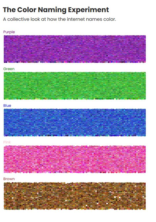
🌈 What happens when thousands of internet users name colors?
This week for #TidyTuesday, I charted the chaos (and charm) of the xkcd color survey.
🔵🟢🟣 Each dot is a color someone called “blue”, “green”, “purple”...
Made with #Graphane:
playground.graphane.dev/editor/gurzt...
#DataViz #Color
This week for #TidyTuesday, I charted the chaos (and charm) of the xkcd color survey.
🔵🟢🟣 Each dot is a color someone called “blue”, “green”, “purple”...
Made with #Graphane:
playground.graphane.dev/editor/gurzt...
#DataViz #Color
July 9, 2025 at 10:43 AM
🌈 What happens when thousands of internet users name colors?
This week for #TidyTuesday, I charted the chaos (and charm) of the xkcd color survey.
🔵🟢🟣 Each dot is a color someone called “blue”, “green”, “purple”...
Made with #Graphane:
playground.graphane.dev/editor/gurzt...
#DataViz #Color
This week for #TidyTuesday, I charted the chaos (and charm) of the xkcd color survey.
🔵🟢🟣 Each dot is a color someone called “blue”, “green”, “purple”...
Made with #Graphane:
playground.graphane.dev/editor/gurzt...
#DataViz #Color
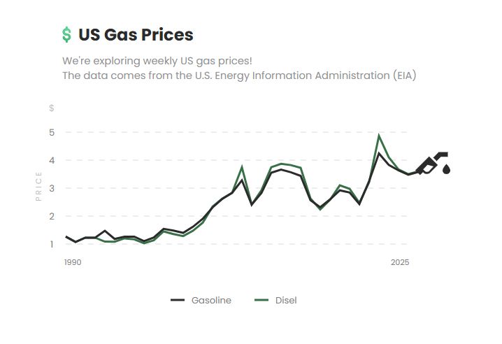
⛽US Gas Prices
For this week’s #TidyTuesday, I visualized annual average fuel prices in the US from 1990 to 2025.
📈Each line shows how gas and diesel prices changed — shaped by economics, events, and policy.
Visual made with #Graphane:
playground.graphane.dev/editor/gjz5x...
#DataViz #FuelPrices
For this week’s #TidyTuesday, I visualized annual average fuel prices in the US from 1990 to 2025.
📈Each line shows how gas and diesel prices changed — shaped by economics, events, and policy.
Visual made with #Graphane:
playground.graphane.dev/editor/gjz5x...
#DataViz #FuelPrices
July 2, 2025 at 10:49 AM
⛽US Gas Prices
For this week’s #TidyTuesday, I visualized annual average fuel prices in the US from 1990 to 2025.
📈Each line shows how gas and diesel prices changed — shaped by economics, events, and policy.
Visual made with #Graphane:
playground.graphane.dev/editor/gjz5x...
#DataViz #FuelPrices
For this week’s #TidyTuesday, I visualized annual average fuel prices in the US from 1990 to 2025.
📈Each line shows how gas and diesel prices changed — shaped by economics, events, and policy.
Visual made with #Graphane:
playground.graphane.dev/editor/gjz5x...
#DataViz #FuelPrices
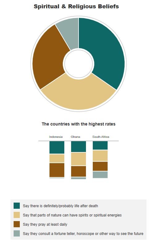
🌀Spiritual Beliefs Around the World
For this week’s #MakeoverMonday, I visualized how religions across countries connect with:
life after death, daily prayer, nature's energy, and fortune telling.
Visual built with #Graphane:
playground.graphane.dev/editor/ggof9...
#DataViz #Spirituality #Religions
For this week’s #MakeoverMonday, I visualized how religions across countries connect with:
life after death, daily prayer, nature's energy, and fortune telling.
Visual built with #Graphane:
playground.graphane.dev/editor/ggof9...
#DataViz #Spirituality #Religions
July 1, 2025 at 12:12 PM
🌀Spiritual Beliefs Around the World
For this week’s #MakeoverMonday, I visualized how religions across countries connect with:
life after death, daily prayer, nature's energy, and fortune telling.
Visual built with #Graphane:
playground.graphane.dev/editor/ggof9...
#DataViz #Spirituality #Religions
For this week’s #MakeoverMonday, I visualized how religions across countries connect with:
life after death, daily prayer, nature's energy, and fortune telling.
Visual built with #Graphane:
playground.graphane.dev/editor/ggof9...
#DataViz #Spirituality #Religions
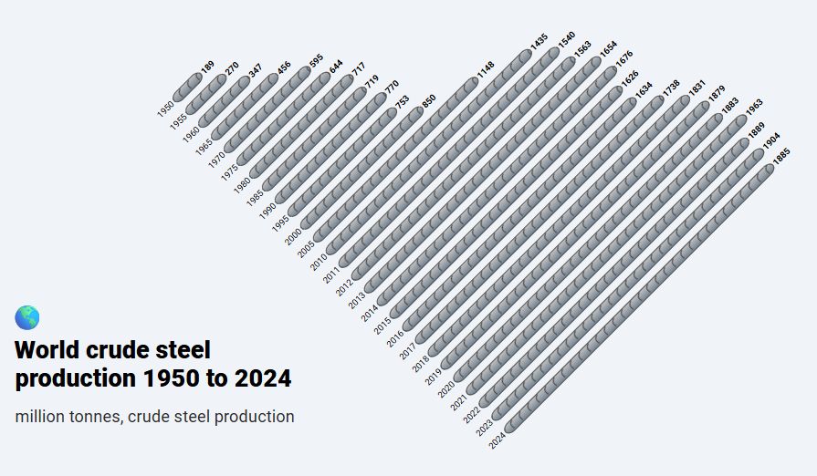
🔩📊World Crude Steel Production
For this week’s #MakeoverMonday,
To add a special visual touch, I represented the bars as real steel bars, where the length of each reflects the tons produced per year.
Visual made with #Graphane:
playground.graphane.dev/editor/g5pv6...
#DataViz #SteelProduction
For this week’s #MakeoverMonday,
To add a special visual touch, I represented the bars as real steel bars, where the length of each reflects the tons produced per year.
Visual made with #Graphane:
playground.graphane.dev/editor/g5pv6...
#DataViz #SteelProduction
June 10, 2025 at 3:59 PM
🔩📊World Crude Steel Production
For this week’s #MakeoverMonday,
To add a special visual touch, I represented the bars as real steel bars, where the length of each reflects the tons produced per year.
Visual made with #Graphane:
playground.graphane.dev/editor/g5pv6...
#DataViz #SteelProduction
For this week’s #MakeoverMonday,
To add a special visual touch, I represented the bars as real steel bars, where the length of each reflects the tons produced per year.
Visual made with #Graphane:
playground.graphane.dev/editor/g5pv6...
#DataViz #SteelProduction
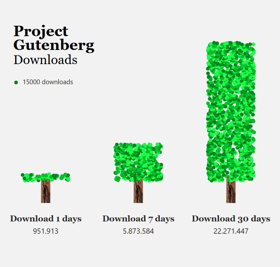
📚 Project Gutenberg Downloads
For this week’s #TidyTuesday, I visualized downloads over 1, 7, and 30 days.
Each tree shows a span — each leaf a download.
🌳A growing forest for every paper book we didn’t need to print.
Visual made with #Graphane:
playground.graphane.dev/editor/g621m...
#DataViz
For this week’s #TidyTuesday, I visualized downloads over 1, 7, and 30 days.
Each tree shows a span — each leaf a download.
🌳A growing forest for every paper book we didn’t need to print.
Visual made with #Graphane:
playground.graphane.dev/editor/g621m...
#DataViz
June 3, 2025 at 8:18 AM
📚 Project Gutenberg Downloads
For this week’s #TidyTuesday, I visualized downloads over 1, 7, and 30 days.
Each tree shows a span — each leaf a download.
🌳A growing forest for every paper book we didn’t need to print.
Visual made with #Graphane:
playground.graphane.dev/editor/g621m...
#DataViz
For this week’s #TidyTuesday, I visualized downloads over 1, 7, and 30 days.
Each tree shows a span — each leaf a download.
🌳A growing forest for every paper book we didn’t need to print.
Visual made with #Graphane:
playground.graphane.dev/editor/g621m...
#DataViz
🎲 Dungeons & Dragons: Who Can Take It and Who Dishes It Out?
For this week’s #TidyTuesday, I made Scatter plot of HP vs. total damage per character.
The Tarrasque dominates in HP, the Solar in damage.
Visual made with #Graphane:
playground.graphane.dev/editor/g5q1x...
#DataViz
For this week’s #TidyTuesday, I made Scatter plot of HP vs. total damage per character.
The Tarrasque dominates in HP, the Solar in damage.
Visual made with #Graphane:
playground.graphane.dev/editor/g5q1x...
#DataViz
May 28, 2025 at 8:42 AM
🎲 Dungeons & Dragons: Who Can Take It and Who Dishes It Out?
For this week’s #TidyTuesday, I made Scatter plot of HP vs. total damage per character.
The Tarrasque dominates in HP, the Solar in damage.
Visual made with #Graphane:
playground.graphane.dev/editor/g5q1x...
#DataViz
For this week’s #TidyTuesday, I made Scatter plot of HP vs. total damage per character.
The Tarrasque dominates in HP, the Solar in damage.
Visual made with #Graphane:
playground.graphane.dev/editor/g5q1x...
#DataViz
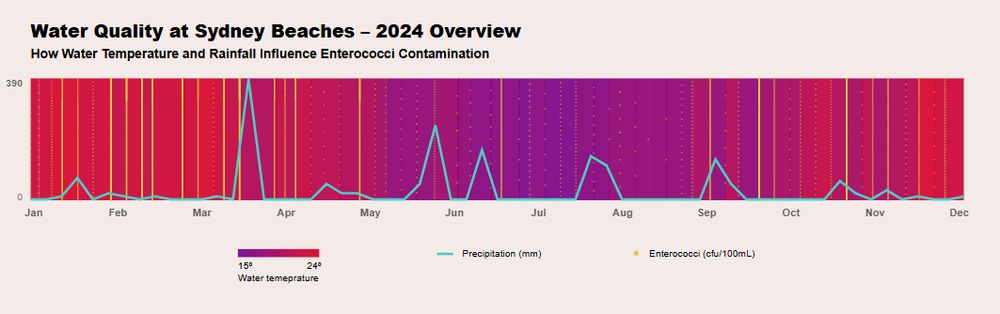
🌊 Water Quality at Sydney Beaches
For this week’s #TidyTuesday, I explored how water temperature and rainfall influence enterococci contamination in 2024.
Visual made with #Graphane:
playground.graphane.dev/editor/gcatt...
#DataViz
For this week’s #TidyTuesday, I explored how water temperature and rainfall influence enterococci contamination in 2024.
Visual made with #Graphane:
playground.graphane.dev/editor/gcatt...
#DataViz
May 20, 2025 at 7:42 AM
🌊 Water Quality at Sydney Beaches
For this week’s #TidyTuesday, I explored how water temperature and rainfall influence enterococci contamination in 2024.
Visual made with #Graphane:
playground.graphane.dev/editor/gcatt...
#DataViz
For this week’s #TidyTuesday, I explored how water temperature and rainfall influence enterococci contamination in 2024.
Visual made with #Graphane:
playground.graphane.dev/editor/gcatt...
#DataViz
🌋 Seismic Events at Mount Vesuvius
For this week’s #TidyTuesday, I visualized seismic depths from 2013–2024.
Each circle shows an event, with its size reflecting how far the shockwave could spread from the epicenter.
You can see this in #Graphane:
playground.graphane.dev/editor/gazn7...
#DataViz
For this week’s #TidyTuesday, I visualized seismic depths from 2013–2024.
Each circle shows an event, with its size reflecting how far the shockwave could spread from the epicenter.
You can see this in #Graphane:
playground.graphane.dev/editor/gazn7...
#DataViz
May 13, 2025 at 8:32 AM
🌋 Seismic Events at Mount Vesuvius
For this week’s #TidyTuesday, I visualized seismic depths from 2013–2024.
Each circle shows an event, with its size reflecting how far the shockwave could spread from the epicenter.
You can see this in #Graphane:
playground.graphane.dev/editor/gazn7...
#DataViz
For this week’s #TidyTuesday, I visualized seismic depths from 2013–2024.
Each circle shows an event, with its size reflecting how far the shockwave could spread from the epicenter.
You can see this in #Graphane:
playground.graphane.dev/editor/gazn7...
#DataViz
📈📅30 charts in 30 days.
A month of exploring stories through data.
Grateful for the ride — and for everyone who followed along.
Big thanks to #Graphane for being the canvas behind every chart. 📊🖤
You can see it in my gallery:
playground.graphane.dev/gallery/@cod...
#30DayChartChallenge #DataViz
A month of exploring stories through data.
Grateful for the ride — and for everyone who followed along.
Big thanks to #Graphane for being the canvas behind every chart. 📊🖤
You can see it in my gallery:
playground.graphane.dev/gallery/@cod...
#30DayChartChallenge #DataViz
April 30, 2025 at 11:04 AM
📈📅30 charts in 30 days.
A month of exploring stories through data.
Grateful for the ride — and for everyone who followed along.
Big thanks to #Graphane for being the canvas behind every chart. 📊🖤
You can see it in my gallery:
playground.graphane.dev/gallery/@cod...
#30DayChartChallenge #DataViz
A month of exploring stories through data.
Grateful for the ride — and for everyone who followed along.
Big thanks to #Graphane for being the canvas behind every chart. 📊🖤
You can see it in my gallery:
playground.graphane.dev/gallery/@cod...
#30DayChartChallenge #DataViz
Day 30 of the #30DayChartChallenge! 📊
Today's theme: National Geographic 🌍
I traced the vanishing path of Arctic sea ice, 1999–2014.
Once perennial, now ephemeral.
Based on a National Geographic article.
#DataViz #Graphane #ClimateCrisis
See it here:
playground.graphane.dev/editor/ggvdl...
Today's theme: National Geographic 🌍
I traced the vanishing path of Arctic sea ice, 1999–2014.
Once perennial, now ephemeral.
Based on a National Geographic article.
#DataViz #Graphane #ClimateCrisis
See it here:
playground.graphane.dev/editor/ggvdl...
April 30, 2025 at 9:42 AM
Day 30 of the #30DayChartChallenge! 📊
Today's theme: National Geographic 🌍
I traced the vanishing path of Arctic sea ice, 1999–2014.
Once perennial, now ephemeral.
Based on a National Geographic article.
#DataViz #Graphane #ClimateCrisis
See it here:
playground.graphane.dev/editor/ggvdl...
Today's theme: National Geographic 🌍
I traced the vanishing path of Arctic sea ice, 1999–2014.
Once perennial, now ephemeral.
Based on a National Geographic article.
#DataViz #Graphane #ClimateCrisis
See it here:
playground.graphane.dev/editor/ggvdl...
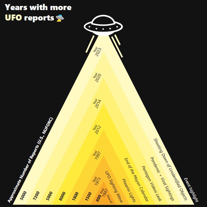
Day 29 of the #30DayChartChallenge! 👽
Today's theme: Extraterrestrial 🛸
A timeline of Earth’s most UFO-obsessed years, based on real sighting reports.
Turns out the skies get busier when the world gets weirder.
#DataViz #Charts #Graphane #UFO
See it here:
playground.graphane.dev/editor/gj9xw...
Today's theme: Extraterrestrial 🛸
A timeline of Earth’s most UFO-obsessed years, based on real sighting reports.
Turns out the skies get busier when the world gets weirder.
#DataViz #Charts #Graphane #UFO
See it here:
playground.graphane.dev/editor/gj9xw...
April 29, 2025 at 1:13 PM
Day 29 of the #30DayChartChallenge! 👽
Today's theme: Extraterrestrial 🛸
A timeline of Earth’s most UFO-obsessed years, based on real sighting reports.
Turns out the skies get busier when the world gets weirder.
#DataViz #Charts #Graphane #UFO
See it here:
playground.graphane.dev/editor/gj9xw...
Today's theme: Extraterrestrial 🛸
A timeline of Earth’s most UFO-obsessed years, based on real sighting reports.
Turns out the skies get busier when the world gets weirder.
#DataViz #Charts #Graphane #UFO
See it here:
playground.graphane.dev/editor/gj9xw...
Day 28 of the #30DayChartChallenge! 📊
Today's theme: #Inclusion 🫶
From the self to society —
A journey across 6 layers of inclusion.
Social inclusion isn't a single circle — it's a system.
#DataViz #Charts #Graphane
See it here:
playground.graphane.dev/editor/g0otm...
Today's theme: #Inclusion 🫶
From the self to society —
A journey across 6 layers of inclusion.
Social inclusion isn't a single circle — it's a system.
#DataViz #Charts #Graphane
See it here:
playground.graphane.dev/editor/g0otm...
April 28, 2025 at 8:29 AM
Day 28 of the #30DayChartChallenge! 📊
Today's theme: #Inclusion 🫶
From the self to society —
A journey across 6 layers of inclusion.
Social inclusion isn't a single circle — it's a system.
#DataViz #Charts #Graphane
See it here:
playground.graphane.dev/editor/g0otm...
Today's theme: #Inclusion 🫶
From the self to society —
A journey across 6 layers of inclusion.
Social inclusion isn't a single circle — it's a system.
#DataViz #Charts #Graphane
See it here:
playground.graphane.dev/editor/g0otm...
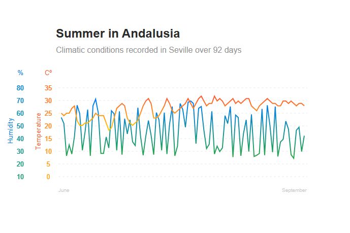
Day 27 of the #30DayChartChallenge! 📊
Today's theme: Noise 🌡️💦
Summer in Andalusia.
92 days of temperature and humidity recorded in Seville — patterns shaped by heatwaves and moisture shifts.
#DataViz #Charts #Graphane
See it here:
playground.graphane.dev/editor/go6k9...
Today's theme: Noise 🌡️💦
Summer in Andalusia.
92 days of temperature and humidity recorded in Seville — patterns shaped by heatwaves and moisture shifts.
#DataViz #Charts #Graphane
See it here:
playground.graphane.dev/editor/go6k9...
April 27, 2025 at 11:01 AM
Day 27 of the #30DayChartChallenge! 📊
Today's theme: Noise 🌡️💦
Summer in Andalusia.
92 days of temperature and humidity recorded in Seville — patterns shaped by heatwaves and moisture shifts.
#DataViz #Charts #Graphane
See it here:
playground.graphane.dev/editor/go6k9...
Today's theme: Noise 🌡️💦
Summer in Andalusia.
92 days of temperature and humidity recorded in Seville — patterns shaped by heatwaves and moisture shifts.
#DataViz #Charts #Graphane
See it here:
playground.graphane.dev/editor/go6k9...
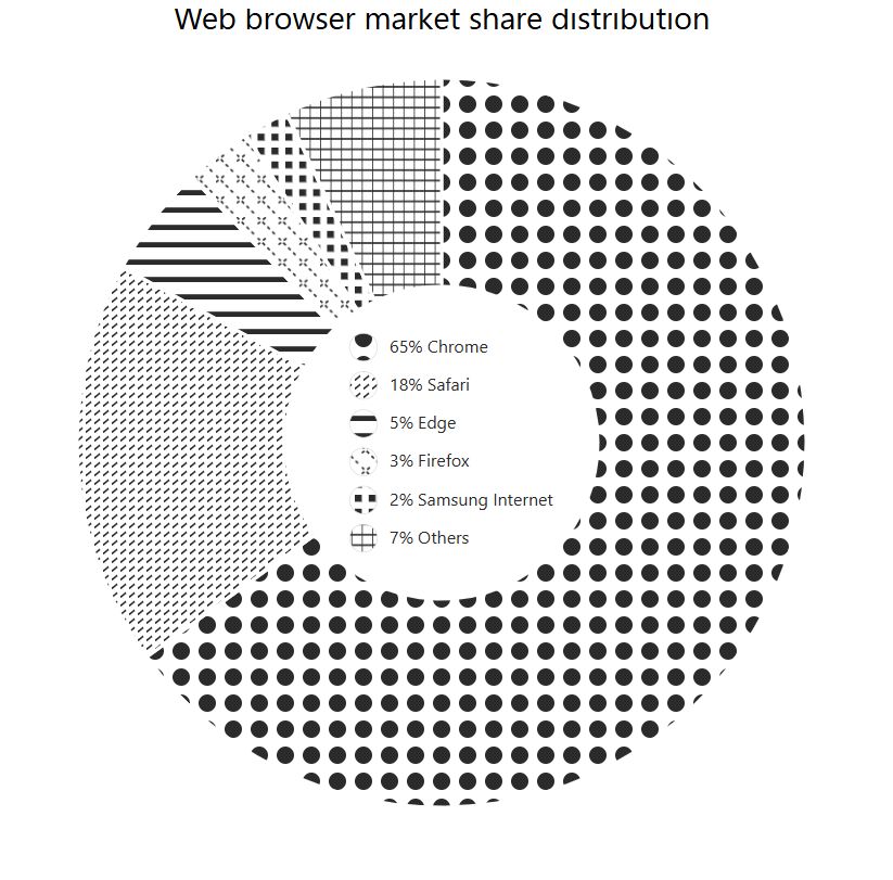
Day 26 of the #30DayChartChallenge! 📊
Today's theme: Monochrome ⚫⚪
A black & white donut chart, with old-school style, showing who’s winning the browser wars. Chrome takes the bite, but others still have a slice.
#DataViz #Charts #Graphane
See it here:
playground.graphane.dev/editor/gkrw3...
Today's theme: Monochrome ⚫⚪
A black & white donut chart, with old-school style, showing who’s winning the browser wars. Chrome takes the bite, but others still have a slice.
#DataViz #Charts #Graphane
See it here:
playground.graphane.dev/editor/gkrw3...
April 26, 2025 at 11:23 AM
Day 26 of the #30DayChartChallenge! 📊
Today's theme: Monochrome ⚫⚪
A black & white donut chart, with old-school style, showing who’s winning the browser wars. Chrome takes the bite, but others still have a slice.
#DataViz #Charts #Graphane
See it here:
playground.graphane.dev/editor/gkrw3...
Today's theme: Monochrome ⚫⚪
A black & white donut chart, with old-school style, showing who’s winning the browser wars. Chrome takes the bite, but others still have a slice.
#DataViz #Charts #Graphane
See it here:
playground.graphane.dev/editor/gkrw3...
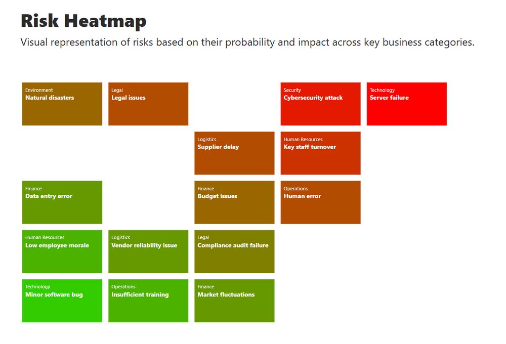
Day 25 of the #30DayChartChallenge! 📊
Today's theme: Risk ⚠️
Visualized business risks by probability and impact —
a heatmap of what could go wrong, and how bad it could be.
#DataViz #Charts #Graphane
See it here:
playground.graphane.dev/editor/gvi5x...
Today's theme: Risk ⚠️
Visualized business risks by probability and impact —
a heatmap of what could go wrong, and how bad it could be.
#DataViz #Charts #Graphane
See it here:
playground.graphane.dev/editor/gvi5x...
April 25, 2025 at 9:05 AM
Day 25 of the #30DayChartChallenge! 📊
Today's theme: Risk ⚠️
Visualized business risks by probability and impact —
a heatmap of what could go wrong, and how bad it could be.
#DataViz #Charts #Graphane
See it here:
playground.graphane.dev/editor/gvi5x...
Today's theme: Risk ⚠️
Visualized business risks by probability and impact —
a heatmap of what could go wrong, and how bad it could be.
#DataViz #Charts #Graphane
See it here:
playground.graphane.dev/editor/gvi5x...
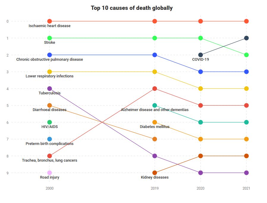
Day 24 of the #30DayChartChallenge! 📊
Theme: Data Day: WHO⚕️
How the end shifts over time.
Top 10 causes of death from 2000 to 2021 —
some diseases fade, others take their place.
#DataViz #Charts #Graphane #WHO #Health
See it here:
playground.graphane.dev/editor/gmfut...
Theme: Data Day: WHO⚕️
How the end shifts over time.
Top 10 causes of death from 2000 to 2021 —
some diseases fade, others take their place.
#DataViz #Charts #Graphane #WHO #Health
See it here:
playground.graphane.dev/editor/gmfut...
April 24, 2025 at 7:35 AM
Day 24 of the #30DayChartChallenge! 📊
Theme: Data Day: WHO⚕️
How the end shifts over time.
Top 10 causes of death from 2000 to 2021 —
some diseases fade, others take their place.
#DataViz #Charts #Graphane #WHO #Health
See it here:
playground.graphane.dev/editor/gmfut...
Theme: Data Day: WHO⚕️
How the end shifts over time.
Top 10 causes of death from 2000 to 2021 —
some diseases fade, others take their place.
#DataViz #Charts #Graphane #WHO #Health
See it here:
playground.graphane.dev/editor/gmfut...
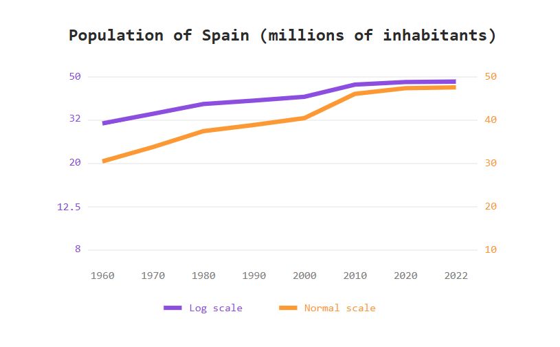
Day 23 of the #30DayChartChallenge! 📊
Today's theme: Log Scales 📈
Same data, two views.
Spain’s population (1960–2022) —
one line linear, one logarithmic.
Growth feels different when perception shifts.
#DataViz #Charts #Graphane #Spain
See it here:
playground.graphane.dev/editor/gku93...
Today's theme: Log Scales 📈
Same data, two views.
Spain’s population (1960–2022) —
one line linear, one logarithmic.
Growth feels different when perception shifts.
#DataViz #Charts #Graphane #Spain
See it here:
playground.graphane.dev/editor/gku93...
April 23, 2025 at 10:33 AM
Day 23 of the #30DayChartChallenge! 📊
Today's theme: Log Scales 📈
Same data, two views.
Spain’s population (1960–2022) —
one line linear, one logarithmic.
Growth feels different when perception shifts.
#DataViz #Charts #Graphane #Spain
See it here:
playground.graphane.dev/editor/gku93...
Today's theme: Log Scales 📈
Same data, two views.
Spain’s population (1960–2022) —
one line linear, one logarithmic.
Growth feels different when perception shifts.
#DataViz #Charts #Graphane #Spain
See it here:
playground.graphane.dev/editor/gku93...
Day 22 of the #30DayChartChallenge! 📊
Today's theme: Stars ⭐
Not all that glitters is close.
This chart plots the brightest stars in our sky —
Some shine nearby, others burn far away. ✨
#DataViz #Charts #Graphane #Astronomy #Stars
See it here:
playground.graphane.dev/editor/gm3xm...
Today's theme: Stars ⭐
Not all that glitters is close.
This chart plots the brightest stars in our sky —
Some shine nearby, others burn far away. ✨
#DataViz #Charts #Graphane #Astronomy #Stars
See it here:
playground.graphane.dev/editor/gm3xm...
April 22, 2025 at 11:20 AM
Day 22 of the #30DayChartChallenge! 📊
Today's theme: Stars ⭐
Not all that glitters is close.
This chart plots the brightest stars in our sky —
Some shine nearby, others burn far away. ✨
#DataViz #Charts #Graphane #Astronomy #Stars
See it here:
playground.graphane.dev/editor/gm3xm...
Today's theme: Stars ⭐
Not all that glitters is close.
This chart plots the brightest stars in our sky —
Some shine nearby, others burn far away. ✨
#DataViz #Charts #Graphane #Astronomy #Stars
See it here:
playground.graphane.dev/editor/gm3xm...
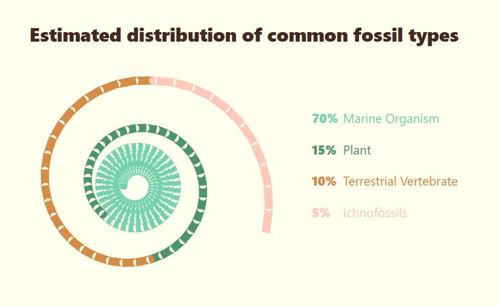
Day 21 of the #30DayChartChallenge! 📊
Today's theme: Fossil 🦴🌀
I created a spiral chart showing the types of fossils found —
marine life dominates, while traces and vertebrates are rare relics.
#DataViz #Charts #Graphane
See it here:
playground.graphane.dev/editor/gn41m...
Today's theme: Fossil 🦴🌀
I created a spiral chart showing the types of fossils found —
marine life dominates, while traces and vertebrates are rare relics.
#DataViz #Charts #Graphane
See it here:
playground.graphane.dev/editor/gn41m...
April 21, 2025 at 2:15 PM
Day 21 of the #30DayChartChallenge! 📊
Today's theme: Fossil 🦴🌀
I created a spiral chart showing the types of fossils found —
marine life dominates, while traces and vertebrates are rare relics.
#DataViz #Charts #Graphane
See it here:
playground.graphane.dev/editor/gn41m...
Today's theme: Fossil 🦴🌀
I created a spiral chart showing the types of fossils found —
marine life dominates, while traces and vertebrates are rare relics.
#DataViz #Charts #Graphane
See it here:
playground.graphane.dev/editor/gn41m...
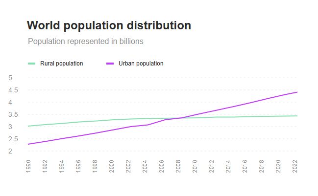
Day 20 of the #30DayChartChallenge! 📊
Today's theme: Urbanization 🌆🌾
I charted urban vs rural population from 1990 to 2022 —
a steady climb for rural areas, but cities are growing much faster.
#DataViz #Charts #Graphane
See it here:
playground.graphane.dev/editor/ghq08...
Today's theme: Urbanization 🌆🌾
I charted urban vs rural population from 1990 to 2022 —
a steady climb for rural areas, but cities are growing much faster.
#DataViz #Charts #Graphane
See it here:
playground.graphane.dev/editor/ghq08...
April 20, 2025 at 10:56 AM
Day 20 of the #30DayChartChallenge! 📊
Today's theme: Urbanization 🌆🌾
I charted urban vs rural population from 1990 to 2022 —
a steady climb for rural areas, but cities are growing much faster.
#DataViz #Charts #Graphane
See it here:
playground.graphane.dev/editor/ghq08...
Today's theme: Urbanization 🌆🌾
I charted urban vs rural population from 1990 to 2022 —
a steady climb for rural areas, but cities are growing much faster.
#DataViz #Charts #Graphane
See it here:
playground.graphane.dev/editor/ghq08...
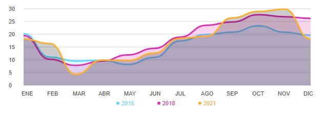
Day 19 of the #30DayChartChallenge! 📊
Today's theme: Smooth 🌫️
I visualized PM2.5 air pollution trends across Europe from 2015 to 2021. 🌍💨
The data shows a clear seasonal rhythm:
PM2.5 ↓☀️summer, ↑❄️winter
#DataViz #Charts #Graphane
See it here:
playground.graphane.dev/editor/glyw5...
Today's theme: Smooth 🌫️
I visualized PM2.5 air pollution trends across Europe from 2015 to 2021. 🌍💨
The data shows a clear seasonal rhythm:
PM2.5 ↓☀️summer, ↑❄️winter
#DataViz #Charts #Graphane
See it here:
playground.graphane.dev/editor/glyw5...
April 19, 2025 at 10:56 AM
Day 19 of the #30DayChartChallenge! 📊
Today's theme: Smooth 🌫️
I visualized PM2.5 air pollution trends across Europe from 2015 to 2021. 🌍💨
The data shows a clear seasonal rhythm:
PM2.5 ↓☀️summer, ↑❄️winter
#DataViz #Charts #Graphane
See it here:
playground.graphane.dev/editor/glyw5...
Today's theme: Smooth 🌫️
I visualized PM2.5 air pollution trends across Europe from 2015 to 2021. 🌍💨
The data shows a clear seasonal rhythm:
PM2.5 ↓☀️summer, ↑❄️winter
#DataViz #Charts #Graphane
See it here:
playground.graphane.dev/editor/glyw5...