


🌡️ Radial Temperature
Chart showing how min (blue) and max (red) temps change through the year. The shaded area shows their average variation and seasonal contrast.
👉 Made with Grapper: playground.grapper.io/editor/gu5oy...
#DataViz #Climate #RadialChart #Grapper
Chart showing how min (blue) and max (red) temps change through the year. The shaded area shows their average variation and seasonal contrast.
👉 Made with Grapper: playground.grapper.io/editor/gu5oy...
#DataViz #Climate #RadialChart #Grapper

October 31, 2025 at 8:23 AM
🌡️ Radial Temperature
Chart showing how min (blue) and max (red) temps change through the year. The shaded area shows their average variation and seasonal contrast.
👉 Made with Grapper: playground.grapper.io/editor/gu5oy...
#DataViz #Climate #RadialChart #Grapper
Chart showing how min (blue) and max (red) temps change through the year. The shaded area shows their average variation and seasonal contrast.
👉 Made with Grapper: playground.grapper.io/editor/gu5oy...
#DataViz #Climate #RadialChart #Grapper

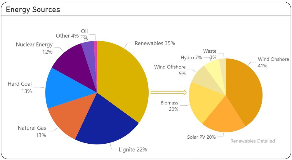
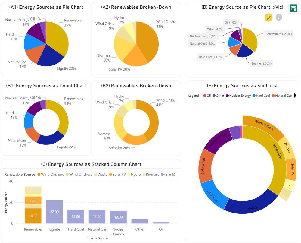
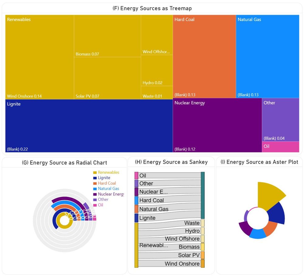
📊𝗣𝗶𝗲 𝗮𝗻𝗱 𝗗𝗼𝗻𝘂𝘁 𝗖𝗵𝗮𝗿𝘁𝘀 𝗶𝗻 𝗣𝗼𝘄𝗲𝗿 𝗕𝗜
There are many voices against the use of pie and donut #charts, though they have their place in #dataviz. However, one should consider also the alternatives, when appropriate.
#PowerBI #piechart #donut #treemap #sankey #aster #radialchart
tinyurl.com/5fkcys5f
There are many voices against the use of pie and donut #charts, though they have their place in #dataviz. However, one should consider also the alternatives, when appropriate.
#PowerBI #piechart #donut #treemap #sankey #aster #radialchart
tinyurl.com/5fkcys5f
December 16, 2024 at 12:50 AM
📊𝗣𝗶𝗲 𝗮𝗻𝗱 𝗗𝗼𝗻𝘂𝘁 𝗖𝗵𝗮𝗿𝘁𝘀 𝗶𝗻 𝗣𝗼𝘄𝗲𝗿 𝗕𝗜
There are many voices against the use of pie and donut #charts, though they have their place in #dataviz. However, one should consider also the alternatives, when appropriate.
#PowerBI #piechart #donut #treemap #sankey #aster #radialchart
tinyurl.com/5fkcys5f
There are many voices against the use of pie and donut #charts, though they have their place in #dataviz. However, one should consider also the alternatives, when appropriate.
#PowerBI #piechart #donut #treemap #sankey #aster #radialchart
tinyurl.com/5fkcys5f

Diving into #Vermont wildlife for the #30DayChartChallenge "circle" day! 🦌 Using #Python & #plotly to compare monthly #Moose and #BlackBear sightings 🐻 Data wrangled with #BigQuery and #SQL. Any guesses which animal is seen more consistently throughout the year? 😜 #DataViz #Wildlife #RadialChart

April 3, 2025 at 8:10 PM
Diving into #Vermont wildlife for the #30DayChartChallenge "circle" day! 🦌 Using #Python & #plotly to compare monthly #Moose and #BlackBear sightings 🐻 Data wrangled with #BigQuery and #SQL. Any guesses which animal is seen more consistently throughout the year? 😜 #DataViz #Wildlife #RadialChart