


WebcoreUI
@webcoreui.bsky.social
Astro UI component library with Svelte + React support. Get fully coded frontend components on webcoreui.dev
✨ Updates to Modal in Astro
We released new updates to the Modal & Sheet components API. Now you can:
✅ Navigate between multiple modals
✅ Compatible API for sheets
Updated docs available on webcoreui.dev/docs/modal#m...
We released new updates to the Modal & Sheet components API. Now you can:
✅ Navigate between multiple modals
✅ Compatible API for sheets
Updated docs available on webcoreui.dev/docs/modal#m...

November 12, 2025 at 8:41 AM
✨ Updates to Modal in Astro
We released new updates to the Modal & Sheet components API. Now you can:
✅ Navigate between multiple modals
✅ Compatible API for sheets
Updated docs available on webcoreui.dev/docs/modal#m...
We released new updates to the Modal & Sheet components API. Now you can:
✅ Navigate between multiple modals
✅ Compatible API for sheets
Updated docs available on webcoreui.dev/docs/modal#m...
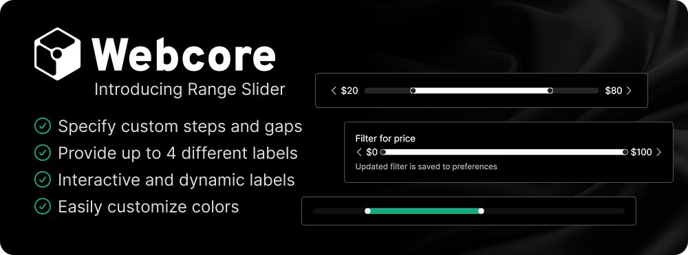
✨ Introducing Range Slider for Astro
Use the RangeSlider component in Astro to allow your users to select a range for a numeric value.
✅ Provide up to 4 different labels
✅ Interactive & dynamic labels
✅ Easily customize colors
Docs available on webcoreui.dev/docs/range-s...
Use the RangeSlider component in Astro to allow your users to select a range for a numeric value.
✅ Provide up to 4 different labels
✅ Interactive & dynamic labels
✅ Easily customize colors
Docs available on webcoreui.dev/docs/range-s...
November 11, 2025 at 8:44 AM
✨ Introducing Range Slider for Astro
Use the RangeSlider component in Astro to allow your users to select a range for a numeric value.
✅ Provide up to 4 different labels
✅ Interactive & dynamic labels
✅ Easily customize colors
Docs available on webcoreui.dev/docs/range-s...
Use the RangeSlider component in Astro to allow your users to select a range for a numeric value.
✅ Provide up to 4 different labels
✅ Interactive & dynamic labels
✅ Easily customize colors
Docs available on webcoreui.dev/docs/range-s...
🚀 Introducing Webcore v1.2.0
✅ New RangeSlider component
✅ Responsive itemsPerSlide for Carousel
✅ Multimodal support for Modals & Sheets
✅ Smart filling for Form blocks
Read more about the changes:
webcoreui.dev/docs/changelog
✅ New RangeSlider component
✅ Responsive itemsPerSlide for Carousel
✅ Multimodal support for Modals & Sheets
✅ Smart filling for Form blocks
Read more about the changes:
webcoreui.dev/docs/changelog

November 10, 2025 at 8:57 AM
🚀 Introducing Webcore v1.2.0
✅ New RangeSlider component
✅ Responsive itemsPerSlide for Carousel
✅ Multimodal support for Modals & Sheets
✅ Smart filling for Form blocks
Read more about the changes:
webcoreui.dev/docs/changelog
✅ New RangeSlider component
✅ Responsive itemsPerSlide for Carousel
✅ Multimodal support for Modals & Sheets
✅ Smart filling for Form blocks
Read more about the changes:
webcoreui.dev/docs/changelog
✨ Introducing Smart Fill
You can now call useSmartFill on your form instance to let users copy-paste blocks of unstructured text into your form, and fill in relevant inputs with a single paste.
✅ Also supports defining your own matchers
Updated docs available at webcoreui.dev/blocks/form#...
You can now call useSmartFill on your form instance to let users copy-paste blocks of unstructured text into your form, and fill in relevant inputs with a single paste.
✅ Also supports defining your own matchers
Updated docs available at webcoreui.dev/blocks/form#...

November 5, 2025 at 8:41 AM
✨ Introducing Smart Fill
You can now call useSmartFill on your form instance to let users copy-paste blocks of unstructured text into your form, and fill in relevant inputs with a single paste.
✅ Also supports defining your own matchers
Updated docs available at webcoreui.dev/blocks/form#...
You can now call useSmartFill on your form instance to let users copy-paste blocks of unstructured text into your form, and fill in relevant inputs with a single paste.
✅ Also supports defining your own matchers
Updated docs available at webcoreui.dev/blocks/form#...
✨ New CLI update
We just released a new version of our CLI tool!
➡ Dependent blocks are now added automatically
➡ Import statements auto-update when using custom component folders
Docs available on webcoreui.dev/docs/cli
We just released a new version of our CLI tool!
➡ Dependent blocks are now added automatically
➡ Import statements auto-update when using custom component folders
Docs available on webcoreui.dev/docs/cli

September 23, 2025 at 7:44 AM
✨ New CLI update
We just released a new version of our CLI tool!
➡ Dependent blocks are now added automatically
➡ Import statements auto-update when using custom component folders
Docs available on webcoreui.dev/docs/cli
We just released a new version of our CLI tool!
➡ Dependent blocks are now added automatically
➡ Import statements auto-update when using custom component folders
Docs available on webcoreui.dev/docs/cli
✨ Updates to Hero
Now you can also add avatars and ratings via props to our updated Hero components in Astro.
Read more about how in our updated docs at webcoreui.dev/blocks/hero
Now you can also add avatars and ratings via props to our updated Hero components in Astro.
Read more about how in our updated docs at webcoreui.dev/blocks/hero

September 22, 2025 at 7:57 AM
✨ Updates to Hero
Now you can also add avatars and ratings via props to our updated Hero components in Astro.
Read more about how in our updated docs at webcoreui.dev/blocks/hero
Now you can also add avatars and ratings via props to our updated Hero components in Astro.
Read more about how in our updated docs at webcoreui.dev/blocks/hero
✨ Introducing Avatar with Rating
Use the Avatar with Rating component in Astro to display an avatar group with user feedback to build trust.
✅ Visually represent user feedback
✅ Customize avatars and ratings
✅ Use different layouts
Docs available on webcoreui.dev/blocks/avata...
Use the Avatar with Rating component in Astro to display an avatar group with user feedback to build trust.
✅ Visually represent user feedback
✅ Customize avatars and ratings
✅ Use different layouts
Docs available on webcoreui.dev/blocks/avata...

September 17, 2025 at 7:41 AM
✨ Introducing Avatar with Rating
Use the Avatar with Rating component in Astro to display an avatar group with user feedback to build trust.
✅ Visually represent user feedback
✅ Customize avatars and ratings
✅ Use different layouts
Docs available on webcoreui.dev/blocks/avata...
Use the Avatar with Rating component in Astro to display an avatar group with user feedback to build trust.
✅ Visually represent user feedback
✅ Customize avatars and ratings
✅ Use different layouts
Docs available on webcoreui.dev/blocks/avata...
We just hit 100 stars on GitHub! ⭐
Thank you to everyone who has supported us by starring, contributing, and sharing our work. Your support helps us continue improving and building for the community. ❤️
If you haven’t checked it out yet, here’s your chance to be ⭐ #101:
github.com/Frontendland...
Thank you to everyone who has supported us by starring, contributing, and sharing our work. Your support helps us continue improving and building for the community. ❤️
If you haven’t checked it out yet, here’s your chance to be ⭐ #101:
github.com/Frontendland...

September 16, 2025 at 7:44 AM
We just hit 100 stars on GitHub! ⭐
Thank you to everyone who has supported us by starring, contributing, and sharing our work. Your support helps us continue improving and building for the community. ❤️
If you haven’t checked it out yet, here’s your chance to be ⭐ #101:
github.com/Frontendland...
Thank you to everyone who has supported us by starring, contributing, and sharing our work. Your support helps us continue improving and building for the community. ❤️
If you haven’t checked it out yet, here’s your chance to be ⭐ #101:
github.com/Frontendland...
✨ Updates to Switch
In our latest version, you can now format switch labels with HTML to bold, color, or change the look of your switch labels in any way you like.
📃 Updated docs available at webcoreui.dev/docs/switch
In our latest version, you can now format switch labels with HTML to bold, color, or change the look of your switch labels in any way you like.
📃 Updated docs available at webcoreui.dev/docs/switch

September 9, 2025 at 7:44 AM
✨ Updates to Switch
In our latest version, you can now format switch labels with HTML to bold, color, or change the look of your switch labels in any way you like.
📃 Updated docs available at webcoreui.dev/docs/switch
In our latest version, you can now format switch labels with HTML to bold, color, or change the look of your switch labels in any way you like.
📃 Updated docs available at webcoreui.dev/docs/switch
✨ Introducing Context Menu for Astro
Use the Context Menu to display a right-click menu with context-specific actions.
✅ Pass any element as the context menu
✅ JavaScript API to close menus programmatically
✅ Use a List to create feature-rich menus
Docs available on webcoreui.dev/docs/context...
Use the Context Menu to display a right-click menu with context-specific actions.
✅ Pass any element as the context menu
✅ JavaScript API to close menus programmatically
✅ Use a List to create feature-rich menus
Docs available on webcoreui.dev/docs/context...

September 8, 2025 at 7:57 AM
✨ Introducing Context Menu for Astro
Use the Context Menu to display a right-click menu with context-specific actions.
✅ Pass any element as the context menu
✅ JavaScript API to close menus programmatically
✅ Use a List to create feature-rich menus
Docs available on webcoreui.dev/docs/context...
Use the Context Menu to display a right-click menu with context-specific actions.
✅ Pass any element as the context menu
✅ JavaScript API to close menus programmatically
✅ Use a List to create feature-rich menus
Docs available on webcoreui.dev/docs/context...
✨ Setup project templates with one line
Use our updated CLI tool to bootstrap your new projects with one of our templates with a single line of command 🚀
✅ Setup templates with one line
✅ Auto-pull in dependencies
✅ Comes with an example page
Updated docs available on webcoreui.dev/docs/cli
Use our updated CLI tool to bootstrap your new projects with one of our templates with a single line of command 🚀
✅ Setup templates with one line
✅ Auto-pull in dependencies
✅ Comes with an example page
Updated docs available on webcoreui.dev/docs/cli

August 26, 2025 at 7:44 AM
✨ Setup project templates with one line
Use our updated CLI tool to bootstrap your new projects with one of our templates with a single line of command 🚀
✅ Setup templates with one line
✅ Auto-pull in dependencies
✅ Comes with an example page
Updated docs available on webcoreui.dev/docs/cli
Use our updated CLI tool to bootstrap your new projects with one of our templates with a single line of command 🚀
✅ Setup templates with one line
✅ Auto-pull in dependencies
✅ Comes with an example page
Updated docs available on webcoreui.dev/docs/cli
✨ Updates to Timeline
Now you can also create timelines with icons using our updated Timeline component in Astro. Read more about how in our updated docs available at webcoreui.dev/docs/timeline
Now you can also create timelines with icons using our updated Timeline component in Astro. Read more about how in our updated docs available at webcoreui.dev/docs/timeline

August 25, 2025 at 7:57 AM
✨ Updates to Timeline
Now you can also create timelines with icons using our updated Timeline component in Astro. Read more about how in our updated docs available at webcoreui.dev/docs/timeline
Now you can also create timelines with icons using our updated Timeline component in Astro. Read more about how in our updated docs available at webcoreui.dev/docs/timeline
✨ Updated CLI tool
Use our updated CLI to easily:
✅ Update config in existing projects
✅ Add blocks through your terminal
✅ Update Webcore programmatically
Docs available on webcoreui.dev/docs/cli
Use our updated CLI to easily:
✅ Update config in existing projects
✅ Add blocks through your terminal
✅ Update Webcore programmatically
Docs available on webcoreui.dev/docs/cli

August 20, 2025 at 7:41 AM
✨ Updated CLI tool
Use our updated CLI to easily:
✅ Update config in existing projects
✅ Add blocks through your terminal
✅ Update Webcore programmatically
Docs available on webcoreui.dev/docs/cli
Use our updated CLI to easily:
✅ Update config in existing projects
✅ Add blocks through your terminal
✅ Update Webcore programmatically
Docs available on webcoreui.dev/docs/cli
🚀 Introducing Webcore v1.1.0
✅ Easier setup flow with custom integration
✅ New ContextMenu component
✅ Improvements to existing components
✅ New blocks and templates
Read more about the changes:
webcoreui.dev/docs/changelog
✅ Easier setup flow with custom integration
✅ New ContextMenu component
✅ Improvements to existing components
✅ New blocks and templates
Read more about the changes:
webcoreui.dev/docs/changelog

August 19, 2025 at 7:44 AM
🚀 Introducing Webcore v1.1.0
✅ Easier setup flow with custom integration
✅ New ContextMenu component
✅ Improvements to existing components
✅ New blocks and templates
Read more about the changes:
webcoreui.dev/docs/changelog
✅ Easier setup flow with custom integration
✅ New ContextMenu component
✅ Improvements to existing components
✅ New blocks and templates
Read more about the changes:
webcoreui.dev/docs/changelog
✨ Introducing Carousel for Astro
Use the Carousel component to display a series of content items, such as images for image galleries
✅ Combine with any component
✅ Multiple items per slide
✅ Customize pagination
✅ Create with a progress bar
Docs available on webcoreui.dev/docs/carousel
Use the Carousel component to display a series of content items, such as images for image galleries
✅ Combine with any component
✅ Multiple items per slide
✅ Customize pagination
✅ Create with a progress bar
Docs available on webcoreui.dev/docs/carousel

August 11, 2025 at 7:57 AM
✨ Introducing Carousel for Astro
Use the Carousel component to display a series of content items, such as images for image galleries
✅ Combine with any component
✅ Multiple items per slide
✅ Customize pagination
✅ Create with a progress bar
Docs available on webcoreui.dev/docs/carousel
Use the Carousel component to display a series of content items, such as images for image galleries
✅ Combine with any component
✅ Multiple items per slide
✅ Customize pagination
✅ Create with a progress bar
Docs available on webcoreui.dev/docs/carousel
✨ Introducing Checkbox for Astro
Allow your users to make binary (yes/no, true/false) choices using the Checkbox component.
✅ Use alone or with multiple labels
✅ Create with custom colors
✅ Use existing HTML states
Docs available on webcoreui.dev/docs/checkbox
Allow your users to make binary (yes/no, true/false) choices using the Checkbox component.
✅ Use alone or with multiple labels
✅ Create with custom colors
✅ Use existing HTML states
Docs available on webcoreui.dev/docs/checkbox

August 6, 2025 at 7:41 AM
✨ Introducing Checkbox for Astro
Allow your users to make binary (yes/no, true/false) choices using the Checkbox component.
✅ Use alone or with multiple labels
✅ Create with custom colors
✅ Use existing HTML states
Docs available on webcoreui.dev/docs/checkbox
Allow your users to make binary (yes/no, true/false) choices using the Checkbox component.
✅ Use alone or with multiple labels
✅ Create with custom colors
✅ Use existing HTML states
Docs available on webcoreui.dev/docs/checkbox
✨ Introducing Collapsible for Astro
Use the Collapsible component to manage large sets of content in a compact way.
✅ Use with any component
✅ Create partially visible elements
✅ Customize toggle elements
✅ Turn animation on/off
Docs available on webcoreui.dev/docs/collaps...
Use the Collapsible component to manage large sets of content in a compact way.
✅ Use with any component
✅ Create partially visible elements
✅ Customize toggle elements
✅ Turn animation on/off
Docs available on webcoreui.dev/docs/collaps...

August 5, 2025 at 7:44 AM
✨ Introducing Collapsible for Astro
Use the Collapsible component to manage large sets of content in a compact way.
✅ Use with any component
✅ Create partially visible elements
✅ Customize toggle elements
✅ Turn animation on/off
Docs available on webcoreui.dev/docs/collaps...
Use the Collapsible component to manage large sets of content in a compact way.
✅ Use with any component
✅ Create partially visible elements
✅ Customize toggle elements
✅ Turn animation on/off
Docs available on webcoreui.dev/docs/collaps...
✨ Introducing DataTable for Astro
Display data in a tabular format that can be filtered, sorted, paginated, and toggled.
✅ Filter, sort, and toggle columns
✅ Customize pagination
✅ Stripe rows/columns
✅ Customize overfiltering state
Docs available on webcoreui.dev/docs/data-ta...
Display data in a tabular format that can be filtered, sorted, paginated, and toggled.
✅ Filter, sort, and toggle columns
✅ Customize pagination
✅ Stripe rows/columns
✅ Customize overfiltering state
Docs available on webcoreui.dev/docs/data-ta...

August 4, 2025 at 7:57 AM
✨ Introducing DataTable for Astro
Display data in a tabular format that can be filtered, sorted, paginated, and toggled.
✅ Filter, sort, and toggle columns
✅ Customize pagination
✅ Stripe rows/columns
✅ Customize overfiltering state
Docs available on webcoreui.dev/docs/data-ta...
Display data in a tabular format that can be filtered, sorted, paginated, and toggled.
✅ Filter, sort, and toggle columns
✅ Customize pagination
✅ Stripe rows/columns
✅ Customize overfiltering state
Docs available on webcoreui.dev/docs/data-ta...
✨ Introducing Footer for Astro
Use the Footer component to provide supplementary information and navigation options to users at the bottom of your page.
✅ Create any number of columns
✅ Customize logo
✅ Add additional elements
Docs available on webcoreui.dev/docs/footer
Use the Footer component to provide supplementary information and navigation options to users at the bottom of your page.
✅ Create any number of columns
✅ Customize logo
✅ Add additional elements
Docs available on webcoreui.dev/docs/footer

July 30, 2025 at 7:41 AM
✨ Introducing Footer for Astro
Use the Footer component to provide supplementary information and navigation options to users at the bottom of your page.
✅ Create any number of columns
✅ Customize logo
✅ Add additional elements
Docs available on webcoreui.dev/docs/footer
Use the Footer component to provide supplementary information and navigation options to users at the bottom of your page.
✅ Create any number of columns
✅ Customize logo
✅ Add additional elements
Docs available on webcoreui.dev/docs/footer
✨ Introducing Group for Astro
Use the Group component to organize related buttons or badges together into a single, cohesive group
✅ Create button or badge groups
✅ Use any existing themes
✅ Create with different styles
Docs available on webcoreui.dev/docs/group
Use the Group component to organize related buttons or badges together into a single, cohesive group
✅ Create button or badge groups
✅ Use any existing themes
✅ Create with different styles
Docs available on webcoreui.dev/docs/group

July 29, 2025 at 7:44 AM
✨ Introducing Group for Astro
Use the Group component to organize related buttons or badges together into a single, cohesive group
✅ Create button or badge groups
✅ Use any existing themes
✅ Create with different styles
Docs available on webcoreui.dev/docs/group
Use the Group component to organize related buttons or badges together into a single, cohesive group
✅ Create button or badge groups
✅ Use any existing themes
✅ Create with different styles
Docs available on webcoreui.dev/docs/group
✨ Introducing Input for Astro
Use the Input component to collect data or create interactive user experiences.
✅ Different themes
✅ Use with icons
✅ Create multiple labels
✅ Use existing HTML attributes
Docs available on webcoreui.dev/docs/input
Use the Input component to collect data or create interactive user experiences.
✅ Different themes
✅ Use with icons
✅ Create multiple labels
✅ Use existing HTML attributes
Docs available on webcoreui.dev/docs/input

July 28, 2025 at 7:57 AM
✨ Introducing Input for Astro
Use the Input component to collect data or create interactive user experiences.
✅ Different themes
✅ Use with icons
✅ Create multiple labels
✅ Use existing HTML attributes
Docs available on webcoreui.dev/docs/input
Use the Input component to collect data or create interactive user experiences.
✅ Different themes
✅ Use with icons
✅ Create multiple labels
✅ Use existing HTML attributes
Docs available on webcoreui.dev/docs/input
✨ Introducing List for Astro
Use the List component to create a list of searchable grouped items with optional icons and labels.
✅ Organize links or items into groups
✅ Create with a search bar
✅ Use with icons and labels
Docs available on webcoreui.dev/docs/list
Use the List component to create a list of searchable grouped items with optional icons and labels.
✅ Organize links or items into groups
✅ Create with a search bar
✅ Use with icons and labels
Docs available on webcoreui.dev/docs/list

July 23, 2025 at 7:41 AM
✨ Introducing List for Astro
Use the List component to create a list of searchable grouped items with optional icons and labels.
✅ Organize links or items into groups
✅ Create with a search bar
✅ Use with icons and labels
Docs available on webcoreui.dev/docs/list
Use the List component to create a list of searchable grouped items with optional icons and labels.
✅ Organize links or items into groups
✅ Create with a search bar
✅ Use with icons and labels
Docs available on webcoreui.dev/docs/list
✨ Introducing Masonry for Astro
Use the lightweight CSS Masonry component to create grid layouts with optimized space
✅ Use with any component or element
✅ Use sequential ordering
✅ Set the number of columns and gap size
Docs available on webcoreui.dev/docs/masonry
Use the lightweight CSS Masonry component to create grid layouts with optimized space
✅ Use with any component or element
✅ Use sequential ordering
✅ Set the number of columns and gap size
Docs available on webcoreui.dev/docs/masonry

July 22, 2025 at 7:44 AM
✨ Introducing Masonry for Astro
Use the lightweight CSS Masonry component to create grid layouts with optimized space
✅ Use with any component or element
✅ Use sequential ordering
✅ Set the number of columns and gap size
Docs available on webcoreui.dev/docs/masonry
Use the lightweight CSS Masonry component to create grid layouts with optimized space
✅ Use with any component or element
✅ Use sequential ordering
✅ Set the number of columns and gap size
Docs available on webcoreui.dev/docs/masonry
✨ Introducing Layout and SEO for Astro
Use the Layout component to structure content on your site.
✅ Structure your page with one component
✅ Improve your site’s technical SEO
✅ Set your theme with a single line
Docs available on webcoreui.dev/blocks/layout
Use the Layout component to structure content on your site.
✅ Structure your page with one component
✅ Improve your site’s technical SEO
✅ Set your theme with a single line
Docs available on webcoreui.dev/blocks/layout

July 21, 2025 at 7:57 AM
✨ Introducing Layout and SEO for Astro
Use the Layout component to structure content on your site.
✅ Structure your page with one component
✅ Improve your site’s technical SEO
✅ Set your theme with a single line
Docs available on webcoreui.dev/blocks/layout
Use the Layout component to structure content on your site.
✅ Structure your page with one component
✅ Improve your site’s technical SEO
✅ Set your theme with a single line
Docs available on webcoreui.dev/blocks/layout
✨ Introducing Product Page Template
Create pages even faster with our fully coded templates!
✅ Easily configure your layout
✅ Customizable image carousel
✅ Add call to action
✅ Improve discoverability with recommendations
Download our first template at webcoreui.dev/templates/pr...
Create pages even faster with our fully coded templates!
✅ Easily configure your layout
✅ Customizable image carousel
✅ Add call to action
✅ Improve discoverability with recommendations
Download our first template at webcoreui.dev/templates/pr...

June 11, 2025 at 7:41 AM
✨ Introducing Product Page Template
Create pages even faster with our fully coded templates!
✅ Easily configure your layout
✅ Customizable image carousel
✅ Add call to action
✅ Improve discoverability with recommendations
Download our first template at webcoreui.dev/templates/pr...
Create pages even faster with our fully coded templates!
✅ Easily configure your layout
✅ Customizable image carousel
✅ Add call to action
✅ Improve discoverability with recommendations
Download our first template at webcoreui.dev/templates/pr...