


Typographica
@typographica.org
A review of #lettering and #typography. Since 2002. Posts by editor @stewf.com.
Primarily on Mastodon with many from the type community: https://typo.social/@typographica
Primarily on Mastodon with many from the type community: https://typo.social/@typographica
but the Script – a cursive/italic hybrid – is what makes this design special. The only thing kinda like it is Commercial Type’s Control Cursive (commercialtype.com/catalog/cont...), which was inspired by Van Dijk (fontsinuse.com/typefaces/35...).


November 5, 2025 at 8:04 PM
but the Script – a cursive/italic hybrid – is what makes this design special. The only thing kinda like it is Commercial Type’s Control Cursive (commercialtype.com/catalog/cont...), which was inspired by Van Dijk (fontsinuse.com/typefaces/35...).
Erik Marinovich & Lucas Sharp’s new Rotina is very fun. www.sharptype.co/typefaces/ro... I like how Erik brings his lettering instincts into his type design.
The Swash, a refined improvement on 1970s Helvetica & Univers Flairs (fontsinuse.com/typefaces/16...), is what the promos feature most,
The Swash, a refined improvement on 1970s Helvetica & Univers Flairs (fontsinuse.com/typefaces/16...), is what the promos feature most,


November 5, 2025 at 8:04 PM
Erik Marinovich & Lucas Sharp’s new Rotina is very fun. www.sharptype.co/typefaces/ro... I like how Erik brings his lettering instincts into his type design.
The Swash, a refined improvement on 1970s Helvetica & Univers Flairs (fontsinuse.com/typefaces/16...), is what the promos feature most,
The Swash, a refined improvement on 1970s Helvetica & Univers Flairs (fontsinuse.com/typefaces/16...), is what the promos feature most,
Another view of ITC Zapf Dingbats in U&lc, vol. 5, no. 2, 1978. Layout probably by Herb Lubalin.
archive.org/details/ulc-...
archive.org/details/ulc-...


October 25, 2025 at 8:19 AM
Another view of ITC Zapf Dingbats in U&lc, vol. 5, no. 2, 1978. Layout probably by Herb Lubalin.
archive.org/details/ulc-...
archive.org/details/ulc-...
Image: detail from ITC Zapf Dingbats specimen booklet via @nicksherman.bsky.social flic.kr/p/fvHrm7
BTW, Nick and Grießhammer gave a great talk about Zapf Dingbats at TypeCon2016 in Seattle. Here’s the view from JP’s control booth.
BTW, Nick and Grießhammer gave a great talk about Zapf Dingbats at TypeCon2016 in Seattle. Here’s the view from JP’s control booth.

October 25, 2025 at 7:58 AM
Image: detail from ITC Zapf Dingbats specimen booklet via @nicksherman.bsky.social flic.kr/p/fvHrm7
BTW, Nick and Grießhammer gave a great talk about Zapf Dingbats at TypeCon2016 in Seattle. Here’s the view from JP’s control booth.
BTW, Nick and Grießhammer gave a great talk about Zapf Dingbats at TypeCon2016 in Seattle. Here’s the view from JP’s control booth.
❣️ (Heart Exclamation) has become a go-to emoji for me. Strangely, I never stopped to think of its origin. Hermann Zapf, of course! It was among dozens of his 1978 Dingbats adopted into Unicode 1.0 in 1991. The block was even initially named after the typeface! en.wikipedia.org/wiki/Dingbat...

October 25, 2025 at 7:58 AM
❣️ (Heart Exclamation) has become a go-to emoji for me. Strangely, I never stopped to think of its origin. Hermann Zapf, of course! It was among dozens of his 1978 Dingbats adopted into Unicode 1.0 in 1991. The block was even initially named after the typeface! en.wikipedia.org/wiki/Dingbat...
It’s puzzling that in 2025, with all the energy and money Google has invested in web fonts, these are still the only options in Gmail.
(Of course, this low on the list of the many reasons not to use Gmail.)
(Of course, this low on the list of the many reasons not to use Gmail.)

October 22, 2025 at 3:58 AM
It’s puzzling that in 2025, with all the energy and money Google has invested in web fonts, these are still the only options in Gmail.
(Of course, this low on the list of the many reasons not to use Gmail.)
(Of course, this low on the list of the many reasons not to use Gmail.)
Everett’s Bar, Arcata, CA.
While we were shooting this sign, someone from behind asked why we’re taking photos. Turns out she’s the owner. There has been a bar at this location since the early 1900s. Her dad bought it in 1951, and it’s been in the family ever since. She invited us to see inside.
While we were shooting this sign, someone from behind asked why we’re taking photos. Turns out she’s the owner. There has been a bar at this location since the early 1900s. Her dad bought it in 1951, and it’s been in the family ever since. She invited us to see inside.


October 7, 2025 at 7:01 AM
Everett’s Bar, Arcata, CA.
While we were shooting this sign, someone from behind asked why we’re taking photos. Turns out she’s the owner. There has been a bar at this location since the early 1900s. Her dad bought it in 1951, and it’s been in the family ever since. She invited us to see inside.
While we were shooting this sign, someone from behind asked why we’re taking photos. Turns out she’s the owner. There has been a bar at this location since the early 1900s. Her dad bought it in 1951, and it’s been in the family ever since. She invited us to see inside.
From the Clement Mok collection at @letterformarchive.org


September 30, 2025 at 5:15 PM
From the Clement Mok collection at @letterformarchive.org
Without looking it up, guess when this theater was built.

September 20, 2025 at 9:58 PM
Without looking it up, guess when this theater was built.
You know you’re at Neon Speaks online symposium (neonspeaks.org/2025-schedule/) when…

September 6, 2025 at 7:47 PM
You know you’re at Neon Speaks online symposium (neonspeaks.org/2025-schedule/) when…


The extra space after the “of” is because you take a long breath before saying the next word.

September 6, 2025 at 4:26 AM
The extra space after the “of” is because you take a long breath before saying the next word.
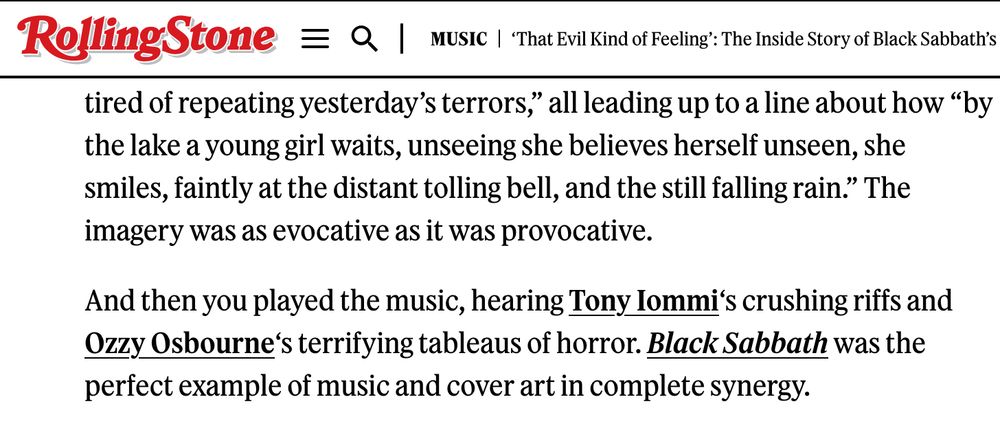
Rotated apostrophes are increasingly common. Maybe the fault of malfunctioning text editors?
On this Rolling Stone page it only happens after links. Anyone know what’s going on?
(Remember: if your apostrophe is shaped like a 6, it’s probably an opening single quote. smartquotesforsmartpeople.com)
On this Rolling Stone page it only happens after links. Anyone know what’s going on?
(Remember: if your apostrophe is shaped like a 6, it’s probably an opening single quote. smartquotesforsmartpeople.com)
July 25, 2025 at 4:47 PM
Rotated apostrophes are increasingly common. Maybe the fault of malfunctioning text editors?
On this Rolling Stone page it only happens after links. Anyone know what’s going on?
(Remember: if your apostrophe is shaped like a 6, it’s probably an opening single quote. smartquotesforsmartpeople.com)
On this Rolling Stone page it only happens after links. Anyone know what’s going on?
(Remember: if your apostrophe is shaped like a 6, it’s probably an opening single quote. smartquotesforsmartpeople.com)
Jesse Ragan of @xyztype.com on Jim Parkinson and much more: backgroundlayer.xyztype.com/archive/back...

July 24, 2025 at 5:15 AM
Jesse Ragan of @xyztype.com on Jim Parkinson and much more: backgroundlayer.xyztype.com/archive/back...
Since the start of the pandemic, @laureola.bsky.social and I have been taking (almost) daily walks, some days seeking a new East Bay street so I can shoot more stamps. There are now over 1,000 photos in the album.


July 10, 2025 at 7:59 AM
Since the start of the pandemic, @laureola.bsky.social and I have been taking (almost) daily walks, some days seeking a new East Bay street so I can shoot more stamps. There are now over 1,000 photos in the album.
Friends, do me a favor and walk around the block wherever you live. Do you see any contractor stamps in the concrete sidewalk or driveways? How many?
I’m wondering if #Oakland has more of these than anywhere else, or if it’s just my proximity bias.
I’m wondering if #Oakland has more of these than anywhere else, or if it’s just my proximity bias.


July 10, 2025 at 7:59 AM
Friends, do me a favor and walk around the block wherever you live. Do you see any contractor stamps in the concrete sidewalk or driveways? How many?
I’m wondering if #Oakland has more of these than anywhere else, or if it’s just my proximity bias.
I’m wondering if #Oakland has more of these than anywhere else, or if it’s just my proximity bias.
That’s original hand lettering for the book cover of Sex and Broadcasting, ca. 1970. Via @letterformarchive.org’s collection.

July 7, 2025 at 4:20 PM
That’s original hand lettering for the book cover of Sex and Broadcasting, ca. 1970. Via @letterformarchive.org’s collection.
@laureola.bsky.social spotted the New York location of #SpanjerBros right next to our hotel! 189 Chrystie St in Soho. Now the site of a The Box, a cocktail bar.
#Signs #PrefabLetters
#Signs #PrefabLetters


July 1, 2025 at 9:06 PM
@laureola.bsky.social spotted the New York location of #SpanjerBros right next to our hotel! 189 Chrystie St in Soho. Now the site of a The Box, a cocktail bar.
#Signs #PrefabLetters
#Signs #PrefabLetters
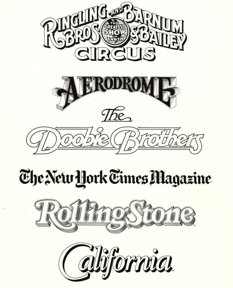
Detail from a promotional poster featuring hand lettered logos and mastheads. Image: @letterformarchive.org
June 27, 2025 at 12:10 PM
Detail from a promotional poster featuring hand lettered logos and mastheads. Image: @letterformarchive.org
Type specimen design: the letters-within-a-letter move.
Will Burtin for Craw Clarendon, ca. 1956–57
Kurt Weidemann for Folio, ca. 1962
Aldo Novarese for Forma, 1973
(All from @letterformarchive.org collection except Forma, loaned from David Jonathan Ross for letterformarchive.org/shop/type-by...)
Will Burtin for Craw Clarendon, ca. 1956–57
Kurt Weidemann for Folio, ca. 1962
Aldo Novarese for Forma, 1973
(All from @letterformarchive.org collection except Forma, loaned from David Jonathan Ross for letterformarchive.org/shop/type-by...)


![Ad from a magazine featuring a large letter ‘O’ filled with other ‘O’s and the word FOLIO. Text in small at the top:
Folio: hohe Vollkommenheit! [high perfection!]](https://cdn.bsky.app/img/feed_thumbnail/plain/did:plc:hwz5ddodleqdt4r32sstlcmb/bafkreihj3ry3i57l6fbx5qcfqqawfwhczjsieiqvlrxwxckb245lo5w6wm@jpeg)

June 25, 2025 at 11:53 PM
Type specimen design: the letters-within-a-letter move.
Will Burtin for Craw Clarendon, ca. 1956–57
Kurt Weidemann for Folio, ca. 1962
Aldo Novarese for Forma, 1973
(All from @letterformarchive.org collection except Forma, loaned from David Jonathan Ross for letterformarchive.org/shop/type-by...)
Will Burtin for Craw Clarendon, ca. 1956–57
Kurt Weidemann for Folio, ca. 1962
Aldo Novarese for Forma, 1973
(All from @letterformarchive.org collection except Forma, loaned from David Jonathan Ross for letterformarchive.org/shop/type-by...)
Ron Jones (art director), Faith and Form covers, 1968–69.
archive.org/details/usmo...
#Architecture #Logos #Religion #1960s #Magazines
archive.org/details/usmo...
#Architecture #Logos #Religion #1960s #Magazines


June 23, 2025 at 6:27 AM
Ron Jones (art director), Faith and Form covers, 1968–69.
archive.org/details/usmo...
#Architecture #Logos #Religion #1960s #Magazines
archive.org/details/usmo...
#Architecture #Logos #Religion #1960s #Magazines