


Phillip Maciak
@pjmaciak.bsky.social
TV Critic @ The New Republic //
DAD: A POP HISTORY (Plume 2027) //
teaching @ Wash U in STL //
https://linktr.ee/phillip.maciak
1, 2, 3, 4, 5, sixers
DAD: A POP HISTORY (Plume 2027) //
teaching @ Wash U in STL //
https://linktr.ee/phillip.maciak
1, 2, 3, 4, 5, sixers
Nobody's more surprised than me about the fact that I think this show is actually REALLY GOOD about screens. And it's precisely because it takes very seriously the idea that WHAT'S ON the screens matters. Ron's phone, laptop, and desktop computer are basically the show's secondary antagonists. 6/x

November 10, 2025 at 7:52 PM
Nobody's more surprised than me about the fact that I think this show is actually REALLY GOOD about screens. And it's precisely because it takes very seriously the idea that WHAT'S ON the screens matters. Ron's phone, laptop, and desktop computer are basically the show's secondary antagonists. 6/x
And one of the show's key insights on that front is that Ron's crisis is both personal and structural. He (we) live in a world optimized to make us go crazy, to encourage our least healthy thoughts and patterns of behavior, to turn our every step into a potential rabbit hole. 5/x

November 10, 2025 at 7:48 PM
And one of the show's key insights on that front is that Ron's crisis is both personal and structural. He (we) live in a world optimized to make us go crazy, to encourage our least healthy thoughts and patterns of behavior, to turn our every step into a potential rabbit hole. 5/x
I kind of love this. The art deco wizard/W reminds me a little of Merlin from the Sword in the Stone. “I’m going to Bermuda!” he says before he jets out the window of his turret. And that’s what the Washington Wizards will be saying, too, after the last game of the regular season. [high five] 22/x

November 10, 2025 at 6:35 PM
I kind of love this. The art deco wizard/W reminds me a little of Merlin from the Sword in the Stone. “I’m going to Bermuda!” he says before he jets out the window of his turret. And that’s what the Washington Wizards will be saying, too, after the last game of the regular season. [high five] 22/x
Every Utah Jazz logo looks like the design on a can of sparkling water. This one is Grape. 21/x

November 10, 2025 at 6:32 PM
Every Utah Jazz logo looks like the design on a can of sparkling water. This one is Grape. 21/x
I have to respect a logo that is an intensely specific homage to one single frame from the Steven Spielberg film Jurassic Park. The one where Samuel Jackson’s severed arm falls on Laura Dern and then the raptor creeps its nasty little head out from behind the breaker panel. CINEMA! 20/x

November 10, 2025 at 6:30 PM
I have to respect a logo that is an intensely specific homage to one single frame from the Steven Spielberg film Jurassic Park. The one where Samuel Jackson’s severed arm falls on Laura Dern and then the raptor creeps its nasty little head out from behind the breaker panel. CINEMA! 20/x
This hat justifies the entire collection. The collection, perhaps, exists to justify this one hat. It’s the reason for the season. Big letters, movement, this is a life-affirming logo. This hat is what the phrase “Generative AI” *should* mean. 19/x

November 10, 2025 at 5:51 PM
This hat justifies the entire collection. The collection, perhaps, exists to justify this one hat. It’s the reason for the season. Big letters, movement, this is a life-affirming logo. This hat is what the phrase “Generative AI” *should* mean. 19/x
Today I am wearing brown shoes and gray pants and a charcoal zip up cardigan, but my tie, which peaks through just about the zipper, is bright purple. That’s kind of the vibe of this hat. Business casual with a fun tie. I would prefer the weekend edition. 18/x

November 10, 2025 at 4:22 PM
Today I am wearing brown shoes and gray pants and a charcoal zip up cardigan, but my tie, which peaks through just about the zipper, is bright purple. That’s kind of the vibe of this hat. Business casual with a fun tie. I would prefer the weekend edition. 18/x
In almost any other context, me saying that something reminds me of Trogdor the Burninator from Homestarrunner would be a compliment. I do not mean this as a compliment here. 17/x


November 9, 2025 at 6:06 PM
In almost any other context, me saying that something reminds me of Trogdor the Burninator from Homestarrunner would be a compliment. I do not mean this as a compliment here. 17/x
Why do the New Era hat designers hate Portland so much. It’s not even that they do a bad job, it’s that all the designs — for this team with an exciting oncourt history and logo history — are instantly forgettable. If I was wearing this hat, I would forget that I was wearing it. 17/x

November 9, 2025 at 5:27 PM
Why do the New Era hat designers hate Portland so much. It’s not even that they do a bad job, it’s that all the designs — for this team with an exciting oncourt history and logo history — are instantly forgettable. If I was wearing this hat, I would forget that I was wearing it. 17/x
Ironically, despite now being a Sixers fan, the first team I really loved was the Charles Barkley Suns (I got really invested in basketball basically the moment he left Philly). I have no objective criteria with which to judge this hat. It makes me feel like middle school. I love it. 16/x

November 9, 2025 at 5:20 PM
Ironically, despite now being a Sixers fan, the first team I really loved was the Charles Barkley Suns (I got really invested in basketball basically the moment he left Philly). I have no objective criteria with which to judge this hat. It makes me feel like middle school. I love it. 16/x
Remember Lil’ Penny? He was everywhere; he was in the “No Diggity” video! The Magic have been lost as a franchise (from a design standpoint, among others) since the Shaq/Penny 90s. Like the hornets hornet, anything from that era is holy iconography. I like the way you work it. 16/x

November 9, 2025 at 4:27 PM
Remember Lil’ Penny? He was everywhere; he was in the “No Diggity” video! The Magic have been lost as a franchise (from a design standpoint, among others) since the Shaq/Penny 90s. Like the hornets hornet, anything from that era is holy iconography. I like the way you work it. 16/x
Wow. I have no investment in New York City exceptionalism, but the Knicks have like three different alternate logos from their history that would be any other team’s greatest graphic design achievement. This hat also looks like a jean jacket with a button on the pocket, which kicks ass. 15/c

November 9, 2025 at 4:22 PM
Wow. I have no investment in New York City exceptionalism, but the Knicks have like three different alternate logos from their history that would be any other team’s greatest graphic design achievement. This hat also looks like a jean jacket with a button on the pocket, which kicks ass. 15/c
There’s an Ian Carmel tweet about this logo that says, “I like the timberwolves retro logo, but it also looks like it just saw its crush agree to go to prom with a different guy.” I think about that every time I see it. Like Ant, this hat is a 10/10 for being both retro and Extremely Online. 14/x

November 9, 2025 at 4:07 PM
There’s an Ian Carmel tweet about this logo that says, “I like the timberwolves retro logo, but it also looks like it just saw its crush agree to go to prom with a different guy.” I think about that every time I see it. Like Ant, this hat is a 10/10 for being both retro and Extremely Online. 14/x
This works because Giannis has the exact surreal cornball manner of a character from a Rankin Bass stop-motion special. Imagine him catching a lob from Yukon Cornelius. Imagine what it would sound like for Burl Ives and Doc Rivers to have a conversation. Kyle Kuzma just wants to be a dentist. 13/x

November 8, 2025 at 11:10 PM
This works because Giannis has the exact surreal cornball manner of a character from a Rankin Bass stop-motion special. Imagine him catching a lob from Yukon Cornelius. Imagine what it would sound like for Burl Ives and Doc Rivers to have a conversation. Kyle Kuzma just wants to be a dentist. 13/x
That's what the flair's about. It's about fun…Look, we want you to express yourself, okay? Now if you feel that the bare minimum is enough, then okay. But some people choose to do more and we encourage that, okay? You do want to express yourself, don't you?

November 8, 2025 at 11:05 PM
That's what the flair's about. It's about fun…Look, we want you to express yourself, okay? Now if you feel that the bare minimum is enough, then okay. But some people choose to do more and we encourage that, okay? You do want to express yourself, don't you?
This hat looks like MVP Austin Reaves’ haircut. No pizzazzzzzzzzzzzzzzzzzzzzzzzzzzzzzzzzzzzzzzzzzzzzzzzzzzzzzzzzzzzzzzzzzzzzzzzzzzzzzzzzzzzzzzzzzzzzzzzzzzzzzzzzzzzzzzzzzzzzzzzzzzzzzzzzzzzzzzzzzzzzzzzzzzzzzzzzzzzzzzzzzzzzzzzzzzzzzzzzzzzzzzzzzzzzzzzzzzzzzzzzzzzzzzzzzzzzzzzzzzzzzzzzzzzzzzzzzzzzzz 12/x

November 8, 2025 at 10:53 PM
This hat looks like MVP Austin Reaves’ haircut. No pizzazzzzzzzzzzzzzzzzzzzzzzzzzzzzzzzzzzzzzzzzzzzzzzzzzzzzzzzzzzzzzzzzzzzzzzzzzzzzzzzzzzzzzzzzzzzzzzzzzzzzzzzzzzzzzzzzzzzzzzzzzzzzzzzzzzzzzzzzzzzzzzzzzzzzzzzzzzzzzzzzzzzzzzzzzzzzzzzzzzzzzzzzzzzzzzzzzzzzzzzzzzzzzzzzzzzzzzzzzzzzzzzzzzzzzzzzzzzzzz 12/x
There’s absolutely no reason this isn’t currently the Rockets logo. The 25-26 Rockets uniforms look like the jersey a famous player would wear in an insurance commercial that didn’t clear the rights. Or the opposing team in Teen Wolf 3. RETVRN, Rockets! 12/x

November 8, 2025 at 10:32 PM
There’s absolutely no reason this isn’t currently the Rockets logo. The 25-26 Rockets uniforms look like the jersey a famous player would wear in an insurance commercial that didn’t clear the rights. Or the opposing team in Teen Wolf 3. RETVRN, Rockets! 12/x
When you’re only playing THREE dimensional chess as an organization, but your Knight is on fire. (This is a metaphor about Cade maybe?) This hat is ok. 11/x

November 8, 2025 at 10:26 PM
When you’re only playing THREE dimensional chess as an organization, but your Knight is on fire. (This is a metaphor about Cade maybe?) This hat is ok. 11/x
A relic of a time before the Oracle, before the exodus from Oakland. I applaud the audacity of just having a big yellow circle. Is it the sun? Is it a basketball? Is it the 3I/atlas comet? What orb is this? (cc: @oaklandreviewofbooks.org) A dream of Chris Mullin’s flat-top, a Golden State. 10/x

November 8, 2025 at 6:25 PM
A relic of a time before the Oracle, before the exodus from Oakland. I applaud the audacity of just having a big yellow circle. Is it the sun? Is it a basketball? Is it the 3I/atlas comet? What orb is this? (cc: @oaklandreviewofbooks.org) A dream of Chris Mullin’s flat-top, a Golden State. 10/x
The lesson of an exercise like this is that not all change is progress. Every step the Nuggets take away from this logo is one further step out of the Light of the Lord. They should install stained glass windows with this logo in the Ball Arena. Nikola Jokic should play in a rainbow cassock. 9/x
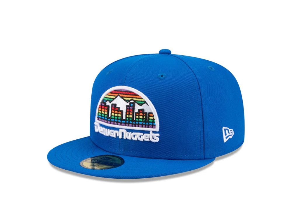
November 8, 2025 at 6:07 PM
The lesson of an exercise like this is that not all change is progress. Every step the Nuggets take away from this logo is one further step out of the Light of the Lord. They should install stained glass windows with this logo in the Ball Arena. Nikola Jokic should play in a rainbow cassock. 9/x
I mean, yes, ok, sure. I generally like the retro Mavs stuff — if only because their contemporary jerseys look like business cards — but this is just…fine. I like the hat, but is it too much? This whole thing feels a little too pleased with itself. But that’s probably just me. 8/x

November 8, 2025 at 5:43 PM
I mean, yes, ok, sure. I generally like the retro Mavs stuff — if only because their contemporary jerseys look like business cards — but this is just…fine. I like the hat, but is it too much? This whole thing feels a little too pleased with itself. But that’s probably just me. 8/x
I don’t think the Cavs have had a cool uniform since prior to the LeBron era, and this hat is a reminder. Its blocky embarrassment of a wordmark feels identifiably and defiantly midwestern to me as opposed to the team’s current bland hotel lobby aesthetic. 7/x

November 8, 2025 at 5:15 PM
I don’t think the Cavs have had a cool uniform since prior to the LeBron era, and this hat is a reminder. Its blocky embarrassment of a wordmark feels identifiably and defiantly midwestern to me as opposed to the team’s current bland hotel lobby aesthetic. 7/x
This one is so bad, I had to say something. The Chicago Bull is blowing his nose, and the words “Windy City” are coming out of it like snot. That’s not me trying to be funny or mean, that’s accurate alt-text. This hat was designed in the 60s by a person who was on drugs. 6/x

November 8, 2025 at 4:58 PM
This one is so bad, I had to say something. The Chicago Bull is blowing his nose, and the words “Windy City” are coming out of it like snot. That’s not me trying to be funny or mean, that’s accurate alt-text. This hat was designed in the 60s by a person who was on drugs. 6/x
The hornets will never be good, but they could never make me hate this hat. This logo on a pullover starter jacket with the big front pocket is divinely inspired. Hang it in the Louvre and steal it. 5/x

November 8, 2025 at 4:49 PM
The hornets will never be good, but they could never make me hate this hat. This logo on a pullover starter jacket with the big front pocket is divinely inspired. Hang it in the Louvre and steal it. 5/x
The Celtics have a hard time with these bc they haven’t really modernized their look all that much. Like the Yankees, their brand is classic. Still, this feels like a punt. I don’t hate the weathered brownish orange of the ball, but…meh. Give Jaylen Brown a nicer hat to hide his balding pate. 4/x

November 8, 2025 at 4:40 PM
The Celtics have a hard time with these bc they haven’t really modernized their look all that much. Like the Yankees, their brand is classic. Still, this feels like a punt. I don’t hate the weathered brownish orange of the ball, but…meh. Give Jaylen Brown a nicer hat to hide his balding pate. 4/x