


Jonas Oesch
@jonasoesch.ch
Visual journalist at @visuals.nzz.ch
Personal: jonasoesch.ch
Personal: jonasoesch.ch
Why Visual Journalism is so slow?
I've tracked every hour I worked on an article for two weeks last year. Most of my time did not go into graphics production but in researching and analyzing data.
The detailed breakdown and some ideas how to speed up the process: nightingaledvs.com/why-visual-j...
I've tracked every hour I worked on an article for two weeks last year. Most of my time did not go into graphics production but in researching and analyzing data.
The detailed breakdown and some ideas how to speed up the process: nightingaledvs.com/why-visual-j...
August 28, 2025 at 10:05 AM
Why Visual Journalism is so slow?
I've tracked every hour I worked on an article for two weeks last year. Most of my time did not go into graphics production but in researching and analyzing data.
The detailed breakdown and some ideas how to speed up the process: nightingaledvs.com/why-visual-j...
I've tracked every hour I worked on an article for two weeks last year. Most of my time did not go into graphics production but in researching and analyzing data.
The detailed breakdown and some ideas how to speed up the process: nightingaledvs.com/why-visual-j...
With the discussion on the future of Datavis, I enjoyed the historical perspective given by @statmodeling.bsky.social and Susan Kruglinski here: nightingaledvs.com/statistical-... 1/2

Statistical Graphics and Comics: Parallel Histories of Visual Storytelling, Nightingale
What do data visualization and comics have in common? One of these is used to communicate in science and journalism, and the other appears in fine art and...
nightingaledvs.com
August 15, 2025 at 12:38 PM
With the discussion on the future of Datavis, I enjoyed the historical perspective given by @statmodeling.bsky.social and Susan Kruglinski here: nightingaledvs.com/statistical-... 1/2
The balance of power in the Middle East has been shifting for some time. Iran’s allies are eroding, but its former rival Saudi Arabia is warming relations.
Explore our updated interactive map: www.nzz.ch/english/inte...
Explore our updated interactive map: www.nzz.ch/english/inte...


June 20, 2025 at 3:17 PM
The balance of power in the Middle East has been shifting for some time. Iran’s allies are eroding, but its former rival Saudi Arabia is warming relations.
Explore our updated interactive map: www.nzz.ch/english/inte...
Explore our updated interactive map: www.nzz.ch/english/inte...
Reposted by Jonas Oesch

2 Millionen Kubikmeter Gestein sind bereits bei Blatten abgebrochen, weitere 2 bis 4 Millionen Kubikmeter instabiles Material befinden sich noch am Berg. Wie gehts weiter? Die Szenarien von @jonasoesch.ch, @rolandshaw.bsky.social und Jan Ludwig.
www.nzz.ch/visuals/die-...
@nzz.ch
www.nzz.ch/visuals/die-...
@nzz.ch
May 22, 2025 at 6:34 AM
2 Millionen Kubikmeter Gestein sind bereits bei Blatten abgebrochen, weitere 2 bis 4 Millionen Kubikmeter instabiles Material befinden sich noch am Berg. Wie gehts weiter? Die Szenarien von @jonasoesch.ch, @rolandshaw.bsky.social und Jan Ludwig.
www.nzz.ch/visuals/die-...
@nzz.ch
www.nzz.ch/visuals/die-...
@nzz.ch
Reposted by Jonas Oesch

🗺️ If you’re a map enthusiast, be sure to read this week’s Data Vis Dispatch! You’ll also find charts on government spending, measles, and the Arctic. 🐻❄️🧊
www.datawrapper.de/blog/data-vi...
www.datawrapper.de/blog/data-vi...


May 20, 2025 at 4:28 PM
🗺️ If you’re a map enthusiast, be sure to read this week’s Data Vis Dispatch! You’ll also find charts on government spending, measles, and the Arctic. 🐻❄️🧊
www.datawrapper.de/blog/data-vi...
www.datawrapper.de/blog/data-vi...
Reposted by Jonas Oesch

Computational Public Space. A talk about a values-driven approach to integrating computation into cities. (40 min)
www.youtube.com/watch?v=PixP...
www.youtube.com/watch?v=PixP...
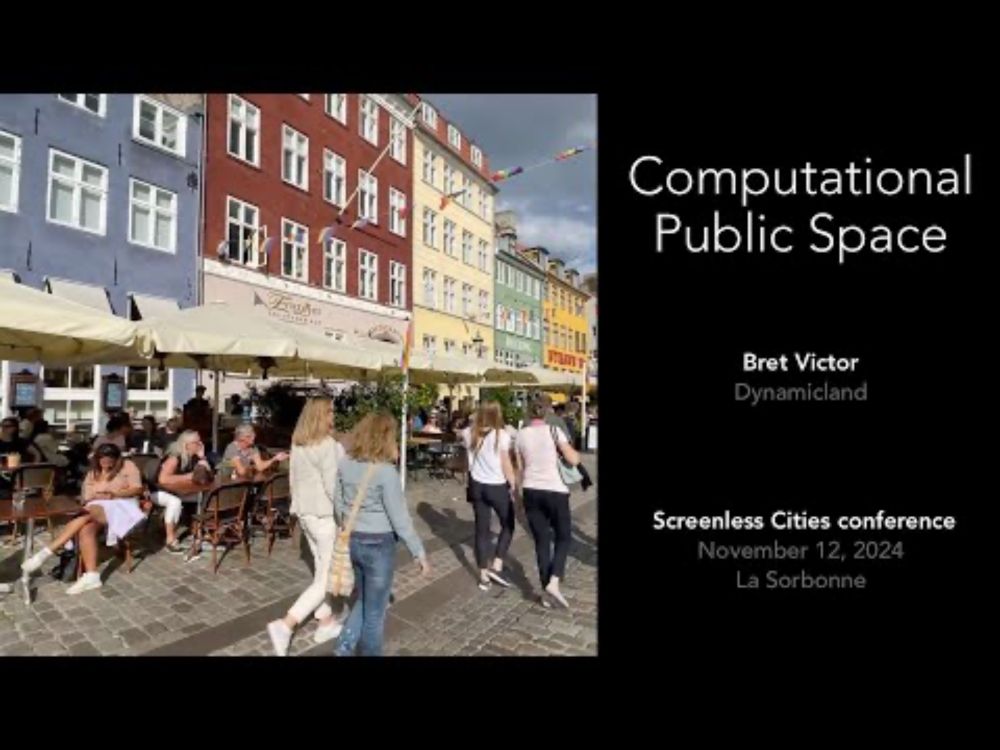
Computational Public Space
YouTube video by Dynamicland
www.youtube.com
May 15, 2025 at 5:33 PM
Computational Public Space. A talk about a values-driven approach to integrating computation into cities. (40 min)
www.youtube.com/watch?v=PixP...
www.youtube.com/watch?v=PixP...
Reposted by Jonas Oesch
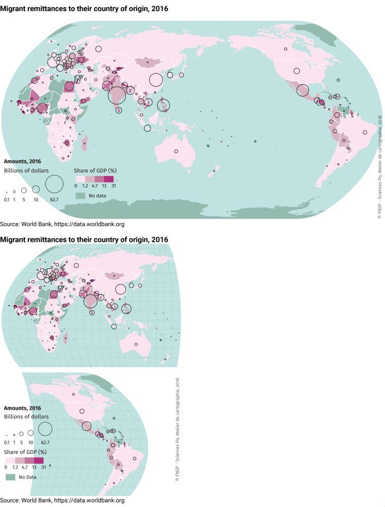
Very nice!
A few years back we faced the same problem and tried different solutions.
From using a different projection to cutting the map and even rotating it.
espace-mondial-atlas.sciencespo.fr/en/topic-res...
A few years back we faced the same problem and tried different solutions.
From using a different projection to cutting the map and even rotating it.
espace-mondial-atlas.sciencespo.fr/en/topic-res...


April 28, 2025 at 9:39 AM
Very nice!
A few years back we faced the same problem and tried different solutions.
From using a different projection to cutting the map and even rotating it.
espace-mondial-atlas.sciencespo.fr/en/topic-res...
A few years back we faced the same problem and tried different solutions.
From using a different projection to cutting the map and even rotating it.
espace-mondial-atlas.sciencespo.fr/en/topic-res...
Reposted by Jonas Oesch

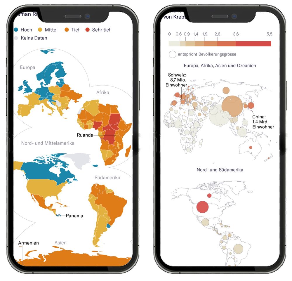
A trick for fitting world maps on phones:
Stack two azimuthal equal-area projections, clipped at 90° longitude, each one rotated 180° from the other.
The bottom map covers the top's Antarctica, which reduces the total height and looks nice.
As seen in www.nytimes.com/2025/04/25/c...
Stack two azimuthal equal-area projections, clipped at 90° longitude, each one rotated 180° from the other.
The bottom map covers the top's Antarctica, which reduces the total height and looks nice.
As seen in www.nytimes.com/2025/04/25/c...

April 27, 2025 at 1:23 AM
A trick for fitting world maps on phones:
Stack two azimuthal equal-area projections, clipped at 90° longitude, each one rotated 180° from the other.
The bottom map covers the top's Antarctica, which reduces the total height and looks nice.
As seen in www.nytimes.com/2025/04/25/c...
Stack two azimuthal equal-area projections, clipped at 90° longitude, each one rotated 180° from the other.
The bottom map covers the top's Antarctica, which reduces the total height and looks nice.
As seen in www.nytimes.com/2025/04/25/c...
Better world maps for mobile!
Despite years of mobile-first design, there’s been little experimentation in this area. So we designed our own at NZZ – and validated it in a large user study.
Summary of the paper: jonasoesch.ch/articles/the... 1/3
Despite years of mobile-first design, there’s been little experimentation in this area. So we designed our own at NZZ – and validated it in a large user study.
Summary of the paper: jonasoesch.ch/articles/the... 1/3
May 14, 2025 at 9:38 AM
Better world maps for mobile!
Despite years of mobile-first design, there’s been little experimentation in this area. So we designed our own at NZZ – and validated it in a large user study.
Summary of the paper: jonasoesch.ch/articles/the... 1/3
Despite years of mobile-first design, there’s been little experimentation in this area. So we designed our own at NZZ – and validated it in a large user study.
Summary of the paper: jonasoesch.ch/articles/the... 1/3
Reposted by Jonas Oesch

What if the U.S. adjusted its tariffs on Germany and Switzerland to match what those countries charge?
This NZZ chart by @florianseliger.bsky.social &
@jonasoesch.ch shows how U.S. tariffs would rise under 3 "reciprocity" scenarios using my data from the Global Tariff Database
👇
This NZZ chart by @florianseliger.bsky.social &
@jonasoesch.ch shows how U.S. tariffs would rise under 3 "reciprocity" scenarios using my data from the Global Tariff Database
👇
March 31, 2025 at 7:30 PM
What if the U.S. adjusted its tariffs on Germany and Switzerland to match what those countries charge?
This NZZ chart by @florianseliger.bsky.social &
@jonasoesch.ch shows how U.S. tariffs would rise under 3 "reciprocity" scenarios using my data from the Global Tariff Database
👇
This NZZ chart by @florianseliger.bsky.social &
@jonasoesch.ch shows how U.S. tariffs would rise under 3 "reciprocity" scenarios using my data from the Global Tariff Database
👇
Reposted by Jonas Oesch

Now that we have vibe coding, we need vibe testing!
March 24, 2025 at 7:45 PM
Now that we have vibe coding, we need vibe testing!
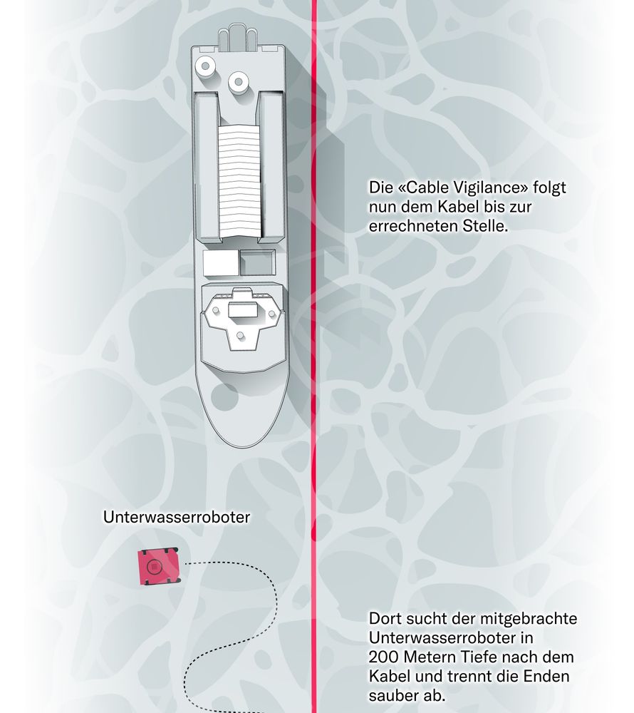
In recent months, Internet cables in the Baltic Sea have been damaged multiple times — Russian sabotage is suspected. But how does that work?
Together with @cianjochem.bsky.social & @lukasmaeder.bsky.social , we visualized one case (inspired by Reuters 🤩)
www.nzz.ch/ld.1875983
Together with @cianjochem.bsky.social & @lukasmaeder.bsky.social , we visualized one case (inspired by Reuters 🤩)
www.nzz.ch/ld.1875983

March 21, 2025 at 3:37 PM
In recent months, Internet cables in the Baltic Sea have been damaged multiple times — Russian sabotage is suspected. But how does that work?
Together with @cianjochem.bsky.social & @lukasmaeder.bsky.social , we visualized one case (inspired by Reuters 🤩)
www.nzz.ch/ld.1875983
Together with @cianjochem.bsky.social & @lukasmaeder.bsky.social , we visualized one case (inspired by Reuters 🤩)
www.nzz.ch/ld.1875983
Reposted by Jonas Oesch

two weeks ago I published www.shirleywu.studio/notebook/202... re: plateau in innovation I've felt in #dataviz last few years.
I've been furiously working on the follow-up (so many thoughts!) & it'll finally be out next Monday 🎉 if you'd like an email notification: www.shirleywu.studio/notebook
I've been furiously working on the follow-up (so many thoughts!) & it'll finally be out next Monday 🎉 if you'd like an email notification: www.shirleywu.studio/notebook

what killed innovation?: the past decade of interactive graphics, a brief recounting - Shirley Wu
Over the past decade, interactive data visualization has gone from bold experimentation to polished, predictable formats. I’ve been reflecting on why—and after speaking with some of the best in the fi...
www.shirleywu.studio
March 21, 2025 at 8:04 AM
two weeks ago I published www.shirleywu.studio/notebook/202... re: plateau in innovation I've felt in #dataviz last few years.
I've been furiously working on the follow-up (so many thoughts!) & it'll finally be out next Monday 🎉 if you'd like an email notification: www.shirleywu.studio/notebook
I've been furiously working on the follow-up (so many thoughts!) & it'll finally be out next Monday 🎉 if you'd like an email notification: www.shirleywu.studio/notebook
Reposted by Jonas Oesch

🏠 Nice & clean → relatively low rent?
🏡 Gorgeous & beautiful → really expensive?
Which adjectives in Craigslist rental posts for SF Bay Area go with which prices?
#TidyTuesday | 2022 week 27
🏡 Gorgeous & beautiful → really expensive?
Which adjectives in Craigslist rental posts for SF Bay Area go with which prices?
#TidyTuesday | 2022 week 27

September 7, 2023 at 6:53 PM
🏠 Nice & clean → relatively low rent?
🏡 Gorgeous & beautiful → really expensive?
Which adjectives in Craigslist rental posts for SF Bay Area go with which prices?
#TidyTuesday | 2022 week 27
🏡 Gorgeous & beautiful → really expensive?
Which adjectives in Craigslist rental posts for SF Bay Area go with which prices?
#TidyTuesday | 2022 week 27
Reposted by Jonas Oesch

Do you want to animate a @vega-vis.bsky.social vega-lite or @observablehq.com Plot chart? Here is a quick experiment that might help you that animates between two SVGs.
Let me know what you think! #dataviz.
👉🏼 observablehq.com/@john-guerra...
Let me know what you think! #dataviz.
👉🏼 observablehq.com/@john-guerra...
February 26, 2025 at 6:45 PM
Do you want to animate a @vega-vis.bsky.social vega-lite or @observablehq.com Plot chart? Here is a quick experiment that might help you that animates between two SVGs.
Let me know what you think! #dataviz.
👉🏼 observablehq.com/@john-guerra...
Let me know what you think! #dataviz.
👉🏼 observablehq.com/@john-guerra...
Swiss supermarket chain Migros promised price cuts—and delivered on many. But at the same time, products like chocolate and coffee became more expensive, reflecting global market trends. For most shoppers, the result is only modest savings. www.nzz.ch/ld.1869677

February 24, 2025 at 12:40 PM
Swiss supermarket chain Migros promised price cuts—and delivered on many. But at the same time, products like chocolate and coffee became more expensive, reflecting global market trends. For most shoppers, the result is only modest savings. www.nzz.ch/ld.1869677
Reposted by Jonas Oesch

What are people searching on Google when it comes to German election candidates?
We visualized it! 📊
➡️ first 10 free: www.spiegel.de/netzwelt/web...
We visualized it! 📊
➡️ first 10 free: www.spiegel.de/netzwelt/web...
February 13, 2025 at 6:23 PM
What are people searching on Google when it comes to German election candidates?
We visualized it! 📊
➡️ first 10 free: www.spiegel.de/netzwelt/web...
We visualized it! 📊
➡️ first 10 free: www.spiegel.de/netzwelt/web...
Reposted by Jonas Oesch

Hello dataviz and design people!
We're looking for a freelancer to help us with data visualization and/or diagrams at Works in Progress.
We cover topics like housing, technology, health, energy, and much more, and experience in these areas is a plus!
If this is you, get in touch! (details below)
We're looking for a freelancer to help us with data visualization and/or diagrams at Works in Progress.
We cover topics like housing, technology, health, energy, and much more, and experience in these areas is a plus!
If this is you, get in touch! (details below)
February 10, 2025 at 9:14 AM
Hello dataviz and design people!
We're looking for a freelancer to help us with data visualization and/or diagrams at Works in Progress.
We cover topics like housing, technology, health, energy, and much more, and experience in these areas is a plus!
If this is you, get in touch! (details below)
We're looking for a freelancer to help us with data visualization and/or diagrams at Works in Progress.
We cover topics like housing, technology, health, energy, and much more, and experience in these areas is a plus!
If this is you, get in touch! (details below)
Reposted by Jonas Oesch

Some new stuff in Fun-tography mhinfographics.github.io/maps 🗺️✈️ a place for #map nerdies

January 20, 2025 at 12:46 AM
Some new stuff in Fun-tography mhinfographics.github.io/maps 🗺️✈️ a place for #map nerdies
Marius Irgens on distortions in vis: "A more common way to distort in […] visualization is through non-linear color mapping." True. Designing a truthful color mapping is incredibly difficult – if not impossible. But as he notes, you need to be transparent about it. nightingaledvs.com/distortion-b...

Distortion by Design - Nightingale
Explore the role of distortion in data visualization, its ethical implications, and use in enhancing comprehension or misleading audiences.
nightingaledvs.com
January 15, 2025 at 12:27 PM
Marius Irgens on distortions in vis: "A more common way to distort in […] visualization is through non-linear color mapping." True. Designing a truthful color mapping is incredibly difficult – if not impossible. But as he notes, you need to be transparent about it. nightingaledvs.com/distortion-b...
Reposted by Jonas Oesch

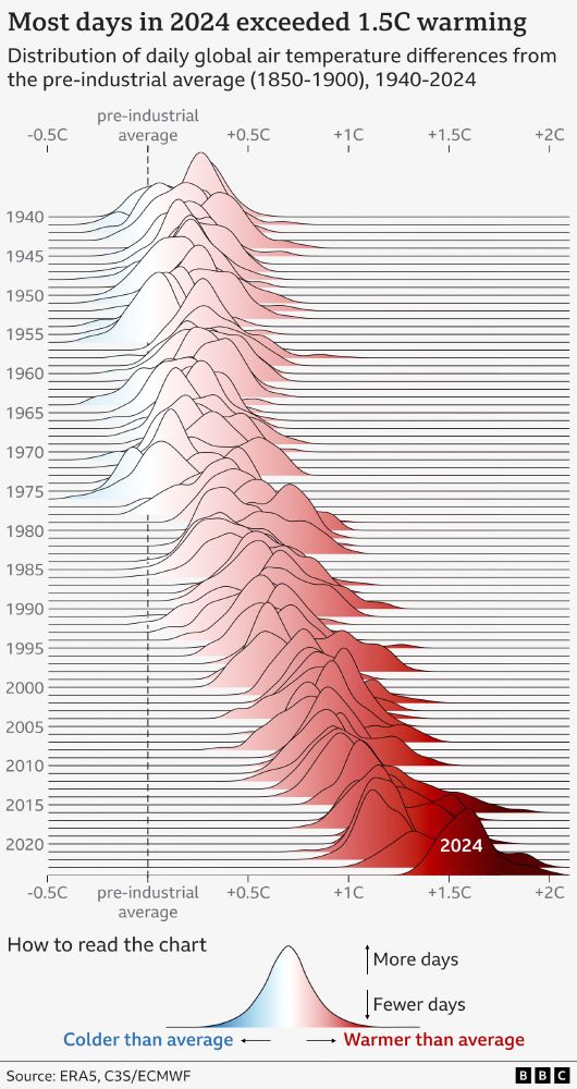
NEW: 2024 has just been confirmed as the warmest year on record, and the first to breach the 1.5C threshold.
We used a ridgeline (Joy Division inspired) chart to visualise daily temperature anomalies since 1940.
2024 clearly stands out with 100% of its days above 1.3C and 75% above 1.5C.
We used a ridgeline (Joy Division inspired) chart to visualise daily temperature anomalies since 1940.
2024 clearly stands out with 100% of its days above 1.3C and 75% above 1.5C.
January 10, 2025 at 8:04 AM
NEW: 2024 has just been confirmed as the warmest year on record, and the first to breach the 1.5C threshold.
We used a ridgeline (Joy Division inspired) chart to visualise daily temperature anomalies since 1940.
2024 clearly stands out with 100% of its days above 1.3C and 75% above 1.5C.
We used a ridgeline (Joy Division inspired) chart to visualise daily temperature anomalies since 1940.
2024 clearly stands out with 100% of its days above 1.3C and 75% above 1.5C.


Reposted by Jonas Oesch
Los Angeles brennt. Angefacht durch die Santa-Ana-Winde. Mit bis zu 113 Kilometer pro Stunde fegen sie über die Stadt. Verursacht haben sie die Brände aber nicht. Eine Analyse von @sventitz.bsky.social, @jonasoesch.ch, Roland Shaw, Jasmine Rüegg, @jeberhart.bsky.social
👉 www.nzz.ch/wissenschaft...
👉 www.nzz.ch/wissenschaft...


January 9, 2025 at 4:17 PM
Los Angeles brennt. Angefacht durch die Santa-Ana-Winde. Mit bis zu 113 Kilometer pro Stunde fegen sie über die Stadt. Verursacht haben sie die Brände aber nicht. Eine Analyse von @sventitz.bsky.social, @jonasoesch.ch, Roland Shaw, Jasmine Rüegg, @jeberhart.bsky.social
👉 www.nzz.ch/wissenschaft...
👉 www.nzz.ch/wissenschaft...
Reposted by Jonas Oesch

Very important thread. Discontinuing fact checking *is* biased because it vastly favours one side of politics. (The side that is spreading disinformation more often, and if you don't know which side that is, you can find out by looking at the data below. Or any other data, there is a plenty).

🚨In Nature🚨
Meta is dropping fact-checking to avoid anti-conservative bias- but is there actually evidence of bias?
We this test empirically & find that conservatives
* ARE suspended more
* BUT share more misinfo
So suspension isn't necessarily evidence of bias www.nature.com/articles/s41...
Meta is dropping fact-checking to avoid anti-conservative bias- but is there actually evidence of bias?
We this test empirically & find that conservatives
* ARE suspended more
* BUT share more misinfo
So suspension isn't necessarily evidence of bias www.nature.com/articles/s41...
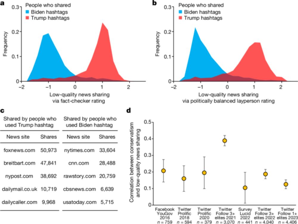
Differences in misinformation sharing can lead to politically asymmetric sanctions - Nature
We find that conservatives tend to share more low-quality news through social media than liberals, and so even if technology companies enact politically neutral anti-misinformation policies, political...
www.nature.com
January 8, 2025 at 10:29 AM
Very important thread. Discontinuing fact checking *is* biased because it vastly favours one side of politics. (The side that is spreading disinformation more often, and if you don't know which side that is, you can find out by looking at the data below. Or any other data, there is a plenty).
Reposted by Jonas Oesch

Visualizing uncertainty in stacked bar charts is a constant problem I face in my work. I absolutely *love* these fuzzy plots, so I made a gist to try them out using simulated data. #rstats
gist.github.com/Koalha/d9403...
gist.github.com/Koalha/d9403...

January 4, 2025 at 5:45 PM
Visualizing uncertainty in stacked bar charts is a constant problem I face in my work. I absolutely *love* these fuzzy plots, so I made a gist to try them out using simulated data. #rstats
gist.github.com/Koalha/d9403...
gist.github.com/Koalha/d9403...