


Anne-Sophie Pereira De Sá
@curiousdata.bsky.social
Over-analyses TV series, music, my cat and Eurovision in #dataviz
By day, data analyst at LinkedIn
Tableau's #VizoftheDay three times, Top 10 in #Ironviz in 2021
Website: https://curiousdata.netlify.app/
She/her
By day, data analyst at LinkedIn
Tableau's #VizoftheDay three times, Top 10 in #Ironviz in 2021
Website: https://curiousdata.netlify.app/
She/her
Pinned


[Wrap up 2024] Creativity wise, I have stalled, as I have dedicated time and energy learning
#d3, #Svelte and all the basics, eg #Javascript 😑
To wrap up 2024 on a cheerful note, I have crafted datavizreadytogo.netlify.app with everything I now know, with the goal to be more creative in 2025! 🌸
#d3, #Svelte and all the basics, eg #Javascript 😑
To wrap up 2024 on a cheerful note, I have crafted datavizreadytogo.netlify.app with everything I now know, with the goal to be more creative in 2025! 🌸
In today's edition of "Data articles I didn’t know I needed to read" 🧅✨
pudding.cool/2025/08/onio...
#DigThisViz #DataStorytelling #UnexpectedlyBrilliant
pudding.cool/2025/08/onio...
#DigThisViz #DataStorytelling #UnexpectedlyBrilliant

Dicing an Onion, the Mathematically Optimal Way
There is more than one way to dice an onion…
pudding.cool
August 13, 2025 at 2:18 PM
In today's edition of "Data articles I didn’t know I needed to read" 🧅✨
pudding.cool/2025/08/onio...
#DigThisViz #DataStorytelling #UnexpectedlyBrilliant
pudding.cool/2025/08/onio...
#DigThisViz #DataStorytelling #UnexpectedlyBrilliant
Reposted by Anne-Sophie Pereira De Sá

Desperately need a word for when you hate the subject of a data, but like the visual. My latest combines a comparison chart & cartogram to show which states allow prisons to charge "pay-to-stay" fees. #dataviz

Visual journalist @jacqueschrag.com's cartogram shows which types of fees each state is allowed to charge incarcerated individuals. Reporting by @russcontreras.bsky.social and @delanomassey.bsky.social

Exclusive: Most states allow jails and prisons to charge inmates for own incarceration
The debt wheel puts up more obstacles to escaping the poverty that likely put them in jail
www.axios.com
July 15, 2025 at 5:47 PM
Desperately need a word for when you hate the subject of a data, but like the visual. My latest combines a comparison chart & cartogram to show which states allow prisons to charge "pay-to-stay" fees. #dataviz


March 4, 2025 at 5:53 PM
Signal boosting this 🧵. Whether you are a #dataviz professional or amateur, journalist or working in a corporate setting, it's all the same: don't ignore your responsibilities and ethics. Especially now.

Once again, the New York Times gives the dataviz community an opportunity to reflect on its purpose.
Can everything be quantified and turned into a chart?
Most important: what are the consequences of a chart?
If words matter, charts matter too.
Can everything be quantified and turned into a chart?
Most important: what are the consequences of a chart?
If words matter, charts matter too.

Of course the NYT sees the "DEI" stuff positively & is neutral on anti-trans discrimination
March 2, 2025 at 6:34 AM
Signal boosting this 🧵. Whether you are a #dataviz professional or amateur, journalist or working in a corporate setting, it's all the same: don't ignore your responsibilities and ethics. Especially now.
Reposted by Anne-Sophie Pereira De Sá

"…there’s one nut we have not been able to crack: anchoring bespoke data visualization as a full fledged profession in corporate settings."
Re-reading this article from 2017 (medium.com/visualizing-...), I wonder — where are we at 8 years on?
Re-reading this article from 2017 (medium.com/visualizing-...), I wonder — where are we at 8 years on?
There be dragons: dataviz in the industry
I started being serious about data visualization around 2005, when the field was still pretty niche and people like Martin Wattenberg, Ben…
medium.com
February 14, 2025 at 11:11 AM
"…there’s one nut we have not been able to crack: anchoring bespoke data visualization as a full fledged profession in corporate settings."
Re-reading this article from 2017 (medium.com/visualizing-...), I wonder — where are we at 8 years on?
Re-reading this article from 2017 (medium.com/visualizing-...), I wonder — where are we at 8 years on?
Thanks (or no thanks?) to @alexselbyb.bsky.social for mentioning this 'spot the wrong colour' game in the latest @economist.com 'Off the charts' #dataviz newsletter sent by @mariesegger.bsky.social.
My Saturday morning productivity? Nonexistent! 😂
My Saturday morning productivity? Nonexistent! 😂
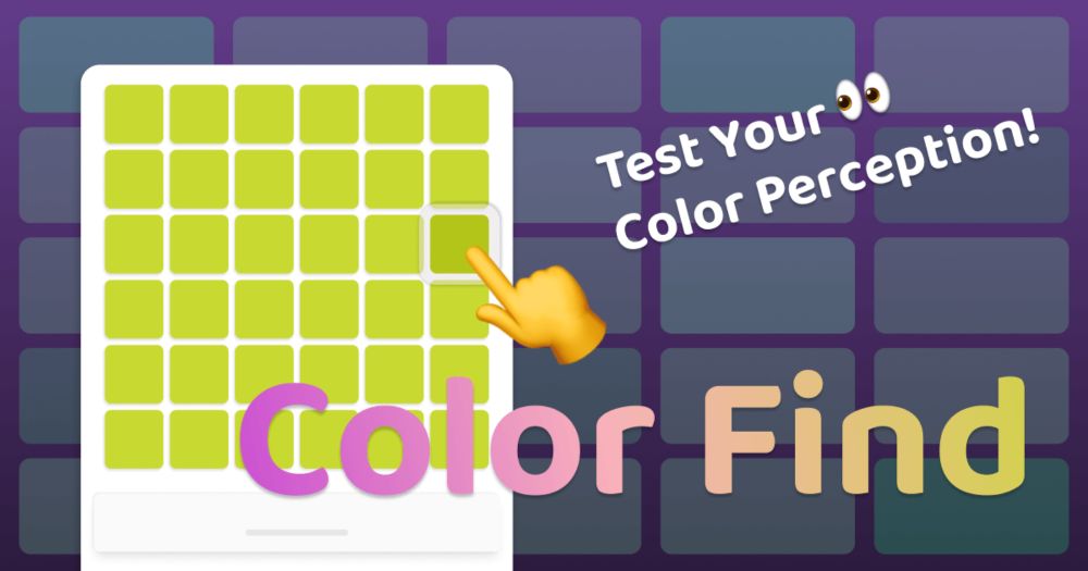
Color Find - Test Your Color Perception
Challenge yourself with this addictive color perception game. Find the different colored square, compete on the leaderboard, and see how far you can go!
5jqdmjxdwavv.trickle.host
February 15, 2025 at 11:46 AM
Thanks (or no thanks?) to @alexselbyb.bsky.social for mentioning this 'spot the wrong colour' game in the latest @economist.com 'Off the charts' #dataviz newsletter sent by @mariesegger.bsky.social.
My Saturday morning productivity? Nonexistent! 😂
My Saturday morning productivity? Nonexistent! 😂
🎵 They manipulate and threaten
With terror as a weapon
Scare you till you're stupefied
Wear you down until you're on their side 🎵
(Where’s the Revolution)
With terror as a weapon
Scare you till you're stupefied
Wear you down until you're on their side 🎵
(Where’s the Revolution)

Don't worry, everyone. I've come up with a solution...
February 14, 2025 at 9:25 AM
🎵 They manipulate and threaten
With terror as a weapon
Scare you till you're stupefied
Wear you down until you're on their side 🎵
(Where’s the Revolution)
With terror as a weapon
Scare you till you're stupefied
Wear you down until you're on their side 🎵
(Where’s the Revolution)
#Dataviz pros, I’d love your insights! 💡 Speaking to a corporate audience (incl. graphic designers) about the value of a data viz professional 📊 vs. a graphic designer 🎨.
How do you explain what sets us apart while showing how we complement each other? Keen to hear your take! #DataVisualization
How do you explain what sets us apart while showing how we complement each other? Keen to hear your take! #DataVisualization

two men are sitting next to each other and one of them is saying teamwork
ALT: two men are sitting next to each other and one of them is saying teamwork
media.tenor.com
February 13, 2025 at 2:25 PM
#Dataviz pros, I’d love your insights! 💡 Speaking to a corporate audience (incl. graphic designers) about the value of a data viz professional 📊 vs. a graphic designer 🎨.
How do you explain what sets us apart while showing how we complement each other? Keen to hear your take! #DataVisualization
How do you explain what sets us apart while showing how we complement each other? Keen to hear your take! #DataVisualization
Reposted by Anne-Sophie Pereira De Sá

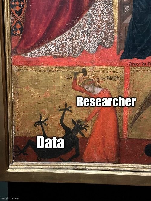
Researcher: "We let the data speak for itself."
Earlier that day:
Earlier that day:
January 2, 2025 at 3:31 PM
Researcher: "We let the data speak for itself."
Earlier that day:
Earlier that day:
Reposted by Anne-Sophie Pereira De Sá

a bit more #Severance data
please enjoy all analyses equally
👉 lucymcgowan.github.io/mdr-website/
and for my #rstats friends:
👉 lucymcgowan.github.io/mdr/
please enjoy all analyses equally
👉 lucymcgowan.github.io/mdr-website/
and for my #rstats friends:
👉 lucymcgowan.github.io/mdr/
January 31, 2025 at 2:54 PM
a bit more #Severance data
please enjoy all analyses equally
👉 lucymcgowan.github.io/mdr-website/
and for my #rstats friends:
👉 lucymcgowan.github.io/mdr/
please enjoy all analyses equally
👉 lucymcgowan.github.io/mdr-website/
and for my #rstats friends:
👉 lucymcgowan.github.io/mdr/
Calling the #datafam to the rescue! 📊
I'm looking for examples of #dataviz presented in a video format. Long, short, with voiceover or a presenter: anything that doesnt require interaction, just to watch. Got any favourites to share? 🙌 #DataVisualization #VisualStorytelling #DataVizInspiration
I'm looking for examples of #dataviz presented in a video format. Long, short, with voiceover or a presenter: anything that doesnt require interaction, just to watch. Got any favourites to share? 🙌 #DataVisualization #VisualStorytelling #DataVizInspiration
January 27, 2025 at 5:05 PM
Calling the #datafam to the rescue! 📊
I'm looking for examples of #dataviz presented in a video format. Long, short, with voiceover or a presenter: anything that doesnt require interaction, just to watch. Got any favourites to share? 🙌 #DataVisualization #VisualStorytelling #DataVizInspiration
I'm looking for examples of #dataviz presented in a video format. Long, short, with voiceover or a presenter: anything that doesnt require interaction, just to watch. Got any favourites to share? 🙌 #DataVisualization #VisualStorytelling #DataVizInspiration

January 17, 2025 at 2:49 PM
Reposted by Anne-Sophie Pereira De Sá

For the love of all that is holy, switch to Signal. WhatsApp is not secure and probably being mined for AI content. Host your family group chats etc elsewhere.
January 11, 2025 at 12:01 PM
For the love of all that is holy, switch to Signal. WhatsApp is not secure and probably being mined for AI content. Host your family group chats etc elsewhere.
Reposted by Anne-Sophie Pereira De Sá

I want to remind everyone that your local library is both physical AND digital.
You hate streaming everything because the price is ridiculous? Library.
You hate ads because they're every 3 mins or less? Library.
You want to reduce your digital footprint? Library.
You want sourced info? Library.
You hate streaming everything because the price is ridiculous? Library.
You hate ads because they're every 3 mins or less? Library.
You want to reduce your digital footprint? Library.
You want sourced info? Library.
January 11, 2025 at 2:05 AM
I want to remind everyone that your local library is both physical AND digital.
You hate streaming everything because the price is ridiculous? Library.
You hate ads because they're every 3 mins or less? Library.
You want to reduce your digital footprint? Library.
You want sourced info? Library.
You hate streaming everything because the price is ridiculous? Library.
You hate ads because they're every 3 mins or less? Library.
You want to reduce your digital footprint? Library.
You want sourced info? Library.
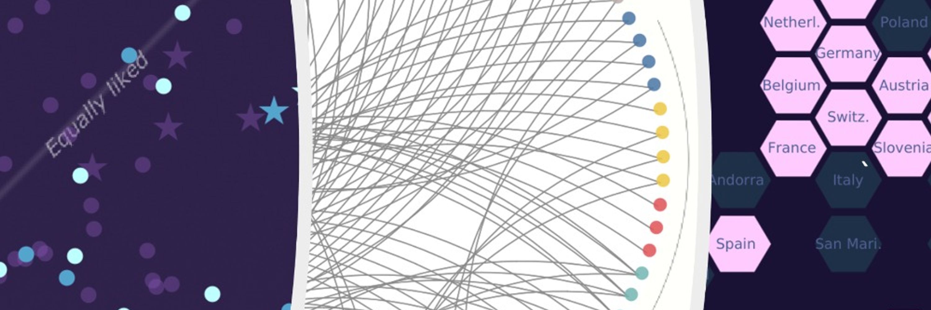
Calling all data viz enthusiasts! 📊
I'm looking for inspiring examples of arc diagrams to spark some creativity for an article. Got any favourites or resources to share? Drop them below! 🙌 #DataViz #DataVisualization #InfoDesign #DataArt #VisualStorytelling #DataVizInspiration
I'm looking for inspiring examples of arc diagrams to spark some creativity for an article. Got any favourites or resources to share? Drop them below! 🙌 #DataViz #DataVisualization #InfoDesign #DataArt #VisualStorytelling #DataVizInspiration

January 10, 2025 at 3:46 PM
Calling all data viz enthusiasts! 📊
I'm looking for inspiring examples of arc diagrams to spark some creativity for an article. Got any favourites or resources to share? Drop them below! 🙌 #DataViz #DataVisualization #InfoDesign #DataArt #VisualStorytelling #DataVizInspiration
I'm looking for inspiring examples of arc diagrams to spark some creativity for an article. Got any favourites or resources to share? Drop them below! 🙌 #DataViz #DataVisualization #InfoDesign #DataArt #VisualStorytelling #DataVizInspiration
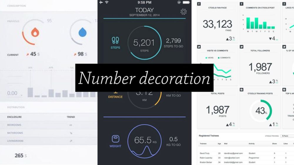
[Wrap up 2024] Creativity wise, I have stalled, as I have dedicated time and energy learning
#d3, #Svelte and all the basics, eg #Javascript 😑
To wrap up 2024 on a cheerful note, I have crafted datavizreadytogo.netlify.app with everything I now know, with the goal to be more creative in 2025! 🌸
#d3, #Svelte and all the basics, eg #Javascript 😑
To wrap up 2024 on a cheerful note, I have crafted datavizreadytogo.netlify.app with everything I now know, with the goal to be more creative in 2025! 🌸
December 31, 2024 at 2:56 PM
[Wrap up 2024] Creativity wise, I have stalled, as I have dedicated time and energy learning
#d3, #Svelte and all the basics, eg #Javascript 😑
To wrap up 2024 on a cheerful note, I have crafted datavizreadytogo.netlify.app with everything I now know, with the goal to be more creative in 2025! 🌸
#d3, #Svelte and all the basics, eg #Javascript 😑
To wrap up 2024 on a cheerful note, I have crafted datavizreadytogo.netlify.app with everything I now know, with the goal to be more creative in 2025! 🌸
As someone who has been waiting very (im)patiently for the season 2 of #Severance, massive appreciation for @lisacmuth.bsky.social's #datavisualisation on the increasing gap between TV series season releases. blog.datawrapper.de/waittime-for...
#dataviz
#dataviz

We're waiting longer than ever for our favorite TV shows to return - Datawrapper Blog
If you’re a fan of almost any TV series these days, you're used to the waiting. Here are some charts on how long you're waiting, exactly.
blog.datawrapper.de
December 24, 2024 at 11:14 AM
As someone who has been waiting very (im)patiently for the season 2 of #Severance, massive appreciation for @lisacmuth.bsky.social's #datavisualisation on the increasing gap between TV series season releases. blog.datawrapper.de/waittime-for...
#dataviz
#dataviz
Recently found this beautifully animated vid in @pbump.com's 'How to read this chart' newsletter.
Reminded me how dataviz goes beyond classic charts: it's about visualising info to understand how things work. Couldn't stop watching, even with my tiny attention span. www.youtube.com/watch?v=Fpao...
Reminded me how dataviz goes beyond classic charts: it's about visualising info to understand how things work. Couldn't stop watching, even with my tiny attention span. www.youtube.com/watch?v=Fpao...

Sample Breakdown: The Most Iconic Electronic Music Sample of Every Year (1990-2024)
YouTube video by Tracklib
www.youtube.com
December 24, 2024 at 9:41 AM
Recently found this beautifully animated vid in @pbump.com's 'How to read this chart' newsletter.
Reminded me how dataviz goes beyond classic charts: it's about visualising info to understand how things work. Couldn't stop watching, even with my tiny attention span. www.youtube.com/watch?v=Fpao...
Reminded me how dataviz goes beyond classic charts: it's about visualising info to understand how things work. Couldn't stop watching, even with my tiny attention span. www.youtube.com/watch?v=Fpao...
Hey #datafam!
This Christmas, why not treat yourself (or someone else) to something to a paid membership to the Data Visualization Society? One of the best decisions I made.
1/
This Christmas, why not treat yourself (or someone else) to something to a paid membership to the Data Visualization Society? One of the best decisions I made.
1/
November 26, 2024 at 4:32 PM
Hey #datafam!
This Christmas, why not treat yourself (or someone else) to something to a paid membership to the Data Visualization Society? One of the best decisions I made.
1/
This Christmas, why not treat yourself (or someone else) to something to a paid membership to the Data Visualization Society? One of the best decisions I made.
1/
Reposted by Anne-Sophie Pereira De Sá

So far in the keynote we have “the state of Florida is run by alligators” and “not everything in this talk will be true”. Awesome start on Evil Dataviz from Eli Holder in collaboration with Gabrielle Merite at #outlier2024 📊

June 12, 2024 at 4:29 PM
So far in the keynote we have “the state of Florida is run by alligators” and “not everything in this talk will be true”. Awesome start on Evil Dataviz from Eli Holder in collaboration with Gabrielle Merite at #outlier2024 📊
Reposted by Anne-Sophie Pereira De Sá

#Outlier2024 off to a cracking start as @elibryan outlines how charts are modified to be evil. Also, how Florida is run by alligators, how racism is an American tradition, and how not everything in his talk is true. Be ABSURD (or not).

June 12, 2024 at 3:21 PM
#Outlier2024 off to a cracking start as @elibryan outlines how charts are modified to be evil. Also, how Florida is run by alligators, how racism is an American tradition, and how not everything in his talk is true. Be ABSURD (or not).
Reposted by Anne-Sophie Pereira De Sá

Opening remarks by Outlier Director Julia Hennelly and Events Director Emily Kund.
Executive Director @abmakulec.bsky.social building on the importance of communities in data viz.
Our first keynote ‘Visual Villainy: How to Undermine Humanity with Data Viz’ by @elibryan.bsky.social
Executive Director @abmakulec.bsky.social building on the importance of communities in data viz.
Our first keynote ‘Visual Villainy: How to Undermine Humanity with Data Viz’ by @elibryan.bsky.social


June 12, 2024 at 3:28 PM
Opening remarks by Outlier Director Julia Hennelly and Events Director Emily Kund.
Executive Director @abmakulec.bsky.social building on the importance of communities in data viz.
Our first keynote ‘Visual Villainy: How to Undermine Humanity with Data Viz’ by @elibryan.bsky.social
Executive Director @abmakulec.bsky.social building on the importance of communities in data viz.
Our first keynote ‘Visual Villainy: How to Undermine Humanity with Data Viz’ by @elibryan.bsky.social
London #dataviz folks, this free event next Tuesday could be of interest to you, with two great talks on ethical data viz and Palestine Open Maps 📊

London Data Visualisation · Luma
If you feel inspired by the visual journalism of the New York Times, winners of the Information is Beautiful awards or the wonderfully crafted graphics of great communicators like Mona...
lu.ma
March 7, 2024 at 3:25 PM
London #dataviz folks, this free event next Tuesday could be of interest to you, with two great talks on ethical data viz and Palestine Open Maps 📊
Reposted by Anne-Sophie Pereira De Sá
It's here! Check out the data viz feed below, open to sharing work & all kinds of discussion related to the field. To participate in the feed you must:
- Include 📊 in your post
- Be added to the account list. Sign up here: forms.gle/4iVMTBgTycXW...
Excited to continued discussions with you!
- Include 📊 in your post
- Be added to the account list. Sign up here: forms.gle/4iVMTBgTycXW...
Excited to continued discussions with you!
January 4, 2024 at 12:07 AM
It's here! Check out the data viz feed below, open to sharing work & all kinds of discussion related to the field. To participate in the feed you must:
- Include 📊 in your post
- Be added to the account list. Sign up here: forms.gle/4iVMTBgTycXW...
Excited to continued discussions with you!
- Include 📊 in your post
- Be added to the account list. Sign up here: forms.gle/4iVMTBgTycXW...
Excited to continued discussions with you!