


Peter Donahue
@colornerd.bsky.social
Artist and color theory educator
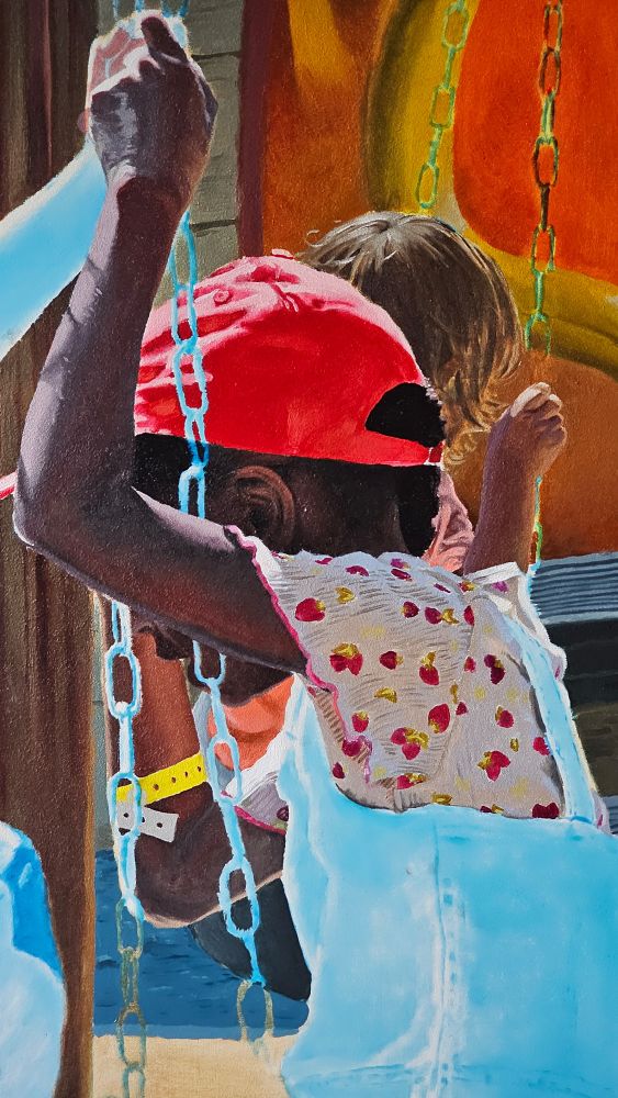
Here it is with the water finished and a few other touch-ups.

November 27, 2025 at 1:55 PM
Here it is with the water finished and a few other touch-ups.
July 29, 2025 at 10:25 AM
June 20, 2025 at 4:55 PM
June 19, 2025 at 1:10 PM
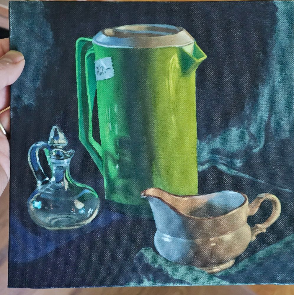
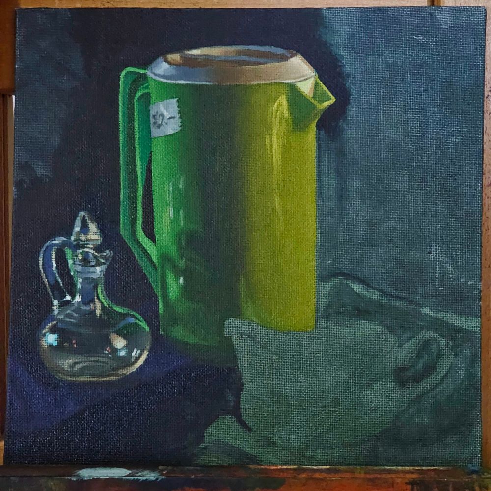
Thanks- appreciate your perspective. Yes, I started with a warm tan ground. The forest floor does feel a bit disconnected. I do want to keep experimenting with different colored grounds!
May 13, 2025 at 12:15 PM
Thanks- appreciate your perspective. Yes, I started with a warm tan ground. The forest floor does feel a bit disconnected. I do want to keep experimenting with different colored grounds!
Very cool tool! Thanks for sharing!
March 23, 2025 at 2:11 PM
Very cool tool! Thanks for sharing!
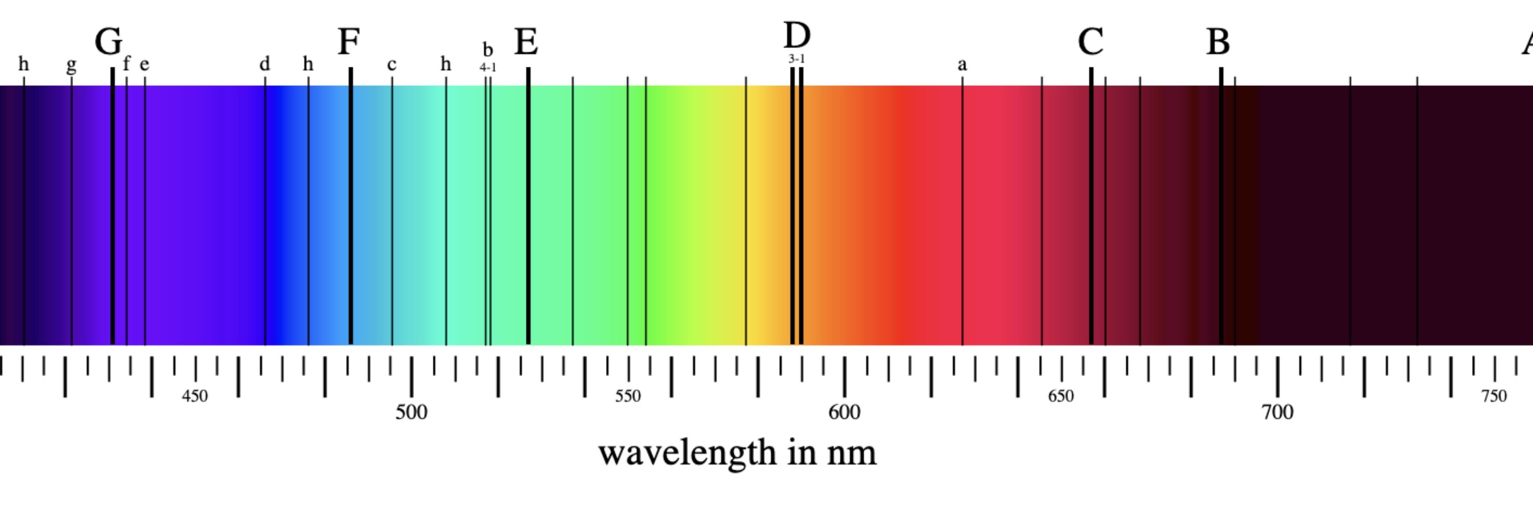
I think it is squished because the chroma of blue-greens are limited on RGB displays, and I showed the helix in a sorta-perceptual space (CieLUV) whereas viridis was constructed with reference to rgb values, not perceptual space.
March 23, 2025 at 2:07 PM
I think it is squished because the chroma of blue-greens are limited on RGB displays, and I showed the helix in a sorta-perceptual space (CieLUV) whereas viridis was constructed with reference to rgb values, not perceptual space.
That's my working theory, anyway, haha. The problem with the painting, I think, might be that I couldn't get my purple vivid enough for the amount of push I wanted.
March 16, 2025 at 12:46 AM
That's my working theory, anyway, haha. The problem with the painting, I think, might be that I couldn't get my purple vivid enough for the amount of push I wanted.
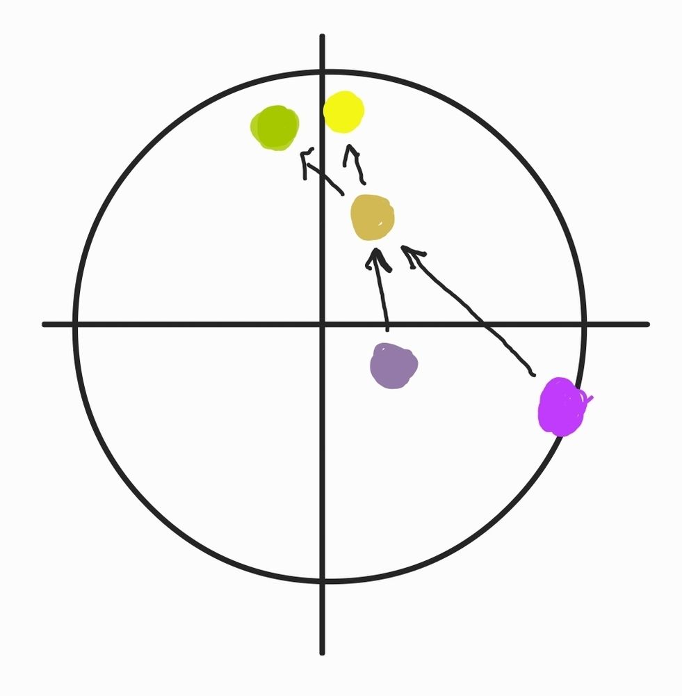
If the purple were duller, it would push the ochre more toward vivid yellow. Making the purple vivid changes the angle of "push" towards lime green. And yeah, these paintings were partially inspired by Kitaoka's bowl of gray strawberries :)
March 16, 2025 at 12:45 AM
If the purple were duller, it would push the ochre more toward vivid yellow. Making the purple vivid changes the angle of "push" towards lime green. And yeah, these paintings were partially inspired by Kitaoka's bowl of gray strawberries :)
Good thoughts. I did add some black to the yellow ochre, in the darker areas. And you might be right about the background. Interestingly I was wondering the opposite - was it too light? Haha
March 16, 2025 at 12:31 AM
Good thoughts. I did add some black to the yellow ochre, in the darker areas. And you might be right about the background. Interestingly I was wondering the opposite - was it too light? Haha