(read pinned)
After years of stagnating art skills I’ve had enough so here I show how I try to improve-
I’m always open to advice!
This was definitely interesting
I constantly found myself darkening colors and also definitely struggled to apply the lamplight color correctly.
Yesterday’s drawing also looked too unfocused for my taste so I focused on sharpening a few edges at the end
#artstudy #study


A simple attempt at saturation-based contrast in a painting
I feel like I could definitely do better
A fun spin on this would be to reverse the saturation for example or use more colors.
I’ll probably try this type again sometime but not in monochrome to challenge myself
#art #artstudy

Mmmmmm contrast
I’m thinking I’ll try to make some very simple paintings to try to practice each type


Mmmmmm contrast
I’m thinking I’ll try to make some very simple paintings to try to practice each type
The very basics of color theory come first; this is the groundwork I’ll be building on
I think I’ll expand upon „temperature“ at some point since that’s the one I’m least familiar with


The very basics of color theory come first; this is the groundwork I’ll be building on
I think I’ll expand upon „temperature“ at some point since that’s the one I’m least familiar with
Imma be so fr if you can’t tell a difference I won’t blame you
this was basically just final little details that I got hung up on and spent too much time on
If I find nothing else to complain about then I should be able to post the finished piece tomorrow~

Imma be so fr if you can’t tell a difference I won’t blame you
this was basically just final little details that I got hung up on and spent too much time on
If I find nothing else to complain about then I should be able to post the finished piece tomorrow~
Also bonus (check alt text):


Also bonus (check alt text):
Todays work doesn’t translate well visually h o w f u n~
I was trying to get the final art to be independent from the sketch/Lineart since that would look inconsistent if only the figure had Lineart
I also wanted to get the man’s figure right :) (I’m not sure I succeed but hey worth a try)

Todays work doesn’t translate well visually h o w f u n~
I was trying to get the final art to be independent from the sketch/Lineart since that would look inconsistent if only the figure had Lineart
I also wanted to get the man’s figure right :) (I’m not sure I succeed but hey worth a try)
Hmmmm I am once more thinking thoughts
I refined the center figure a bit but I kind of really like the monochromatic look on him? Look at me I’m being allergic to colors again-
Not like he’s wearing much more than blue anyway.
I’m also not quite satisfied with the arm? Been experimenting


Hmmmm I am once more thinking thoughts
I refined the center figure a bit but I kind of really like the monochromatic look on him? Look at me I’m being allergic to colors again-
Not like he’s wearing much more than blue anyway.
I’m also not quite satisfied with the arm? Been experimenting
Sat here doodling and thinking to myself ‘haaaaaa why do I put myself through this’
It’s a bit tedious drawing backgrounds sometimes but I do still have an answer to that question;
To git gud c;
Anyway I’ll probably rework that building a bit but for now I’ll get back to the figure

Sat here doodling and thinking to myself ‘haaaaaa why do I put myself through this’
It’s a bit tedious drawing backgrounds sometimes but I do still have an answer to that question;
To git gud c;
Anyway I’ll probably rework that building a bit but for now I’ll get back to the figure
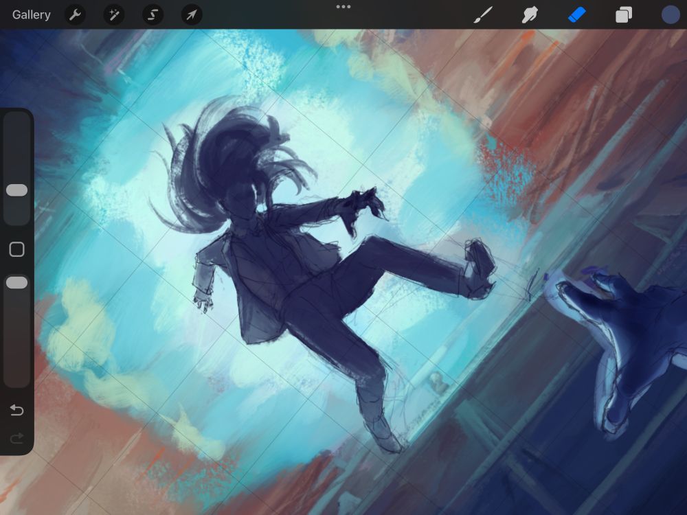
Wasn’t really feeling it today I’m not gonna lie
I worked on the road below. It’s not the focus of the painting so it luckily doesn’t require much detail :) makes me wonder if it’s worth practicing efficient simplification somehow so I can get an image across in as few strokes as possible?

Wasn’t really feeling it today I’m not gonna lie
I worked on the road below. It’s not the focus of the painting so it luckily doesn’t require much detail :) makes me wonder if it’s worth practicing efficient simplification somehow so I can get an image across in as few strokes as possible?
Hmmm I’m wondering what building style I want to have on the other side of the road
I know I want the building he’s falling off of to be one that’s under construction but I have no plan for the surrounding area hmmmmmmmmmm
A problem for tomorrow’s me

Hmmm I’m wondering what building style I want to have on the other side of the road
I know I want the building he’s falling off of to be one that’s under construction but I have no plan for the surrounding area hmmmmmmmmmm
A problem for tomorrow’s me

Not a lot of progress today but I did finish laying the groundwork for the entire background so tomorrow should look a bit more interesting~
I ended up brightening up the streetlights again because the entire image felt too dark and I’m more satisfied with the result

Not a lot of progress today but I did finish laying the groundwork for the entire background so tomorrow should look a bit more interesting~
I ended up brightening up the streetlights again because the entire image felt too dark and I’m more satisfied with the result
I also wanted to see what this would look like if it were a bit more monochrome and-
Yeaaaah no
That or I fumbled the execution- keeping everything simple, after all, I’m just experimenting~

I also wanted to see what this would look like if it were a bit more monochrome and-
Yeaaaah no
That or I fumbled the execution- keeping everything simple, after all, I’m just experimenting~
Making a fun observation here
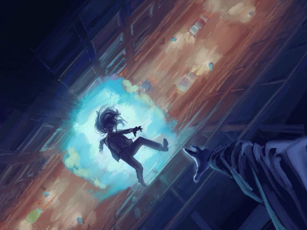
I wanted to reserve the strongest contrast for the falling man so I also kept the lightest and darkest shades for that spot- but I think the entire piece looks a bit unbalanced as a result?
I may stick to using edges to draw the eye as opposed to just light


Making a fun observation here
I wanted to reserve the strongest contrast for the falling man so I also kept the lightest and darkest shades for that spot- but I think the entire piece looks a bit unbalanced as a result?
I may stick to using edges to draw the eye as opposed to just light
Finally the most conflicting result was clipping a ‘color’ mode layer over the black-white image and coloring that. This stayed completely true to the black-white values but the colors weren’t exactly what I saw when I selected them. It also looks blindingly saturated? And I couldn’t change that
…


Finally the most conflicting result was clipping a ‘color’ mode layer over the black-white image and coloring that. This stayed completely true to the black-white values but the colors weren’t exactly what I saw when I selected them. It also looks blindingly saturated? And I couldn’t change that
…


